Healthcare Access and Quality Index based on mortality from causes amenable to personal health care in 195 countries and territories, 1990-2015: a novel analysis from the Global Burden of Disease Study 2015
- PMID: 28528753
- PMCID: PMC5528124
- DOI: 10.1016/S0140-6736(17)30818-8
Healthcare Access and Quality Index based on mortality from causes amenable to personal health care in 195 countries and territories, 1990-2015: a novel analysis from the Global Burden of Disease Study 2015
Abstract
Background: National levels of personal health-care access and quality can be approximated by measuring mortality rates from causes that should not be fatal in the presence of effective medical care (ie, amenable mortality). Previous analyses of mortality amenable to health care only focused on high-income countries and faced several methodological challenges. In the present analysis, we use the highly standardised cause of death and risk factor estimates generated through the Global Burden of Diseases, Injuries, and Risk Factors Study (GBD) to improve and expand the quantification of personal health-care access and quality for 195 countries and territories from 1990 to 2015.
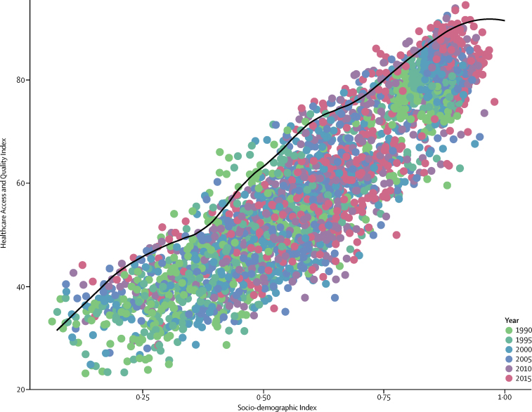
Methods: We mapped the most widely used list of causes amenable to personal health care developed by Nolte and McKee to 32 GBD causes. We accounted for variations in cause of death certification and misclassifications through the extensive data standardisation processes and redistribution algorithms developed for GBD. To isolate the effects of personal health-care access and quality, we risk-standardised cause-specific mortality rates for each geography-year by removing the joint effects of local environmental and behavioural risks, and adding back the global levels of risk exposure as estimated for GBD 2015. We employed principal component analysis to create a single, interpretable summary measure-the Healthcare Quality and Access (HAQ) Index-on a scale of 0 to 100. The HAQ Index showed strong convergence validity as compared with other health-system indicators, including health expenditure per capita (r=0·88), an index of 11 universal health coverage interventions (r=0·83), and human resources for health per 1000 (r=0·77). We used free disposal hull analysis with bootstrapping to produce a frontier based on the relationship between the HAQ Index and the Socio-demographic Index (SDI), a measure of overall development consisting of income per capita, average years of education, and total fertility rates. This frontier allowed us to better quantify the maximum levels of personal health-care access and quality achieved across the development spectrum, and pinpoint geographies where gaps between observed and potential levels have narrowed or widened over time.
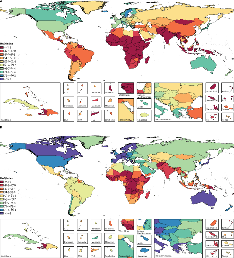
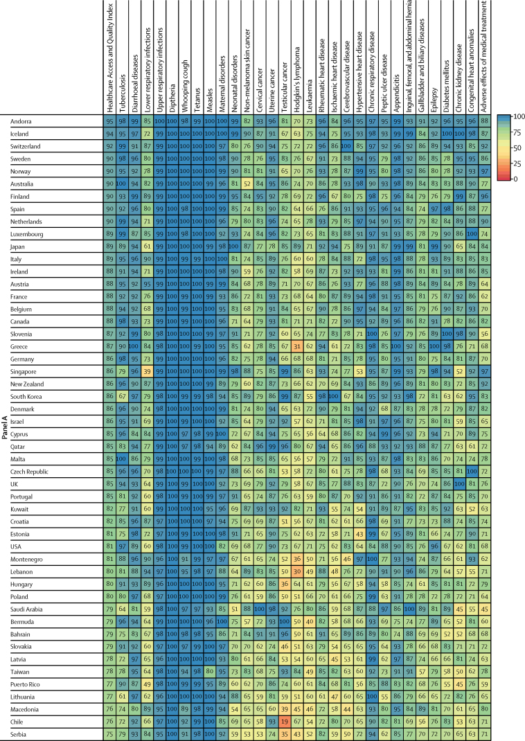
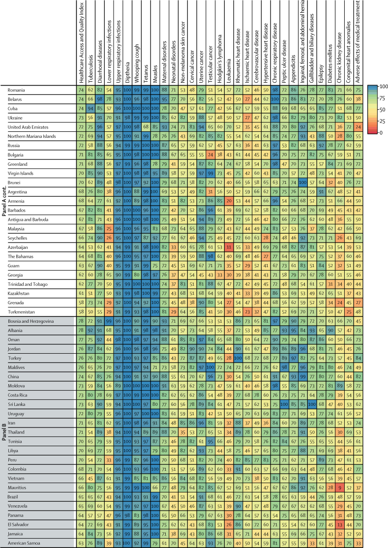
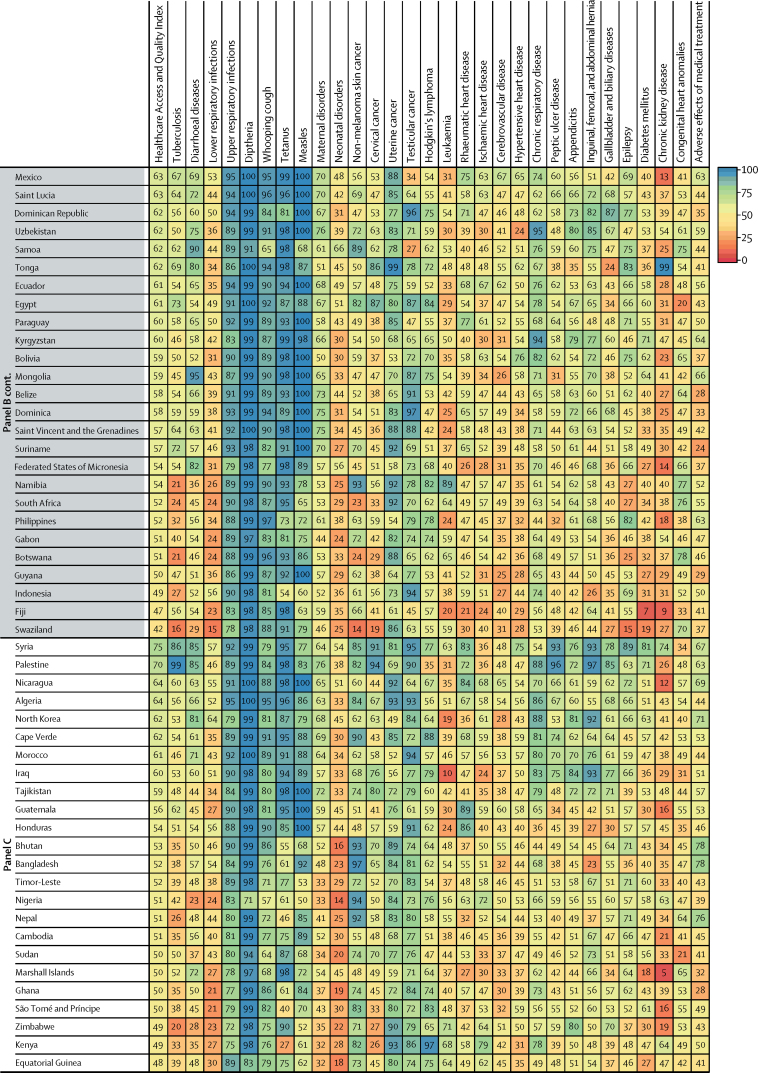
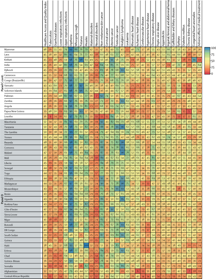
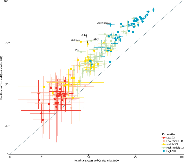
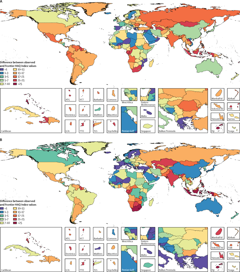
Findings: Between 1990 and 2015, nearly all countries and territories saw their HAQ Index values improve; nonetheless, the difference between the highest and lowest observed HAQ Index was larger in 2015 than in 1990, ranging from 28·6 to 94·6. Of 195 geographies, 167 had statistically significant increases in HAQ Index levels since 1990, with South Korea, Turkey, Peru, China, and the Maldives recording among the largest gains by 2015. Performance on the HAQ Index and individual causes showed distinct patterns by region and level of development, yet substantial heterogeneities emerged for several causes, including cancers in highest-SDI countries; chronic kidney disease, diabetes, diarrhoeal diseases, and lower respiratory infections among middle-SDI countries; and measles and tetanus among lowest-SDI countries. While the global HAQ Index average rose from 40·7 (95% uncertainty interval, 39·0-42·8) in 1990 to 53·7 (52·2-55·4) in 2015, far less progress occurred in narrowing the gap between observed HAQ Index values and maximum levels achieved; at the global level, the difference between the observed and frontier HAQ Index only decreased from 21·2 in 1990 to 20·1 in 2015. If every country and territory had achieved the highest observed HAQ Index by their corresponding level of SDI, the global average would have been 73·8 in 2015. Several countries, particularly in eastern and western sub-Saharan Africa, reached HAQ Index values similar to or beyond their development levels, whereas others, namely in southern sub-Saharan Africa, the Middle East, and south Asia, lagged behind what geographies of similar development attained between 1990 and 2015.
Interpretation: This novel extension of the GBD Study shows the untapped potential for personal health-care access and quality improvement across the development spectrum. Amid substantive advances in personal health care at the national level, heterogeneous patterns for individual causes in given countries or territories suggest that few places have consistently achieved optimal health-care access and quality across health-system functions and therapeutic areas. This is especially evident in middle-SDI countries, many of which have recently undergone or are currently experiencing epidemiological transitions. The HAQ Index, if paired with other measures of health-system characteristics such as intervention coverage, could provide a robust avenue for tracking progress on universal health coverage and identifying local priorities for strengthening personal health-care quality and access throughout the world.
Funding: Bill & Melinda Gates Foundation.
Copyright © 2017 The Author(s). Published by Elsevier Ltd. This is an Open Access article under the CC BY 4.0 license. Published by Elsevier Ltd.. All rights reserved.
Figures
Comment in
-
Account for primary health care when indexing access and quality.Lancet. 2017 Jul 15;390(10091):205-206. doi: 10.1016/S0140-6736(17)31289-8. Epub 2017 May 18. Lancet. 2017. PMID: 28528752 No abstract available.
-
A milestone for palliative care and pain relief.Lancet. 2018 Apr 7;391(10128):1338-1339. doi: 10.1016/S0140-6736(17)32560-6. Epub 2017 Oct 12. Lancet. 2018. PMID: 29032991 No abstract available.
-
Challenges of measuring the Healthcare Access and Quality Index.Lancet. 2018 Feb 3;391(10119):428-429. doi: 10.1016/S0140-6736(18)30145-4. Lancet. 2018. PMID: 29407032 No abstract available.
-
Challenges of measuring the Healthcare Access and Quality Index.Lancet. 2018 Feb 3;391(10119):429. doi: 10.1016/S0140-6736(18)30146-6. Lancet. 2018. PMID: 29407034 No abstract available.
References
-
- United Nations . Transforming our World: the 2030 Agenda for Sustainable Development. UN; New York, NY, USA: 2015.
-
- Tobias M, Yeh L-C. How much does health care contribute to health gain and to health inequality? Trends in amenable mortality in New Zealand 1981–2004. Aust N Z J Public Health. 2009;33:70–78. - PubMed
-
- Gay JG, Paris V, Devaux M, de Looper M. Mortality Amenable to Health Care in 31 OECD Countries. Organisation for Economic Co-operation and Development; Paris: 2011. http://www.oecd-ilibrary.org/content/workingpaper/5kgj35f9f8s2-en (accessed Dec 23, 2016).
-
- Nolte E, McKee M. Does healthcare save lives? Avoidable mortality revisited. Nuffield Trust; London, UK: 2004.
-
- Murray CJ, Lopez AD. On the comparable quantification of health risks: lessons from the Global Burden of Disease Study. Epidemiol Camb Mass. 1999;10:594–605. - PubMed
MeSH terms
Grants and funding
LinkOut - more resources
Full Text Sources
Other Literature Sources
Medical
Miscellaneous