. 2017 Jun;70(3):267-276.
doi: 10.4097/kjae.2017.70.3.267. Epub 2017 May 19.

Statistical data presentation

Affiliations

Statistical data presentation

Junyong In et al. Korean J Anesthesiol. 2017 Jun.

Abstract

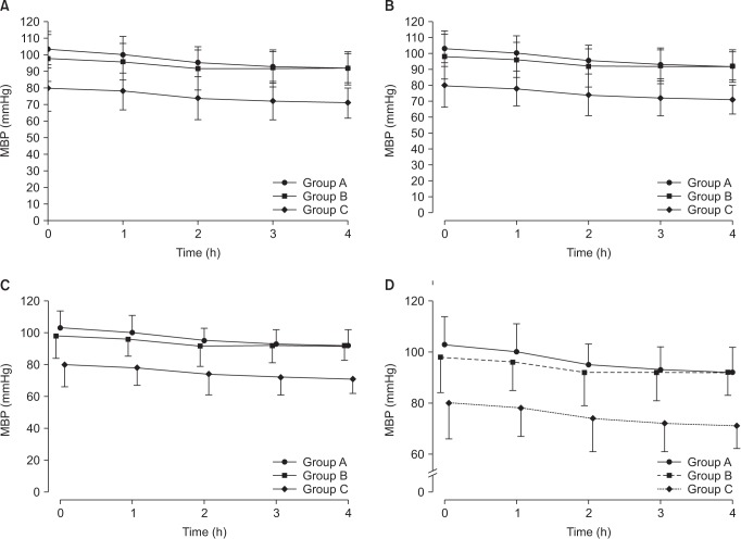
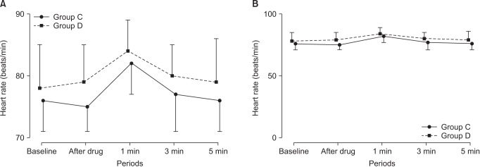
Data are usually collected in a raw format and thus the inherent information is difficult to understand. Therefore, raw data need to be summarized, processed, and analyzed. However, no matter how well manipulated, the information derived from the raw data should be presented in an effective format, otherwise, it would be a great loss for both authors and readers. In this article, the techniques of data and information presentation in textual, tabular, and graphical forms are introduced. Text is the principal method for explaining findings, outlining trends, and providing contextual information. A table is best suited for representing individual information and represents both quantitative and qualitative information. A graph is a very effective visual tool as it displays data at a glance, facilitates comparison, and can reveal trends and relationships within the data such as changes over time, frequency distribution, and correlation or relative share of a whole. Text, tables, and graphs for data and information presentation are very powerful communication tools. They can make an article easy to understand, attract and sustain the interest of readers, and efficiently present large amounts of complex information. Moreover, as journal editors and reviewers glance at these presentations before reading the whole article, their importance cannot be ignored.

Keywords: Data presentation; Data visualization; Graph; Statistics; Table.


Figures

Fig. 1
Fig. 1. Line graph with whiskers. Changes in systolic blood pressure (SBP) in the two groups. Group C: normal saline, Group D: dexmedetomidine. *P < 0.05 indicates a significant increase in each group, compared with the baseline values. P < 0.05 indicates a significant decrease noted in Group D, compared with the baseline values. P < 0.05 indicates a significant difference between the groups (Adapted from Korean J Anesthesiol 2017; 70: 39-45).
Fig. 2
Fig. 2. Scatter plot of GPQ scores and the other questionnaires. Score 1: sensitivity, 2: experience, 3: other. GPQ: Geop-Pain Questionnaire, PSQ: Pain Sensitivity Questionnaire, PASS: Pain Anxiety Symptoms Scale, PCS: Pain Catastrophizing Scale (Adapted from Korean J Anesthesiol 2016; 69: 492-505).
Fig. 3
Fig. 3. Multiple bar graph with whiskers. Pain scores in the recovery room. *P < 0.05 compared with the control group. The nefopam group showed significant lower visual analogue scale (VAS) score at 0, 5, 15, 30, 45 and 60 minutes on postanesthesia care unit compared with the control group (Adapted from Korean J Anesthesiol 2016; 69: 480-6. Fig. 2).
Fig. 4
Fig. 4. Stacked bar graph. Compressed volume of each component from the three operations. We checked the compressed volume of each component from the three operations; pelviscopy (with radical vaginal hysterectomy), laparoscopic anterior resection of the colon, and TKRA. TKRA: total knee replacement arthroplasty, RMW: regulated medical waste (Adapted from Korean J Anesthesiol 2017; 70: 100-4).
Fig. 5
Fig. 5. Pie chart. Total weight of each component from the three operations. RMW: regulated medical waste (Adapted from Korean J Anesthesiol 2017; 70: 100-4).
Fig. 6
Fig. 6. Box graph with whiskers. This graph is a standardized way of displaying the distribution of data based on the five-number summary; minimum, first quartile, median, third quartile, and maximum. The central rectangle represents from the first quartile to the third quartile (the interquartile range [IQR]). A segment inside the rectangle shows the median and “whiskers” above and below the box show the locations of the minimum and maximum.
Fig. 7
Fig. 7. Box graph with whiskers. Calculated volume of desflurane consumed during the observation period. The groups differed significantly. Data are expressed as median, minimum, first interquartile, third interquartile, and maximum values. *P < 0.05 (Adapted from Korean J Anesthesiol 2017; 70: 27-32).
Fig. 8
Fig. 8. Simple pie chart (A) versus 3D pie chart (B). In the 3D pie chart, slices at the rear of the chart appear smaller than those at the front because of the false perspective.
Fig. 9
Fig. 9. Clarification of a graph. Virtual data are presented as mean with standard deviations. (A) A graph with default settings. (B) The axes are separated from each other. The data at 0 are displayed clearly. (C) The points and whiskers are jittered to avoid overlapping. Although one side of the whiskers are removed, it is still easy to understand. However, this graph still has unnecessary blank space. (D) The lines are expressed in various ways. A break is put in the y-axis. MBP: mean blood pressure.
Fig. 10
Fig. 10. An example of misleading graphs. Both plots use the same data set. (A) The readers might be thinking that the heart rates at 1 min are higher than others. (B) The heart rates are very stable during the study. The readers should check the scale of the y-axis and baseline values when they look at the graphs.

Similar articles

Cited by

References

    1. Lee CW, Kim M. Effects of preanesthetic dexmedetomidine on hemodynamic responses to endotracheal intubation in elderly patients undergoing treatment for hypertension: a randomized, double-blinded trial. Korean J Anesthesiol. 2017;70:39–45. - PMC - PubMed
    1. Sohn HM, Ryu JH. Monitored anesthesia care in and outside the operating room. Korean J Anesthesiol. 2016;69:319–326. - PMC - PubMed
    1. Nahm FS. Nonparametric statistical tests for the continuous data: the basic concept and the practical use. Korean J Anesthesiol. 2016;69:8–14. - PMC - PubMed
    1. Kim TK. Understanding one-way ANOVA using conceptual figures. Korean J Anesthesiol. 2017;70:22–26. - PMC - PubMed
    1. Jung W, Hwang M, Won YJ, Lim BG, Kong MH, Lee IO. Comparison of clinical validation of acceleromyography and electromyography in children who were administered rocuronium during general anesthesia: a prospective double-blinded randomized study. Korean J Anesthesiol. 2016;69:21–26. - PMC - PubMed

LinkOut - more resources