. 2017 Jul 5;547(7661):61-67.
doi: 10.1038/nature23001.

Cell-cycle dynamics of chromosomal organization at single-cell resolution

Affiliations

Cell-cycle dynamics of chromosomal organization at single-cell resolution

Takashi Nagano et al. Nature. .

Abstract

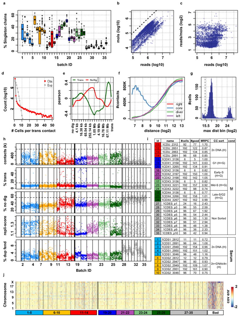
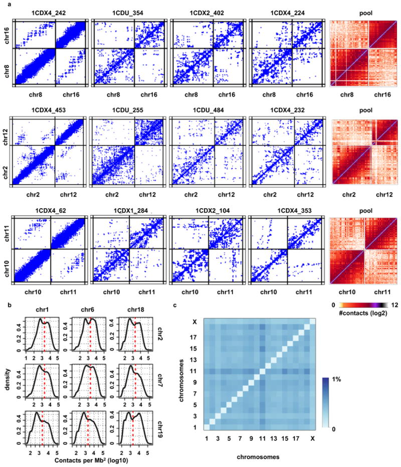
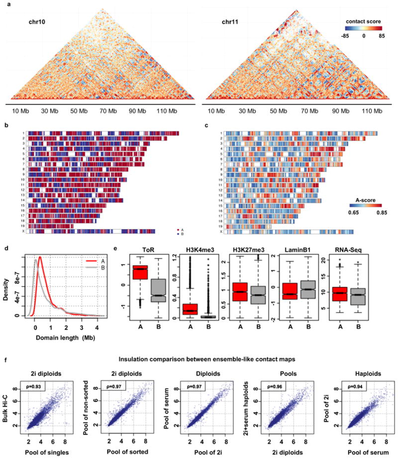
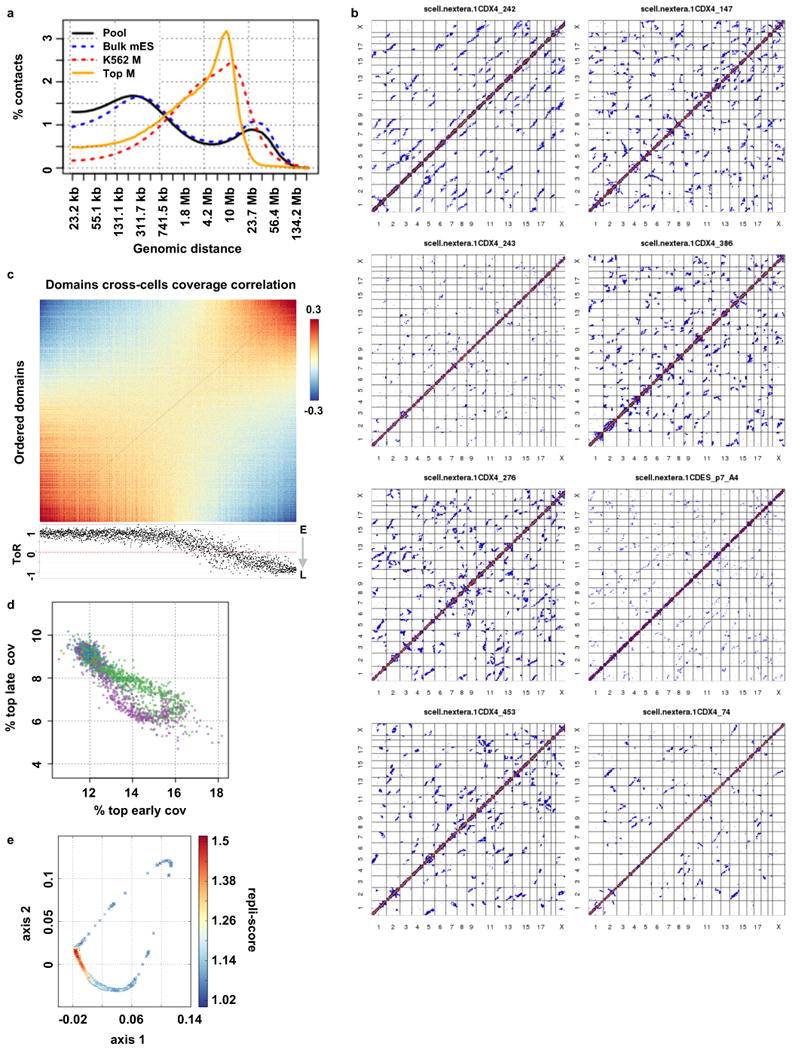
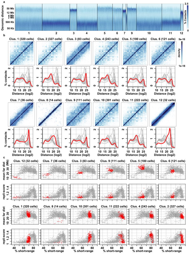
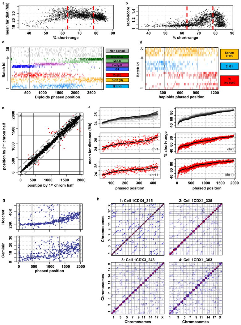
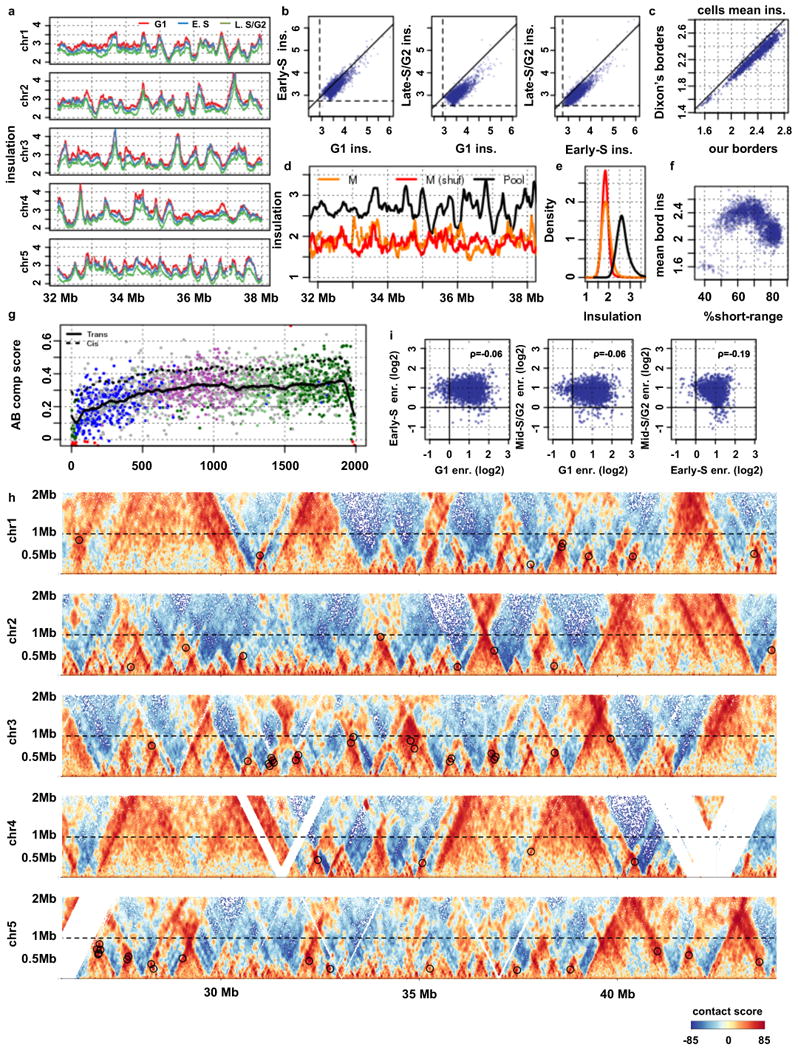
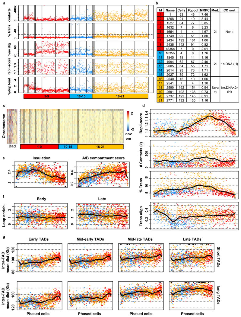
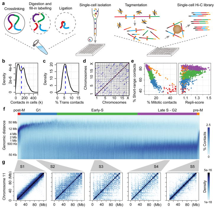
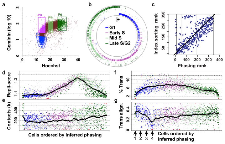
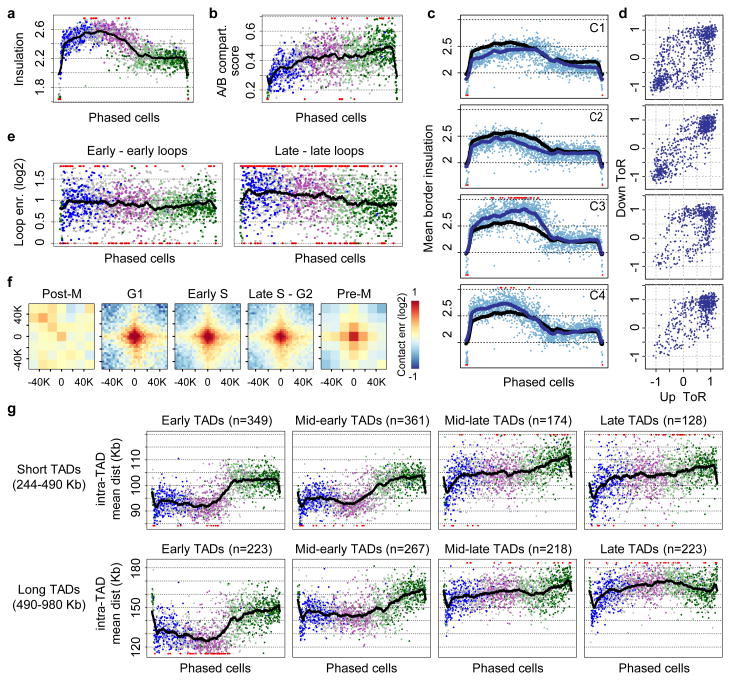
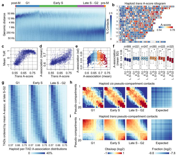
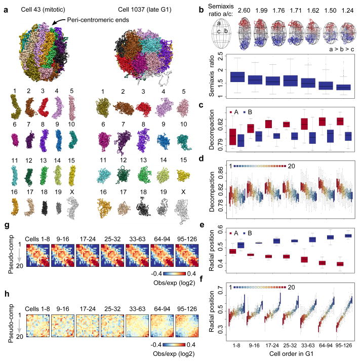
Chromosomes in proliferating metazoan cells undergo marked structural metamorphoses every cell cycle, alternating between highly condensed mitotic structures that facilitate chromosome segregation, and decondensed interphase structures that accommodate transcription, gene silencing and DNA replication. Here we use single-cell Hi-C (high-resolution chromosome conformation capture) analysis to study chromosome conformations in thousands of individual cells, and discover a continuum of cis-interaction profiles that finely position individual cells along the cell cycle. We show that chromosomal compartments, topological-associated domains (TADs), contact insulation and long-range loops, all defined by bulk Hi-C maps, are governed by distinct cell-cycle dynamics. In particular, DNA replication correlates with a build-up of compartments and a reduction in TAD insulation, while loops are generally stable from G1 to S and G2 phase. Whole-genome three-dimensional structural models reveal a radial architecture of chromosomal compartments with distinct epigenomic signatures. Our single-cell data therefore allow re-interpretation of chromosome conformation maps through the prism of the cell cycle.


Figures

Extended Data Fig. 1
Extended Data Fig. 1. Technical QCs
Panels in this figure show data for all the diploid cells analysed, as specified in panel i. a) Testing library saturation. Showing the fraction of segment chains supported by a single read in each batch, batch colours match their sorting criteria, see panel i for details. b) Number of unique molecules captured per cell against the number of sequenced reads. c) Number of reads per unique molecule against number of sequenced reads. d) Observed (red) and expected (by binomial reshuffling of the observed contacts) number of cells each trans contact appears in. e) Correlation of the fraction of trans contacts and close cis (< 1 kb, non-digested) with the fraction of contacts in different distance bins. f) Stratification of contacts by the orientation of contacting fragments against contact distance. g) Distribution of the logarithmic decay bin with the most contacts per cell, dashed line at 15.5 mark QC threshold below which cells are discarded. h) QC metrics of single cells coloured by FACS sorting criteria: “2n DNA” and “2n<DNA≤4n” by Hoechst staining (H), “G1”, “early-S”, “mid-S” and “late-S/G2” by Hoechst (H) and Geminin (G) staining. Vertical lines mark experimental batches. Shown from top to bottom: total number of contacts (coverage); fraction of inter-chromosomal contacts (%trans); fraction of very close (< 1 Kb) intra-chromosomal contacts (%no dig); early replicating coverage enrichment (repli-score); fraction of fragment ends (fends) covered more than once (%dup fend). Horizontal dashed lines mark thresholds used to filter good cells. i) Details on the experimental batches, showing the number of cells in each batch, number of cells passed QC, mean number of reads per cell (MRPC, in million reads), FACS sorting criteria (H = Hoechst, G = Geminin) and the medium used to grow the cells. Batches are colored by FACS sorting criteria. j) Coverage enrichment per cell (column) and chromosome (rows), where expected coverage is calculated from the frequency in the pooled cells and the total number of contacts in each cell. We discard cells that have any aberrantly covered chromosome (at least 2 fold enrichment or depletion, shown on the right “bad” panel). Left panel shows all cells ordered by batch ID, with lower panel colored by FACS sorting criteria (as in panels h-i).
Extended Data Fig. 2
Extended Data Fig. 2. Trans-chromosomal contacts
a) Examples of inter-chromosomal contact maps for several pairs of chromosomes. Showing contact maps of single cells (blue, each point is a contact) and the pooled contact map on the same chromosomes, using 500 Kb square bins. b) Distribution of the number of contacts between selected pairs of chromosomes. Showing the number of contacts per square Mb; red dashed line marks the cutoff for interacting chromosomes. c) Fraction of cells in which each pair of chromosomes was interacting (the pair of chromosomes had normalised interaction above the cutoff shown in panel b.
Extended Data Fig. 3
Extended Data Fig. 3. Pooled contact map and population data
a) Normalised chromosomal contact maps of the pooled diploid 2i single cells (showing chromosomes 10 and 11). b) A chromosome idiogram showing the division of domains to the A and B compartments by k-means clustering of domains trans-chromosomal contact profiles. c) A chromosome idiogram showing the inferred A-score of each domain. d) Comparing A and B domains by their lengths. e) Comparing A and B domains by their mean time of replication (ToR); percentage of H3K4me3 peaks; mean H3K27me3; mean LaminB1 values; mean RNA-Seq. f) Genome-wide comparison of insulation scores across reference bulk Hi-C dataset (from Olivares-Chauvet et al, 2016) and different pools of single cells. Insulation is calculated every 10 kb using a scale of 300 kb, pearson correlation is shown at the legend.
Extended Data Fig. 4
Extended Data Fig. 4. Mitotic cells and dynamics of coverage by replication time
a) Contact decay profile of our pool of diploid 2i singles (pool), a reference mouse ESC ensemble Hi-C dataset (Ens mES, from Olivares-Chauvet et al., 2016, supplementary reference 26), human K562 mitotic population Hi-C (K562 M, from Naumova et al, 2013, reference 11) and our pooled 8 most mitotic-like cells (top M). b) Genome-wide contact maps of 8 putative mitotic diploid cells (cells with the highest fraction of contacts at 2-12 Mb distances). c) Correlation matrix of domain coverage across cells. Ordered by the mean correlation to the top 50 earliest replicating domains minus the mean correlation with the latest 50 domains. Time of replication of each domain is shown at the bottom. d) Comparing the fraction of contacts associated with the latest- and earliest-replicating fends (ToR < -0.5 and ToR > 0.5, respectively). Cells are colored as in Fig. 1e. e) Projection of diploid 2i cells onto a two-dimensional plane using their contact decay profile (>1 kb) by a non-linear dimensionality reduction algorithm (see methods). Cells are colored by their repli-score, which was not used to position them on the plane.
Extended Data Fig. 5
Extended Data Fig. 5. Clustering cells by contact decay and phasing cells over the cell cycle
a) Chromosomal contact maps (chromosome 6) of pooled cells per cluster defined in Fig. 1f and the mean decay trend of each cluster (red) compared to the rest of clusters (grey). b) K-means (k = 12) clusters of single-cell contact decay profiles. c) Mean far contact distances and repli-score against the fraction of short-range contacts per clusters in panel a (red – cells in cluster, grey – all cells), ordering clusters by their mean %short-range.
Extended Data Fig. 6
Extended Data Fig. 6. Phasing cells over the cell cycle and quality controls
a) Mean contact distance among the far (4.5-225 Mb) range against the fraction of short-range (23 kb-2 Mb) contacts. Dashed red lines mark the cutoffs used to divide cells into the main 3 groups (G1, early-S, late-S/G2). b) Similar to panel a but showing repli-score against the fraction of short-range contacts. c) Batch of origin of each phased cell using all diploid 2i and serum cells, colored by the batch FACS sorting criteria (see Extended Data Fig. 1h for batch information) d) Similar to panel c but for haploid 2i and serum cells (see Extended Data Fig. 8b for batch information) e) Testing the stability of our phasing, we compare the positions of cells by phasing using only half the chromosomes (1st half: 2, 3, 5, 6, 9, 10, 12, 15, 17, 19, 2nd half: X, 1, 4, 7, 8, 11, 13, 14, 16, 18). Position of only 38 cells (< 2%) differ in more than 10% of the number of cells (outliers marked in red, 10% margin in dashed grey). Phasing groups marked in black lines. f) Chromosomal comparison of the contact decay metrics used to phase the cells in each group: mean far contact distance for the G1 cells (left) and %short-range for G1, S and G2 cells (right). Showing smoothed (n = 51) trends per chromosome on top, chromosomes colored by length (light grey – chromosome 19, black – chromosome 1). Data for specific chromosomes: chromosome 1 (middle) and chromosome 11 (bottom) as red dots. g) Hoechst and Geminin FACS indices of cells in batches for cells in batches 27-35 against the cells inferred phasing position. h) Genome-wide contact maps of representative cells along the inferred G1 phase, their position marked at the bottom of Fig 2g.
Extended Data Fig. 7
Extended Data Fig. 7. Insulation of sub-groups and loops
a) Insulation profiles of the main three phased groups (G1, early-S, late-S/G2) over 6 Mb regions in chromosomes 1-5. b) Comparing border insulation of phased groups. Dashed blue lines show the mean insulation value per group. c) Showing mean insulation per cell on mouse ESC TAD borders taken from Dixon et al. 2013 (reference 5; using the center point of borders smaller than 80 kb) compared to the mean cell insulation over our inferred borders. d) Insulation profile over a 6 Mb region in chromosome 1 (same as panel a), showing insulation of pooled cells (black), pooled mitotic cells (orange) and a shuffled pool of mitotic cells (red). e) Genome-wide distribution of insulation values for pooled-, pooled-mitotic- and shuffled-pooled-mitotic cells, same colours as in panel c. f) Mean border insulation per cell against the fraction of short-range (< 2 Mb) contacts. g) A/B compartment score on trans-chromosomal contacts, single-cell mean values in dots coloured by FACS sorting, mean trend (black) and mean trend of cis-chromosomal A/B compartment in dashed black (same trend as in Fig. 3b). h) Normalized contact maps of the regions in panel a, circling the loops detected in distances 200 kb to 1 Mb (marked in dashed black line) i) Comparing loop foci enrichment calculated per phased group, showing the Pearson correlation in the legend.
Extended Data Fig. 8
Extended Data Fig. 8. Haploid cells technical QCs
a) QC metrics of single cells colored by FACS sorting criteria: G1 (H) and G1/S (H) by Hoechst staining (see color legend at bottom). Vertical lines mark experimental batches. Shown from top to bottom: total number of contacts (coverage); fraction of inter-chromosomal contacts (%trans); fraction of very close (< 1 kb) intra-chromosomal contacts (%no dig); early replicating coverage enrichment (repli-score); fraction of fragment ends (fends) covered more than once (%dup fend). Horizontal dashed lines mark thresholds used to filter good cells. b) Details on the experimental batches, showing the number of cells in each batch, the number of cells that passed QC, mean number of reads per cell (MRPC, in million reads), FACS sorting criteria (H = Hoechst,) and the medium used to grow the cells. c) Coverage enrichment per cell (column) and chromosome (rows), with expected coverage calculated from the pooled cells. We discard cells that have any aberrantly covered chromosome (at least 2 fold enrichment or depletion, shown on the left “bad” panel). The right panel shows all cells. d) Similar to Fig. 2d-g but produced from the haploid cells, outliers coloured in black. e) Similar to Fig. 3a-b but produced from the haploid cells, outliers coloured in black. f) Similar to Fig. 3e but produced from the haploid cells. g) Similar to Fig. 3g but produced from the haploid cells, outliers coloured in black.
Extended Data Fig. 9
Extended Data Fig. 9. Haploid cells clustering, diploid cells pseudo-compartment analysis
a) Comparing trans A-score of a reference bulk Hi-C dataset (from Olivares-Chauvet et al., 2016) and different pools of single cells, using the set of domains inferred from the pool of diploid 2i cells (A domains in red and B in black). Showing on top of each panel the correlation of the domains’ A-score in each dataset. b) Per-domain distributions of A-association score across haploid cells in each of the three main cell cycle inferred phases (from left to right: G1, early S, late S to G2). Domains were clustered (k-means, k = 20) by their distribution in all groups. Interand intra- cluster ordering by mean A-association score at late-S/G2. c) Similar to Fig. 4g but for diploid 2i cells. d) Contingency table of haploid and diploid inferred pseudo-compartments, considering all overlapping intervals between the haploid and diploid sets of domains. e) Long-range (> 2 Mb) cis-chromosomal contact enrichments between TAD groups according to pseudo-compartments for haploid (top) and 2i diploid (bottom) cells. Showing the expected contact frequency by contacts in the shuffled pooled contact maps on the right. f) Long-range (> 2 Mb) cis-chromosomal (top) and trans-chromosomal (bottom) 2i diploid contact enrichments between TAD groups according to pseudo-compartments. Showing the expected contact frequency by the marginal pseudo-compartments coverage on the right. g) TADs are sorted by their mean A-association in late S – G2 (x-axis, left – strongly B, right – strongly A), and their mean RNA, H3K4me1, Lamin-B1 and H3K4me3 levels are shown (y-axis).
Extended Data Fig. 10
Extended Data Fig. 10. Whole genome structure modelling - quality control and clustering of peri-centromeric regions
a) The distribution of the fraction of unsupported contacts in the pre-filtered contact set in all 190 haploid cells in 2i inferred as being in G1. b) The distribution of the fraction of violated constraints in the 190 haploid G1 cells. c) The fraction of violated constraints in the 3D models of 190 haploid G1 cells at 500 kb versus 100 kb resolutions (Pearson R = 0.96). Black dots represent cells that have at least 10,000 contacts and no more than 0 violations at 1 Mb, 0.5% violations at 500 kb and 0.1% violations at 100 kb. Cells with no violations at either 500 kb or 100 kb resolution are not shown. d) Mean RMSD between all models of the same cell with at least 10,000 (black) and fewer than 10,000 (red) filtered contacts, for cells at 1 Mb (dots), 500 kb (open diamonds) and 100 kb (triangles) resolutions. e) Model reproducibility across cells. The RMSD distribution between all models for the same cell (red) compared to the RMSD distribution between models for different cells for the 126 cells with the highest quality models. The images show aligned structures of 106 × 1 Mb models (top), 80 × 500 kb models (centre) and 5 × 100 kb models (bottom) for NXT-1091 (38th of 126 ordered G1 cells) with a mean RMSD at the peak of the red curves. f) Cross-validation test. Average trans-chromosomal distance distributions, computed using a set of 200 random trans-contacts between any two chromosomes, with the contact points distributed uniformly on the two chromosomes. Red curve: trans-distances between the 5 most strongly contacting chromosome pairs in models using all supported contacts. Blue curve: same as red curve, but using the models computed with the contacts between that chromosome pair removed. Cyan curve: trans-distances of unsupported contacts in the models computed with all supported contacts present. Green curve: trans-distances of chromosome pairs in models of all cells using all supported contacts. g) Nucleus and chromosome shape properties in the 126 cells with high-quality models: the nuclear radius (in arbitrary units), the longest-to-shortest (a/c) semiaxis ratio of the ellipsoid fitted to the whole nucleus model, and the longest-to-shortest (a/c) and middle-to-shortest (b/c) semiaxis ratios of the ellipsoids fitted to each chromosome of the 3D models. For the nucleus size and a/c ratio, values in each model are shown, for the chromosome fitted ellipsoid semiaxis ratios the model-averaged value is shown for each cell. h) The 7 cell groups in the inferred G1 time order for the 126 cells with the highest-quality models. i) Distances of the top third shortest distances between NOR chromosomes or non-NOR chromosomes in 7 cell groups along the inferred G1 time order. Distances are normalised by the nucleus diameter.
Figure 1
Figure 1. Multiplexed single-cell Hi-C reveals heterogeneous, cell-cycle dependent chromosomal architectures
a) Single-cell Hi-C schematic. b) Number of informative contacts retrieved per QC passed cell. Median 127,233 (dashed line). c) Fraction trans-chromosomal contacts per QC passed cell. Median 5.87% (dashed line). d) Genome-wide contact map of a representative mitotic cell (1CDX4_242). e) Percentage cells with short-range contacts (< 2 Mb) versus contacts at the mitotic band (2-12 Mb, left), and repli-score (right). Cells are grouped by % short-range and % mitotic contacts and coloured by group. f) Single-cell contact decay profiles ordered by in-silico inferred cell-cycle phasing, with approximate cell-cycle phases shown on top. Each column represents a single cell. g) Selected phased and pooled contact maps.
Figure 2
Figure 2. Validation of inferred cell-cycle phasing
a) FACS sorting scheme b) Positions of FACS sorted cells along a circular layout of their in-silico phasing (clockwise, M is on top). c) Comparing in-silico phasing rank to combined Hoechst and Geminin FACS indices for 324 indexed-sorting cells. Black lines demarcate approximate cell-cycle phases. d) Repli-score per cell ordered by cell-cycle phasing (left to right). FACS-sorted cells coloured as in a and b, and remaining cells are grey. Outliers (0.5%) are red. Cyclic average window (n = 100) trend shown in black. e-g) Similar to d, showing additional single cell statistics.
Figure 3
Figure 3. Distinct and context specific cell-cycle dynamics of insulation, compartmentalisation, loops, and domain condensation
a) Mean contact insulation at TAD borders, phased cells coloured as in Fig. 2. b) A/B compartmentalisation score c) Clustering borders (k-means, k = 4) according to insulation profile over inferred phasing. Mean insulation of the borders in a cluster (blue dots), mean cluster insulation trend (blue line) and global trend (black line). d) Mean time of replication +/-200 kb of the Fig. 3b clustered borders. Early-replicating positive, late-replicating negative. e) Convergent CTCF loops contact enrichment. Showing data for 762 early-early loops and 456 late-late loops. f) Aggregated contacts around convergent CTCF loops distanced 0.2-1 Mb from each other, pooling cells by their in-silico phasing group and normalising by the expected profile using the shuffled pooled contact map. g) Mean intra-TAD contact distance stratifying domains by length, and mean time of replication.
Figure 4
Figure 4. Haploid single-cell Hi-C reveals a spectrum of TAD pseudocompartments
a) Similar to 1g, but analysing haploid cells. b) Chromosome idiogram depicting inferred A compartment score of each TAD. c) TADs’ mean time of replication versus A-score. d) TADs’ mean cis A-association score versus trans A-score. e) Standard deviation versus mean A-association scores per TAD across cells. Colours mark groups of TADs stratified by mean A-association. f) Standard deviation of A-association score across TADs stratified as in e and averaged separately over cells in each of the three main inferred cell-cycle phases: G1, early S and late S-G2. (* = < 0.05, ** = < 0.01, *** = < 0.001, single side MW-test). g) Per-TAD distributions of A-association scores in the three phased cell-cycle populations. h) Long-range (> 2 Mb) cis-chromosomal and i) trans-chromosomal contact frequency between TAD groups according to pseudo-compartments..
Figure 5
Figure 5. Whole genome structure modelling
a) Whole genome conformations, and separated individual chromosomes. Models computed at 100 kb resolution. b) Top: Chromosome 1 examples along inferred G1 phase with fitted ellipsoid of inertia. Chromosomes coloured by genomic position pericentromeric (red), telomeric (blue). Bottom: Chromosome de-condensation illustrated by distribution of a/c semiaxis ratios of all chromosomes. c) Decompaction of chromatin in A and B compartments, defined as average distance between neighbouring 500 kb segments of same compartment. d) Same as c for the 20 pseudocompartments. e) Average radial position of A and B compartments within the nucleus, defined as the volume fraction enclosed by a sphere of that radius. Zero = nuclear centre, 1 = periphery. f) Same as e for the 20 pseudo-compartments. g) Long-range (> 2 Mb) cis-contact enrichment between 20 pseudo-compartments. h) Trans-contact enrichment between the 20 pseudo-compartments.

Comment in

References

    1. Paweletz N. Walther Flemming: pioneer of mitosis research. Nat Rev Mol Cell Biol. 2001;2:72–75. - PubMed
    1. Lieberman-Aiden E, et al. Comprehensive mapping of long-range interactions reveals folding principles of the human genome. Science. 2009;326:289–93. - PMC - PubMed
    1. Sexton T, et al. Three-dimensional folding and functional organization principles of the Drosophila genome. Cell. 2012;148:458–72. - PubMed
    1. Nora EP, et al. Spatial partitioning of the regulatory landscape of the Xinactivation centre. Nature. 2012;485:381–5. - PMC - PubMed
    1. Dixon JR, et al. Topological domains in mammalian genomes identified by analysis of chromatin interactions. Nature. 2012;485:376–80. - PMC - PubMed

Publication types

LinkOut - more resources