. 2018 May 1;25(5):538-547.
doi: 10.1093/jamia/ocx159.

A dashboard-based system for supporting diabetes care

Affiliations

A dashboard-based system for supporting diabetes care

Arianna Dagliati et al. J Am Med Inform Assoc. .

Abstract

Objective: To describe the development, as part of the European Union MOSAIC (Models and Simulation Techniques for Discovering Diabetes Influence Factors) project, of a dashboard-based system for the management of type 2 diabetes and assess its impact on clinical practice.

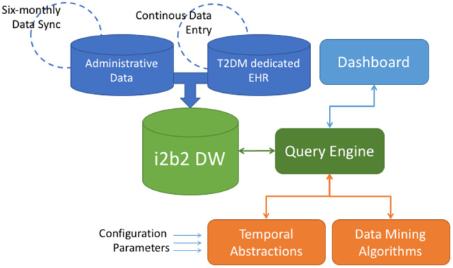
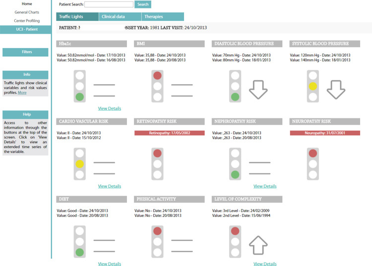
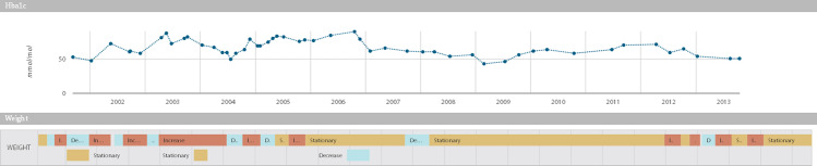
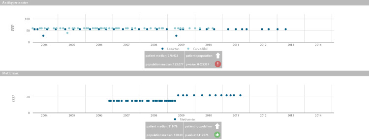
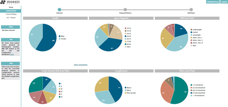
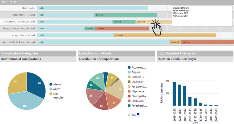
Methods: The MOSAIC dashboard system is based on predictive modeling, longitudinal data analytics, and the reuse and integration of data from hospitals and public health repositories. Data are merged into an i2b2 data warehouse, which feeds a set of advanced temporal analytic models, including temporal abstractions, care-flow mining, drug exposure pattern detection, and risk-prediction models for type 2 diabetes complications. The dashboard has 2 components, designed for (1) clinical decision support during follow-up consultations and (2) outcome assessment on populations of interest. To assess the impact of the clinical decision support component, a pre-post study was conducted considering visit duration, number of screening examinations, and lifestyle interventions. A pilot sample of 700 Italian patients was investigated. Judgments on the outcome assessment component were obtained via focus groups with clinicians and health care managers.

Results: The use of the decision support component in clinical activities produced a reduction in visit duration (P ≪ .01) and an increase in the number of screening exams for complications (P < .01). We also observed a relevant, although nonstatistically significant, increase in the proportion of patients receiving lifestyle interventions (from 69% to 77%). Regarding the outcome assessment component, focus groups highlighted the system's capability of identifying and understanding the characteristics of patient subgroups treated at the center.

Conclusion: Our study demonstrates that decision support tools based on the integration of multiple-source data and visual and predictive analytics do improve the management of a chronic disease such as type 2 diabetes by enacting a successful implementation of the learning health care system cycle.


Figures

Figure 1.
Figure 1.
The Dashboard Service Oriented Architecture. The architecture components include: a) a data module, composed of the i2b2 DW, which collects data from Administrative Data stream (updated every six-months) and clinical data from the T2DM dedicated EHR (continuously updated during follow-ups); b) a logical module, which implements the analytics algorithms and models upon the gathered data. The Query Engine is the central service between users of the Dashboard and data stored in the i2b2 DW. The Temporal Abstraction and Data mining Algorithms modules, once tuned with appropriate configuration parameters, extract meaningful patterns from the data selected through the query engine; c) a graphical module, composed by all the visualization instruments that allow user interactions: data selection (from the i2b2 DW), information retrieval (from the logical module) and graphical presentation of results (in the Dashboard).
Figure 2.
Figure 2.
The traffic lights section of the CDSS dashboard. HbA1c, blood pressure, self-reported diet, BMI, and the results of risk calculators are shown. Traffic light highlight the situation of each metabolic control variable at the last follow-up. Thresholds are variable-specific and are defined based on clinical knowledge. Arrows and equal symbols next to the traffic lights indicate trends (increasing, decreasing, or stable) between the last 2 visits. If a complication has already been diagnosed for the patient, the onset date is displayed. Clicking on the “View Details” hyperlink enables visualization of the complete time series of the variables.
Figure 3.
Figure 3.
Hba1c time series and weight TAs, as calculated by the JTSA module. The scatter plot shows the Hb1Ac measures during follow-ups. The timeline plot shows weight temporal abstractions. The upper time line indicates basic TA, which reports the intervals where measures increase, decrease, or stay steady. The bottom one indicates the time-to-target TAs, which report whether the patient’s weight has decreased by 10% in 6 months.
Figure 4.
Figure 4.
Drug purchase graphs. The graphs show drug purchases during the disease evolution, quantified with the DDD associated with each active principle. Gray boxes indicate whether the patient purchased larger or smaller quantities of the drug (with the arrow pointing up or down) compared to other patients who are treated with the same drug, and whether this difference is significant.
Figure 5.
Figure 5.
Summary charts of the ORSS dashboard. Charts show patient counts grouped by demographic variables, BMI, risk indexes, and HbA1c at the last visit, and complications distribution. The user starts from this view to run the CFM algorithm. By clicking on a chart section, the CFM mining algorithm extracts the care flows associated with the selected population, and in the following step it is possible to select and extract patients with similar temporal clinical patterns.
Figure 6.
Figure 6.
CFM and drill-down results. Timeline graphs show the most frequent temporal patterns of the population selected in the previous step. In this figure, the patients are clustered on the basis of their level of complexity, which illustrates sequence and duration of stay in the different levels of disease evolution, as defined by the MOSAIC project. Clicking on each bar, the subcohort following the selected path is chosen. The drill-down results show the complication distributions of the patients belonging to the subcohort and the distributions of the times of stay in the complexity level.

References

    1. Wagholikar KB, Mandel JC, Klann JG et al. , SMART-on-FHIR implemented over i2b2. J Am Med Inform Assoc. 2017;242:398–402. - PMC - PubMed
    1. Sim I, Gorman P, Greenes RA et al. , Clinical decision support systems for the practice of evidence-based medicine. J Am Med Inform Assoc. 2001;86:527–34. - PMC - PubMed
    1. Palmer AJ, Roze S, Valentine WJ et al. , The CORE Diabetes Model: Projecting long-term clinical outcomes, costs and cost-effectiveness of interventions in diabetes mellitus (types 1 and 2) to support clinical and reimbursement decision-making. Curr Med Res Opin. 2004;20(Suppl 1):S5–26. - PubMed
    1. O’Connor PJ, Bodkin NL, Fradkin J et al. , Diabetes performance measures: current status and future directions. Diabetes Care. 2011;347:1651–59. - PMC - PubMed
    1. Donsa K, Beck P, Höll B et al. , Impact of errors in paper-based and computerized diabetes management with decision support for hospitalized patients with type 2 diabetes. A post-hoc analysis of a before and after study. Int J Med Inform. 2016;90:58–67. - PubMed

Publication types