Review
. 2018 May;19(5):668-685.
doi: 10.1111/obr.12667. Epub 2018 Feb 9.

A review of machine learning in obesity

Affiliations
Review

A review of machine learning in obesity

K W DeGregory et al. Obes Rev. 2018 May.

Abstract

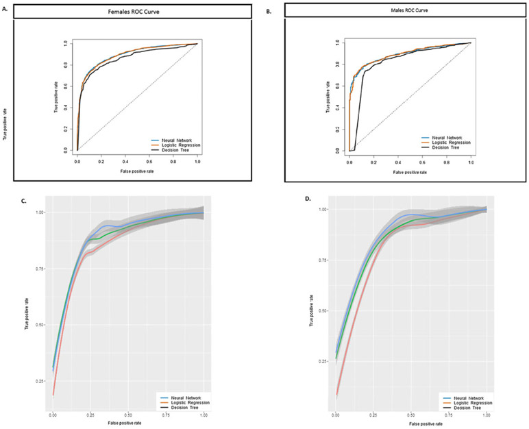
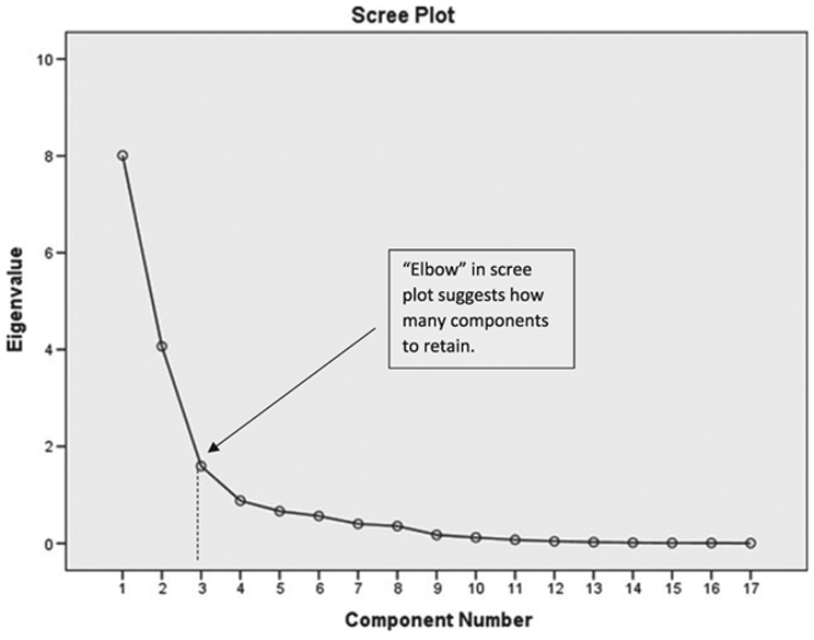
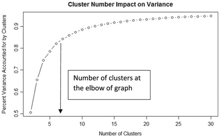
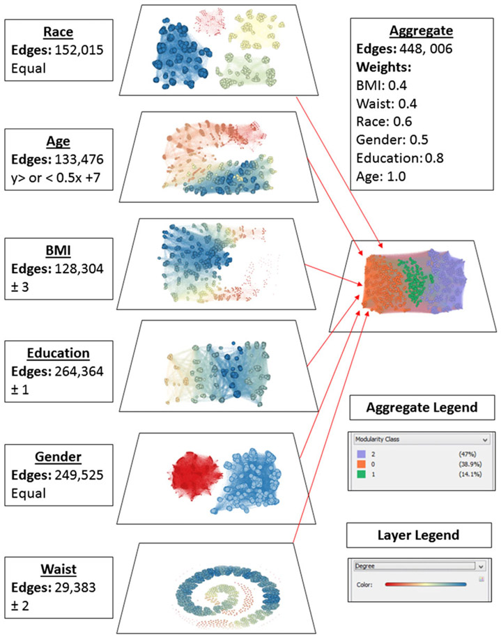
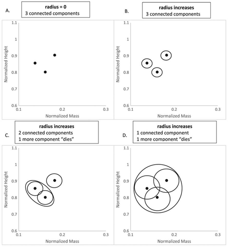
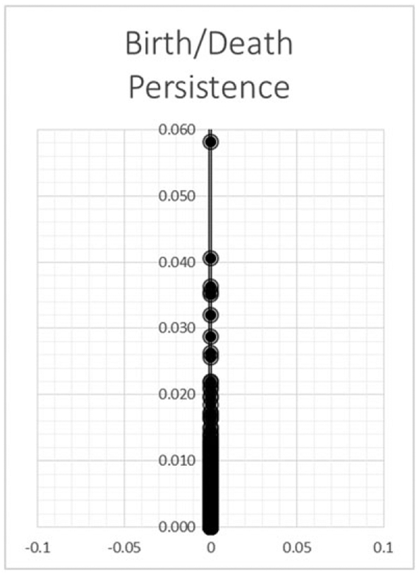
Rich sources of obesity-related data arising from sensors, smartphone apps, electronic medical health records and insurance data can bring new insights for understanding, preventing and treating obesity. For such large datasets, machine learning provides sophisticated and elegant tools to describe, classify and predict obesity-related risks and outcomes. Here, we review machine learning methods that predict and/or classify such as linear and logistic regression, artificial neural networks, deep learning and decision tree analysis. We also review methods that describe and characterize data such as cluster analysis, principal component analysis, network science and topological data analysis. We introduce each method with a high-level overview followed by examples of successful applications. The algorithms were then applied to National Health and Nutrition Examination Survey to demonstrate methodology, utility and outcomes. The strengths and limitations of each method were also evaluated. This summary of machine learning algorithms provides a unique overview of the state of data analysis applied specifically to obesity.

Keywords: Deep learning; National Health and Nutrition Examination Survey; machine learning; topological data analysis.


Conflict of interest statement

Conflict of interest statement

There are no conflicts of interest to report.

Figures

Figure 1
Figure 1
ROC curves displayed for three predictive machine learning algorithms: logistic regression, neural networks and decision tree analysis. Each algorithm used NHANES anthropometric input data to diagnose whether NHANES individuals are classified with high blood pressure or high levels of percent body fat. ROC curve for (A) women and (B) men. While the curves are very close, neural networks perform slightly better than did decision trees and logistic regression. This is observed in the 95% confidence intervals that overlap in the cross-validations for (C) women and (D) men. NHANES, National Health and Nutrition Examination Survey; ROC, receiver operating characteristic.
Figure 2
Figure 2
The scree plot relates each eigenvalue in order of magnitude to its component number. The figure is used to determine how many components to retain. Typically, this is right at the ‘elbow’ indicated by the dashed line.
Figure 3
Figure 3
Total percent variance in the dataset plotted on the y-axis versus the number of clusters. As the number of clusters increases, the percent variance increases and plateaus to total variance explained. An optimal number of clusters to consider is where the rate of change of the graph begins to dwindle, implying less return for additional clusters considered.
Figure 4
Figure 4
NHANES 1000 node sample network and community structure. Each layer depicts the connections of nodes that share attributes, which is described next to the layer. These are then combined to form the aggregate layer, which revealed three communities. BMI, body mass index; NHANES, National Health and Nutrition Examination Survey.
Figure 5
Figure 5
(A–C) TDA ‘death’ process of components as the radius of the circles that cover data points increases. (A) consists of three data points, which by themselves represent three connected components. As the radius increases, they remain as three components (B), until eventually two circles overlap each other (C). The overlapping circles are combined as one, and therefore, one component that used to be alive now dies. (D) The radius has increased sufficiently to cover all three data points so that only one component remains. TDA, topological data analysis.
Figure 6
Figure 6
The graph demonstrates the persistence of a connected component. The y-axis represents the radius at which a connected component merges with another (death). As the radius increases, more components merge until all components become one.

References

    1. Abdel-Aal RE, Mangoud AM. Modeling obesity using abductive networks. Comput Biomed Res 1997; 30(6): 451–471. - PubMed
    1. Acharjee A et al. Integration of metabolomics, lipidomics and clinical data using a machine learning method. BMC Bioinformatics 2016; 17(Suppl 15): 440. - PMC - PubMed
    1. Dugan TM et al. Machine learning techniques for prediction of early childhood obesity. Appl Clin Inform 2015; 6(3): 506–520. - PMC - PubMed
    1. Ellis K et al. Hip and wrist accelerometer algorithms for free-living behavior classification. Med Sci Sports Exerc 2016; 48(5): 933–940. - PMC - PubMed
    1. Hamad R et al. Large-scale automated analysis of news media: a novel computational method for obesity policy research. Obesity (Silver Spring) 2015; 23(2): 296–300. - PMC - PubMed

Publication types

LinkOut - more resources