An Online Risk Index for the Cross-Sectional Prediction of New HIV Chlamydia, and Gonorrhea Diagnoses Across U.S. Counties and Across Years
- PMID: 29427233
- PMCID: PMC7069599
- DOI: 10.1007/s10461-018-2046-0
An Online Risk Index for the Cross-Sectional Prediction of New HIV Chlamydia, and Gonorrhea Diagnoses Across U.S. Counties and Across Years
Abstract
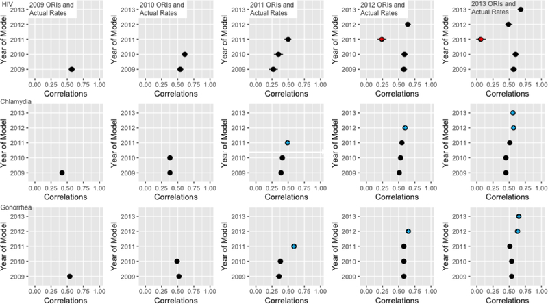
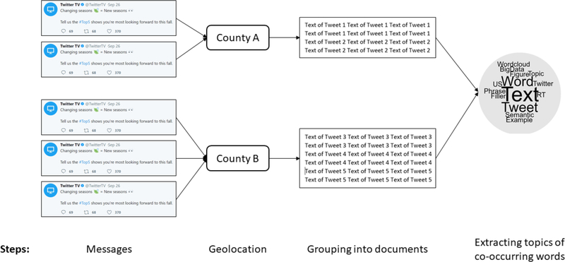
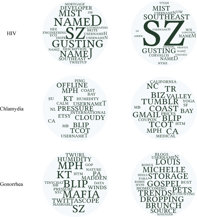
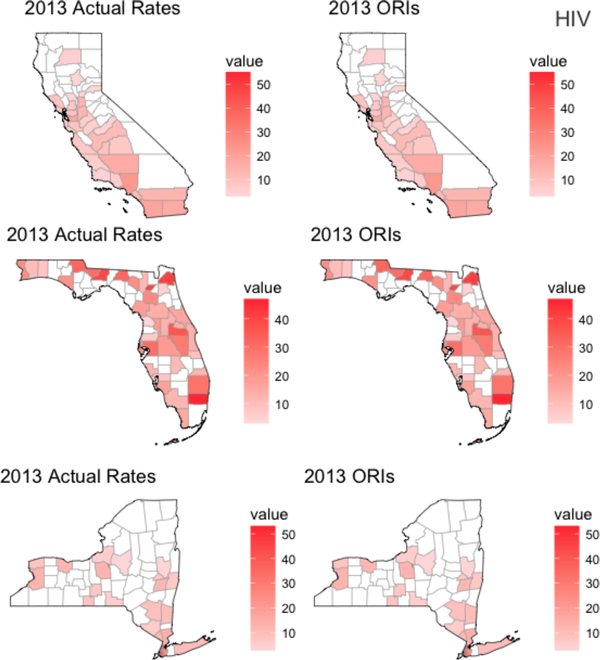
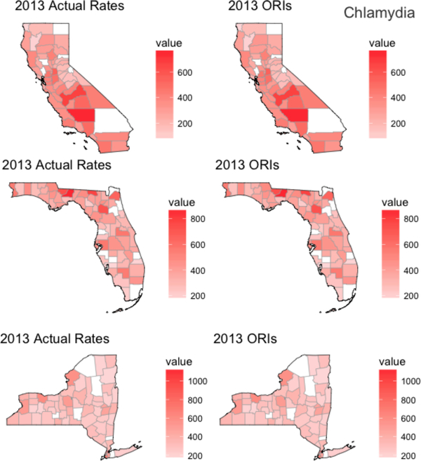
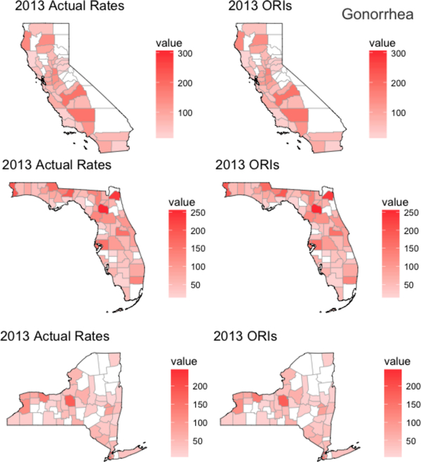
The present study evaluated the potential use of Twitter data for providing risk indices of STIs. We developed online risk indices (ORIs) based on tweets to predict new HIV, gonorrhea, and chlamydia diagnoses, across U.S. counties and across 5 years. We analyzed over one hundred million tweets from 2009 to 2013 using open-vocabulary techniques and estimated the ORIs for a particular year by entering tweets from the same year into multiple semantic models (one for each year). The ORIs were moderately to strongly associated with the actual rates (.35 < rs < .68 for 93% of models), both nationwide and when applied to single states (California, Florida, and New York). Later models were slightly better than older ones at predicting gonorrhea and chlamydia, but not at predicting HIV. The proposed technique using free social media data provides signals of community health at a high temporal and spatial resolution.
Keywords: Big data; Chlamydia; Gonorrhea; HIV; Social media.
Conflict of interest statement
Figures
Similar articles
-
Predicting the impact of sexual behavior change on adolescent STI in the US and New York State: a case study of the teen-SPARC tool.Ann Epidemiol. 2020 Jul;47:13-18. doi: 10.1016/j.annepidem.2020.05.009. Epub 2020 May 27. Ann Epidemiol. 2020. PMID: 32713502 Free PMC article.
-
[Trends in sexually transmitted diseases. Chlamydia and gonococci are often searched for in the wrong place].MMW Fortschr Med. 2011 May 19;153(20):18. doi: 10.1007/BF03368369. MMW Fortschr Med. 2011. PMID: 21644287 German. No abstract available.
-
Gonorrhea and chlamydia prevalence in different anatomical sites among men who have sex with men: a cross-sectional study in Guangzhou, China.BMC Infect Dis. 2018 Dec 18;18(1):675. doi: 10.1186/s12879-018-3579-6. BMC Infect Dis. 2018. PMID: 30563478 Free PMC article.
-
Screening Recommendations for Chlamydia and Gonorrhea.JAMA Dermatol. 2015 Sep;151(9):1014-6. doi: 10.1001/jamadermatol.2015.1987. JAMA Dermatol. 2015. PMID: 26177006 Review.
-
Sexual Assault and Sexually Transmitted Infections in Adults, Adolescents, and Children.Clin Infect Dis. 2015 Dec 15;61 Suppl 8:S856-64. doi: 10.1093/cid/civ786. Clin Infect Dis. 2015. PMID: 26602623 Review.
Cited by
-
Using geospatial social media data for infectious disease studies: a systematic review.Int J Digit Earth. 2023;16(1):130-157. doi: 10.1080/17538947.2022.2161652. Epub 2023 Jan 3. Int J Digit Earth. 2023. PMID: 37997607 Free PMC article.
-
Are spatial models advantageous for predicting county-level HIV epidemiology across the United States?Spat Spatiotemporal Epidemiol. 2021 Aug;38:100436. doi: 10.1016/j.sste.2021.100436. Epub 2021 Jun 16. Spat Spatiotemporal Epidemiol. 2021. PMID: 34353528 Free PMC article.
-
Prospective associations of regional social media messages with attitudes and actual vaccination: A big data and survey study of the influenza vaccine in the United States.Vaccine. 2020 Sep 11;38(40):6236-6247. doi: 10.1016/j.vaccine.2020.07.054. Epub 2020 Aug 10. Vaccine. 2020. PMID: 32792251 Free PMC article.
References
-
- Centers for Disease Control and Prevention. Sexually Transmitted Disease Surveillance 2016. Atlanta, GA; 2017.
-
- Centers for Disease Control and Prevention. NCHHSTP AtlasPlus. https://www.cdc.gov/nchhstp/atlas/. Published 2017 Accessed May 25, 2017.
-
- Centers for Disease Control and Prevention. Overview of the CDC FY 2018 Budget Request; 2017. https://www.cdc.gov/budget/documents/fy2018/fy-2018-cdc-budgetoverview.pdf.
MeSH terms
Grants and funding
LinkOut - more resources
Full Text Sources
Other Literature Sources
Medical