Comparative Study
. 2018 May 1:140-141:74-84.
doi: 10.1016/j.ymeth.2018.01.010. Epub 2018 Mar 1.

Comparison between iMSD and 2D-pCF analysis for molecular motion studies on in vivo cells: The case of the epidermal growth factor receptor

Affiliations
Comparative Study

Comparison between iMSD and 2D-pCF analysis for molecular motion studies on in vivo cells: The case of the epidermal growth factor receptor

Leonel Malacrida et al. Methods. .

Abstract

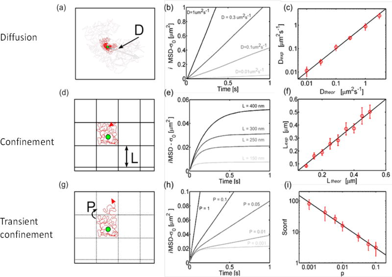
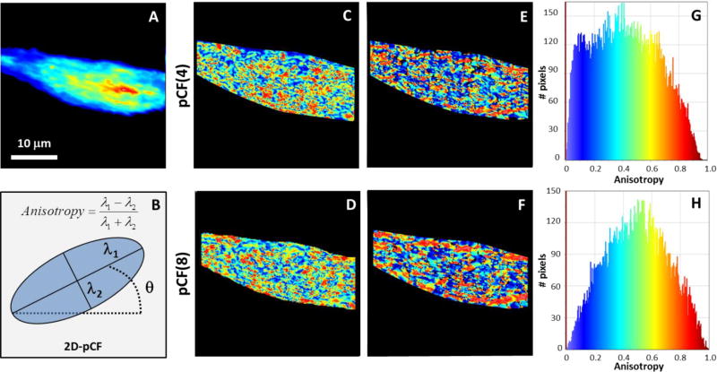
Image correlation analysis has evolved to become a valuable method of analysis of the diffusional motion of molecules in every points of a live cell. Here we compare the iMSD and the 2D-pCF approaches that provide complementary information. The iMSD method provides the law of diffusion and it requires spatial averaging over a small region of the cell. The 2D-pCF does not require spatial averaging and it gives information about obstacles for diffusion at pixel resolution. We show the analysis of the same set of data by the two methods to emphasize that both methods could be needed to have a comprehensive understanding of the molecular diffusional flow in a live cell.

Keywords: Barrier to diffusion; Connectivity maps; Diffusion anisotropy; Fluorescence fluctuation spectroscopy.


Figures

Figure 1
Figure 1
A) Simulation of a Gaussian distribution for with a width of 3 pixels (black curve). The blue curve represents the spreading as a function of time of the original Gaussian function (black curve) by diffusion of a molecule with large diffusion coefficient. The dotted double arrow line represents FWHM for a fast diffusion (16 pixels wide). The red curve represents the spreading of the original Gaussian function (black curve) by diffusion of a molecule with slow diffusion coefficient. The spreading for the slow diffusion is almost unperceivable but the amplitude significantly decreases in the case of slow diffusion. B) Plot for the ROI (in pixels) in a camera-based image (pixel size 100 nm) needed to observe a change of a factor of 2 in the FWHM as a function of diffusion coefficient. From top to bottom the dashed/dotted lines indicate the measurable range in the diffusion coefficient (from 400 µm2/s to 3×10⁻⁴ µm2/s) for a ROI (from 64 to 8 pixels) used in the iMSD analysis. From right to left (black to purple curves) the delay is increasing from 0.01 s black single frame, 0.1s red, 1s green 10s blue, 100s purple (delay after 10,000 frames).
Figure 2
Figure 2
iMSD analysis on simulated 2D diffusion. (a) Simulated condition: 2D isotropic diffusion, with diffusivity D. (b) iMSD is linear, with a higher slope for increasing D values. (c) Accordance between the theoretical D value and that recovered from the analysis. (d) Simulated condition: 2D isotropic diffusion in a meshwork of impenetrable barriers (probability P = 0 to overcome the barrier). (e) iMSD plot starts linear and then reaches a plateau that identifies the confinement area and the corresponding linear size L. (f) Accordance between the theoretical L value and that recovered from the analysis. (g) Simulated condition: 2D isotropic diffusion in a meshwork of penetrable barriers. Particles have probability P > 0 to overcome the barrier, thus generating a hop diffusion component. (h) iMSD plot starts linear (with a slope dependent on Dmicro) and then deviates toward a lower slope which depends on P. (i) Calculated Sconf as a function of the imposed P. Part of this figure was previously published in [1].
Figure 3
Figure 3
Left: Part of an image of size 256×256 is shown (pixel size is 0.139 µm). The red solid square indicates an ROI of 16×16 pixels (2.22 µm square) and the red dashed square indicate to movement by 8 pixels in the x direction where the next sprite will be calculated. The sprites are calculated at each ROI and there is superposition between adjacent sprites. Right: example of one spatial correlation function at one sprite fitted with a 2D Gaussian function tilted. The red ellipse indicates the contour at half the amplitude. The size of the sprite is the same as that of the ROI.
Figure 4
Figure 4
iMSD analysis for linear model of diffusion. A) Intensity image. B) Map of the intercept parameter σ02 as defined in EQ. 3. C) Map of the Dmacro parameter defined in EQ. 3. D) Histogram of the correlation coefficient of the fit. The blue line is at 0.7. Values below 0.7 were not used to evaluate the model. E) Histogram of the σ02 parameter. The black vertical line indicates the value expected if the intercept is due to the PSF. F) Histogram of the Dmacro parameter. The color code in the histograms is the same color code used for the maps.
Figure 5
Figure 5
iMSD analysis for confined model of diffusion. A) Intensity image. B) Map of the intercept parameter σ02 as defined in EQ. 3. C) Map of the L parameter of confinement size as defined in EQ. 3. D) Map of the initial slope also called Dmicro parameter as defined in EQ. 4. E) Histogram of the correlation coefficient of the confined model fit. Only sprites with values above the blue line in the histogram are selected. F) Histogram of the intercept parameter. The blue vertical line indicates the value expected if the intercept is due to the PSF. G) Histogram of the confinement length. H) Histogram of the initial slope also called Dmicro parameter. The color code in the histograms is the same color code used for the maps.
Figure 6
Figure 6
Comparison and ranking of model for diffusion at each sprite. The first column labeled “Sprite best model” show where in the cell one of the 3 models ranks the best. The 3 models tested are in reference to Eq 3. Model one only considers the first and second terms in Eq3 and it is called linear model. Model 2 considers term 1 and term 3 of Eq 3 and is called the confined model. Model 3, also called “all” corresponds to a partially confined model. The linear model has a greater prevalence with the confined model found in fewer sprites and the partially confined model found only in some sprites as indicated in the map. For each model, the map of the parameters of the fit is shown. The maps are complementary because if the best ranking is found in one sprite it cannot be found for another model in the same sprite. The models have different type and number of parameters. Panel J show the histogram of Dmicro only for the sprites with best fit for the confined model. Comparing this panel with panel H) of Figure 5 one can observe that the histogram of Dmicro is now different indicating that forcing a specific model for the fit can give erroneous results. Instead ranking all the models according to the correlation parameter for the fit provides the best model fit for a given sprite.
Figure 7
Figure 7. Analysis of the anisotropy diffusion of the EGFR on CHO-K1 cell based on 2D-pCF of TIRF data
A) Average intensity for the 8192 frames from EGFR-EGFP fluorescence used in the 2D-pCF analysis. B) 2D-pCF illustration (blue ellipse) and definition for the anisotropy calculation. C and D) Anisotropy of EGFR diffusion image for the pCF distance of 4 and 8, respectively. E and F) Angle of the anisotropy diffusion (anisotropy direction, θ) for the EGFR at pCF distance of 4 and 8, respectively. G and H) Histograms of the anisotropy distribution in the images C and D, respectively. The color scale in the histogram plots is the same color scheme used for the anisotropy map in the range 0–1 and for the anisotropy direction in the range 0–180 degrees (blue to red).
Figure 8
Figure 8. Analysis of the anisotropy direction for the pCF distance of 8
A) Two dimensional histogram of the anisotropy vs anisotropy directions (angle) for the pCF(8), Figure 7D and F. B) Polar histogram of the diffusion angle produced by the anisotropy direction histogram using thresholds for the anisotropy (the thresholds are indicated at the 2D-histograme in panel A). This plot is obtained by fitting multi-Gaussian components on the Cartesian histogram for the angles (not shown). The pink arrow represents the cell long axis orientation.
Figure 9
Figure 9. Center of mass shift (CMS) map for the EGFR diffusion in CHO-K1 cells
A and C) Images for the center of mass shift obtained for EGFR-EGFP on the plasma membrane of NIH3T3 cells transfected with the EGFR receptor for pCF distance of 4 and 8, respectively. Insert in figure A illustrate the concept of the CMS calculation.
Figure 10
Figure 10. Connectivity maps and cluster shape analysis of EGFR-EGFP in CHO-K1 cells by pCF(8)
A) The left column shows the connectivity maps for 0.15–0.3, 0.3–0.5, 0.5–0.7 and 0.7–1.0 threshold in the anisotropy values, from top to bottom respectively. B) The connectivity maps are color-coded by the anisotropy angle used in the Figure 7. C) The connectivity clusters obtained by the anisotropy thresholds (0.15–0.3, 0.3–0.5, 0.5–0.7 and 0.7–1.0, from top to bottom respectively) were segmented and masked to be analyzed using the “Analyze Particles” routine in ImageJ for shape descriptors. The insert is a 3× zoom for a ROI on the corresponding map.
Figure 11
Figure 11
A and B) Histograms produced by the shape descriptor of the connectivity clusters: Area and circularity, respectively. Dotted lines are polynomic function fitted to compare the histograms distributions.

Similar articles

Cited by

References

    1. Di Rienzo C, et al. Fast spatiotemporal correlation spectroscopy to determine protein lateral diffusion laws in live cell membranes. Proc Natl Acad Sci U S A. 2013;110(30):12307–12. - PMC - PubMed
    1. Leonel Malacrida PNH, Ranjit Suman, Cardarelli Francesco, Gratton Enrico. Visualization of barriers and obstacles to molecular diffusion in live cells by spatial pair-cross-correlation in two dimensions. Biomedical Optics Express. 2018;9(1):303–321. - PMC - PubMed
    1. Michalet X. Mean square displacement analysis of single-particle trajectories with localization error: Brownian motion in an isotropic medium. Phys Rev E Stat Nonlin Soft Matter Phys. 2010;82(4 Pt 1):041914. - PMC - PubMed
    1. Hebert B, Costantino S, Wiseman PW. Spatiotemporal image correlation spectroscopy (STICS) theory, verification, and application to protein velocity mapping in living CHO cells. Biophys J. 2005;88(5):3601–14. - PMC - PubMed
    1. Di Rienzo C, et al. Diffusion Tensor Analysis by Two-Dimensional Pair Correlation of Fluorescence Fluctuations in Cells. Biophys J. 2016;111(4):841–851. - PMC - PubMed

Publication types