. 2018 Mar 27;319(12):1248-1260.
doi: 10.1001/jama.2018.2089.

Trends and Patterns of Differences in Infectious Disease Mortality Among US Counties, 1980-2014

Affiliations

Trends and Patterns of Differences in Infectious Disease Mortality Among US Counties, 1980-2014

Charbel El Bcheraoui et al. JAMA. .

Abstract

Importance: Infectious diseases are mostly preventable but still pose a public health threat in the United States, where estimates of infectious diseases mortality are not available at the county level.

Objective: To estimate age-standardized mortality rates and trends by county from 1980 to 2014 from lower respiratory infections, diarrheal diseases, HIV/AIDS, meningitis, hepatitis, and tuberculosis.

Design and setting: This study used deidentified death records from the National Center for Health Statistics (NCHS) and population counts from the US Census Bureau, NCHS, and the Human Mortality Database. Validated small-area estimation models were applied to these data to estimate county-level infectious disease mortality rates.

Exposures: County of residence.

Main outcomes and measures: Age-standardized mortality rates of lower respiratory infections, diarrheal diseases, HIV/AIDS, meningitis, hepatitis, and tuberculosis by county, year, and sex.

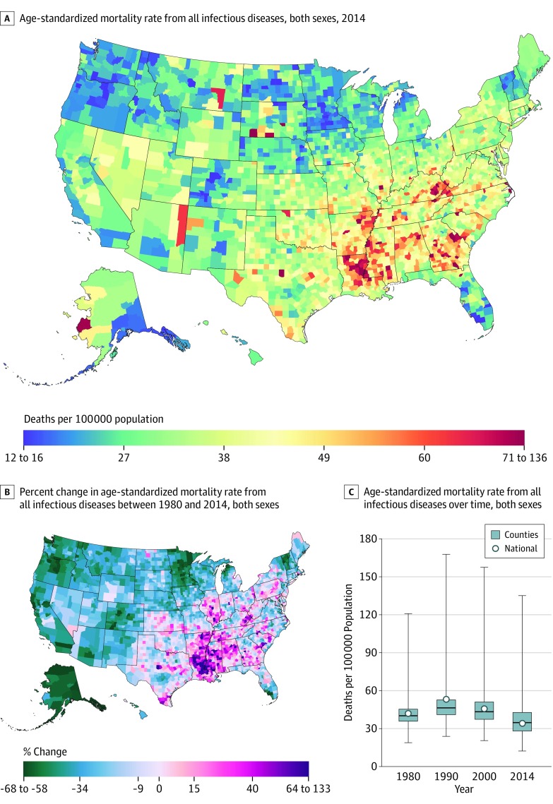
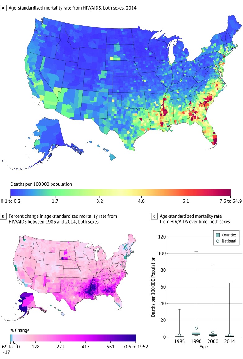
Results: Between 1980 and 2014, there were 4 081 546 deaths due to infectious diseases recorded in the United States. In 2014, a total of 113 650 (95% uncertainty interval [UI], 108 764-117 942) deaths or a rate of 34.10 (95% UI, 32.63-35.38) deaths per 100 000 persons were due to infectious diseases in the United States compared to a total of 72 220 (95% UI, 69 887-74 712) deaths or a rate of 41.95 (95% UI, 40.52-43.42) deaths per 100 000 persons in 1980, an overall decrease of 18.73% (95% UI, 14.95%-23.33%). Lower respiratory infections were the leading cause of infectious diseases mortality in 2014 accounting for 26.87 (95% UI, 25.79-28.05) deaths per 100 000 persons (78.80% of total infectious diseases deaths). There were substantial differences among counties in death rates from all infectious diseases. Lower respiratory infection had the largest absolute mortality inequality among counties (difference between the 10th and 90th percentile of the distribution, 24.5 deaths per 100 000 persons). However, HIV/AIDS had the highest relative mortality inequality between counties (10.0 as the ratio of mortality rate in the 90th and 10th percentile of the distribution). Mortality from meningitis and tuberculosis decreased over the study period in all US counties. However, diarrheal diseases were the only cause of infectious diseases mortality to increase from 2000 to 2014, reaching a rate of 2.41 (95% UI, 0.86-2.67) deaths per 100 000 persons, with many counties of high mortality extending from Missouri to the northeastern region of the United States.

Conclusions and relevance: Between 1980 and 2014, there were declines in mortality from most categories of infectious diseases, with large differences among US counties. However, over this time there was an increase in mortality for diarrheal diseases.


Conflict of interest statement

Conflict of Interest Disclosures: All authors have completed and submitted the ICMJE Form for Disclosure of Potential Conflicts of Interest and none were reported.

Figures

Figure 1.
Figure 1.. County-Level Mortality From All Infectious Diseases
A, Age-standardized mortality rate for both sexes combined in 2014. B, Relative change in the age-standardized mortality rate for both sexes combined between 1980 and 2014. A and B, the color scale is truncated at approximately the first and 99th percentiles as indicated by the range given in the color scale. C, Age-standardized mortality rate for both sexes combined in 1980, 1990, 2000, and 2014. The bottom border of the boxes indicates the 25th percentile; middle line, the 50th percentile; and the top border indicates the 75th percentile across all counties; whiskers indicate the full range across counties; and the dots indicate the national-level rate.
Figure 2.
Figure 2.. County-Level Mortality From Lower Respiratory Infections
A, Age-standardized mortality rate for both sexes combined in 2014. B, Relative change in the age-standardized mortality rate for both sexes combined between 1980 and 2014. A and B, the color scale is truncated at approximately the first and 99th percentiles as indicated by the range given in the color scale. C, Age-standardized mortality rate for both sexes combined in 1980, 1990, 2000, and 2014. The bottom border of the boxes indicates the 25th percentile; middle line, the 50th percentile; and the top border indicates the 75th percentile across all counties; whiskers indicate the full range across counties; and the dots indicate the national-level rate.
Figure 3.
Figure 3.. County-Level Mortality From Diarrheal Diseases
A, Age-standardized mortality rate for both sexes combined in 2014. The color scale is truncated at approximately the first and 99th percentiles as indicated by the range given in the color scale. B, Relative change in the age-standardized mortality rate for both sexes combined between 1980 and 2014. The color scale is similarly truncated at approximately the 99th percentile, but not at the first percentile, to avoid combining counties where the mortality rate increased with counties where the mortality rate decreased in the same group. C, Age-standardized mortality rate for both sexes combined in 1980, 1990, 2000, and 2014. The bottom border of the boxes indicates the 25th percentile; middle line, the 50th percentile; and the top border indicates the 75th percentile across all counties; whiskers indicate the full range across counties; and the dots indicate the national-level rate.
Figure 4.
Figure 4.. County-Level Mortality From HIV/AIDS
A, Age-standardized mortality rate for both sexes combined in 2014. B, Relative change in the age-standardized mortality rate for both sexes combined between 1985 and 2014. A and B, the color scale is truncated at approximately the first and 99th percentiles as indicated by the range given in the color scale. C, Age-standardized mortality rate for both sexes combined in 1985, 1990, 2000, and 2014. The bottom border of the boxes indicates the 25th percentile; middle line, the 50th percentile; and the top border indicates the 75th percentile across all counties; whiskers indicate the full range across counties; and the dots indicate the national-level rate.
Figure 5.
Figure 5.. County-Level Mortality From Meningitis
A, Age-standardized mortality rate for both sexes combined in 2014. B, Relative change in the age-standardized mortality rate for both sexes combined between 1980 and 2014. A and B, the color scale is truncated at approximately the first and 99th percentiles as indicated by the range given in the color scale. C, Age-standardized mortality rate for both sexes combined in 1980, 1990, 2000, and 2014. The bottom border of the boxes indicates the 25th percentile; middle line, the 50th percentile; and the top border indicates the 75th percentile across all counties; whiskers indicate the full range across counties; and the dots indicate the national-level rate.
Figure 6.
Figure 6.. County-Level Mortality From Hepatitis
A, Age-standardized mortality rate for both sexes combined in 2014. B, Relative change in the age-standardized mortality rate for both sexes combined between 1980 and 2014. A and B, the color scale is truncated at approximately the first and 99th percentiles as indicated by the range given in the color scale. C, Age-standardized mortality rate for both sexes combined in 1980, 1990, 2000, and 2014. The bottom border of the boxes indicates the 25th percentile; middle line, the 50th percentile; and the top border indicates the 75th percentile across all counties; whiskers indicate the full range across counties; and the dots indicate the national-level rate.
Figure 7.
Figure 7.. County-Level Mortality From Tuberculosis
A, Age-standardized mortality rate for both sexes combined in 2014. B, Relative change in the age-standardized mortality rate for both sexes combined between 1980 and 2014. A and B, the color scale is truncated at approximately the first and 99th percentiles as indicated by the range given in the color scale. C, Age-standardized mortality rate for both sexes combined in 1980, 1990, 2000, and 2014. The bottom border of the boxes indicates the 25th percentile; middle line, the 50th percentile; and the top border indicates the 75th percentile across all counties; whiskers indicate the full range across counties; and the dots indicate the national-level rate.

Comment in

References

    1. Pinner RW, Teutsch SM, Simonsen L, et al. . Trends in infectious diseases mortality in the United States. JAMA. 1996;275(3):189-193. - PubMed
    1. Armstrong GL, Conn LA, Pinner RW. Trends in infectious disease mortality in the United States during the 20th century. JAMA. 1999;281(1):61-66. - PubMed
    1. Centers for Disease Control and Prevention (CDC) Control of infectious diseases. MMWR Morb Mortal Wkly Rep. 1999;48(29):621-629. - PubMed
    1. Watson JT, Gayer M, Connolly MA. Epidemics after natural disasters. Emerg Infect Dis. 2007;13(1):1-5. - PMC - PubMed
    1. Lederberg J, Shope RE, Oaks SC Jr, Institute of Medicine; Committee on Emerging Microbial Threats to Health eds. Emerging Infections: Microbial Threats to Health in the United States. Washington, DC: National Academy Press; 1992. - PubMed

Publication types