. 2018 May 31;173(6):1495-1507.e18.
doi: 10.1016/j.cell.2018.03.053. Epub 2018 Apr 26.

Pervasive Protein Thermal Stability Variation during the Cell Cycle

Affiliations

Pervasive Protein Thermal Stability Variation during the Cell Cycle

Isabelle Becher et al. Cell. .

Abstract

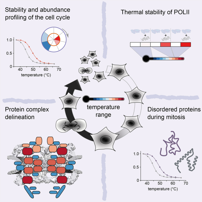
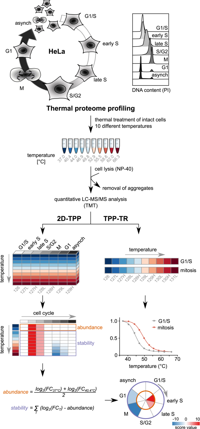
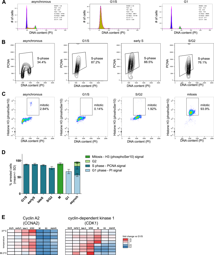
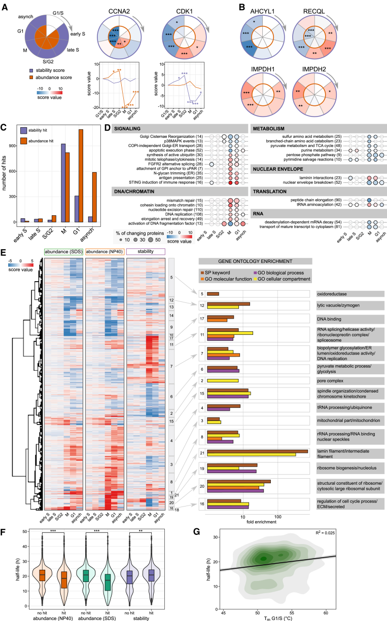
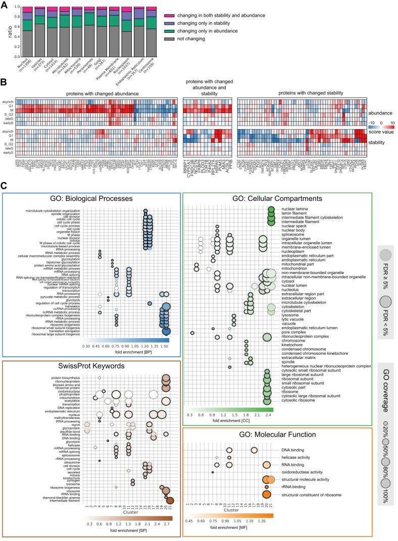
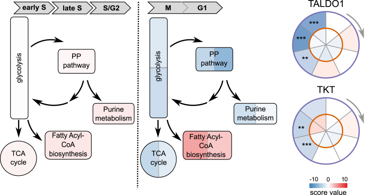
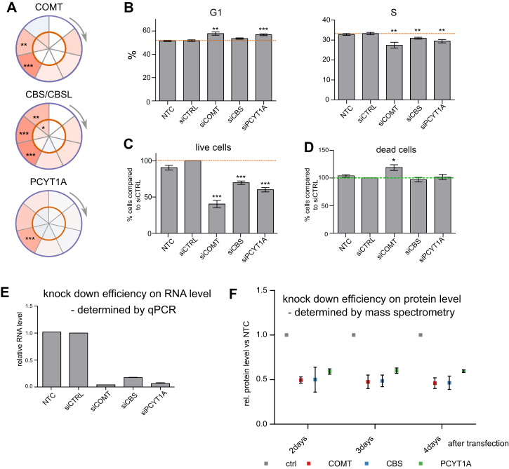
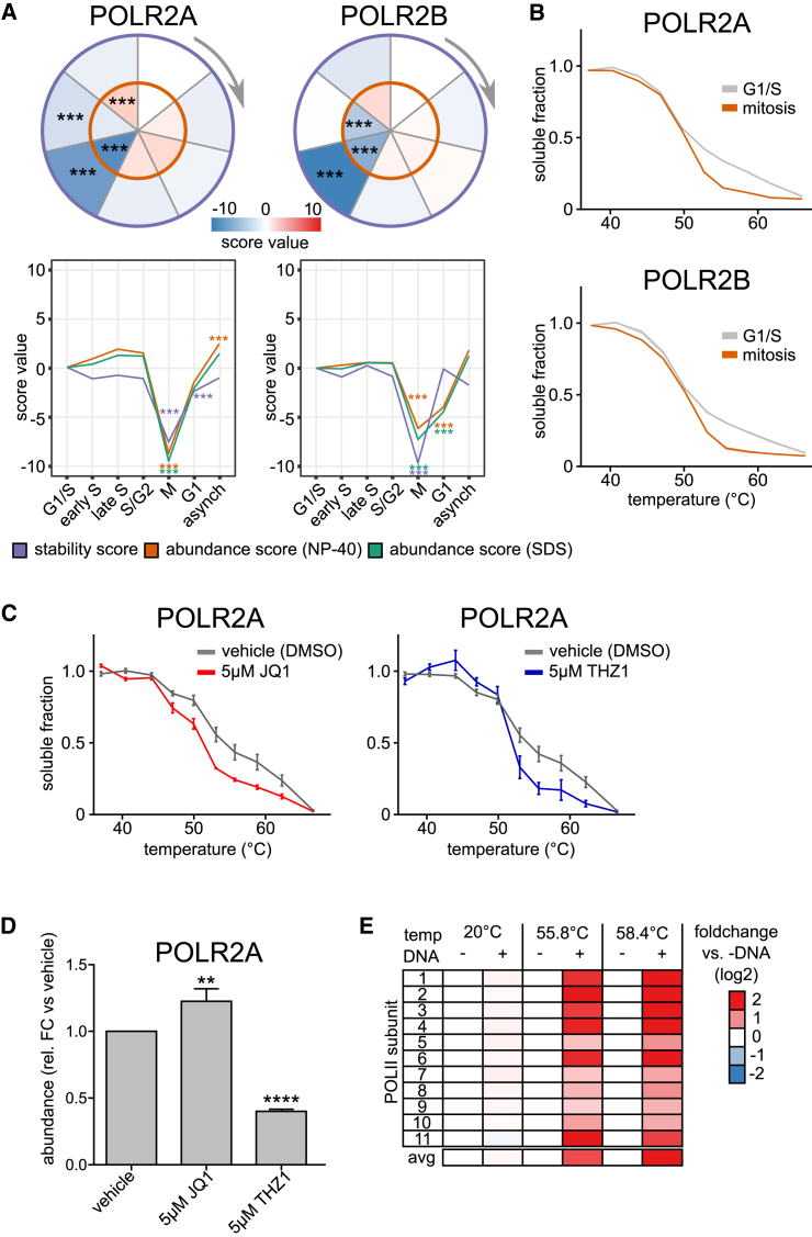
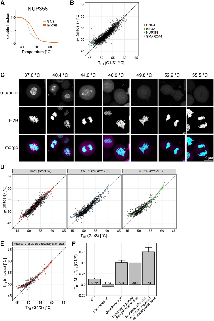
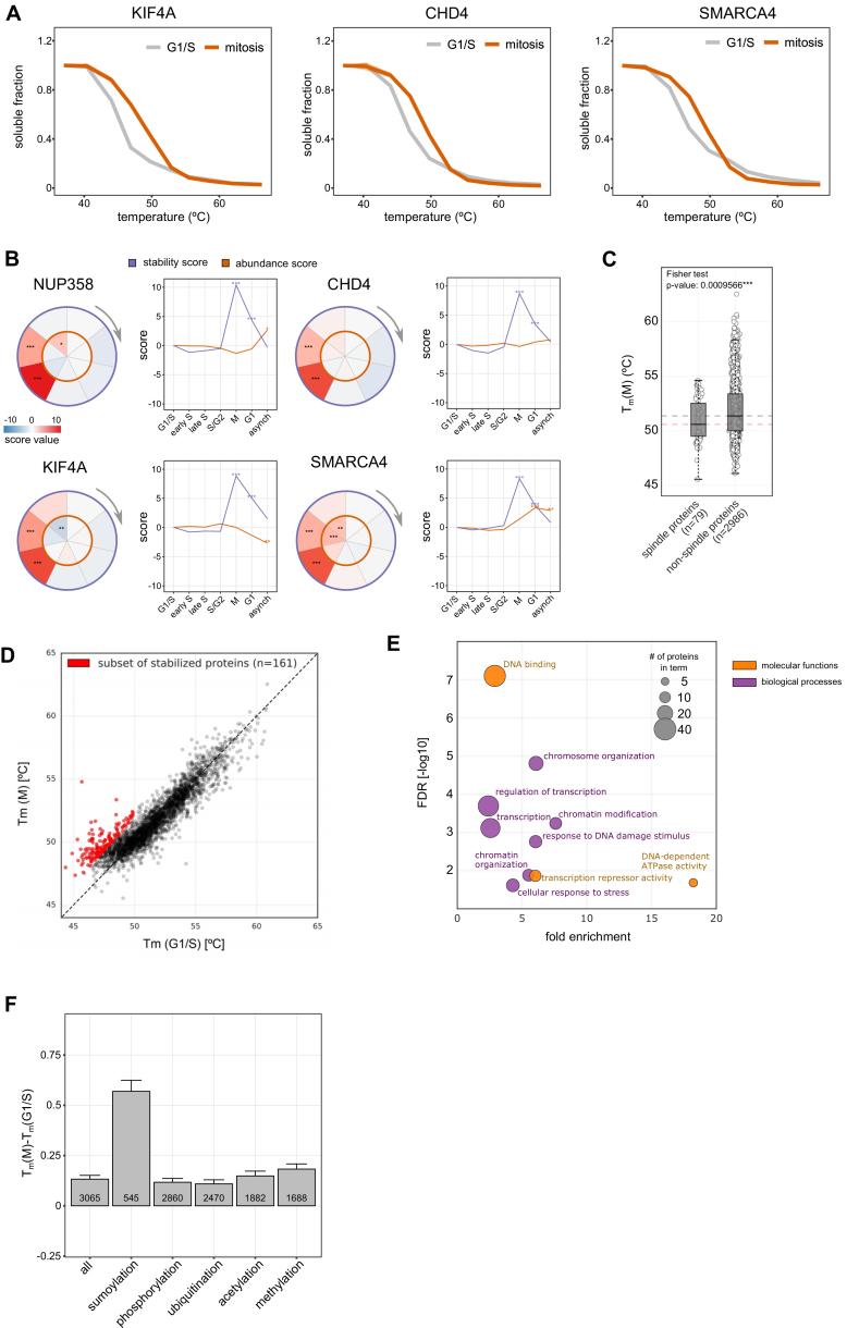
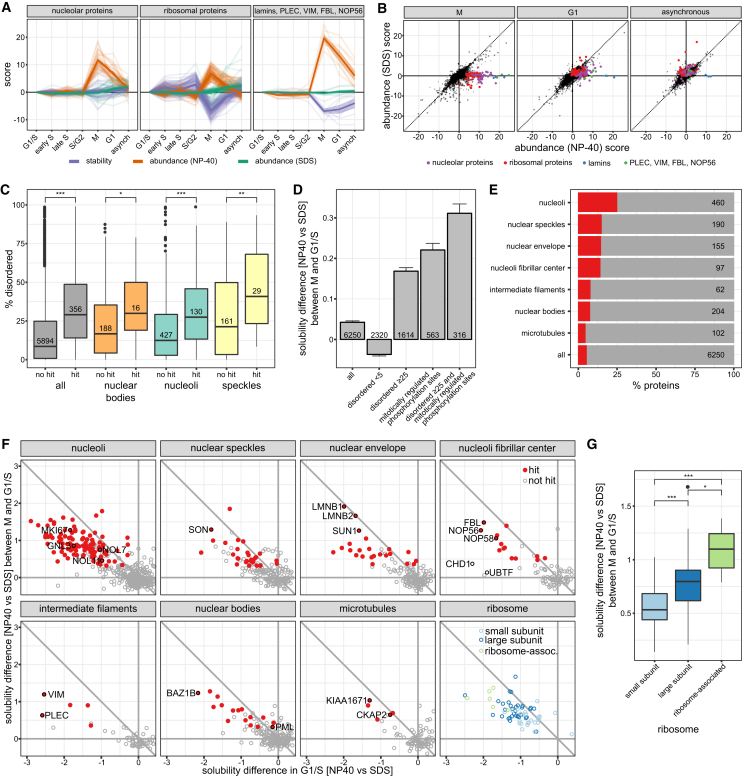
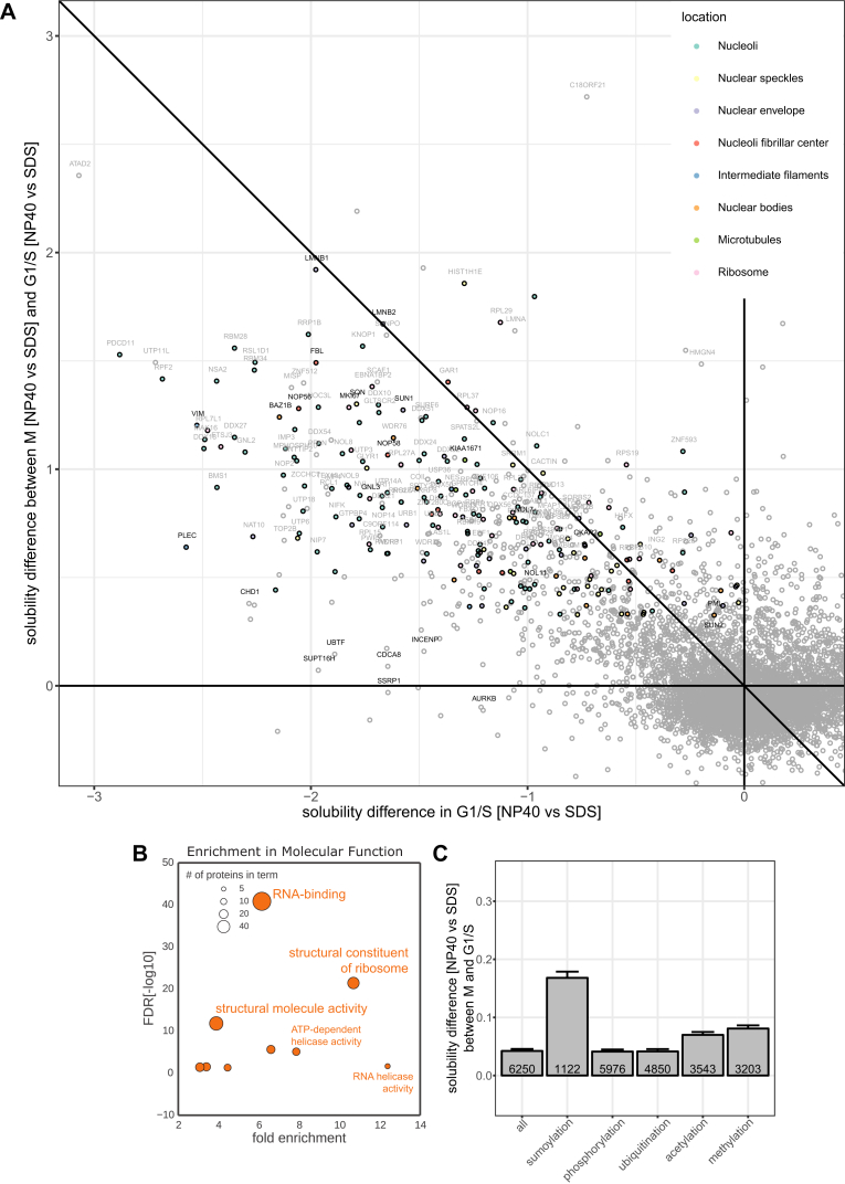
Quantitative mass spectrometry has established proteome-wide regulation of protein abundance and post-translational modifications in various biological processes. Here, we used quantitative mass spectrometry to systematically analyze the thermal stability and solubility of proteins on a proteome-wide scale during the eukaryotic cell cycle. We demonstrate pervasive variation of these biophysical parameters with most changes occurring in mitosis and G1. Various cellular pathways and components vary in thermal stability, such as cell-cycle factors, polymerases, and chromatin remodelers. We demonstrate that protein thermal stability serves as a proxy for enzyme activity, DNA binding, and complex formation in situ. Strikingly, a large cohort of intrinsically disordered and mitotically phosphorylated proteins is stabilized and solubilized in mitosis, suggesting a fundamental remodeling of the biophysical environment of the mitotic cell. Our data represent a rich resource for cell, structural, and systems biologists interested in proteome regulation during biological transitions.

Keywords: cell cycle; proteomics; thermal proteome profiling.


Figures

None
Graphical abstract
Figure 1
Figure 1
Profiling of Proteome Abundance and Stability Changes across the Cell Cycle HeLa cells were arrested with thymidine and/or nocodazole at six different cell-cycle stages, and additionally asynchronous cells were collected. For TPP experiments, intact cells were heated to ten different temperatures and lysed with NP-40. After removing protein aggregates, the soluble fractions were labeled with isobaric mass tags (TMT10-plex) for protein quantification. Samples were combined using the TPP-TR layout (right panel) for melting curve determination or in a 2D-TPP layout (left panel), in order to pool cell-cycle stages from one thermal treatment, for sensitive comparison of protein abundance and stability changes throughout the cell cycle. G1/S was used as reference point for calculating fold changes (FC). By condensing this matrix to two measures (abundance and stability scores), we identified significant changes across the proteome and represented them as a circle plot for individual proteins. Inner circle (orange), abundance changes; outer circle (purple), stability changes. See also Figure S1 and Table S1.
Figure S1
Figure S1
Analysis of the Different Cell-Cycle Stages in Each Sample by Flow Cytometry, Related to Figures 1 and 2A Representative images of the analysis used to quantify the amount of cells in G1-phase, S and mitosis. For all the analysis, the population of single cells with a 2n and 4n DNA content was gated based on the PI staining (pulse area versus pulse width). The G0/G1 population is shown at 50K pulse area of PI signal; the G2/M population, at 100K. (A) Histograms of DNA content. The pulse area of the PI signal was fitted to a cell cycle distribution using the Watson pragmatic model approach in FlowJo v10. The fitted populations in G1, S and G2/M stages are shown in blue, yellow and green, respectively. (B) The population with a stronger PCNA signal was gated on asynchronous cells and considered as S-phase population. The same gate was applied to all other samples. (C) To quantify the mitotic population, cells positive for phospho-Histone H3 (Ser10) and with a G2/M DNA content were gated in the asynchronous sample; this gate was subsequently applied to the rest of samples. (D) Overview of the quantification of the three replicates used for the thermal profiling experiments (2D-TPP and TPP-TR) as well as SDS extracts. The mean ± SD is shown. (E) Heatmap for CCNA2 and CDK1, from which abundance and stability scores were calculated. The vertical direction indicates the increase in temperature and the horizontal direction progress in cell cycle.
Figure 2
Figure 2
Abundance and Stability Changes of Cell-Cycle Markers, Pathways, and Cell Functions (A) Calculated abundance and stability scores for CCNA and CDK1 in a circular plot. The outer circle represents stability and the inner circle abundance. All data shown in the paper represent three independent biological replicates. p < 0.05, ∗∗p < 0.01, and ∗∗∗p < 0.001, unless otherwise indicated. (B) Cell-cycle-dependent changes in protein stability of AHCYL1, RECQL, IMPDH1, and IMPDH2. (C) Number of significantly affected proteins in either stability (purple) or abundance (orange). (D) Pathways from the Reactome Pathway Database indicate how many proteins are associated with the pathway in general (number in brackets); the percentage of proteins affected in the pathway in at least one cell-cycle stage is correlated with the size of the circle. The color of the circle indicates the mean stability of the pathway components that significantly change in their stability. If the circle is fully opaque, the adjusted combined p value is < 0.05; if the bubble is transparent, then proteins were quantified but did not change in their stability in the respective cell-cycle stage. Pathways are categorized into broader functional groups. (E) Clustering stability and abundance of significantly changing proteins results in 21 individual clusters that were analyzed using DAVID (https://david-d.ncifcrf.gov/) with all quantified proteins as a background. The top result (lowest FDR) for all functional categories (colored as indicated in the legend) is shown for each cluster for which the FDR < 0.05 and linked to the heatmap. (F) Violin plots with the indicated median and interquartile range comparing protein half-life (from Boisvert et al. [2012]) distributions of proteins changing significantly in abundance or stability compared with non-changing proteins. Significance levels obtained from a Wilcoxon signed-rank test were encoded as p < 0.05, ∗∗p < 0.01, and ∗∗∗p < 0.001. (G) 2D density plot of protein half-lives comparison with protein melting points in G1/S phase fitted by a linear model. See also Figures S1 and S2 and Tables S2, S3, S4, and S5.
Figure S2
Figure S2
Analysis of Cell-Cycle-Dependent Stability Effects on Organelle-Specific Proteins and Fine-Grained GO Results, Related to Figure 2E (A) Bar plots showing the ratio of organelle-specific proteins (as defined from gene ontology) affected in either stability or abundance or both. (B) Heatmap showing ER-associated/localized proteins that are significantly affected in their abundance (left panel), stability (right panel) or both (middle panel) during mitosis. (C) GO-enrichment results from DAVID (https://david-d.ncifcrf.gov/) with the colors encoding different broad functional categories. The size of the bubble illustrates the relative coverage of the respective GO-category, and the color of the bubbles shows the fold enrichment, x axis with the 21 clusters defined in Figure 2E.
Figure 3
Figure 3
Metabolic Pathways Cell-cycle effect on the stability of protein components of the pentose phosphate pathway (PPP). On the left-hand side, the PPP is shown along with related pathways colored by average stability across the stages from early S to S/G2. On the right-hand side, the same constellation is shown. It is colored in stability values derived from mitosis (left) and G1 phase (right) for each protein. TKT and TALDO1 are two enzymes of the PPP that become significantly destabilized upon the onset of mitosis. See also Figure S3 and Table S2.
Figure S3
Figure S3
Related to Figures 3B and 3C (A) Circle plots for potential new cell cycle markers changing in their stability during the cell cycle (COMT, CBS/CBSL, PCYT1A). (B) Knock-down of the proteins shown in A results in significant changes in percentage of cells in G1 and S (assessed after 4 days knock-down by PI staining and flow cytometry). (C) Knock-down of the proteins shown in A results in significant changes in percentage of live cells (assessed after 4 days knock/down using a cytotoxicity assay) compared with siCTRL. (D) Knock-down of the proteins shown in A results in minor changes in percentage of dead cells (assessed after 4 days knock/down using a cytotoxicity assay). (E) Knock down efficiency on mRNA level (qPCR), two biological replicates. (F) Knock down efficiency on protein level (mass spectrometry-based quantification), two biological replicates. SEM is shown.
Figure 4
Figure 4
Thermal Stability and Activity of RNA Polymerase II in Mitosis (A) Circle and line plots for two subunits of RNA Pol II (POLR2A and POLR2B) show the significant change in stability (purple) and abundance (NP-40, orange, SDS green). (B) Melting curves (generated in TPP-TR experiments) for POLR2A and POLR2B show the biphasic melting behavior in G1/S, compared with mitosis. (C) TPP-TR experiment of HeLa cells treated with vehicle (DMSO), BET inhibitor JQ1, or CDK7 inhibitor THZ1. Quantified western blot data for POLR2A. SEM is shown. (D) Quantification of POLR2A protein level after a 3-hr treatment with DMSO, JQ1, or THZ1 (western blot quantification). SEM is shown. (E) Stabilization of purified RNA Pol II complex from yeast by its specific DNA sequence. The stabilization was calculated as a fold change against the control (without DNA) for each temperature. Coomassie gel quantification. See also Figure S4 and Tables S2, S3, and S4.
Figure S4
Figure S4
Related to Figure 4 (A) Western blot images used for quantification of POLR2A destabilization upon 3h treatment with JQ1. (B) Western blot images used for quantification of POLR2A destabilization upon 3h treatment with THZ1, as well as melting curve plot derived from this image. (C) Western blot images used for quantification of phosphorylated POLR2A destabilization upon 3h treatment with JQ1. (D) Quantification of (C). SEM is shown. (E) Coomassie gel showing purified RNA Pol II complex from yeast. From left to right with increasing temperature, always control and treatment (+DNA) next to each other. Blue numbers indicate the subunits separated on the gel.
Figure 5
Figure 5
Co-stability of Known Protein Complexes and Submodules of the NPC (A) Schematic illustration of correlation analysis (see STAR Methods for further details). (B–D) Density graph of correlation coefficient values (Pearson) calculated from abundance (B), stability (C), and concatenated abundance-stability (D) profiles between proteins known to be members of the same complex (green). The gray density shows correlation values from all combinations of proteins not associated with any complex. (E) Density graph of correlation values (Pearson) calculated from concatenated abundance-stability profiles of all subunits of the nuclear pore complex (NPC). (F) Correlation matrix of NPC subunits based on their concatenated abundance-stability profiles. The colors on the left indicate their association with a specific substructure of the NPC, as colored in the respective cartoon. The scale on the bottom of the matrix indicates how many mitotic phosphorylation sites the corresponding protein subunit contains as described by Olsen et al. (2010). See also Figure S5 and Table S2.
Figure S5
Figure S5
Overview of Complex Co-stability and Co-abundance and Differential Stability Pattern of Moonlighting Subunits of the Exosome Complex, Related to Figure 5 co-co-(A) Melting temperatures of same protein complexes in G1/S compared to random complex assignment. (B) Scatterplot showing complex median co-abundance (median correlation calculated from abundance profiles of corresponding subunits) versus complex median co-stability (median correlation calculated from stability profiles of corresponding subunits). (C) Exosome structure with indicated catalytic subunits, DIS3 and EXOSC10 (light red). Density graph of correlation values (Pearson) calculated from concatenated abundance-stability profiles of all subunits of the Exosome complex, as well as the corresponding correlation matrix as designed for the NPC (see Figure 6F). (D) Correlation matrix of proteasome-subunits based on their concatenated abundance-stability profiles. The colors on the left indicate their association with a specific sub-structure of the proteasome, as colored in the respective cartoon. (E) Correlation matrix of condensin II-subunits based on their concatenated abundance-stability profiles. The colors on the left indicate their association with a specific sub-structure of condensin II, as colored in the respective cartoon. (F) Line plots for all measured subunits of the NPC-complex showing stability (purple), abundance (NP-40, orange) and abundance (SDS, green) scores.
Figure 6
Figure 6
Disordered, Mitotically Phosphorylated Proteins Are Stabilized during Mitosis (A) Melting curves of NUP358 in G1/S and mitosis. Data represent three biological replicates. (B) Scatterplot comparing the melting temperatures (Tm) for proteins in G1/S (x axis) and M (y axis). A shift toward higher melting points in mitosis for representative proteins CHD4, KIF4A, NUP358, and SMARCA4 are indicated with coloring. (C) Microscopy images of the mitotic spindle at different temperatures. Mitotic HeLa Kyoto EGFP-alpha-tubulin/H2B-mCherry cells were imaged after heat treatment. z stacks maximum intensity projections of samples treated at the indicated temperatures are shown. On the merged images, α-tubulin and H2B are shown in magenta and cyan, respectively. (D) Scatterplots illustrate the melting point shift observed from G1/S (x axis) to M (y axis) at different cutoffs for the relative coverage of disordered regions (indicated above each plot as a percentage). (E) Shift of melting point for proteins containing mitotically regulated phosphorylation sites as described in Olsen et al. (2010). (F) Melting point difference for proteins with different levels of disordered regions in their sequence and containing mitotic phosphorylation sites. SEM is shown. See also Figure S6 and Tables S4 and S6.
Figure S6
Figure S6
Related to Figure 6 (A) Melting curves for CHD4, KIF4A and SMARCA4A. Data shows the median for three replicates. (B) Circle and line plots showing abundance (NP-40, orange) and stability scores (purple) for NUP358, CHD4, KIF4A and SMARAC4. (C) Boxplot comparing melting temperatures in M, on the left are annotated spindle proteins from Sauer et al. The horizontal lines show the median of non-spindle proteins (black line) and spindle proteins (red line) indicating the lower melting temperatures of spindle proteins. (D) Melting temperatures for G1/S and M. Proteins in red were selected for further GO analysis shown in (E). (E) GO for spindle proteins shown in (D). GO analysis using DAVID (https://david-d.ncifcrf.gov/) was conducted on the protein set that is stabilized in mitosis relative to the G1/S reference point. For filtering we considered proteins that were significantly stabilized (p value < 0.1) and with their melting point in mitosis below 55°C and in G1/S below 50°C. The resulting 161 proteins were primarily found to be involved in DNA-binding activity and chromatin-associated processes. The scatter illustrates the fold-enrichment against the respective FDR for terms derived from the broad categories “molecular function” and “biological processes.” The size of each bubble relates to the number of proteins identified for each term. (F) Difference in melting points (G1/S versus M) of all proteins, and proteins annotated with different post-translational modifications (specified in the STAR Methods). SEM is shown.
Figure 7
Figure 7
Solubility Transitioning Proteome (A) Abundance (measured in NP-40 lysis buffer in orange and SDS lysis buffer in green) and stability (purple) profiles of three protein groups (nucleolar, ribosomal, or lamins and others from cluster 19, 20, or 21 as shown in Figure 2E, respectively) are shown across all cell-cycle stages. (B) Scatterplot depicting the abundance scores in SDS lysis (y axis) versus abundance scores from NP-40 lysis (x axis) for each protein. The indicated functional groups are solubilized during mitosis, but not in G1, except for lamins, which also remain soluble during G1 phase. (C) Boxplots of relative coverage of disordered regions for proteins significantly changing in solubility in mitosis versus G1/S compared to other proteins. Comparisons are made for all proteins, as well as for proteins located within different membraneless organelles as defined by the Human Protein Atlas (HPA). (D) Solubility differences in mitosis versus G1/S for proteins with different levels of disordered regions in their sequence and containing mitotic phosphorylation sites. SEM is shown. (E) Percentage of the proteomes of different organelles significantly changing in solubility in mitosis versus G1/S and localization as defined by HPA, except for the nuclear envelope, which combines nuclear membrane annotated proteins as defined by HPA and proteins annotated as inner nuclear membrane proteins by Wilkie et al. (2011). (F) Scatterplots comparing the solubility of proteins in G1/S and the relative change in solubility of proteins in mitosis versus G1/S for different organelles, the cytoplasmic ribosomal subunits, and the ribosome-associated complex determined by Havugimana et al. (2012) (BOP1, RRS1, GNL3, EBNA1BP2, FTSJ3, MKI67). Proteins with negative x axis values and close to zero y axis values are insoluble in G1/S and remain insoluble in mitosis. Proteins with negative x axis values and positive y axis values are insoluble in G1/S and become more soluble in mitosis. Proteins that are significantly more soluble in mitosis compared to G1/S are marked in red. (G) Solubility differences in mitosis versus G1/S compared between proteins from the small and large cytoplasmic ribosomal subunits and the ribosome associated complex determined by Havugimana et al. (2012). See also Figure S7 and Tables S3 and S7.
Figure S7
Figure S7
Related to Figure 7 (A) Scatterplot comparing the solubility of proteins in G1/S and the relative change in solubility of proteins in mitosis versus G1/S. Proteins with negative x axis values and close to zero y axis values are insoluble in G1/S and remain insoluble in mitosis. Proteins with negative x axis values and positive y axis values are insoluble in G1/S and become more soluble in mitosis. (B) GO analysis using DAVID (https://david-d.ncifcrf.gov/) was conducted on the protein set that is significantly more soluble in mitosis versus G1/S. The scatter illustrates the fold-enrichment against the respective FDR for terms derived from the broad category “molecular function.” The size of each bubble relates to the number of proteins identified for each term. (C) Solubility differences in mitosis versus G1/S of all proteins, and proteins annotated with different post-translational modifications (specified in the STAR Methods). SEM is shown.

References

    1. Arnaoutov A., Dasso M. Enzyme regulation. IRBIT is a novel regulator of ribonucleotide reductase in higher eukaryotes. Science. 2014;345:1512–1515. - PMC - PubMed
    1. Bah A., Vernon R.M., Siddiqui Z., Krzeminski M., Muhandiram R., Zhao C., Sonenberg N., Kay L.E., Forman-Kay J.D. Folding of an intrinsically disordered protein by phosphorylation as a regulatory switch. Nature. 2015;519:106–109. - PubMed
    1. Becher I., Werner T., Doce C., Zaal E.A., Tögel I., Khan C.A., Rueger A., Muelbaier M., Salzer E., Berkers C.R. Thermal profiling reveals phenylalanine hydroxylase as an off-target of panobinostat. Nat. Chem. Biol. 2016;12:908–910. - PubMed
    1. Boisvert F.M., Lam Y.W., Lamont D., Lamond A.I. A quantitative proteomics analysis of subcellular proteome localization and changes induced by DNA damage. Mol. Cell. Proteomics. 2010;9:457–470. - PMC - PubMed
    1. Boisvert F.M., Ahmad Y., Gierlinski M., Charriere F., Lamont D., Scott M., Barton G., Lamond A.I. A quantitative spatial proteomics analysis of proteome turnover in human cells. Mol. Cell Proteomics. 2012;11 M111.011429. - PMC - PubMed

Publication types