. 2018 Jul 26;174(3):716-729.e27.
doi: 10.1016/j.cell.2018.05.061. Epub 2018 Jun 28.

Recovering Gene Interactions from Single-Cell Data Using Data Diffusion

Affiliations

Recovering Gene Interactions from Single-Cell Data Using Data Diffusion

David van Dijk et al. Cell. .

Abstract

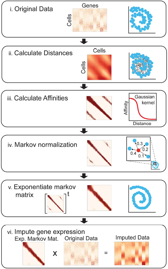
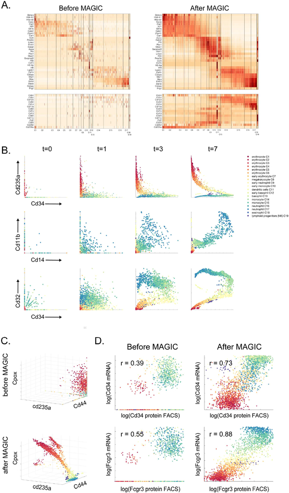
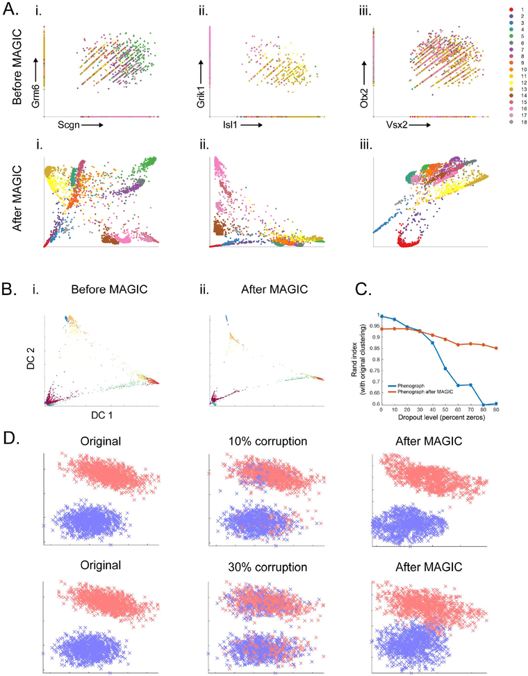
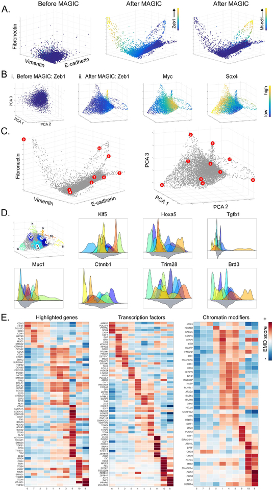
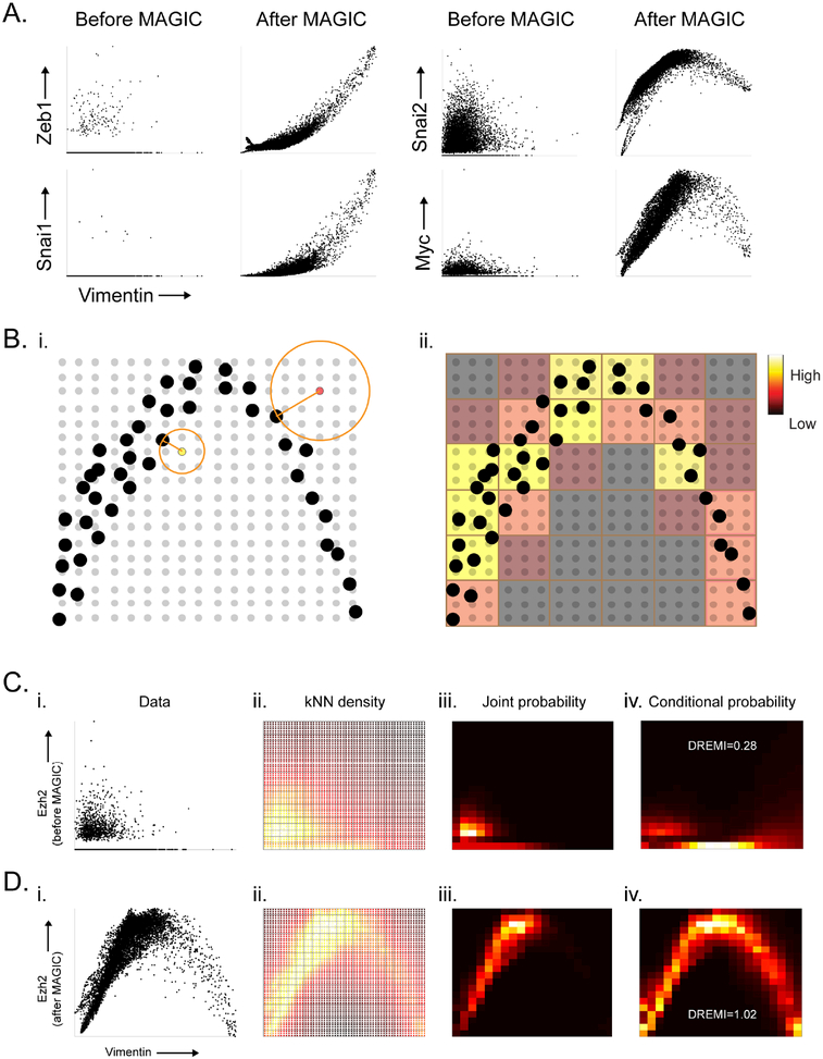
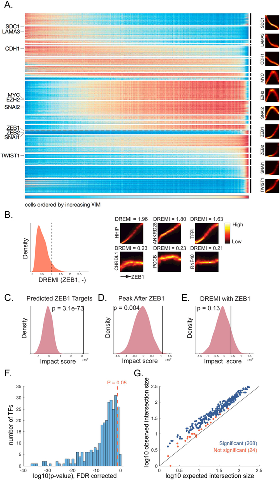
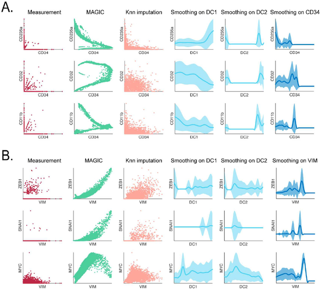
Single-cell RNA sequencing technologies suffer from many sources of technical noise, including under-sampling of mRNA molecules, often termed "dropout," which can severely obscure important gene-gene relationships. To address this, we developed MAGIC (Markov affinity-based graph imputation of cells), a method that shares information across similar cells, via data diffusion, to denoise the cell count matrix and fill in missing transcripts. We validate MAGIC on several biological systems and find it effective at recovering gene-gene relationships and additional structures. Applied to the epithilial to mesenchymal transition, MAGIC reveals a phenotypic continuum, with the majority of cells residing in intermediate states that display stem-like signatures, and infers known and previously uncharacterized regulatory interactions, demonstrating that our approach can successfully uncover regulatory relations without perturbations.

Keywords: EMT; imputation; manifold learning; regulatory networks; single-cell RNA sequencing.


Conflict of interest statement

DECLARATION OF INTERESTS

The authors declare no competing interests.

Figures

Fig 1:
Fig 1:. Steps of the MAGIC algorithm:
(i) The input data consists of a matrix of cells by genes (middle) of the data (right). (ii) We compute a cell by cell distance matrix. (iii) The distance matrix is converted to an affinity matrix (middle) using a Gaussian kernel. A graphical depiction of the kernel function is shown (right). (iv) The affinities are normalized, resulting in a Markov matrix (middle). The normalized affinities are shown for a single point as transition probabilities (right). (v) To perform diffusion we exponentiate the Markov matrix to a chosen power t. (vi) We matrix multiply the exponentiated Markov matrix (left) with the original data matrix (middle) to obtain a denoised and imputed data matrix (right). See also Figure S1.
Fig 2:
Fig 2:. MAGIC applied to mouse myeloid progenitor data:
Mouse bone marrow dataset (Paul et al., 2015). A) Gene expression matrix for hematopoietic genes (top) and characteristic surface markers of immune subsets (bottom) before and after MAGIC. See also Figure S2A. B) Scatter plots of several gene-gene relationships after different amounts of diffusion. In these scatter plots, each dot represents a single cell, plotted according to its expression values (measured at t=0 and imputed for t=1,3,7), and colored based on the clusters identified in (Paul et al., 2015). C) Shows before and after MAGIC of a 3D relationships (with diffusion time t=7). D) FACS measurements of CD34 and FCGR3 protein levels versus transcript levels, before and after MAGIC. Both FACS measurements and mRNA levels are log-scaled as per FACS conventions.
Fig 3:
Fig 3:. MAGIC preserves cluster structure.
A) Mouse retinal bipolar cells from (Shekhar et al., 2016) showing 2D relationships before and after MAGIC. Cells colored by Phenograph clusters and show differing trends among clusters. B-C): Mouse cortex and hippocampus cells (Zeisel et al., 2015). B) Diffusion components before MAGIC (i) and after MAGIC (ii) colored with clusters, MAGIC does not merge clusters. C) Rand index (Y-axis) of Phenograph clustering after dropout, with MAGIC (red) or without MAGIC (blue), against Phenograph original data. D) Synthetic mixture of two Gaussians embedded in high dimension (original, left), 10% and 30% of the values are corrupted by randomly switching values between the clusters (middle). MAGIC is able to fix the majority of the corruptions (right); 98% recovery for 10% corruption and 81% recovery for 30% corruption.
Fig 4:
Fig 4:. MAGIC recovers a state space in EMT data.
EMT data collected 8 and 10 days after TGFβ-stimulation of HMLE breast cancer cells. A) 3D scatterplots between canonical EMT genes CDH1, VIM, and FN1. (Left) Before MAGIC (Middle) after MAGIC with cells colored by the level of ZEB1 and (Right) MT-ND1. See also Figure S3. B) 3D PCA plots before MAGIC (i) and after MAGIC (ii) with cells colored by levels of ZEB1, MYC and SOX4 respectively. C) 3D scatter plots after MAGIC, red dots represent each of the 10 archetypes in the data. Plotted by (Left) CDH1, VIM and FN1, and (right) PCA. D) (Left) most archetypal neighborhoods, cell colored by archetype, grey cells are not associated with any archetype. Histograms represent distributions of genes in archetypal neighborhoods, color-coded by the colors shown in the leftmost plot. E) A subset of differentially expressed genes for each archetype including highlighted genes, transcription factors and chromatin modifiers. Additional differentially expressed genes are shown in table S1. See also Figure S4.
Fig. 5:
Fig. 5:. Gene-Gene Relationships and kNN-DREMI.
A) 2D scatterplots before and after MAGIC. B) Illustrates the computation of kNN-based density estimation on an 18 × 18 grid, shown as gray points with data points shown in black. Each grid point (yellow, and red grid points are examples) is given density inversely proportional to the volume of a circle with radius r equal to the distance to its nearest data neighbor (black point). After density estimation on the grid-points, the grid is coarse grained into a 6×6 discrete density estimate (red and yellow squares show coarse grained partitions) by accumulation of all densities within each square bin. C) The steps for computing kNN-DREMI are shown for EZH2 (Y-axis) and VIM (X-axis) before MAGIC, with (i) a scatter plot, (ii) kNN-based density estimation on a fine grid (60×60), (iii) coarse-grained joint probability estimate on probability to obtain conditional probability density, resulting in 20 × 20 partition, and (iv) normalization of joint kNN-DREMI = 0.28. D) Same steps as (C) shown after MAGIC resulting in a kNN-DREMI = 1.02. See also Figure S5.
Fig. 6:
Fig. 6:. Gene Expression Dynamics Underlying EMT and TF target predictions
(A) Expression of genes (Y-axis) ordered by DREVI-based clustering and by peak expression along VIM (X-axis). ZEB1 is highlighted with dashed line. Representative DREVI plots with VIM shown to the right. B) (Left) Distribution of kNN-DREMI with ZEB1. The dashed line marks the threshold for genes that we include in the prediction. (Right) DREVI plots and DREMI values for a set of example genes above the threshold (top row) and below threshold (bottom row). C) Impact score of the predicted ZEB1 targets. D) Impact score of all genes that peak after ZEB1. E) Impact score of all genes with kNN-DREMI against ZEB1 >= 1. F) Histogram of 292 FDR corrected p-values (log transformed) obtained using a hypergeometric test on TF-target predictions soverlap with targets obtained from ATAC-seq data, 268 out of 292 TFs have p-value < 0.05. G) Expected number of genes in intersection (log10 scale, X-axis) based on the hypergeometric distribution, versus the observed intersection (log10 scale, Y-axis). For all TFs except one, the observed intersection is higher than expected from random. For 268 TFs (blue points) the difference is significant, and 24 (red points) are not significant. See also Figure S6.
Fig. 7:
Fig. 7:. Comparison of MAGIC to other imputation and smoothing methods.
A) Comparison shown on bone marrow data (as in Figure 2), raw data (first column), MAGIC imputed (second column). The other columns show kNN-based imputation, smoothing on diffusion components 1 to 2, and smoothing on CD34, respectively. B) The same as in A but for the EMT data. See also Figure S7.

References

    1. Achlioptas D, and McSherry F (2007). Fast computation of low-rank matrix approximations. Journal of the ACM (JACM) 54, 9.
    1. Amir el AD, Davis KL, Tadmor MD, Simonds EF, Levine JH, Bendall SC, Shenfeld DK, Krishnaswamy S, Nolan GP, and Pe’er D (2013). viSNE enables visualization of high dimensional single-cell data and reveals phenotypic heterogeneity of leukemia. Nat Biotechnol 31, 545–552. - PMC - PubMed
    1. Ben-Porath I, Thomson MW, Carey VJ, Ge R, Bell GW, Regev A, and Weinberg RA (2008). An embryonic stem cell–like gene expression signature in poorly differentiated aggressive human tumors. Nature genetics 40, 499–507. - PMC - PubMed
    1. Bendall SC, Davis KL, Amir el AD, Tadmor MD, Simonds EF, Chen TJ, Shenfeld DK, Nolan GP, and Pe’er D (2014). Single-cell trajectory detection uncovers progression and regulatory coordination in human B cell development. Cell 157, 714–725. - PMC - PubMed
    1. Botev ZI, Grotowski JF, and Kroese DP (2010). Kernel Density Estimation Via Diffusion. Annals of Statistics 38, 2916–2957.

Publication types

LinkOut - more resources