. 2018 Jul 17:7:e35471.
doi: 10.7554/eLife.35471.

Genetics of trans-regulatory variation in gene expression

Affiliations

Genetics of trans-regulatory variation in gene expression

Frank Wolfgang Albert et al. Elife. .

Abstract

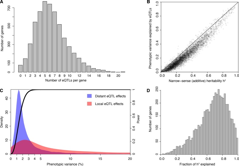
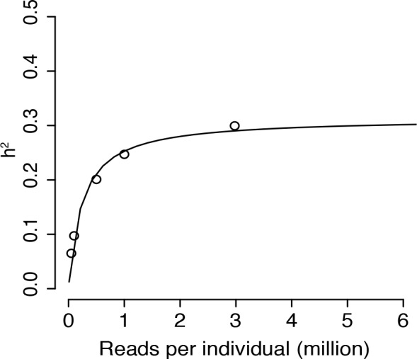
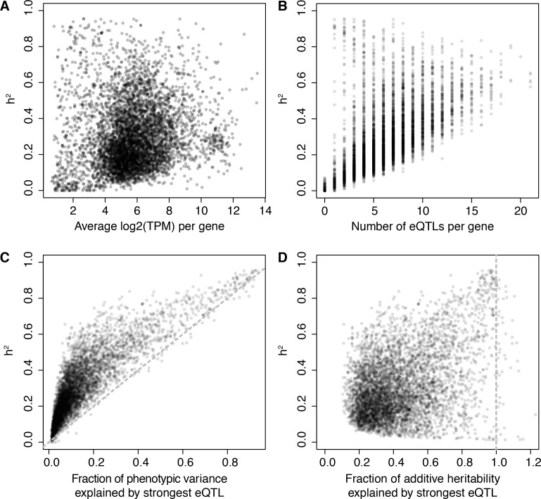
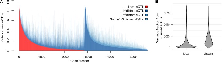
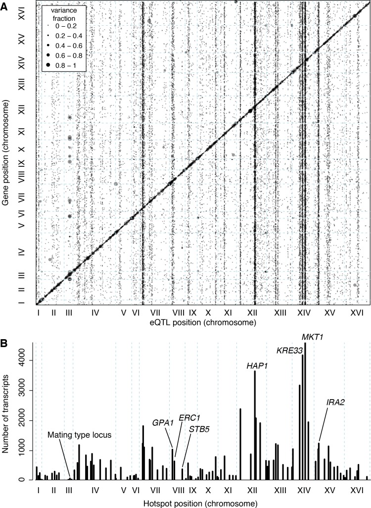
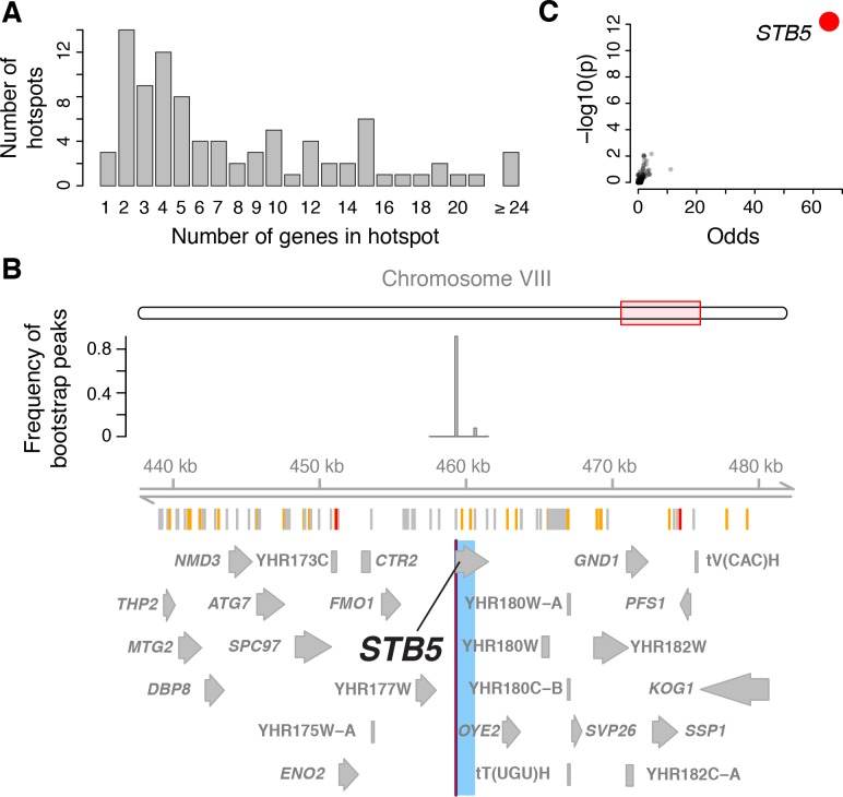
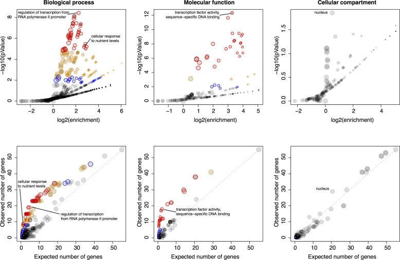
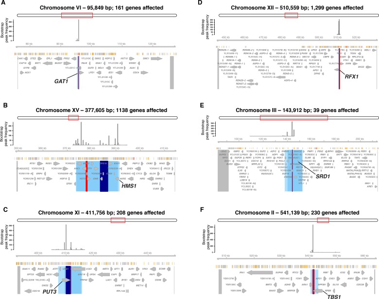
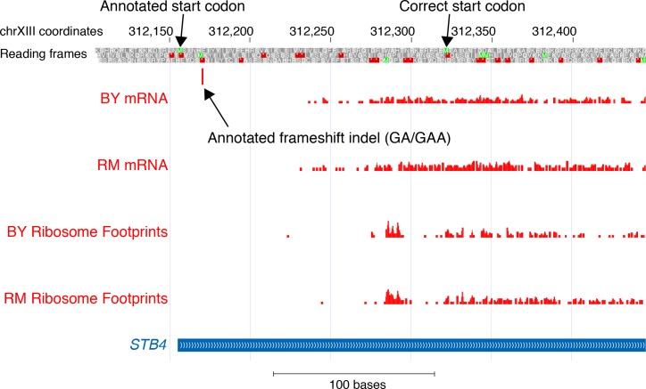
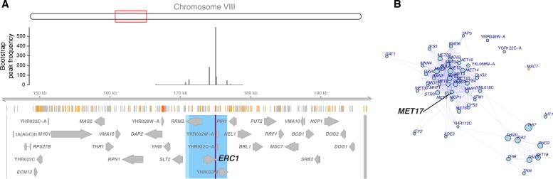
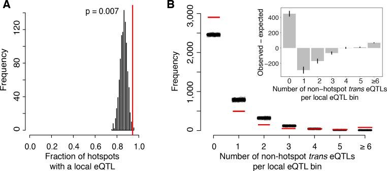
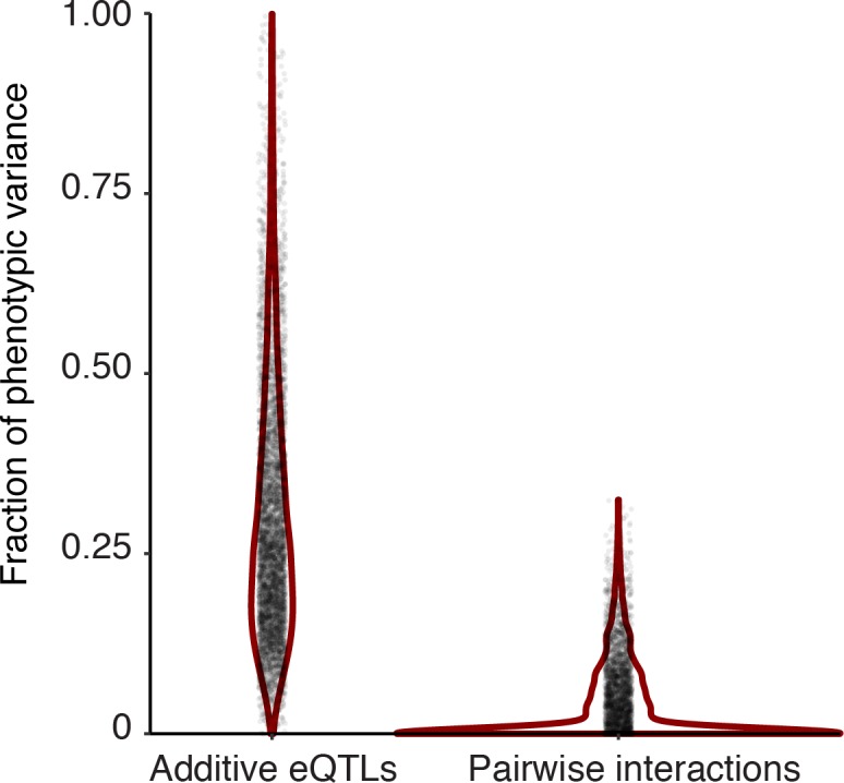
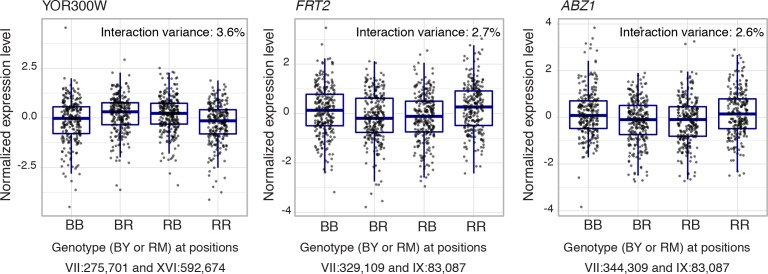
Heritable variation in gene expression forms a crucial bridge between genomic variation and the biology of many traits. However, most expression quantitative trait loci (eQTLs) remain unidentified. We mapped eQTLs by transcriptome sequencing in 1012 yeast segregants. The resulting eQTLs accounted for over 70% of the heritability of mRNA levels, allowing comprehensive dissection of regulatory variation. Most genes had multiple eQTLs. Most expression variation arose from trans-acting eQTLs distant from their target genes. Nearly all trans-eQTLs clustered at 102 hotspot locations, some of which influenced the expression of thousands of genes. Fine-mapped hotspot regions were enriched for transcription factor genes. While most genes had a local eQTL, most of these had no detectable effects on the expression of other genes in trans. Hundreds of non-additive genetic interactions accounted for small fractions of expression variation. These results reveal the complexity of genetic influences on transcriptome variation in unprecedented depth and detail.

Keywords: S. cerevisiae; chromosomes; eQTL; gene expression; genetic variation; genetics; genomics; regulatory variation.


Conflict of interest statement

FA, JB, JS, LD No competing interests declared, LK Reviewing editor, eLife

Figures

Figure 1.
Figure 1.. eQTL detection and transcriptome heritability.
(A) Histogram showing the number of eQTLs per gene. (B) Most additive heritability for transcript abundance variation is explained by detected eQTLs. The total variance explained by detected eQTLs for each transcript (y-axis) is plotted against the additive heritability (h2). The diagonal line represents a scenario under which the variance explained by eQTLs exactly matches the heritability. (C) Power to detect eQTLs as a function of effect size, and distributions of observed local and distant eQTL effects. The black curve corresponds to the statistical power (right y-axis) for eQTL detection at a genome-wide significance threshold. Colored areas show the density of individual significant eQTLs (left y-axis) that explain a given fraction of phenotypic variance (x-axis) for distant (blue) and local (red) eQTLs. Note that the x-axis is truncated at 20% variance explained to aid visualization of smaller effects, and omits a long tail of few eQTLs with large effects. (D) Histogram showing the fraction of h2 explained by the sum of the eQTLs for each gene.
Figure 1—figure supplement 1.
Figure 1—figure supplement 1.. Mean additive heritability across all transcripts as a function of downsampling the total number of reads per sample.
The downsampled number of reads per sample (x-axis) is plotted against the mean additive heritability across all genes (y-axis). The black line is a non-linear least squares fit.
Figure 1—figure supplement 2.
Figure 1—figure supplement 2.. Heritability (h2) compared to other measures.
In all panels, heritability for each gene is plotted on the y-axis and compared to: (A) The average log2(TPM) for a gene across the segregants. (B) The number of detected eQTLs per gene. (C) The fraction of phenotypic variance explained by the largest effect eQTL per gene. The diagonal line represents the case of all heritability mapping to the strongest eQTL. (D) The fraction of additive heritability explained by the largest effect eQTL per gene. The vertical line represents the case of all additive heritability being explained by the strongest eQTL.
Figure 2.
Figure 2.. Contribution of local and distant eQTLs to expression variance.
(A) A stacked barplot showing for each gene with at least one eQTL the amount of phenotypic variance from local and distant eQTLs. Genes are sorted first by the amount of variance from the local eQTL, followed by the amount of variance from the strongest distant eQTL. (B) Violin plots of the distributions of fractions of phenotypic variance explained by summed local and distant eQTLs, respectively. This panel was generated using genes with at least one local and one distant eQTL.
Figure 2—figure supplement 1.
Figure 2—figure supplement 1.. Allele-specific expression (ASE) compared to local eQTL effects.
(A) For each gene present in the ASE datasets, we show the magnitude of ASE in the diploid BY/RM hybrid (x-axis) vs. the magnitude of the local eQTL in the current data (y-axis). Positive values indicate higher expression in RM compared to BY. The vertical and horizontal lines indicate ASE and local eQTL effects of zero, respectively. The diagonal line represents identical ASE and local eQTL effects. Local eQTL effects are computed for all genes, irrespective of whether the local eQTLs were significant. (B) As in (A), but showing only genes with significant ASE in at least one ASE dataset. Black circles: genes without a significant local eQTL. We show names of genes that have ASE in both datasets but do not have a significant local eQTL. (C) Boxplots showing absolute local eQTL effects for genes with no, one, or two significant ASE datasets. (D) as in (A), but only for genes with a significant local eQTL. Blue circles: genes with high statistical power to detect ASE. We show the names of genes with a local eQTL and high ASE power but no significant ASE, and names of genes with significant ASE and a local eQTL with opposite direction of effect (TDH3, YTA12, DBP5).
Figure 2—figure supplement 2.
Figure 2—figure supplement 2.. Power to detect allele-specific expression.
The figure shows the results from a simulation study that varied the strength of true ASE (x-axis) and the depth of sequencing coverage, expressed as the number of reads covering the two alleles of the gene. Different depths of coverage are shown as colored lines. The blue line indicates the median coverage per gene observed in (Albert et al., 2014a), and the grey lines indicate the 10th and 90th coverage quantile in the same reference. The green area indicates the fold-changes observed for local eQTLs to show the ASE magnitudes that may be expected in real data. On the y-axes, the panels show: Left: Power to detect ASE at nominal significance of p≤0.05, Middle: Power to detect ASE with Bonferroni correction across the number of expressed genes, Right: the fraction of simulated ASE datasets in which the observed direction of ASE matched the true direction, irrespective of statistical significance.
Figure 3.
Figure 3.. Locations of eQTLs in the genome.
(A) Map of local and distant eQTLs. The genomic locations of eQTL peaks (x-axis) are plotted against the genomic locations of the genes whose expression they influence (y-axis). The strong diagonal band corresponds to local eQTLs. The many vertical bands correspond to eQTL hotspots. Point size is scaled as a function of eQTL effect size, measured in fraction of phenotypic variance explained. (B) The number of gene expression traits linking to each of 102 identified eQTL hotspots (Methods) are shown as vertical bars. Text labels identify genes in hotspots referred to in the text.
Figure 4.
Figure 4.. Genes located in hotspot regions.
(A) Histogram showing the number of genes located in the hotspot regions. (B) A hotspot on chromosome VIII maps to the gene STB5. From top to bottom: the general region on the chromosome, the empirical frequency distribution of hotspot peak locations from 1000 bootstrap samples (Materials and methods), locations of BY/RM sequence variants (red: variants with ‘high’ impact such as premature stop codons (McLaren et al., 2016); orange: ‘moderate’ impact such as nonsynonymous variants; grey: ‘low’ impact such as synonymous or intergenic variants), and gene locations. The light blue area shows the 95% confidence interval of the hotspot location as determined from the bootstraps. The red line shows the position of the most frequent bootstrap marker. (C) Genes for which the BY allele at the STB5 hotspot is linked to lower expression are enriched for STB5 transcription factor (TF) binding sites in their promoter regions. The figure shows enrichment results for all annotated TFs (grey dots), with the strength of enrichment (odds ratio) on the x-axis vs. significance of the enrichment on the y-axis. The STB5 result is highlighted in red.
Figure 4—figure supplement 1.
Figure 4—figure supplement 1.. Gene ontology (GO) enrichments of genes located in hotspots.
For each major GO category of ‘Biological Process’, ‘Molecular Function’, and ‘Cellular Compartment’, the figure shows two panels. The most significant GO term as well as GO terms discussed in the main text are indicated. Top panels: Relationship between strength (x-axis) and significance (y-axis) of the GO enrichment. Each GO term is plotted as a dot, with size scaled as a function of the number of terms in the GO group. Note how the relationship between enrichment strength and significance depends on GO category size. Different levels of significance are indicated by colored circles. With decreasing stringency, these colors indicate: Red: p<0.05 after Bonferroni correction for the number of GO terms tested; Orange: permutation-based p<0.005, corresponding to an FDR of 5% (Materials and methods), Blue: GO term specific permutation-based p<0.01. Bottom panels: The number of genes in each GO term expected to be significant based on GO category size (x-axis) vs. the number of genes in each GO term observed to be significant. Color codes are as in the top panels. The diagonal line indicates observations that match the expectation.
Figure 4—figure supplement 2.
Figure 4—figure supplement 2.. Hotspots at six transcription factor genes with damaging mutations.
Each panel shows the region surrounding one hotspot containing (A) GAT1, (B) HMS1, (C) PUT3, (D) RFX1, (E) SRD1, and F) TBS1. Panel elements are as in Figure 4. Blue area shows the 90% confidence interval of hotspot location, and lighter blue areas shows the 95% confidence interval. The entire region tested in the bootstrap analysis is delimited by two markers shown as grey lines at the outer edges of the plots. These markers and the peak markers are padded to span all variants that are in perfect linkage disequilibrium with the given marker.
Figure 4—figure supplement 3.
Figure 4—figure supplement 3.. mRNA and translation at STB4.
The figure shows the position of the first base in aligned reads from mRNA sequence and ribosome profile data (Albert et al., 2014a) in BY and RM. The annotated frameshift is located in a region without any mRNA or ribosome footprint reads. The annotated (presumably incorrect) and the likely correct start codon of STB4 are indicated.
Figure 4—figure supplement 4.
Figure 4—figure supplement 4.. The ERC1 hotspot.
(A) The region surrounding the ERC1 hotspot. Legend as in Figure 4B. The entire region tested in the bootstrap analysis is delimited by two markers shown as grey lines at the outer edges of the plots. These markers and the peak markers are padded to span all variants that are in perfect linkage disequilibrium with the given marker. (B) A visual representation of the top 50 genes affected by the hotspot. Each gene is shown as a dot, with size scaled as a function of the size of the effect of the hotspot on the gene. We show genes with lower expression linked to the BY allele. Genes with a local eQTL anywhere in the region tested in the bootstrap analysis are indicated by orange circles. Edges between genes indicate co-expression in a gene regulatory network (Zhang and Kim, 2014). Blue edges: positive co-expression, red edges: negative co-expression. Note the group of genes with methionine-related functions, including MET17.
Figure 5.
Figure 5.. Relationship of local eQTLs and distant eQTL hotspots.
(A) The fraction of hotspots that contain a genome-wide significant local eQTL. The black histogram shows the distribution observed in 1000 random, size-matched regions of the genome. Because of the high number of local eQTLs, most hotspots are expected to contain a local eQTL even by chance. The observed fraction (red line) still exceeds this random expectation. (B) Distribution of trans eQTLs at local eQTLs outside of hotspot regions. The genome was divided into non-overlapping bins centered on local eQTLs that did not overlap a hotspot. We counted the number of trans-eQTL peaks in each bin. The figure shows the frequency of bins with a given number of trans-eQTLs. The distribution observed in real data is shown by red lines, and distributions obtained in 1000 randomizations of trans-eQTL positions is show by clouds of black circles. The inset shows the observed less the expected frequency for each bin. Error bars indicate the 95% range from the randomizations.
Figure 6.
Figure 6.. eQTLs and pQTLs.
(A) Distant eQTL and pQTL hotspots. The figure shows the fraction of 154 genes (Albert et al., 2014b) that have an eQTL or pQTL in a given bin along the genome. eQTLs from the current dataset are shown in the upper half of the figure, and pQTLs from (Albert et al., 2014b) are shown in the bottom half with an inverted scale. Chromosome III is omitted from the figure because no pQTLs can be detected on this chromosome due to the experimental design of (Albert et al., 2014b). (B–D) Comparison of individual distant eQTLs and pQTLs. Each panel shows the effect size of linkage of mRNA levels for a given gene to a given genomic position (x-axis; correlation coefficient between mRNA level and marker genotype) compared to the effect size of linkage of protein levels for the same gene to the same genomic position (y-axis; difference in frequency of the BY allele between segregant pools with high and low expression of the protein [Albert et al., 2014b]). Positive values indicate higher expression in RM compared to BY. Only distant QTLs located on different chromosomes than their target gene are shown. (B) All distant eQTLs, irrespective of significance in pQTL data. Dot size scales as a function of eQTL effect size. Red circles: eQTLs that overlap a significant pQTL. Blue circles: strong eQTLs that do not overlap a pQTL (Supplementary file 8); extreme cases are indicated by QTL location and the name of the affected gene. (C) Overlapping significant eQTLs and significant pQTLs. Blue circles: overlapping QTLs with different direction of effect (Supplementary file 9); extreme cases are indicated. (D) All distant pQTLs, irrespective of significance in eQTL data. Dot size scales as a function of pQTL effect size. Red circles: pQTLs that overlap a significant eQTL. Blue circles: strong pQTLs that do not overlap an eQTL (Supplementary file 10); extreme cases are indicated.
Figure 7.
Figure 7.. Non-additive interactions between eQTLs.
(A) Locations of markers of epistatic pairs (pointing downward) compared to those of additive eQTLs (pointing upward). Epistatic hotspots discussed in the text are highlighted. (B) Interactions between two trans loci. The plot shows the genome broken up into chromosomes (indicated as roman numerals), with arches connecting two interacting loci. Arches are shaded such that multiple overlapping interactions appear darker. Epistatic hotspots are indicated as in panel A. The outer histogram shows the density of additive eQTLs. (C) Expression levels of SAG1 as a function of genotypes at the mating type locus and GPA1.
Figure 7—figure supplement 1.
Figure 7—figure supplement 1.. Cis by trans interactions.
(A) Interactions between trans and local loci. The plot shows the genome broken up into chromosomes (indicated as roman numerals), with arches connecting two interacting loci. Arches are shaded such that multiple overlapping interactions appear darker. Red arrows denote the local eQTLs. Blue lines indicate the interactions involving the HAP1 locus. The example shown in panel B is indicated. The outer histogram shows the density of additive eQTLs. (B) Expression levels of SCM4 as a function of genotypes at HAP1 and the SCM4 locus.
Figure 7—figure supplement 2.
Figure 7—figure supplement 2.. Distribution of the fraction of phenotypic variance (y-axis) explained by genetic variation as captured by genome-wide relatedness in an additive (left), and interactive (right) model.
Figure 7—figure supplement 3.
Figure 7—figure supplement 3.. Epistatic interactions without additive effects.
Shown are expression levels of three genes without any additive signal at either of the two interacting markers.

References

    1. Aguet F, Brown AA, Castel SE, Davis JR, He Y, Jo B, Mohammadi P, Park Y, Parsana P, Segrè AV, Strober BJ, Zappala Z, Cummings BB, Gelfand ET, Hadley K, Huang KH, Lek M, Li X, Nedzel JL, Nguyen DY, Noble MS, Sullivan TJ, Tukiainen T, MacArthur DG, Getz G, Addington A, Guan P, Koester S, Little AR, Lockhart NC, Moore HM, Rao A, Struewing JP, Volpi S, Brigham LE, Hasz R, Hunter M, Johns C, Johnson M, Kopen G, Leinweber WF, Lonsdale JT, McDonald A, Mestichelli B, Myer K, Roe B, Salvatore M, Shad S, Thomas JA, Walters G, Washington M, Wheeler J, Bridge J, Foster BA, Gillard BM, Karasik E, Kumar R, Miklos M, Moser MT, Jewell SD, Montroy RG, Rohrer DC, Valley D, Mash DC, Davis DA, Sobin L, Barcus ME, Branton PA, Abell NS, Balliu B, Delaneau O, Frésard L, Gamazon ER, Garrido-Martín D, Gewirtz ADH, Gliner G, Gloudemans MJ, Han B, He AZ, Hormozdiari F, Li X, Liu B, Kang EY, McDowell IC, Ongen H, Palowitch JJ, Peterson CB, Quon G, Ripke S, Saha A, Shabalin AA, Shimko TC, Sul JH, Teran NA, Tsang EK, Zhang H, Zhou Y-H, Bustamante CD, Cox NJ, Guigó R, Kellis M, McCarthy MI, Conrad DF, Eskin E, Li G, Nobel AB, Sabatti C, Stranger BE, Wen X, Wright FA, Ardlie KG, Dermitzakis ET, Lappalainen T, Aguet F, Ardlie KG, Cummings BB, Gelfand ET, Getz G, Hadley K, Handsaker RE, Huang KH, Kashin S, Karczewski KJ, Lek M, Li X, MacArthur DG, Nedzel JL, Nguyen DT, Noble MS, Segrè AV, Trowbridge CA, Tukiainen T, Abell NS, Balliu B, Barshir R, Basha O, Battle A, Bogu GK, Brown A, Brown CD, Castel SE, Chen LS, Chiang C, Conrad DF, Cox NJ, Damani FN, Davis JR, Delaneau O, Dermitzakis ET, Engelhardt BE, Eskin E, Ferreira PG, Frésard L, Gamazon ER, Garrido-Martín D, Gewirtz ADH, Gliner G, Gloudemans MJ, Guigo R, Hall IM, Han B, He Y, Hormozdiari F, Howald C, Kyung Im H, Jo B, Yong Kang E, Kim Y, Kim-Hellmuth S, Lappalainen T, Li G, Li X, Liu B, Mangul S, McCarthy MI, McDowell IC, Mohammadi P, Monlong J, Montgomery SB, Muñoz-Aguirre M, Ndungu AW, Nicolae DL, Nobel AB, Oliva M, Ongen H, Palowitch JJ, Panousis N, Papasaikas P, Park Y, Parsana P, Payne AJ, Peterson CB, Quan J, Reverter F, Sabatti C, Saha A, Sammeth M, Shabalin AA, Sodaei R, Stephens M, Stranger BE, Strober BJ, Sul JH, Tsang EK, Urbut S, van de Bunt M, Wang G, Wen X, Wright FA, Xi HS, Yeger-Lotem E, Zappala Z, Zaugg JB, Zhou Y-H, Akey JM, Bates D, Chan J, Chen LS, Claussnitzer M, Demanelis K, Diegel M, Doherty JA, Feinberg AP, Fernando MS, Halow J, Hansen KD, Haugen E, Hickey PF, Hou L, Jasmine F, Jian R, Jiang L, Johnson A, Kaul R, Kellis M, Kibriya MG, Lee K, Billy Li J, Li Q, Li X, Lin J, Lin S, Linder S, Linke C, Liu Y, Maurano MT, Molinie B, Montgomery SB, Nelson J, Neri FJ, Oliva M, Park Y, Pierce BL, Rinaldi NJ, Rizzardi LF, Sandstrom R, Skol A, Smith KS, Snyder MP, Stamatoyannopoulos J, Stranger BE, Tang H, Tsang EK, Wang L, Wang M, Van Wittenberghe N, Wu F, Zhang R, Nierras CR, Branton PA, Carithers LJ, Guan P, Moore HM, Rao A, Vaught JB, Gould SE, Lockart NC, Martin C, Struewing JP, Volpi S, Addington AM, Koester SE, Little AR, Brigham LE, Hasz R, Hunter M, Johns C, Johnson M, Kopen G, Leinweber WF, Lonsdale JT, McDonald A, Mestichelli B, Myer K, Roe B, Salvatore M, Shad S, Thomas JA, Walters G, Washington M, Wheeler J, Bridge J, Foster BA, Gillard BM, Karasik E, Kumar R, Miklos M, Moser MT, Jewell SD, Montroy RG, Rohrer DC, Valley DR, Davis DA, Mash DC, Undale AH, Smith AM, Tabor DE, Roche NV, McLean JA, Vatanian N, Robinson KL, Sobin L, Barcus ME, Valentino KM, Qi L, Hunter S, Hariharan P, Singh S, Um KS, Matose T, Tomaszewski MM, Barker LK, Mosavel M, Siminoff LA, Traino HM, Flicek P, Juettemann T, Ruffier M, Sheppard D, Taylor K, Trevanion SJ, Zerbino DR, Craft B, Goldman M, Haeussler M, Kent WJ, Lee CM, Paten B, Rosenbloom KR, Vivian J, Zhu J. Genetic effects on gene expression across human tissues. Nature. 2017;550:204–213. doi: 10.1038/nature24277. - DOI - PMC - PubMed
    1. Albert FW, Kruglyak L. The role of regulatory variation in complex traits and disease. Nature Reviews Genetics. 2015;16:197–212. doi: 10.1038/nrg3891. - DOI - PubMed
    1. Albert FW, Muzzey D, Weissman JS, Kruglyak L. Genetic influences on translation in yeast. PLoS Genetics. 2014a;10:e1004692. doi: 10.1371/journal.pgen.1004692. - DOI - PMC - PubMed
    1. Albert FW, Treusch S, Shockley AH, Bloom JS, Kruglyak L. Genetics of single-cell protein abundance variation in large yeast populations. Nature. 2014b;506:494–497. doi: 10.1038/nature12904. - DOI - PMC - PubMed
    1. Alexa A, Rahnenführer J, Lengauer T. Improved scoring of functional groups from gene expression data by decorrelating GO graph structure. Bioinformatics. 2006;22:1600–1607. doi: 10.1093/bioinformatics/btl140. - DOI - PubMed

Publication types

MeSH terms