

Do Larger Health Insurance Subsidies Benefit Patients or Producers? Evidence from Medicare Advantage
Affiliations
- PMID: 30091862
- PMCID: PMC10782851
Item in Clipboard
Do Larger Health Insurance Subsidies Benefit Patients or Producers? Evidence from Medicare Advantage
Am Econ Rev.
2018 Aug.
Abstract
A central question in the debate over privatized Medicare is whether increased government payments to private Medicare Advantage (MA) plans generate lower premiums for consumers or higher profits for producers. Using difference‑in‑differences variation brought about by a sharp legislative change, we find that MA insurers pass through 45 percent of increased payments in lower premiums and an additional 9 percent in more generous benefits. We show that advantageous selection into MA cannot explain this incomplete pass‑through. Instead, our evidence suggests that market power is important, with premium pass‑through rates of 13 percent in the least competitive markets and 74 percent in the most competitive.
Figures
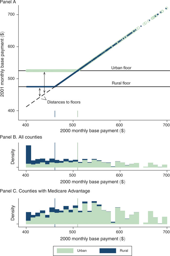
Notes: Figure illustrates the identifying variation arising from BIPA. Panel A shows county base payments before (-axis) and after (-axis) the implementation of the BIPA urban and rural payment floors in 2001. Urban counties are represented in light green and rural counties in blue. The dashed line in panel A indicates the uniform 3 percent increase that was applied to all counties between 2000 and 2001 and traces the counterfactual payment rule in absence of the floors. The distance to the floor defines our identifying payment variation and is a function of both the pre-BIPA base payment and a county’s urban rural classification. Panels B and C plot histograms of the base payments in 2000, stacking rural and urban counties and weighting by county Medicare population, for all counties (panel B) and for counties with an MA plan in at least one year of the 1997–2003 study period (panel C). All values are denominated in dollars per beneficiary per month. Base payments in this figure are not adjusted for inflation and are not normalized for the sample average demographic risk adjustment factor. The sample in the top two panels is 3,143 counties that include 100 percent of the Medicare population in 2000. The sample in the bottom is 880 counties that include 73 percent of the Medicare population in 2000.
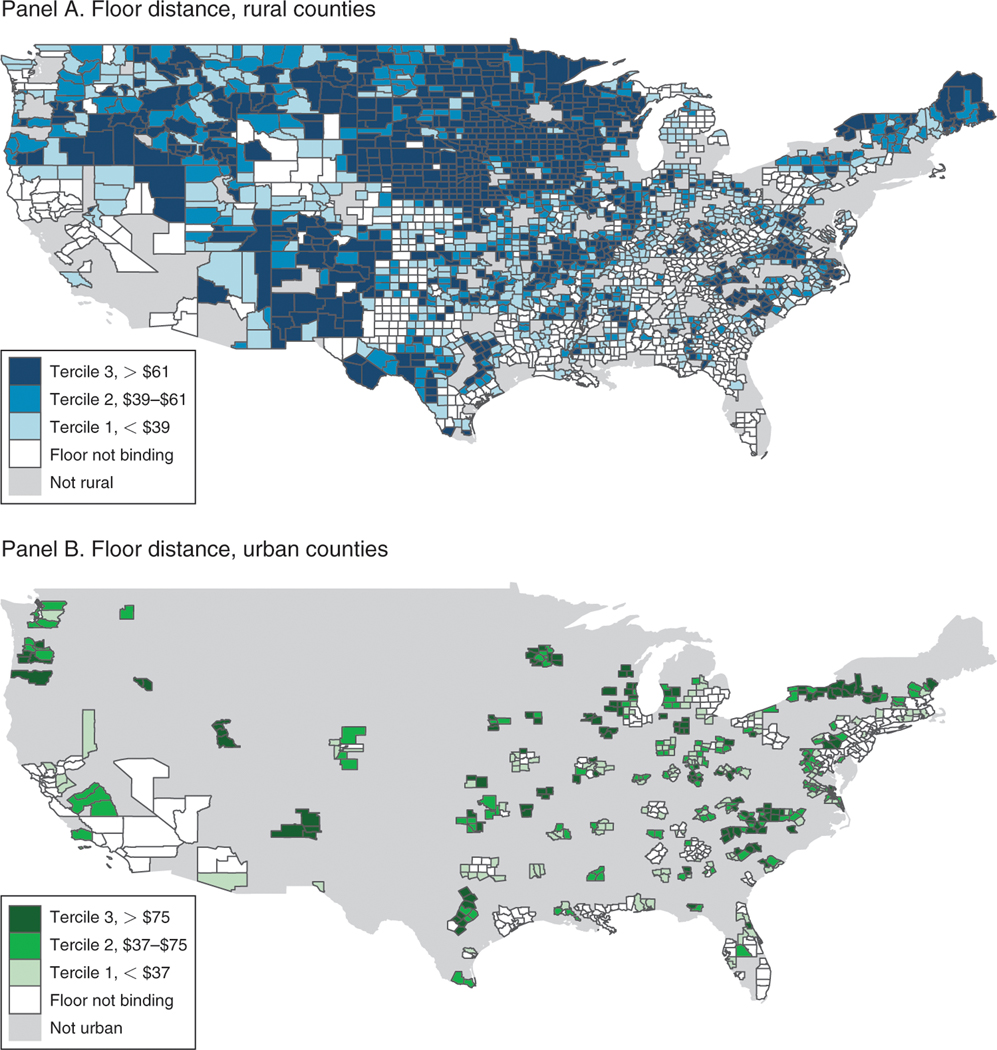
Notes: Map shows the geography of the identifying variation across urban and rural counties. Counties are binned according to their tercile of distance-to-floor, separately for rural counties (panel A) and urban counties (panel B). Legends indicate the bin ranges, and counties for which the floors were not binding are shaded white. The distance-to-floor variable, which describes the payment shock between 2000 and 2001, is defined precisely in equation (2) and is graphically illustrated in the panel A of Figure 1. Base payments in this figure are not adjusted for inflation and are not normalized for the sample average demographic risk adjustment factor. Alaska and Hawaii are excluded from these maps but included in all of the other analysis. Inclusive of AK and HI, the sample is 3,143 counties that include 100 percent of the Medicare population in 2000.
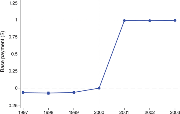
Notes: Figure shows coefficients on distance-to-the-floor × year interactions from difference-in-differences regressions with the monthly base payments as the dependent variable. The unit of observation is the county × year, and observations are weighted by the number of beneficiaries in the county. The sample is the unbalanced panel of county-years with at least one MA plan over years 1997 to 2003. This sample includes 4,262 of 22,001 possible county-years and 64 percent of all Medicare beneficiary-years. Controls include year and county fixed effects as well as flexible controls for the 1998 payment floor introduction and the blended payment increase in 2000. The capped vertical bars show 95 percent confidence intervals calculated using standard errors clustered at the county level. Year 2000, which is the year prior to BIPA implementation, is the omitted category and denoted with a vertical dashed line. Horizontal dashed lines are plotted at the reference values of 0 and 1.
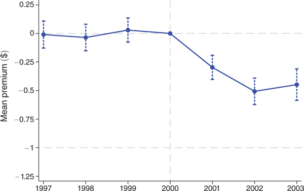
Notes: Figure shows coefficients on distance-to-floor × year interactions from difference-in-differences regressions. The first-stage results displayed in Table 3 indicate that a $1 change in distance-to-floor translates into a $1 change in the monthly payments, so we can interpret the coefficients as the effect of an increase in monthly payments on a dollar-for-dollar basis. The dependent variable is the mean monthly premiums weighted by enrollment in the plan. The unit of observation is the county × year, and observations are weighted by the number of beneficiaries in the county. The county-level measures are constructed using plan-level data weighted by plan enrollment. The sample is the unbalanced panel of county-years with at least one MA plan over years 1997 to 2003. This sample includes 4,262 of 22,001 possible county-years and 64 percent of all Medicare beneficiary-years. Controls are identical to those in Figure 3. The capped vertical bars show 95 percent confidence intervals calculated using standard errors clustered at the county level. Horizontal dashed lines are plotted at the reference values of 0 and −1, where −1 corresponds to 100 percent pass-through.
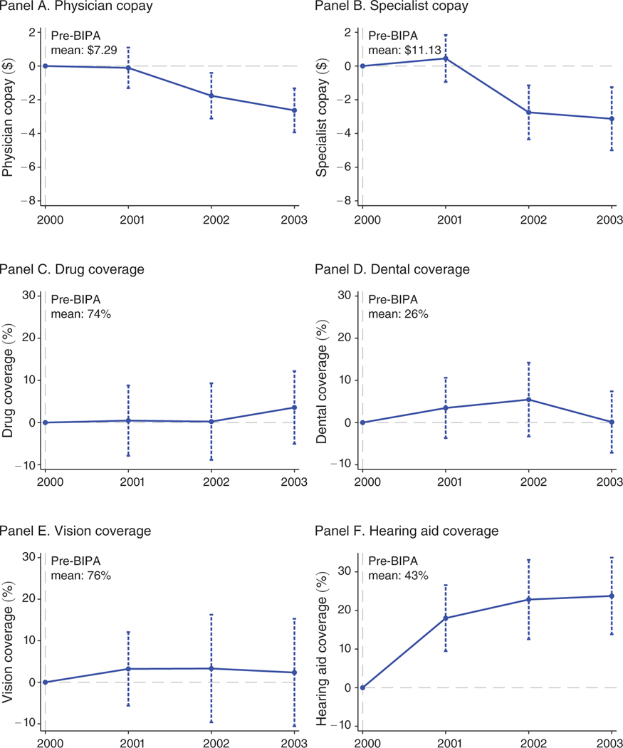
Notes: Figure shows scaled coefficients on distance-to-floor × year interactions from difference-in-differences regressions. The first-stage results displayed in Table 3 indicate that a $1 change in distance-to-floor translates into a $1 change in the monthly payments, so we can interpret the coefficients as the effect of an increase in monthly payments on a dollar-for-dollar basis. The dependent variables are physician copays in dollars (panel A), specialist copays in dollars (panel B), and indicators for coverage of outpatient prescription drugs (panel C), dental (panel D), corrective lenses (panel E), and hearing aids (panel F). The unit of observation is the county × year, and observations are weighted by the number of beneficiaries in the county. The sample is the unbalanced panel of county-years with at least one MA plan over years 2000 to 2003. This sample includes 2,250 of 12,572 possible county-years and 62 percent of all Medicare beneficiaries. Controls are identical to those in Figure 3. In panels A and B, the vertical axes measure the effect on copays in dollars of a $50 difference in monthly payments. In panels C through F, the vertical axes measure the effect on the probability that a plan offers each benefit, again for a $50 difference in monthly payments. The capped vertical bars show 95 percent confidence intervals calculated using standard errors clustered at the county level. Year 2000, which is the year prior to BIPA implementation, is the omitted category. The horizontal dashed line is plotted at 0.
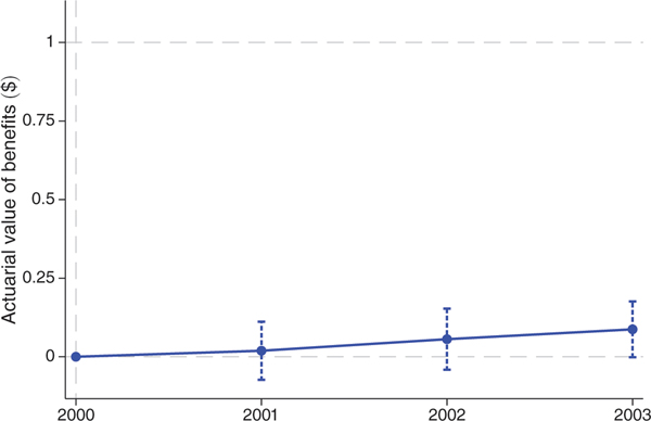
Note: Figure shows coefficients on distance-to-floor × year interactions from difference-in-differences regressions. The first-stage results displayed in Table 3 indicate that a $1 change in distance-to-floor translates into a $1 change in the monthly payments, so we can interpret the coefficients as the effect of a $1 increase in monthly payments. The dependent variable is the actuarial value of benefits, which is constructed based on observed plan benefits in our main analysis dataset and utilization and cost data from the 2000 Medical Expenditure Panel Survey. See text for full details. The unit of observation is the county × year, and observations are weighted by the number of beneficiaries in the county. The sample is the unbalanced panel of county-years with at least one MA plan over years 2000 to 2003. This sample includes 2,250 of 12,572 possible county-years and 62 percent of all Medicare beneficiaries. Controls are identical to those in Figure 3. The capped vertical bars show 95 percent confidence intervals calculated using standard errors clustered at the county level. Horizontal dashed lines are plotted at 0 and 1.
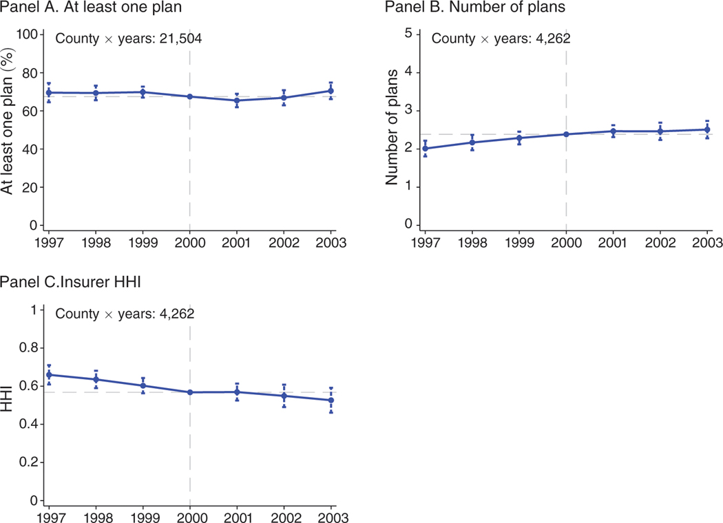
Notes: Figure shows scaled coefficients on distance-to-floor × year interactions from difference-in-differences regressions. The first-stage results displayed in Table 3 indicate that a $1 change in distance-to-floor translates into a $1 change in the monthly payments, so we can interpret the coefficients as the effect of an increase in monthly payments on a dollar-for-dollar basis. Coefficients are scaled to reflect the impact of a $50 increase in monthly payments. The dependent variable in panel A is an indicator for at least one plan. The dependent variable in panel B is the number of plans conditional on at least one plan. The dependent variable in panel C is a Herfindahl-Hirschman Index (HHI) with a scale of 0 to 1. The unit of observation is the county × year, and observations are weighted by the number of beneficiaries in the county. The sample in panel A is the balanced panel of county-years with non-missing information on base rates and Medicare beneficiaries during 1997 to 2003. This sample includes 21,504 of 22,001 county-years and more than 99.9 percent of all Medicare beneficiaries. The sample in panels B and C is the unbalanced panel of county-years with at least one MA plan over years 1997 to 2003. This sample includes 4,262 of 22,001 possible county-years and 64 percent of all Medicare beneficiary-years. Controls are identical to those in Figure 3. The capped vertical bars show 95 percent confidence intervals calculated using standard errors clustered at the county level. The horizontal dashed lines are plotted at the sample means, which are added to the coefficients.
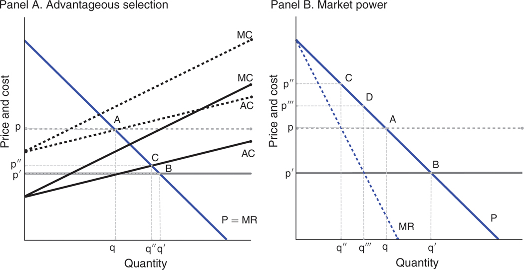
Notes: Figure shows the pass-though of an increase in monthly payments depicted by a decrease in (net) marginal costs. Panel A examines pass-through when there are perfectly competitive markets and either no selection or advantageous selection. With no selection (horizontal AC curve), a downward shift in costs translates one-for-one into a reduction in premiums, from point A to point B. With advantageous selection (upward-sloping AC curve), a downward shift in costs translates less than one-for-one into a reduction in premiums, from point A to point C. Panel B examines pass-through where there is no selection and either perfectly competitive markets or a monopolist. Points A and B are repeated from panel A. With monopolist pricing, a downward shift in costs translates less than one-for-one into a reduction in premiums, from point C to point D.
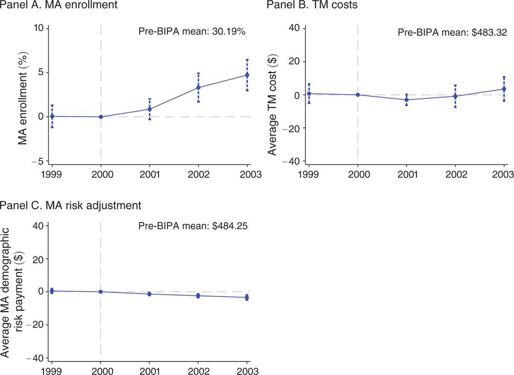
Notes: Figure shows scaled coefficients on distance-to-floor × year interactions from difference-in-differences regressions. The first-stage results displayed in Table 3 indicate that a $1 change in distance-to-floor translates into a $1 change in the monthly payments, so we can interpret the coefficients as the effect of an increase in monthly payments on a dollar-for-dollar basis. Coefficients are scaled to reflect the impact of a $50 increase in monthly payments. The dependent variables are MA enrollment (panel A), traditional Medicare costs (panel B), and mean demographic risk payments for MA enrollees (panel C). The unit of observation is the county × year, and observations are weighted by the number of beneficiaries in the county. The sample is the unbalanced panel of county-years with at least one MA plan over years 1999 to 2003. This sample includes 2,892 of 15,715 possible county-years and 63 percent of all Medicare beneficiaries. Controls are identical to those in Figure 3. The capped vertical bars show 95 percent confidence intervals calculated using standard errors clustered at the county level. The horizontal dashed lines indicate zero effects.
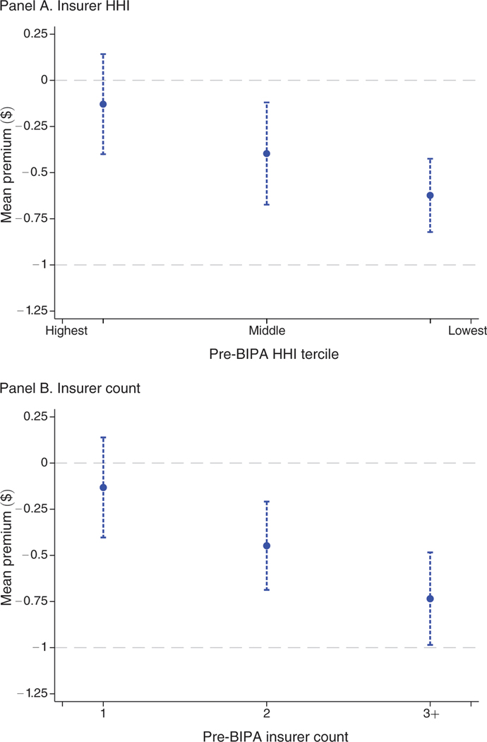
Notes: Figure shows coefficients on distance-to-floor × year 2003 interactions from several difference-in-differences regressions. The dependent variable is the mean premium defined as in Figure 4. Each point represents a coefficient from a separate regression in which the estimation sample is stratified by market concentration in the pre-BIPA period. In panel A, counties are binned according to the tercile of insurer HHI in plan year 2000. In panel B, counties are binned according to the number of insurers operating in the county in plan year 2000. Competition increases to the right of both panels. The unit of observation is the county × year, and observations are weighted by the number of beneficiaries in the county. While the analysis is conducted on segments of the data, the underlying sample is the unbalanced panel of county-years with at least one MA plan over years 1997 to 2003. This sample includes 4,262 of 22,001 possible county-years and 64 percent of all Medicare beneficiary-years. Controls are identical to those in Figure 3. The capped vertical bars show 95 percent confidence intervals calculated using standard errors clustered at the county level. Horizontal dashed lines are plotted at the reference values of 0 and −1, where −1 corresponds to 100 percent pass-through.
References
-
- Achman Lori, and Gold Marsha. 2002. “Medicare+Choice 1999–2001: An Analysis of Managed Care Plan Withdrawals and Trends in Benefits and Premiums.” New York: Commonwealth Fund.
-
- Agarwal Sumit, Souphala Chomsisengphet, Mahoney Neale, and Stroebel Johannes. 2014. “A Simple Framework for Estimating the Consumer Benefits from Regulating Hidden Fees.” Journal of Legal Studies 43 (S2) : S239–52.
-
- Agarwal Sumit, Chomsisengphet Souphala, Mahoney Neale, and Stroebel Johannes. 2015. “Regulating Consumer Financial Products: Evidence from Credit Cards.” Quarterly Journal of Economics 130 (1): 111–64.
-
- Brown Jason, Duggan Mark, Kuziemko Ilyana, and Woolston William. 2014. “How Does Risk Selection Respond to Risk Adjustment? New Evidence from the Medicare Advantage Program.” American Economic Review 104 (10) : 3335–64. - PubMed
-
- Bulow Jeremy I, and Pfleiderer Paul. 1983. “A Note on the Effect of Cost Changes on Prices.” Journal of Political Economy 91 (1) : 182–85.
MeSH terms
Grants and funding
LinkOut - more resources
Full Text Sources
Other Literature Sources