Area Dominates Edge in Pointillistic Colour
- PMID: 30140421
- PMCID: PMC6096696
- DOI: 10.1177/2041669518788582
Area Dominates Edge in Pointillistic Colour
Abstract
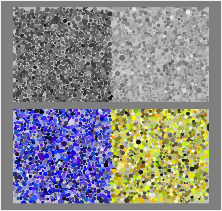
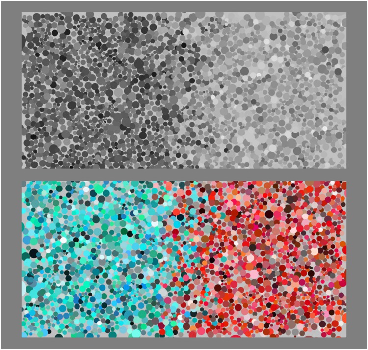
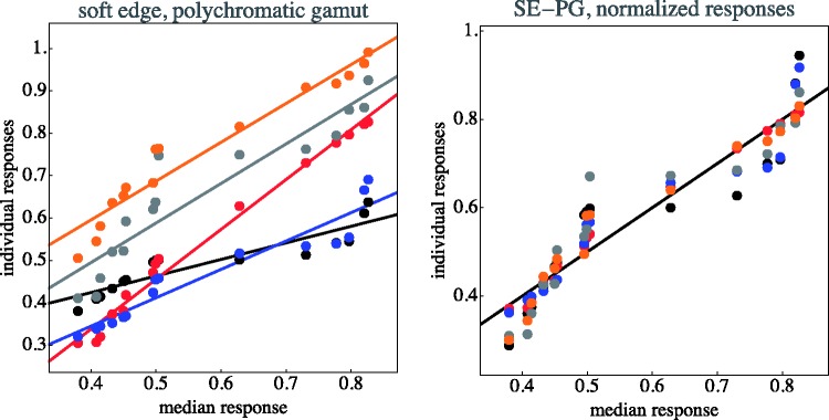
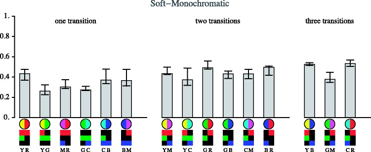
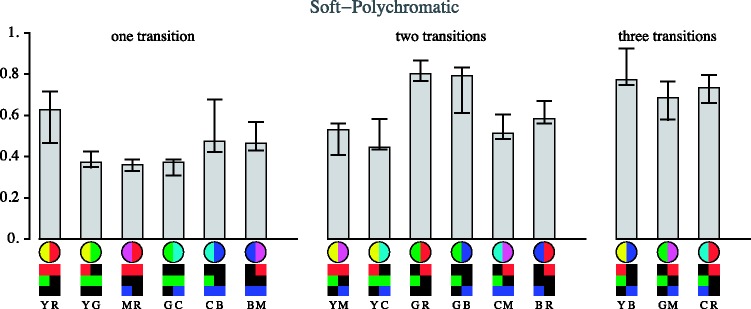
In Pointillism and Divisionism, artists moved from tonal to chromatic palettes, as Impressionism did before them, and relied on what is often called optical mixture instead of stirring paints together. The so-called optical mixture is actually not an optical mixture, but a mental blend, because the texture of the paint marks is used as a means to stress the picture plane. The touches are intended to remain separately visible. These techniques require novel methods of colour description that have to depart from standard colorimetric conventions. We investigate the distinctiveness of transitions between regions as defined through such artistic techniques. We find that the pointillist edges are not primarily defined by luminance contrast but are achieved in almost purely chromatic ways. A very simple rule suffices to predict transition distinctiveness for pairs of cardinal colours (yellow, green, cyan, blue, magenta, and red); it is simply distance along the colour circle or in the RGB cube. Distinctiveness of partition depends mainly on the colours of the regions, not the sharpness of the transition.
Keywords: Pointillism; colour; edges; macchie; textures; transitions.
Figures


Similar articles
-
Chromatic and luminance losses with multiple sclerosis and optic neuritis measured using dynamic random luminance contrast noise.Ophthalmic Physiol Opt. 2004 May;24(3):225-33. doi: 10.1111/j.1475-1313.2004.00191.x. Ophthalmic Physiol Opt. 2004. PMID: 15130171
-
Colour at edges and colour spreading in McCollough effects.Vision Res. 1999 Apr;39(7):1305-20. doi: 10.1016/s0042-6989(98)00231-4. Vision Res. 1999. PMID: 10343844
-
Chromatic properties of the colour-shading effect.Vision Res. 2005 May;45(11):1425-37. doi: 10.1016/j.visres.2004.11.023. Vision Res. 2005. PMID: 15743612
-
The role of luminance and chromatic cues in emmetropisation.Ophthalmic Physiol Opt. 2013 May;33(3):196-214. doi: 10.1111/opo.12050. Ophthalmic Physiol Opt. 2013. PMID: 23662955 Review.
-
Colour thresholding in video imaging.J Anat. 1995 Jun;186 ( Pt 3)(Pt 3):469-81. J Anat. 1995. PMID: 7559121 Free PMC article. Review.
Cited by
-
Graininess of RGB-Display Space.Iperception. 2018 Oct 23;9(5):2041669518803971. doi: 10.1177/2041669518803971. eCollection 2018 Sep-Oct. Iperception. 2018. PMID: 30430002 Free PMC article.
References
-
- Agostini T., Galmont A. (2000) Contrast and assimilation: The belongingness paradox. Reviews of Psychology 7: 3–7.
-
- (2013) Experimental phenomenology: An introduction. In: Albertazzi L. (ed.) In: Albertazzi (ed) Handbook of experimental phenomenology: Visual perception of shape, space and appearance, Chichester, England: John Wiley & Sons, Ltd, pp. 1–37. .
-
- Albertazzi L., Koenderink J., van Doorn A. (2015) Chromatic dimensions earthy, watery, airy, and fiery. Perception 44: 1153–1178. - PubMed
-
- Alman D. (1993) Industrial color difference evaluation. Color Research and Application 18: 137–139.
-
- Aurenhammer F. (1991) Voronoi diagrams – A survey of a fundamental geometric data structure. ACM Computing Surveys 23: 345–405.
LinkOut - more resources
Full Text Sources
Other Literature Sources