. 2018 Oct 8;9(1):4124.
doi: 10.1038/s41467-018-06461-1.

Biosynthetic energy cost for amino acids decreases in cancer evolution

Affiliations

Biosynthetic energy cost for amino acids decreases in cancer evolution

Hong Zhang et al. Nat Commun. .

Abstract

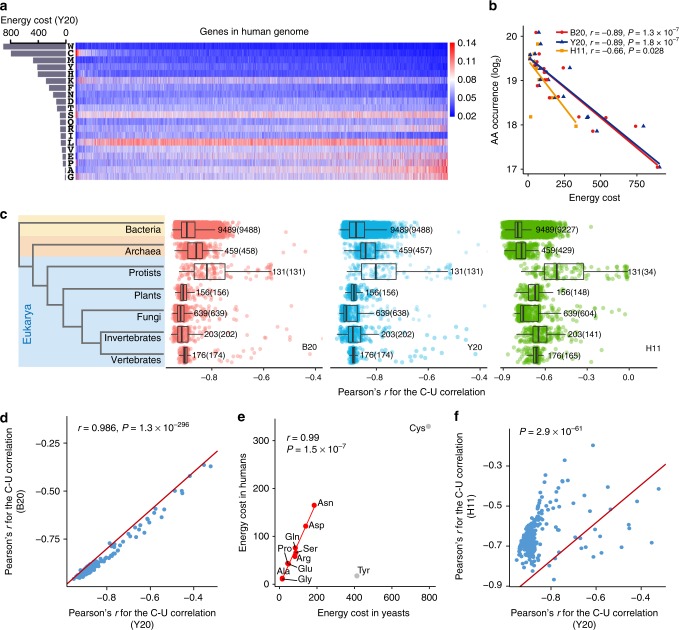
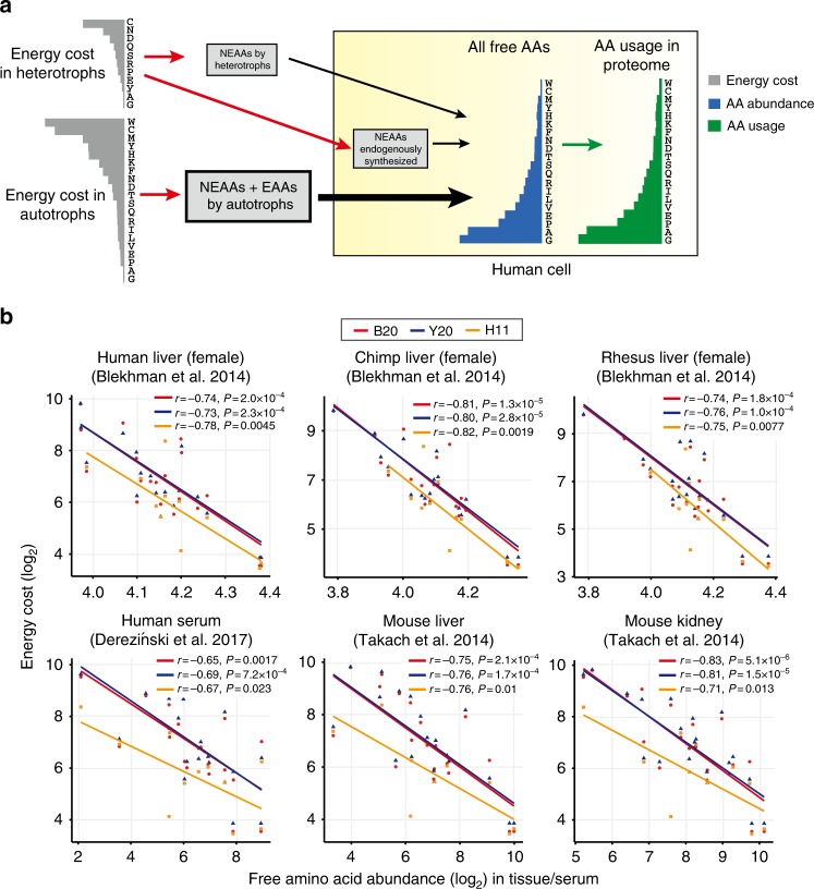
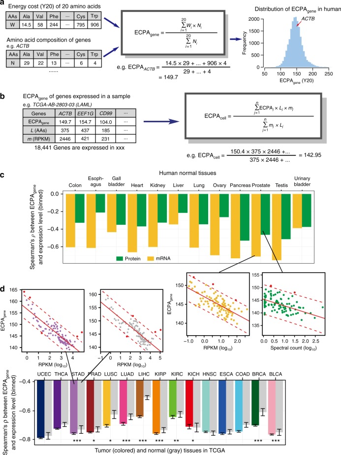
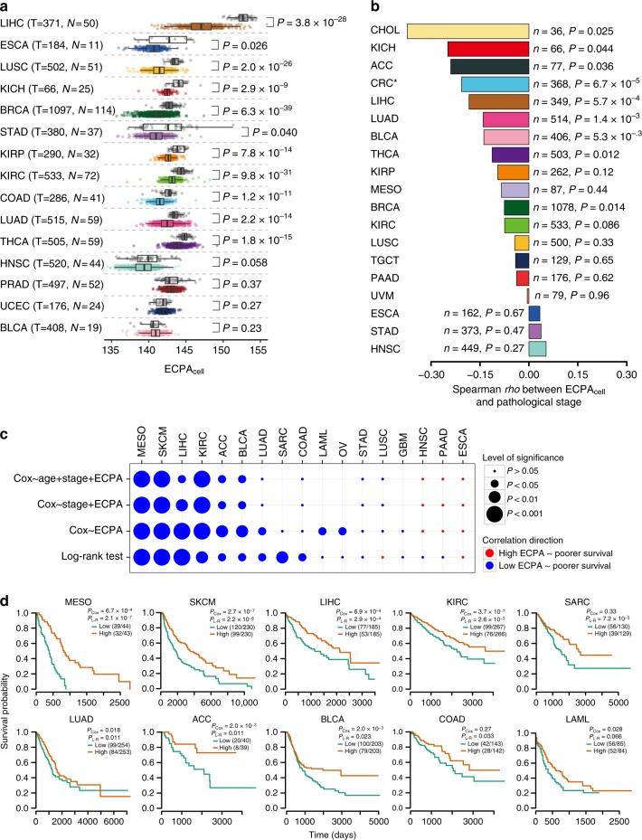
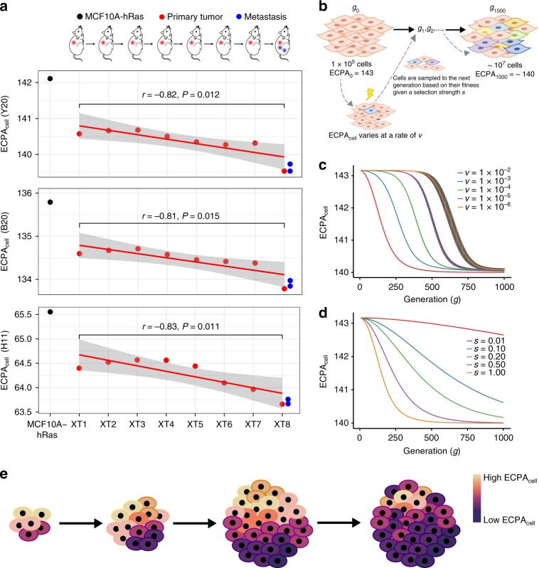
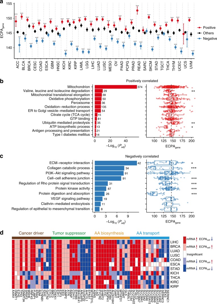
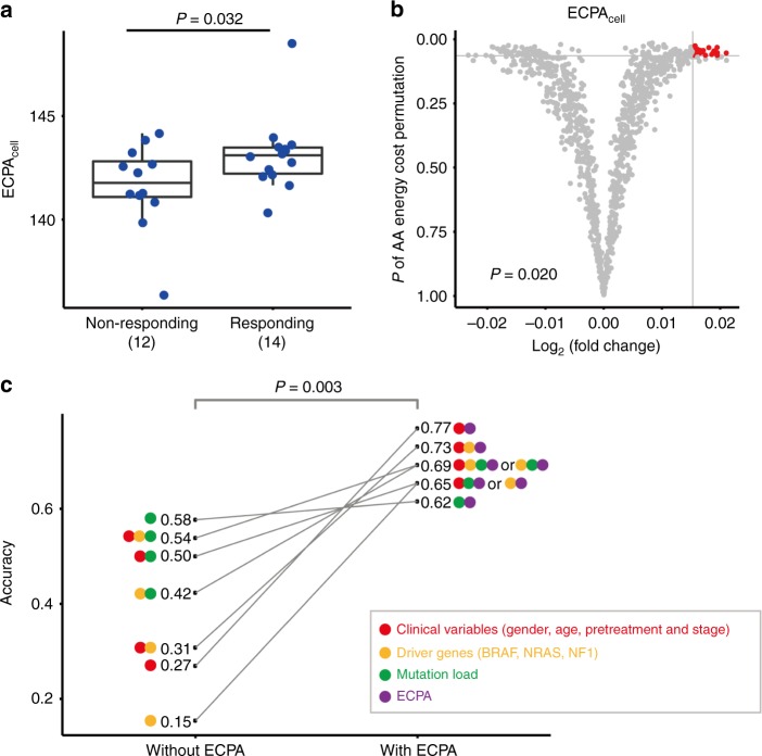
Rapidly proliferating cancer cells have much higher demand for proteinogenic amino acids than normal cells. The use of amino acids in human proteomes is largely affected by their bioavailability, which is constrained by the biosynthetic energy cost in living organisms. Conceptually distinct from gene-based analyses, we introduce the energy cost per amino acid (ECPA) to quantitatively characterize the use of 20 amino acids during protein synthesis in human cells. By analyzing gene expression data from The Cancer Genome Atlas, we find that cancer cells evolve to utilize amino acids more economically by optimizing gene expression profile and ECPA shows robust prognostic power across many cancer types. We further validate this pattern in an experimental evolution of xenograft tumors. Our ECPA analysis reveals a common principle during cancer evolution.


Conflict of interest statement

H.L. is a shareholder and on the Scientific Advisory Board for Precision Scientific Ltd. and Eagle Nebula Inc. And all authors declare no other competing interests.

Figures

Fig. 1
Fig. 1
Biosynthetic cost of AAs is correlated with AA usage in protein sequences. a Proportions of 20 AAs in human proteins. Bar plot on the left shows the biosynthetic cost of each AA (Y20). b The relationship between AA occurrences (log2) in all human protein sequences and cost of AAs (red point, blue triangle and green square for B20, Y20, and H11, respectively). Pearson’s correlation test was performed. c Boxplots showing the distribution of Pearson’s r for the C–U correlation in seven major taxonomic groups in all domains of life. Phylogenetic tree at left shows the evolutionary relationship between the seven groups. The number of species in each of the seven groups is presented and the number of species showing significant C–U anticorrelation (P< 0.05) is given in parentheses. Due to the conservation of cost metric or food chain, significant C–U anticorrelation was observed in all domains of life with three cost metrics (B20, Y20, and H11). Center line, median; box limits, upper and lower quartiles; whiskers, 1.5 times the interquartile range. d Pearson’s r for C–U correlation in animals based on Y20 (x axis) is highly correlated with the corresponding value obtained with B20 (y axis). The red line indicates where y = x. e Correlation between the biosynthetic costs of NEAAs in humans (y axis) against those in yeast (x axis). The nine AAs that can be synthesized from basic metabolites produced during glycolysis and TCA cycle (Ala, Asp, Asn, Arg, Gln, Glu, Gly, Pro, and Ser) are shown in red. The red line shows the results of the linear regression of biosynthetic costs of the nine AAs in humans against those in yeast. Biosynthesis of cysteine (Cys) and tyrosine (Tyr) depends on EAAs methionine and phenylalanine, respectively, and are displayed in gray. A significant correlation was still observed when incorporating Cys and Tyr in the analysis (Pearson’s r = 0.79 and P = 0.004 for all 11 NEAAs). f C–U anticorrelation in animals is weaker using H11 metric compared with Y20 metric (Wilcoxon’s signed-rank test, P = 3 × 10−61). The red line indicates where y = x
Fig. 2
Fig. 2
Biosynthetic cost of AAs constrains their usage in mammalian proteomes. a A model that explains anticorrelation between the usage of AAs in human proteomes and their cost in autotrophs (B20 or Y20) and heterotrophs (H11). Free AA pool in human cells comes from two sources: (1) NEAAs that are endogenously synthesized in human or other animal cells, which are constrained by H11 cost metric; and (2) AAs ultimately taken from autotrophs, which are constrained by B20 or Y20 cost metric. As a result, the total free AAs show anticorrelation with cost in heterotrophs (H11) or cost in autotrophs (B20 or Y20). Bioavailability of free AAs further shapes AA usage in human proteomes by optimizing compositions of protein sequences and expression levels of genes during evolution. b The relationship between the biosynthetic cost of AAs (B20, Y20, H11) and experimentally measured in vivo concentration of free AAs in mammalian tissues
Fig. 3
Fig. 3
Impact of ECPAgene on the expression of individual genes in normal and cancer tissues. a Schematic diagram showing the calculation of ECPAgene. For each gene, ECPAgene is the average of the biosynthetic cost of AAs weighted by the occurrence of each AA in the protein sequence. ACTB gene is used as an example. The histogram on the right shows the distribution of ECPAgene of 19,571 unique protein-coding genes in humans. b Illustration of ECPAcell calculation with mRNA-Seq data of sample TCGA-AB-2803-03 from TCGA study of acute myeloid leukemia (LAML). ECPAcell is an average of ECPAgene of all expressed genes weighted by lengths regarding encoded AAs and expression levels of those genes. c Correlations between ECPAgene and gene expression level in 12 normal human tissues with both mRNA-Seq and proteomic data available. For each tissue, genes were divided into 100 groups based on their expression levels (spectral count for proteomic data and RPKM for mRNA-Seq), and the median expression level (log10) and median ECPAgene in each group were used in the correlation analysis. Two representative correlations are magnified for more detail. d Correlations between ECPAgene and gene expression level across different cancer (colored) and normal tissues (gray) using TCGA mRNA-Seq data. For each sample of each cancer type, genes were divided into 100 groups based on their expression levels and, the median expression level and median ECPA in each group were used in the correlation analysis. Error bars indicate the 95% confidence intervals of ρ. The number of tumor and normal tissue samples for each cancer type can be found in Supplementary Table 6. For each cancer type, the significant difference in the correlation coefficient (Spearman’s ρ) between tumor and related normal samples is marked as *P < 0.05; **P < 0.01; and ***P < 0.001. Two representative correlations for tumor and normal samples of STAD are magnified for more detail
Fig. 4
Fig. 4
Clinically relevant patterns of ECPAcell across cancer types. a Boxplot showing ECPAcell of tumor samples and matched normal tissue samples in 15 cancer types for which mRNA-Seq data of > 10 normal samples were available. The number of tumor samples (T), the number of normal samples (N), and Wilcoxon’s rank-sum test P-values are displayed in the plot. Center line, median; box limits, upper and lower quartiles; whiskers, 1.5 times the interquartile range. b Bar plot showing Spearman’s correlation coefficient of ECPAcell and the pathologic stage for patients with 19 cancer types. The numbers of tumor samples (n) and Spearman’s rank correlation P-values are displayed in the plot. *Colon and rectal adenocarcinoma are merged as colorectal carcinoma (CRC) in the analysis. c Associations between ECPAcell and the patients’ survival times using either log-rank tests or Cox proportional hazards model in 17 cancer types that have ≥ 75 samples and ≥ 25% events. Sample size and results for additional cancer types are provided in Supplementary Fig. 11. Circle size indicates the significance of the correlation; color indicates correlation direction. d Kaplan–Meier plots showing the survival probability of patients with lower ECPAcell or higher ECPAcell in ten cancer types. For each cancer type, patients were divided into two equal groups based on ECPAcell of the patients’ tumor samples. P-values of log-rank and univariate Cox tests are shown
Fig. 5
Fig. 5
ECPAcell change during the evolution of a single cancer cell population. a The decreasing trend of ECPAcell during the experimental evolution of a xenograft tumor. The MCF10A-HRAS cells (in black) that were xenografted into mice for generations. XT1, XT2, …, XT8 represent the first-stage xenograft tumor, the second-stage, …, the eighth-stage (in red); two metastatic tumors were detected in the mouse carrying XT8 (in blue). P-values for linear regression of ECPAcell against generation number (XT1 to XT8) are shown. b Computational simulation setup for the evolutionary process of a single tumor cell population based on the selection of ECPAcell value of each cell in the population. c Mean ECPAcell trend of a single cancer cell population under different mutation rates v that with fixed selective strength (s = 1) throughout the simulation. d Mean ECPAcell trend of a single cancer cell population under different selective strengths s with a fixed mutation rate v = 1 × 10−6 throughout the simulation. e Cartoon showing that ECPAcell of a cancer cell population gradually decreases under selection for increased AA metabolic efficiency
Fig. 6
Fig. 6
Genes and pathways associated with ECPAcell across 31 TCGA cancer types. a Distribution of ECPAgene of the genes that had expression levels positively (red) or negatively (blue) correlated with ECPAcell among samples (FDR-adjusted P < 0.05) and the other genes (black) in each of the 31 cancer types with at least 50 samples. The number of positively or negatively correlated genes is presented in Supplementary Table 8. Error bars indicate 95% confidence intervals. Wilcoxon’s rank-sum tests were performed to compare the ECPAgene of positively or negatively correlated genes and that of the remaining genes (*P < 0.05; **P < 0.01; ***P < 0.001). b Pathways over-represented in positively correlated genes and the distribution of ECPAgene of genes in each pathway (number of genes displayed beside the bar). ECPAgene of positively correlated genes in each pathway compared to genomic background (dashed line) with Wilcoxon rank-sum tests. c Pathways over-represented in negatively correlated genes and the distribution of ECPAgene of genes in each pathway (number of genes displayed beside the bar). ECPAgene of negatively correlated genes in each pathway compared to genomic background (dashed line) with Wilcoxon’s rank-sum tests. d Examples showing differential expression of cancer drivers, tumor suppressors and genes related to AA biosynthesis or transport between tumor and normal samples with respect to their ECPAgene in the 11 cancer types that had significantly lower ECPAcell in tumors. Up- or downregulated genes are identified with t-tests at an FDR of 0.05 and displayed in red and blue, respectively. Differential expression events that contribute to the decrease or increase of ECPAcell in tumors are displayed with dark and light color, respectively. Insignificant events are shown in white. For box plots, center line, median; box limits, upper and lower quartiles; whiskers, 1.5 times the interquartile range
Fig. 7
Fig. 7
The predictive power of ECPAcell for response to anti-PD-1 immunotherapy. a Comparison of ECPAcell between responding (14 patients) and non-responding (12 patients) groups diagnosed with melanoma. One-sided t-test P-value is shown. Center line, median; box limits, upper and lower quartiles; whiskers, 1.5 times the interquartile range. b Volcano plots showing how P-values and ECPAcell differences (responding/non-responding) for the two-group comparison of ECPAcell are distributed given 1000 permutations, where the biosynthetic energy costs of 20 AAs were randomly shuffled. The gray horizontal and vertical lines indicate the P-value and the fold-change observed from the true ECPAcell. The red dots falling in the upper-right corner of the gray lines represent random cases that are better than the true values shown in a. Empirical P-value (P = 0.02) was estimated using the number of red dots divided by the total number of permutation tests. c Comparison of predictive power between the models with and without ECPAcell using random forests with leave-one-out cross-validation. In addition to ECPAcell (purple circle), three groups of candidate features were used: clinical variables (red circle), mutation status of melanoma driver genes (yellow circle) and mutation load (green circle). The P-value (0.003) was calculated by paired t-test between the models with and without ECPAcell as the candidate feature. The paired models are linked by the solid gray lines

References

    1. Wu Chung-I, Wang Hurng-Yi, Ling Shaoping, Lu Xuemei. The Ecology and Evolution of Cancer: The Ultra-Microevolutionary Process. Annual Review of Genetics. 2016;50(1):347–369. doi: 10.1146/annurev-genet-112414-054842. - DOI - PubMed
    1. Nowell PC. The clonal evolution of tumor cell populations. Science (New York, N. Y.) 1976;194:23. doi: 10.1126/science.959840. - DOI - PubMed
    1. McGranahan N, Swanton C. Clonal heterogeneity and tumor evolution: past, present, and the future. Cell. 2017;168:613–628. doi: 10.1016/j.cell.2017.01.018. - DOI - PubMed
    1. Vogelstein B, et al. Cancer genome landscapes. Science (New York, N. Y.) 2013;339:1546. doi: 10.1126/science.1235122. - DOI - PMC - PubMed
    1. Cancer Genome Atlas Research, N.. et al. The Cancer Genome Atlas Pan-Cancer analysis project. Nat. Genet. 2013;45:1113–1120. doi: 10.1038/ng.2764. - DOI - PMC - PubMed

Publication types