
The chromatin accessibility landscape of primary human cancers

M Ryan Corces et al. Science. .

Abstract

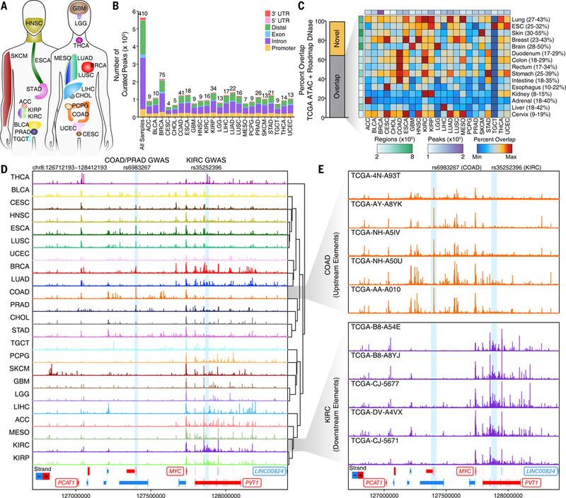
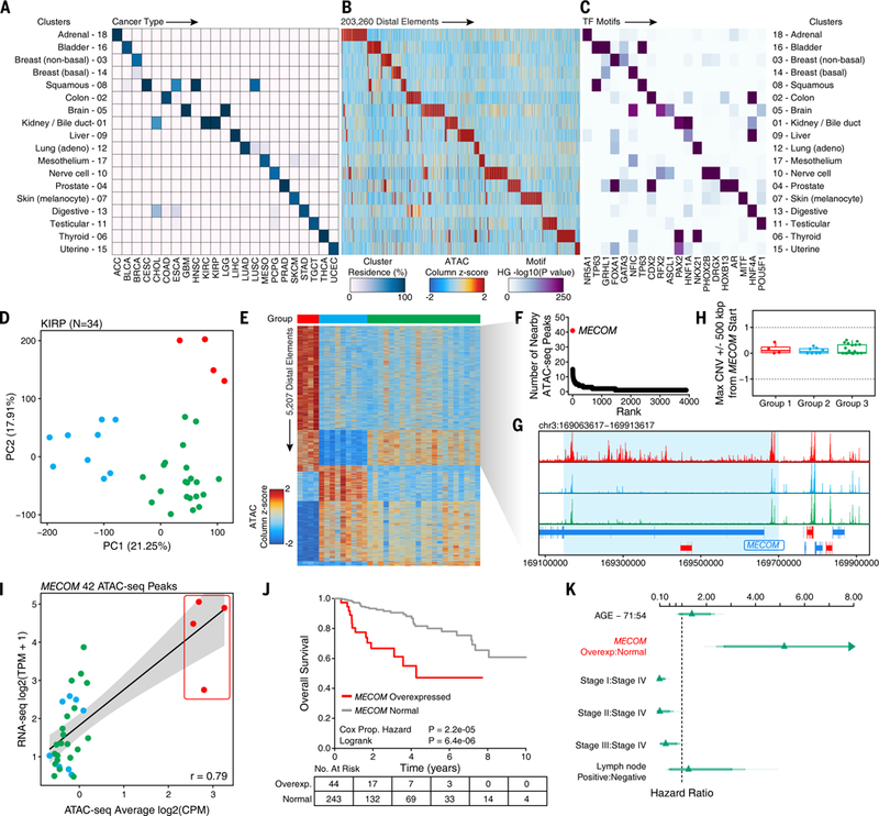
We present the genome-wide chromatin accessibility profiles of 410 tumor samples spanning 23 cancer types from The Cancer Genome Atlas (TCGA). We identify 562,709 transposase-accessible DNA elements that substantially extend the compendium of known cis-regulatory elements. Integration of ATAC-seq (the assay for transposase-accessible chromatin using sequencing) with TCGA multi-omic data identifies a large number of putative distal enhancers that distinguish molecular subtypes of cancers, uncovers specific driving transcription factors via protein-DNA footprints, and nominates long-range gene-regulatory interactions in cancer. These data reveal genetic risk loci of cancer predisposition as active DNA regulatory elements in cancer, identify gene-regulatory interactions underlying cancer immune evasion, and pinpoint noncoding mutations that drive enhancer activation and may affect patient survival. These results suggest a systematic approach to understanding the noncoding genome in cancer to advance diagnosis and therapy.


Figures

Fig. 1.
Fig. 1.. Pan-cancer ATAC-seq of TCGA samples identifies diverse regulatory landscapes.
(A) Diagram of the 23 cancer types profiled in this study. Colors are kept consistent throughout the manuscript. Abbreviations are defined in Data S1. (B) Pan-cancer peak calls from ATAC-seq data. Peak calls from each cancer type are shown individually in addition to the 562,709 peaks that represent the pan-cancer merged peak set. Color indicates the type of genomic region overlapped by the peak. The numbers shown above each bar represent the number of samples profiled for each cancer type. (C) Overlap of cancer type-specific ATAC-seq peaks with Roadmap DNase-seq peaks from various tissues and cell types. Left, the percent of ATAC-seq peaks that are overlapped by one or more Roadmap peaks. Right, a heatmap of the percent overlap observed for each ATAC-seq peak set within the Roadmap DNase-seq peak set. Colors are scaled according to the minimum and maximum overlaps which are indicated numerically to the right of the DNase-seq peak set names. The total number of ATAC-seq peaks (white-to-purple) or Roadmap DNase-seq regions (white-to-green) are shown colorimetrically. (D) Normalized ATAC-seq sequencing tracks of all 23 cancer types at the MYC locus. Each track represents the average accessibility per 100-bp bin across all replicates. Known GWAS SNPs rs6983267 (COAD, PRAD) and rs35252396 (KIRC) are highlighted with blue boxes. Region shown represents chr8:126712193–128412193. (E) Normalized ATAC-seq sequencing tracks of 5 different colon cancer samples (top, orange) and kidney renal clear cell cancer samples (bottom, purple) shown across the same MYC locus as in Figure 1D. Known GWAS SNPs rs6983267 (COAD, PRAD) and rs35252396 (KIRC) are highlighted with blue boxes. Region shown represents chr8:126712193–128412193.
Fig. 2.
Fig. 2.. Chromatin accessibility profiles reveal distinct molecular subtypes of cancers.
(A) Pearson correlation heatmaps of ATAC-seq distal elements (left), ATAC-seq promoters (middle), and RNA-seq of all genes (right). Clustering orientation is dictated by the ATAC-seq distal element accessibility and all other heatmaps use this same clustering orientation. Color scale values vary between heatmaps. Promoter peaks are defined as occurring between −1000 bp and +100 bp of a transcriptional start site. Distal peaks are all non-promoter peaks. The total number of features used for correlation is indicated above each Pearson correlation heatmap. (B) Unsupervised t-distributed stochastic neighbor embedding (t-SNE) on the top 50 principal components for the 250,000 most variable peaks across all cancer types. Each dot represents the merge of all technical replicates from a given sample. Color represents the cancer type shown above the plot. (C) Cluster residence heatmap showing the percent of each TCGA iCluster that overlaps with each ATAC-seq-based cluster. (D) ATAC-seq t-SNE clusters shown on the PanCanAtlas iCluster TumorMap. Each hexagon represents a cancer patient sample and the positions of the hexagons are computed from the similarity of samples in the iCluster latent space. The color and larger size of the hexagon indicates the ATAC-seq cluster assignment. Samples that were not included in the ATAC-seq analysis are represented by smaller grey-colored hexagons. The text labels indicate the cancer disease type. (E) Variation of information analysis of clustering schemes derived using various data types from TCGA.
Fig. 3.
Fig. 3.. ATAC-seq clusters cancer samples to show cancer- and tissue-specific drivers.
(A) Cluster residence heatmap showing the percent of samples from a given cancer type that reside within each of the 18 annotated ATAC-seq clusters. (B) Heatmap showing the ATAC-seq accessibility at distal elements (N=203,260) identified to be cluster-specific by distal binarization. (C) Enrichment of TF motifs in peak sets identified in Figure 3B. Enrichment is determined by a hypergeometric test –log10(p-value) of the motif’s representation within the cluster-specific peaks compared to the pan-cancer peak set. Transcription factors shown represent a manually trimmed set of factors whose expression is highly correlated (R > 0.4) with the accessibility of the corresponding motif. Color represents the –log10(p-value) of the hypergeometric test. (D) Principal component analysis of the top 25,000 distal ATAC-seq peaks within the KIRP cohort (N=34 samples). Each dot represents an individual sample. The color of the dots represents k-means clustering (k=3 by gap statistic). (E) Distal binarization analysis based on the three k-means-defined groups identified and shown (by color) in Figure 3D. (F) Dot plot showing the number of nearby ATAC-seq peaks per gene from the Group 1 distal binarization. Each dot represents a different gene. The MECOM (aka EVI1) gene is highlighted in red. (G) Normalized average sequencing tracks of k-means-defined Group 1, 2, and 3 at the MECOM locus. Peaks specific to Group 1 are highlighted by a light blue box. (H) DNA copy number data at the MECOM locus in the 3 k-means-defined groups. Each dot represents an individual sample. (I) Average chromatin accessibility at peaks near the MECOM gene (N=42 peaks) and RNA-seq gene expression of MECOM in KIRP samples (N=34 samples). Each dot represents an individual donor. Dots are colored according to the clustering group colors shown in Figure 3D. (J) Kaplan-Meier analysis of overall survival of all KIRP donors in TCGA (N=287) stratified by MECOM overexpressed (N=44) and normal MECOM expression (N=243). (K) Hazard plot of risk of dying from KIRP based on multiple covariates including MECOM expression (HR=5.2, 95% confidence interval = 2.4 – 11.0). Lines represent 95% confidence intervals.
Fig. 4.
Fig. 4.. Footprinting analysis identifies distinct classes of transcription factor activities in cancer.
(A) Schematic illustrating the dynamics of transcription factor binding and Tn5 insertion. (B) Classification of TFs by the correlation of their RNA expression to the footprint depth and flanking accessibility of their motifs. Color represents whether the depth (red), flank (blue), or both (purple) are significantly correlated to TF expression below an FDR cutoff of 0.1. Each dot represents an individual deduplicated TF motif (see methods). (C) Transcription factor footprinting of the TP63 motif (CIS-BP M2321_1.02) in lung cancer samples from the squamous (cluster 8) or adenocarcinoma (cluster 12) subtype. The Tn5 insertion bias track of TP63 motifs is shown below. (D) Dot plots showing the footprint depth and flanking accessibility of TP63 motifs across all lung cancer samples studied. Each dot represents a unique sample. Color represents cancer type (top), RNA-seq gene expression (middle), or methylation beta value (bottom). Samples without matching RNA or methylation data are shown in grey. (E) Transcription factor footprinting of the NKX2–1 motif (CIS-BP M6374_1.02) in lung squamous (cluster 8) and lung adenocarcinoma (cluster 12) cell carcinoma samples. The Tn5 insertion bias of the NKX2–1 motif is shown below. (F) Dot plots showing the footprint depth and flanking accessibility of NKX2–1 motifs across all lung cancer samples studied. Each dot represents a unique sample. Color represents cancer type (top), RNA-seq gene expression (middle), or methylation beta value (bottom). Samples without matching RNA or methylation data are shown in grey.
Fig. 5.
Fig. 5.. In silico linking of ATAC-seq peaks to genes.
(A) Schematic of the in silico approach used to link ATAC-seq peaks in distal noncoding DNA elements to genes via correlation of chromatin accessibility and RNA expression. (B) Heatmap representation of the 81,323 unique peak-to-gene links predicted. Each row represents an individual link between one ATAC-seq peak and one gene. Color represents the relative ATAC-seq accessibility (left) or RNA-seq gene expression (right) for each link as a z-score. (C) Dot plot of the ATAC-seq accessibility and RNA-seq gene expression of a peak-to-gene link located 164 kbp away from the transcription start site of the BCL2 gene (peak 498895) that is predicted to regulate its expression. Color represents the cancer type. Each dot represents an individual sample. (D) Same as in Figure 5C but for a peak that is located 49 kbp away from the SRC gene (peak 525295). (E) Same as in Figure 5C but for a peak that is located 93 kbp away from the PPARG gene (peak 98874). (F) Same as in Figure 5C but for a peak that is located 58 kbp away from the ERBB3 gene (peak 381116). (G) Bar plot showing the number of predicted links that were filtered for various reasons. First, regions whose correlation is driven by DNA copy number amplification were excluded (“CNA”). Next, regions of high local correlation were filtered out (“Diffuse”). Lastly, peak-to-gene links where the peak overlapped a promoter region were excluded (“Promoter”). (H) Distribution of the distance of each peak to the transcription start site of the linked gene. (I) Distribution of the number of peaks linked per gene. (J) Distribution of the number of genes linked per peak. (K) Distribution of the number of genes “skipped” by a peak in order to reach its predicted linked gene.
Fig. 6.
Fig. 6.. Validation of long-range gene regulation of cancer in peak-to-gene links.
(A) Schematic of CRISPRi experiments performed. Each experiment uses 3 guide RNAs to target an individual peak. The effect of this perturbation on the expression of the linked gene is determined using qPCR. (B) Gene expression changes by qPCR after CRISPRi of peaks predicted to be linked to the BCL2 (peak 498895) and SRC (peak 525295) genes in MCF7 and MDA-MB-231 cells. Error bars represent the standard deviation of 4 technical replicates. *** p < 0.001 by two-tailed t-test. (C) Meta-virtual 4C plot of predicted BRCA-specific peak-to-gene links with distances greater than 100 kbp. HiChIP interaction frequency is shown for the MDA-MB-231 basal breast cancer cell line as well as multiple populations of primary T cells. (D) Bar plot showing the overlap of predicted ATAC-seq-based peak-to-gene links and DNA methylation-based ELMER predicted probe-to-gene links in BRCA, as a percentage of all ATAC-seq-based peak-to-gene links with a peak overlapping a methylation probe. The percentage of peak-to-gene links overlapping an ELMER probe-to-gene link (34.9%) is compared to the overlap with 1,000 sets of randomized ELMER probe-to-gene links (3.6 +/− 0.6%, p << 0.001). (E) Virtual 4C plot of the peak-to-gene link between rs4322801 and the OSR1 gene. Normalized HiChIP interaction signal is shown for the MDA-MB-231 basal breast cancer cell line as well as multiple populations of primary T cells using the colors shown in Figure 6C. ATAC-seq sequencing tracks are shown below for 4 BRCA samples and MDA-MB-231 cells with increasing levels of OSR1 gene expression. The rs4322801 SNP (left) and OSR1 gene (right) are highlighted by light blue boxes. Region shown represents chr2:18999999−19425000. (F) Diagram of the hematopoietic differentiation hierarchy with differentiated cells colored as either B cells (green), T/NK cells (blue), or myeloid cells (red). (G) Schematic of the analysis shown in Figure 6H. Peak-to-gene links are classified as related to immune infiltration if their accessibility is higher in immune cells than TCGA cancer samples and they are highly correlated to cytolytic activity. (H) Dot plot showing ATAC-seq peak-to-gene links with relevance to immune infiltration. Each dot represents an individual peak with a known gene link. Peaks that are related to immune cells have higher ATAC-seq accessibility in immune cell types compared to TCGA cancer samples. Peaks related to immune infiltration have a higher correlation to cytolytic activity. Color represents the cell type of the observation. The vertical dotted line represents the mean + 2.5 standard deviations above the mean for all ATAC-seq peak correlations to the cytolytic activity. Red box indicates peak-to-gene links that are predicted to be related to immune infiltration. Blue box indicates peak-to-gene links that are not predicted to be related to immune infiltration. (I) Violin plots of the distribution of Spearman correlations across all peak-to-gene links predicted to be related to immune infiltration (red) or not (blue) with various metrics of tumor purity. (J) Normalized ATAC-seq sequencing tracks of the PDL1 gene locus in 6 samples with variable levels of expression of the PDL1 gene (right). Predicted links (red) are shown below for 4 peak-to-gene links (L1–4, peaks 293734, 293735, 293736, and 293740 respectively) to the promoter of PDL1. One of these peak-to-gene links (L2) overlaps an alternative start site for PDL1 and was therefore labeled as a “promoter” peak during filtration. This peak-to-gene link was added to this analysis after manual observation. Region shown represents chr9:5400502−5500502. (K) Heatmap representation of the ATAC-seq chromatin accessibility of the 5000-bp region centered at each of the 4 peak-to-gene links shown in Figure 6J. Each row represents a unique donor (N=373) ranked by PDL1 expression. The correlation of the chromatin accessibility of each peak with the expression of PDL1 is shown below the plot. Color represents normalized accessibility. (L) Gene expression changes by qPCR after CRISPRi of peaks predicted to be linked to the PDL1 gene in MCF7 and MDA-MB-231 cells. Error bars represent the standard deviation of 4 technical replicates. *** p < 0.0001, * p < 0.05 by two-tailed t-test.
Fig. 7.
Fig. 7.. Integration of WGS and ATAC-seq identifies cancer-relevant regulatory mutations.
(A) Schematic of how functional variants are identified in regulatory elements. Example shown depicts the TERT promoter. (B) Dot plot of the difference in variant allele frequency of ATAC-seq and WGS and the changes in chromatin accessibility caused by the given variant with respect to other samples of the same cancer type. Variants with a higher variant allele frequency in ATAC-seq than WGS would be expected to cause an increase in accessibility. Each dot represents an individual somatic mutation. (C) Normalized ATAC-seq and RNA-seq of thyroid cancer samples profiled in this study. Each dot represents an individual donor. Blue dot represents the sample with a TERT promoter mutation shown in Figure 7B. Other thyroid cancer samples known to harbor a TERT promoter mutation were excluded from this plot. The hinges of the box represent the 25th to 75th percentile. (D) Normalized ATAC-seq and RNA-seq of bladder cancer samples profiled in this study. Each dot represents an individual donor. Purple dot represents the sample with a mutation upstream of the FGD4 gene shown in Figure 7B. The hinges of the box represent the 25th to 75th percentile. (E) Comparison of wildtype and mutant reads in WGS and ATAC-seq data at the TERT promoter and FGD4 upstream region. (F) Normalized ATAC-seq sequencing tracks of the FGD4 locus in the 10 bladder cancer samples profiled in this study, including the one sample with a mutation predicted to generate a de novo NKX motif (TCGA-BL-A13J). Locus shown represents chr12:32335774−32435774. The mutation position is indicated by a black dotted line. The predicted enhancer region surrounding this mutation is highlighted by a blue box. (G) Difference in motif score in the wildtype and mutant FGD4 upstream region. Motif score represents the degree of similarity between the sequence of interest and the relevant motif. Each dot represents an individual motif. (H) Overlay of the NXK2–8 motif (CIS-BP M6377_1.02) and the wildtype and mutant sequences of the FGD4 upstream region. (I) Kaplan-Meier survival analysis of TCGA bladder cancer patients with high (top 33%) and low (bottom 33%) expression for the FGD4 gene.

Comment in

  • The chromatin of cancer.
    Taipale J. Taipale J. Science. 2018 Oct 26;362(6413):401-402. doi: 10.1126/science.aav3494. Science. 2018. PMID: 30361360 No abstract available.
  • Cancer chromatin accessed.
    Trenkmann M. Trenkmann M. Nat Rev Genet. 2019 Jan;20(1):5. doi: 10.1038/s41576-018-0075-1. Nat Rev Genet. 2019. PMID: 30429584 No abstract available.
  • Cancer chromatin accessed.
    Trenkmann M. Trenkmann M. Nat Rev Cancer. 2019 Jan;19(1):7. doi: 10.1038/s41568-018-0088-2. Nat Rev Cancer. 2019. PMID: 30487581 No abstract available.

References

    1. Hutter C, Zenklusen JC, The Cancer Genome Atlas: Creating Lasting Value beyond Its Data. Cell. 173, 283–285 (2018). - PubMed
    1. Flavahan WA, Gaskell E, Bernstein BE, Epigenetic plasticity and the hallmarks of cancer. Science. 357, 1–8 (2017). - PMC - PubMed
    1. Hanahan D, Weinberg RA, Hallmarks of Cancer : The Next Generation. Cell. 144, 646–674 (2011). - PubMed
    1. Egeblad M, Nakasone ES, Werb Z, Tumors as organs: Complex tissues that interface with the entire organism. Dev. Cell. 18, 884–901 (2010). - PMC - PubMed
    1. Zhou W et al., DNA methylation loss in late-replicating domains is linked to mitotic cell division. Nat. Genet. 50, 591–602 (2018). - PMC - PubMed

Publication types