. 2018 Dec 19;64(1):015006.
doi: 10.1088/1361-6560/aaf307.

Generalized breast density metrics

Affiliations

Generalized breast density metrics

Erin E E Fowler et al. Phys Med Biol. .

Abstract

Mammograms represent data that can inform future risk of breast cancer. Data from two case-control study populations were analyzed. Population 1 included women (N = 180 age matched case-control pairs) with mammograms acquired with one indirect x-ray conversion mammography unit. Population 2 included women (N = 319 age matched case-control pairs) with mammograms acquired from 6 direct x-ray conversion units. The Fourier domain was decomposed into n concentric rings (radial spatial frequency bands). The power in each ring was summarized giving a set of measures. We investigated images in raw, for presentation (processed) and calibrated representations and made comparison with the percentage of breast density (BD) determined with the operator assisted Cumulus method. Breast cancer associations were evaluated with conditional logistic regression, adjusted for body mass index and ethnicity. Odds ratios (ORs), per standard deviation increase derived from the respective breast density distributions and 95% confidence intervals (CIs) were estimated. A measure from a lower radial frequency ring, corresponding 0.083-0.166 cycles mm-1 and BD had significant associations with risk in both populations. In Population 1, the Fourier measure produced significant associations in each representation: OR = 1.76 (1.33, 2.32) for raw; OR = 1.43 (1.09, 1.87) for processed; and OR = 1.68 (1.26, 2.25) for calibrated. BD also provided significant associations in Population 1: OR = 1.72 (1.27, 2.33). In Population 2, the Fourier measure produced significant associations for each representation as well: OR = 1.47 (1.19, 1.80) for raw; OR = 1.38 (1.15, 1.67) for processed; and OR = 1.42 (1.15, 1.75) for calibrated. BD provided significant associations in Population 2: OR = 1.43 (1.17, 1.76). Other coincident spectral regions were also predictive of case-control status. In sum, generalized breast density measures were significantly associated with breast cancer in both FFDM technologies.


Conflict of interest statement

Conflicts of interest

The authors have patents and pending patent applications in related work.

Figures

Figure 1.
Figure 1.
Fourier Ring Architecture Illustration: This shows the ring layout in the two-dimensional Fourier plane. We use a relatively coarse ring-width example with n = 11 for illustrative purposes. Cartesian spatial frequency coordinates are referenced as (fx, fy). The highest resolvable special frequency, fc (red), is applicable to both frequency directions. This also shows a radial frequency variable defined as fr (green). The radial width of a given ring is given by fcn=fc11 cycles/mm. Each ring corresponds to a specific radial frequency band. Ring labeling starts at r = 0 (center disk) to r = n-1= 10 (inner border of the outer ring); rings are gray shaded, where the inner ring is white and regions exterior to the last ring are black. The radial frequency bounds for the rth ring are expressed as r×ε for the inner ring border and (r+1) × ε for the outer ring border; in this, example fr points to the inner boundary of the fourth ring that is 4×ε from the origin. This mask is used as an overlay for the frequency spectrum of a given mammogram. Summing over the spectrum within each ring area produces n = 11 measures in this example designated as Pr. The portion of the spectrum exterior to the last ring (black), where fr > n × ε = 11× ε, is referred to as the corners; the sum over this area produces an additional measure.
Figure 2.
Figure 2.
Region of Interest Algorithm Illustration: (a) this shows a typical mammogram; (b) this shows the segmented breast area; (c) this shows 6 color coded rectangles inscribed with the breast region selected from approximately 3000 possible rectangles; and (d) this shows the breast area for all possible rectangles as function of their x-dimension with the 6 selected color-coded rectangles marked with color-coded dots. The horizontal line marks 0.67 × AL and the vertical line marks the detected rectangle (black point).
Figure 3.
Figure 3.
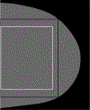
Region of Interest Algorithm Output: This shows the box algorithm output for the rectangle for the mammogram shown in Figure 2 with approximately the largest area outlined (black border) and the final box used in the analysis with the margins trimmed (white border).
Figure 4.
Figure 4.
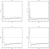
Ring Analyses for Population 1: This shows the ring analysis for P applied to images acquired with the Senographe 2000D FFDM unit for the raw on the left and for presentation (proc) images on the right. The spectrum was divided into 61 rings (bands) and the corners. Top plots give the p-values for each band; dashed lines mark 0.05 and 0.02 significance levels for reference in each plot. The bottom plots show the associated t-statics. The dashed line marks where the t-statistic = 0 in each plot; points above this line indicate the measure from the group exhibited stochastic dominance.
Figure 5.
Figure 5.
Normalized Ring Analyses for Population 1. This shows the ring analysis for p (normalized) applied to images acquired with the Senographe 2000D FFDM unit for the raw on the left and processed images on the right. The spectrum was divided into 61 rings (bands) and the corners. Top plots give the p-values for each band; the dashed lines mark the 0.05 and 0.02 significance levels for reference in each plot. The bottom plots show the associated t-statistics. The dashed line marks where the t-statistic = 0; points above this line indicate the measure from the case group exhibited stochastic dominance.
Figure 6.
Figure 6.
Ring Analyses for Population 2: This shows the ring analysis for P applied to images acquired with the Hologic units for the raw on the left and for processed images on the right. The spectrum was divided into 86 rings (bands) and the corners. Top plots give the p-values for each band; dashed lines mark the 0.05 and 0.02 significance levels for reference in each plot. The bottom plots show the associated t-statistics. The dashed line marks the t-statistic = 0; points above this line indicate the case group measure exhibited stochastic dominance.
Figure 7.
Figure 7.
Normalized Ring Analyses for Population 2. This shows the ring analysis for p (normalized) applied to images acquired with the Hologic for the raw on the left and processed images on the right. The spectrum was divided into 86 rings (bands) and the corners. Top plots give the p-values for each band; dashed lines mark 0.05 and 0.02 significance levels for reference in each plot. The bottom plots show the associated t-statistics. The dashed line marks where the t-statistic = 0; points above this line indicate the measure from the case group exhibited stochastic dominance.
Figure 8.
Figure 8.
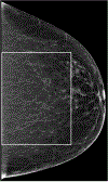
Mammogram Illustration: This shows a processed (for presentation) mammogram used for viewing purposes with the rectangular region of interest outlined.
Figure 9.
Figure 9.
Structure Captured by Select Spatial Frequency Bands: Regions in the top row correspond to the outlined region in Figure 8. These images show the structure captured by various frequency bands that were common across populations determined without the Hanning window application. The image on the top-left shows structure captured by P1. The image in the top-middle shows structure captured in rings16–34 and the image on the top-right shows structure captured in rings 25–60. The respective corresponding bands in the Fourier plane are illustrated in the bottom row, where the passbands are illustrated in white. The Fourier plane corresponds to Figure 1.

Similar articles

Cited by

References

    1. Boyd NF, Martin LJ, Yaffe MJ, and Minkin S, “Mammographic density and breast cancer risk: current understanding and future prospects,” Breast cancer research: BCR, vol. 13, no. 6, pp. 223, 2011. - PMC - PubMed
    1. McCormack VA, and dos Santos Silva I, “Breast density and parenchymal patterns as markers of breast cancer risk: a meta-analysis,” Cancer Epidemiol Biomarkers Prev, vol. 15, no. 6, pp. 1159–69, June, 2006. - PubMed
    1. Huo CW, Chew GL, Britt KL, Ingman WV, Henderson MA, Hopper JL, and Thompson EW, “Mammographic density-a review on the current understanding of its association with breast cancer,” Breast Cancer Res Treat, vol. 144, no. 3, pp. 479–502, April, 2014. - PubMed
    1. Pettersson A, Graff RE, Ursin G, Santos Silva ID, McCormack V, Baglietto L, Vachon C, Bakker MF, Giles GG, Chia KS, Czene K, Eriksson L, Hall P, Hartman M, Warren RM, Hislop G, Chiarelli AM, Hopper JL, Krishnan K, Li J, Li Q, Pagano I, Rosner BA, Wong CS, Scott C, Stone J, Maskarinec G, Boyd NF, van Gils CH, and Tamimi RM, “Mammographic density phenotypes and risk of breast cancer: a meta-analysis,” J Natl Cancer Inst, vol. 106, no. 5, May, 2014. - PMC - PubMed
    1. Brandt KR, Scott CG, Ma L, Mahmoudzadeh AP, Jensen MR, Whaley DH, Wu FF, Malkov S, Hruska CB, Norman AD, Heine J, Shepherd J, Pankratz VS, Kerlikowske K, and Vachon CM, “Comparison of Clinical and Automated Breast Density Measurements: Implications for Risk Prediction and Supplemental Screening,” Radiology, vol. 279, no. 3, pp. 710–9, 2016. - PMC - PubMed

Publication types