. 2018 Jan 9;5(6):ENEURO.0336-18.2018.
doi: 10.1523/ENEURO.0336-18.2018. eCollection 2018 Nov-Dec.

Neuronal Correlations in MT and MST Impair Population Decoding of Opposite Directions of Random Dot Motion

Affiliations

Neuronal Correlations in MT and MST Impair Population Decoding of Opposite Directions of Random Dot Motion

Tristan A Chaplin et al. eNeuro. .

Abstract

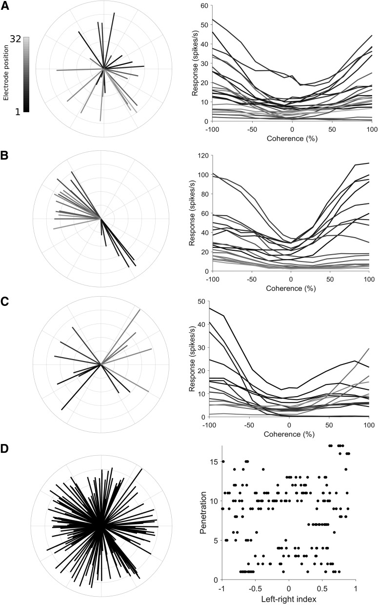
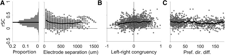
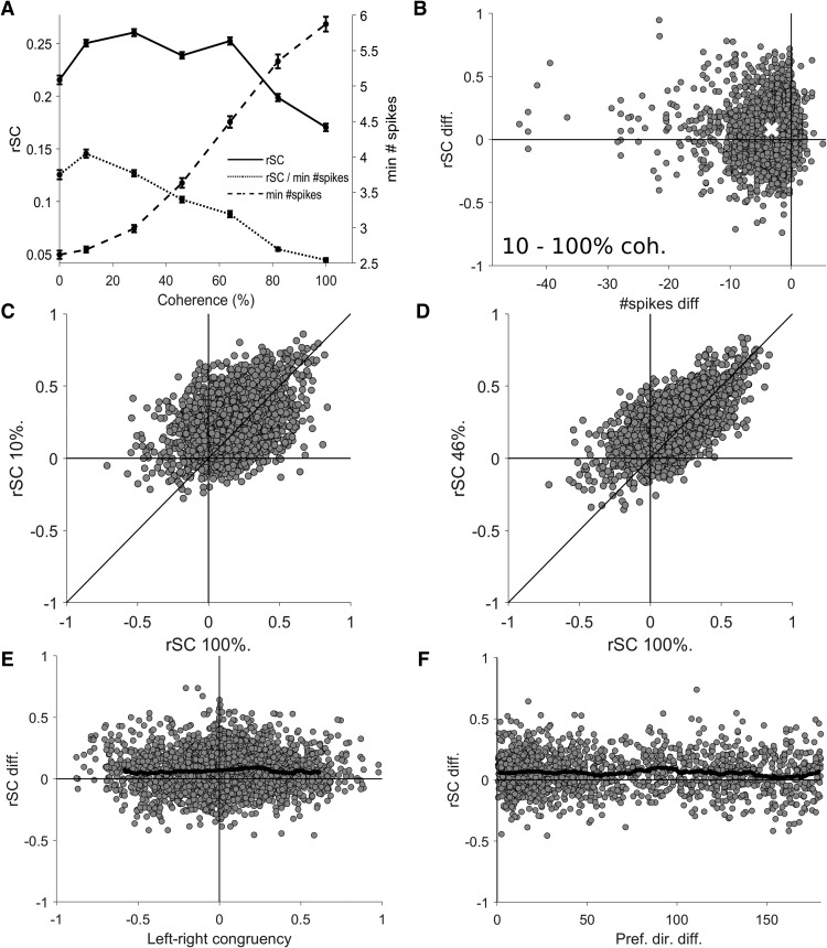
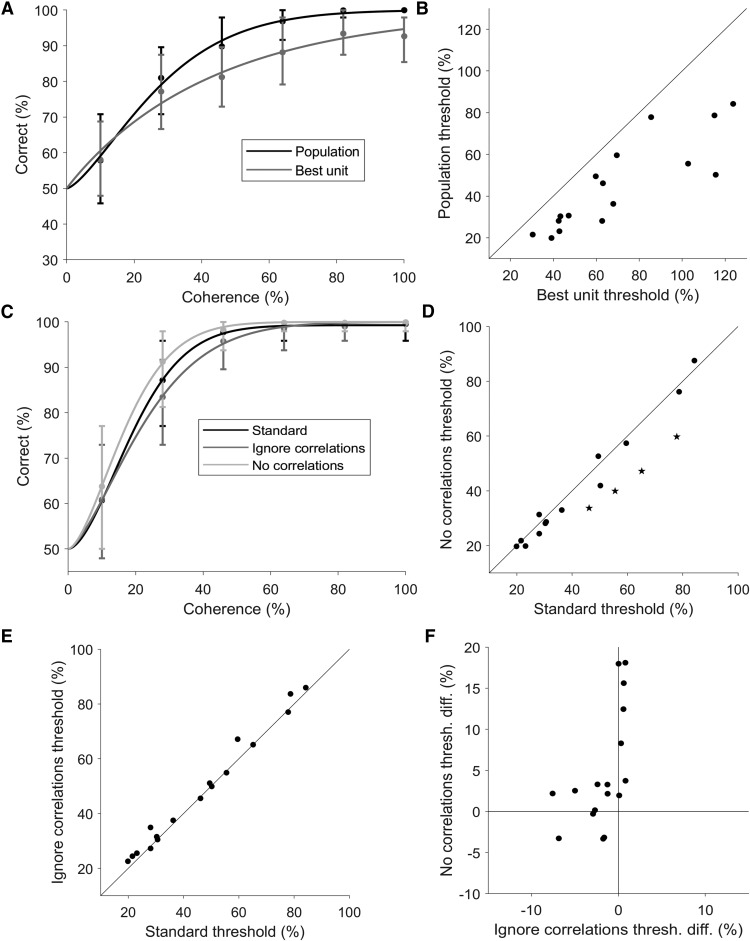
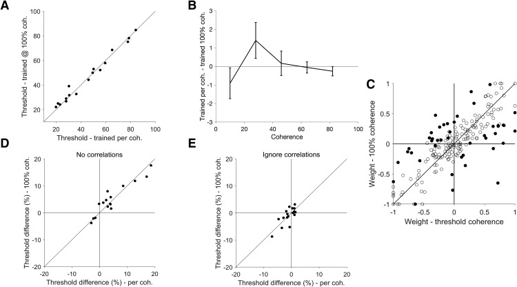
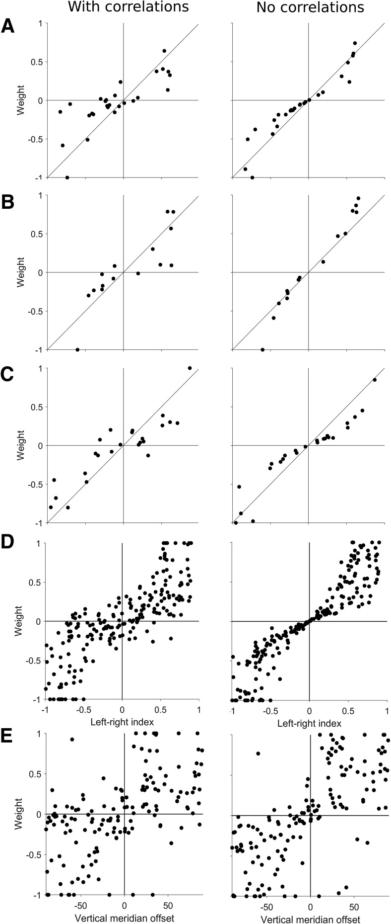
The study of neuronal responses to random-dot motion patterns has provided some of the most valuable insights into how the activity of neurons is related to perception. In the opposite directions of motion paradigm, the motion signal strength is decreased by manipulating the coherence of random dot patterns to examine how well the activity of single neurons represents the direction of motion. To extend this paradigm to populations of neurons, studies have used modelling based on data from pairs of neurons, but several important questions require further investigation with larger neuronal datasets. We recorded neuronal populations in the middle temporal (MT) and medial superior temporal (MST) areas of anaesthetized marmosets with electrode arrays, while varying the coherence of random dot patterns in two opposite directions of motion (left and right). Using the spike rates of simultaneously recorded neurons, we decoded the direction of motion at each level of coherence with linear classifiers. We found that the presence of correlations had a detrimental effect to decoding performance, but that learning the correlation structure produced better decoding performance compared to decoders that ignored the correlation structure. We also found that reducing motion coherence increased neuronal correlations, but decoders did not need to be optimized for each coherence level. Finally, we showed that decoder weights depend of left-right selectivity at 100% coherence, rather than the preferred direction. These results have implications for understanding how the information encoded by populations of neurons is affected by correlations in spiking activity.

Keywords: electrode arrays; marmoset; motion; population decoding; random dot.


Figures

Figure 1.
Figure 1.
Direction preference and left-right selectivity of the recorded neuronal populations. A–C, Direction tuning and the responses to left-right motion at difference coherences for three example populations (A, B are in area MT, C is in area MST). In the left column’s polar plots, the direction of each line represents the preferred direction of a unit, the length represents the strength of the direction selectivity (direction index; Eq. 1), and the shading shows the position of the unit on the electrode shank. In the right column’s Cartesian plots, the mean spiking rate to motion on the left-right axis of motion are plotted at different levels of motion coherence. Each line shows the coherence response function for a unit from the polar plot shown in the left column, using the same shading convention. Leftwards motion is represented by negative coherence values, rightwards motion by positive coherence values. D, Distribution of preferred directions and left-right selectivity across all populations in this study. The left panel’s polar plot shows the combined set of preferred directions (same convention as A–C) for all recorded units. In the right panel, each row of dots represents a population, and the position of each dot along the x-axis represents the left-right index (Eq. 2). Dots positioned on the left (negative) side of the axis prefer leftwards motion, dots positioned on the right (positive) side of the axis prefer rightwards motion.
Figure 2.
Figure 2.
Factors that affect spike count correlations (rSC). A, The histogram on the left shows the distribution of rSC in the dataset, and black line indicates the mean. The scatter plot on the right shows the rSC of each pair plotted against electrode separation, and the black line shows the mean rSC at each separation (only plotted for electrode separations that had at least 10 pairs of units). B, rSC plotted against left-right congruency (the product the left-right indices; Eq. 2), the black line shows the running mean (bin size = 0.15, only plotted for the middle 95th percentile range, to obtain reliable estimate of the mean). C, rSC plotted against the difference in preferred direction of pairs of direction selective units, black line indicates the running mean (bin size = 10°).
Figure 3.
Figure 3.
Spike count correlation (rSC) at different levels of motion coherence. A, The solid line shows the mean rSC plotted for each level of coherence, demonstrating that low coherences produces higher rSC values (left axis) than 100% coherence. The dashed line shows the mean minimum spike count (right axis) at each coherence, demonstrating that spiking activity increases with coherence, which could cause a trivial increase in rSC, not the observed decrease (solid line). The dotted line shows the mean rSC normalized by dividing by the minimum spike count of the neuronal pair plotted against each level of coherence, confirming that the decrease in rSC with coherence is not trivially due to decreases in spiking activity. Error bars show the SEM. B, The difference in rSC and minimum spike count for each pair of units at 10% and 100%, the white cross indicates the means. Note the rSC values were higher at 10% coherence, but the spike counts were lower. C, D, rSC values at 100% coherence are shown with respect to the rSC values at lower coherences. E, The difference in rSC for 46% and 100% coherence plotted against left-right congruency, showing no relationship. The black line shows the running mean (bin size = 0.15, only plotted for the middle 95th percentile range). E, The difference in rSC for 46% and 100% coherence plotted against the difference in preferred direction of pairs of direction selective units, showing no relationship. The black line indicates the running mean (bin size = 10°).
Figure 4.
Figure 4.
Population decoding and correlations. A, An example population showing the decoding performance of the population (black) and the best individual unit (gray) plotted against coherence. The two data sets were both fitted with a Weibull curve to determine the threshold, defined as the level of coherence that achieves 82% correct. B, Population thresholds plotted against the threshold of the best unit for all populations. All populations had thresholds lower than the threshold of the best individual unit. C, Another example population, showing the performance of the standard decoding procedure (black), performance when correlations were removed (light gray), and performance when correlations were ignored (dark gray). D, Effects of correlations. The thresholds from the standard decoding procedure are plotted against the thresholds obtained when correlations were removed, showing a statistically significant decrease in the median threshold (p = 0.025, Wilcoxon signed-rank test). Star symbols represent populations in which the difference is statistically significant (p < 0.05; bootstrap). E, Effects of ignoring correlations. The thresholds from the standard decoding procedure are plotted against the thresholds obtained when correlations were ignored, showing a small but statistically significant increase in the median threshold (p = 0.007, Wilcoxon signed-rank test). F, The change in thresholds when correlations were ignored was significantly positively correlated with change in thresholds when correlations were removed (Spearman’s ρ = 0.647, p = 0.005). The change in threshold was calculated as the standard threshold minus the remove or ignore correlations threshold. Therefore, for the x-axis, negative values represent populations which had lower (better performance) thresholds in the standard decoding compared to decoding when correlations where ignored. These were the units that were above the line of unity in E, and were the majority of populations. For the y-axis, positive values indicate populations that had higher thresholds (worse performance) for the standard decoder in comparison to decoding when correlations where removed. These were the units below the line of unit in D and were the majority of the populations.
Figure 5.
Figure 5.
Generalizability of decoders across motion coherence. A, Population thresholds of the standard decoder (trained and tested for each coherence) are plotted against the thresholds of the decoders trained only at 100% coherence (and tested at every other coherence). The median threshold difference was not statistically significantly different to zero (p = 0.826, Wilcoxon signed-rank test). B, Mean difference in accuracy between standard decoders and decoders trained only at 100% coherence, plotted at each coherence level, showing that performance was similar at all levels of coherence not just near threshold (one-way repeated measures ANOVA F(4) = 1.61, p = 0.18). Error bars represent the SEM. No individual data point was significantly different from 0 (p > 0.05). C, Normalized decoder weights of the per coherence decoders plotted against the 100% coherence decoders. Each point represents the weight of an individual unit, filled circles represent weights that are statistically different at the 100% and near threshold conditions. The weights of the two decoder types were strongly correlated (Spearman’s ρ = 0.711, p < 0.001). D, E, Effects of correlations on decoders trained at 100% coherence. D, The changes in thresholds for the 100% coherence trained decoders and the per coherence trained decoders was very similar when removing correlations (Spearman’s ρ = 0.938, p < 0.001). As in Figure 4F, the change in threshold was calculated as the standard threshold minus the no correlations threshold. E, The changes in threshold for the two types of decoders was also very similar when ignoring correlations (Spearman’s ρ = 0.715, p = 0.001). Similar to Figure 4F, the change in threshold was calculated as the standard threshold minus the ignore correlations threshold.
Figure 6.
Figure 6.
Decoders weights and direction selectivity. A–C, Three example populations showing the normalized decoder weights plotted against the left-right selectivity for the standard decoders (left column, correlations present) and the decoders trained on shuffled data (right column, no correlations present). D, Decoder weights for all populations plotted against left-right selectivity, showing a strong relationship (left), especially when spiking correlations are removed (right). E, Decoder weights for all populations plotted against vertical meridian offset, showing a much weaker relationship (left), even when spiking correlations were not present (right).

Similar articles

Cited by

References

    1. Abbott LF, Dayan P (1999) The effect of correlated variability on the accuracy of a population code. Neural Comput 11:91–101. - PubMed
    1. Adibi M, McDonald JS, Clifford CWG, Arabzadeh E (2014) Population decoding in rat barrel cortex: optimizing the linear readout of correlated population responses. PLoS Comput Biol 10:e1003415. 10.1371/journal.pcbi.1003415 - DOI - PMC - PubMed
    1. Albright TD (1984) Direction and orientation selectivity of neurons in visual area MT of the macaque. J Neurophysiol 52:1106–1130. 10.1152/jn.1984.52.6.1106 - DOI - PubMed
    1. Averbeck BB, Crowe DA, Chafee MV, Georgopoulos AP (2003) Neural activity in prefrontal cortex during copying geometrical shapes. Exp Brain Res 150:142–153. 10.1007/s00221-003-1417-5 - DOI - PubMed
    1. Averbeck BB, Latham PE, Pouget A (2006) Neural correlations, population coding and computation. Nat Rev Neurosci 7:358–366. 10.1038/nrn1888 - DOI - PubMed

Publication types

LinkOut - more resources