Association of Chronic Opioid Use With Presidential Voting Patterns in US Counties in 2016
- PMID: 30646079
- PMCID: PMC6324412
- DOI: 10.1001/jamanetworkopen.2018.0450
Association of Chronic Opioid Use With Presidential Voting Patterns in US Counties in 2016
Abstract
Importance: The causes of the opioid epidemic are incompletely understood.
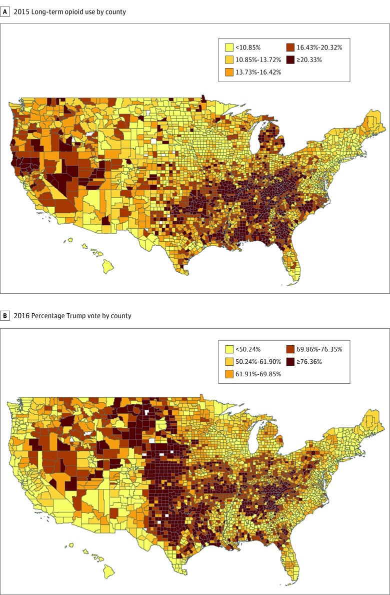
Objective: To explore the overlap between the geographic distribution of US counties with high opioid use and the vote for the Republican candidate in the 2016 presidential election.
Design, setting, and participants: A cross-sectional analysis to explore the extent to which individual- and county-level demographic and economic measures explain the association of opioid use with the 2016 presidential vote at the county level, using rate of prescriptions for at least a 90-day supply of opioids in 2015. Medicare Part D enrollees (N = 3 764 361) constituting a 20% national sample were included.
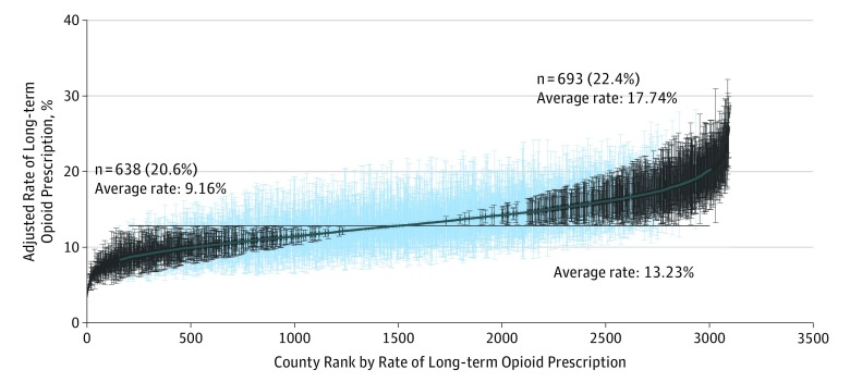
Main outcomes and measures: Chronic opioid use was measured by county rate of receiving a 90-day or greater supply of opioids prescribed in 2015.
Results: Of the 3 764 361 Medicare Part D enrollees in the 20% sample, 679 314 (18.0%) were younger than 65 years, 2 283 007 (60.6%) were female, 3 053 688 (81.1%) were non-Hispanic white, 351 985 (9.3%) were non-Hispanic black, and 198 778 (5.3%) were Hispanic. In a multilevel analysis including county and enrollee, the county of residence explained 9.2% of an enrollee's odds of receiving prolonged opioids after adjusting for individual enrollee characteristics. The correlation between a county's Republican presidential vote and the adjusted rate of Medicare Part D recipients receiving prescriptions for prolonged opioid use was 0.42 (P < .001). In the 693 counties with adjusted rates of opioid prescription significantly higher than the mean county rate, the mean (SE) Republican presidential vote was 59.96% (1.73%), vs 38.67% (1.15%) in the 638 counties with significantly lower rates. Adjusting for county-level socioeconomic measures in linear regression models explained approximately two-thirds of the association of opioid rates and presidential voting rates.
Conclusions and relevance: Support for the Republican candidate in the 2016 election is a marker for physical conditions, economic circumstances, and cultural forces associated with opioid use. The commonly used socioeconomic indicators do not totally capture all of those forces.
Conflict of interest statement
Figures
Comment in
-
The Opiates and the (Voting) Masses.JAMA Netw Open. 2018 Jun 1;1(2):e180451. doi: 10.1001/jamanetworkopen.2018.0451. JAMA Netw Open. 2018. PMID: 30646076 No abstract available.
References
Publication types
MeSH terms
Substances
Grants and funding
LinkOut - more resources
Full Text Sources
Medical