. 2019 Feb;14(2):482-517.
doi: 10.1038/s41596-018-0103-9.

Pathway enrichment analysis and visualization of omics data using g:Profiler, GSEA, Cytoscape and EnrichmentMap

Affiliations

Pathway enrichment analysis and visualization of omics data using g:Profiler, GSEA, Cytoscape and EnrichmentMap

Jüri Reimand et al. Nat Protoc. 2019 Feb.

Abstract

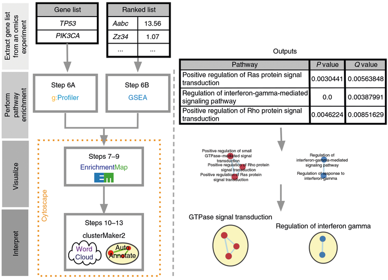
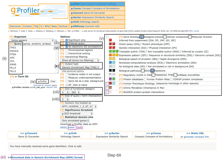
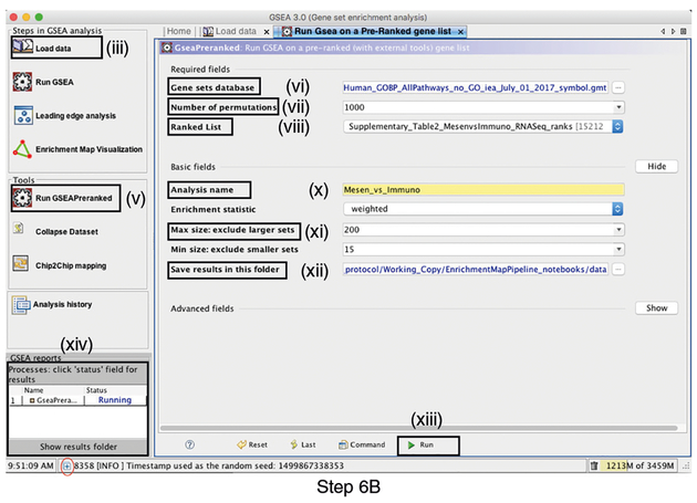
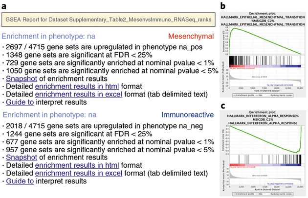
Pathway enrichment analysis helps researchers gain mechanistic insight into gene lists generated from genome-scale (omics) experiments. This method identifies biological pathways that are enriched in a gene list more than would be expected by chance. We explain the procedures of pathway enrichment analysis and present a practical step-by-step guide to help interpret gene lists resulting from RNA-seq and genome-sequencing experiments. The protocol comprises three major steps: definition of a gene list from omics data, determination of statistically enriched pathways, and visualization and interpretation of the results. We describe how to use this protocol with published examples of differentially expressed genes and mutated cancer genes; however, the principles can be applied to diverse types of omics data. The protocol describes innovative visualization techniques, provides comprehensive background and troubleshooting guidelines, and uses freely available and frequently updated software, including g:Profiler, Gene Set Enrichment Analysis (GSEA), Cytoscape and EnrichmentMap. The complete protocol can be performed in ~4.5 h and is designed for use by biologists with no prior bioinformatics training.


Conflict of interest statement

Competing interests

The authors declare no competing interests.

Figures

Fig. 1 |
Fig. 1 |. Protocol overview.
Gene lists derived from diverse omics data undergo pathway enrichment analysis, using g;Profiler or GSEA, to identify pathways that are enriched in the experiment. Pathway enrichment analysis results are visualized and interpreted in Cytoscape using its EnrichmentMap, AutoAnnotate, WordCloud and clusterMaker2 applications. Protocol overview is shown on the left, starting from gene list input, and example outputs at each stage are shown on the right.
Fig. 2 |
Fig. 2 |. Screenshot of g:Profiler user interface.
Protocol Step 6A involves populating the g:Profiler interface. Procedural steps are highlighted with rectangles and roman numerals (refer to Step 6A(i-xii)). Purple boxes highlight files that must be downloaded for subsequent protocol steps. The remaining boxes indicate parameters for the analysis.
Fig. 3 |
Fig. 3 |. Screenshot of GSEA user interface.
Step 6B involves populating the GSEA interface (v.3.0). Procedural steps are highlighted with rectangles and roman numerals (refer to Step 6B(i-xiv)). At the bottom left corner of the screen there is a ‘+’ sign (circled in red at the bottom of the figure). Click on the ‘+’ to see progress messages such as ‘shuffleGeneSet for GeneSet 4661/4715 nperm: 1000’. This message indicates that GSEA is shuffling 4,715 gene sets 1,000 times each, 4,661 of which are complete.
Fig. 4 |
Fig. 4 |. GSEA output overview.
a, Web page summary of GSEA results showing pathways enriched in the top or bottom of the ranked list, with the ‘na_pos’ and ‘na_neg’ phenotypes corresponding to enrichment in upregulated and downregulated genes, respectively. These have been manually labeled here as mesenchymal and immunoreactive, respectively. Clicking on ‘Snapshot’ under either of the phenotypes will show the top 20 enrichment plots for that phenotype. b, An example enrichment plot for the top pathway in the mesenchymal set. c, An example enrichment plot for the top pathway in the immunoreactive set.
Fig. 5 |
Fig. 5 |. Class/phenotype-specific GSEA output.
Class/phenotype-specific GSEA output in the web page summary shows how many gene sets were found enriched in upregulated genes, regardless of significance (purple), the total number of gene sets used after size filtering (cyan), the phenotype name (red) and the number of gene sets that pass different thresholds (orange).
Fig. 6 |
Fig. 6 |. Screenshot of the EnrichmentMap software user interface.
a,b, Input fields in the EnrichmentMap interface for g:Profiler (a) and GSEA (b) results. Procedural steps are shown for Step 9A and 9B. Other than the specific input files, the parameters are the same for the two analysis types. Attributes surrounded by a dashed box should be filled out automatically if the user selects an appropriate folder with the required files. Missing file names indicate that EnrichmentMap was unable to find the specified file. Orange boxes indicate optional files. For the examples presented in the protocol, optional files are used for the GSEA analysis but not for the g:Profiler analysis to demonstrate the two distinct use cases. EM, EnrichmentMap.
Fig. 7 |
Fig. 7 |. Resulting enrichment maps (no manual formatting).
a,b, Unformatted enrichment maps generated from Steps 6A (a) and 6B (b). Each node (circle) represents a distinct pathway, and edges (blue lines) represent the number of genes overlapping between two pathways, determined using the similarity coefficient. a, Enrichment map of significantly mutated cancer driver genes generated using the g:Profiler analysis in Step 6A. b, Enrichment map of pathways enriched in upregulated genes in mesenchymal (red) and immunoreactive (blue) ovarian cancer samples using the GSEA analysis in Step 6B.
Fig. 8 |
Fig. 8 |. Overview of EnrichmentMap panels in Cytoscape.
(i) Cytoscape ‘Control Panel’, which contains ‘Networks’, ‘Styles’ and ‘Select’ tabs as well as the ‘EnrichmentMap’ main panel. (ii) The ‘Table Panel’ contains tables with node, edge and network attributes, as well as an enrichment map ‘Heat Map’ panel displaying expression for genes associated with selected nodes and edges. (iii) Cytoscape search bar, which can be used to search for genes in the enrichment map. (iv) ‘Node Table’ containing values for all variables associated with each node in the network. (v) Q-value or P-value slider bar. By default, the slider is set to Q value if the data contains Q values but can be changed to use P values by selecting the ‘P-value’ radio button. All nodes that pass the initial Q-value threshold are displayed in the enrichment map. By moving the slider to the left, the Q-value threshold is adjusted to a lower value, removing any nodes that do not pass the Q-value threshold. The currently set threshold will be displayed in the accompanying text box. Thresholds can be manually adjusted by modifying the text box value directly. (vi) ‘Edge Cutoff (Similarity)’ slider bar. The slider bar modifies the similarity threshold. The similarity threshold can only be increased; i.e., edges are required to have more genes in common in order to remain visible, which will remove edges from the network that do not satisfy the threshold. One can also manually change the threshold by modifying the text box value directly.
Fig. 9 |
Fig. 9 |. Example heat map in EnrichmentMap.
Heat map created by selecting the immunoreactive pathway interferon alpha beta signaling pathway from Reactome. The heat map is useful for visualization of detailed gene expression patterns for a pathway of interest. Magenta corresponds to high expression, and green corresponds to low expression. This heat map is for GSEA results, thus the ‘leading edge’ genes are highlighted in yellow; these genes have the largest contribution to the enrichment signal. (i-vi) Additional controls in the Heat Map panel include sorting options (i), selection of genes to include (ii), expression data visualization options (iii), data compression options (iv), the option to show values (v) and heat map settings (vi).
Fig. 10 |
Fig. 10 |. Resulting publication-ready enrichment map.
(i) Overall thumbnail view of the publication-ready enrichment map created with parameters FDR Q value < 0.01, and combined coefficient >0.375 with combined constant = 0.5. (ii) Zoomed-in section of publication-ready enrichment map, in which red and blue nodes represent mesenchymal and immunoreactive phenotype pathways, respectively. Nodes were manually laid out to form a clearer picture. Clusters of nodes were labeled using the AutoAnnotate Cytoscape application. Individual node labels were removed for clarity using the publication-ready button in EnrichmentMap and exported as PNG and PDF files. A legend was manually added at the bottom of the figure.
Fig. 11 |
Fig. 11 |. Collapsed enrichment map.
The enrichment map was summarized by collapsing node clusters using the AutoAnnotate application. Each cluster of nodes in Fig. 10 is now represented as a single node. The network was scaled for better node distribution and manually adjusted to reduce node and label overlap. (i) Overall thumbnail view of the entire collapsed enrichment map. (ii) Zoomed-in section of the publication-ready collapsed enrichment map that corresponds to the zoomed-in network in Fig. 10 (ii).
Fig. 12 |
Fig. 12 |. Subnetwork example.
Subnetwork of the main enrichment map (Fig. 10) was manually created by selecting pathways with the top NES values and creating a new network from the selection. Red and blue nodes are mesenchymal and immunoreactive phenotypes, respectively. Clusters of nodes were automatically labeled using the AutoAnnotate application. Annotations in the subnetwork may differ slightly from those in the main network, as word counts were normalized on a network basis.
Fig. 13 |
Fig. 13 |. Generic enrichment map legend.
Enrichment map attributes can be copied for use in a custom figure legend. Only components relevant to the analysis should be copied. Post-analysis ‘Signature set’ nodes are included in the generic legend (not covered in this protocol). Post-analysis nodes highlight pathways in the enrichment map that contain specific genes of interest such as targets of drugs or microRNAs.

References

    1. Lander ES Initial impact of the sequencing of the human genome. Nature 470, 187–197 (2011). - PubMed
    1. Stephens ZD et al. Big data: astronomical or genomical? PLoS Biol. 13, e1002195 (2015). - PMC - PubMed
    1. Mack SC et al. Epigenomic alterations define lethal CIMP-positive ependymomas of infancy. Nature 506, 445–450 (2014). - PMC - PubMed
    1. Pinto D et al. Functional impact of global rare copy number variation in autism spectrum disorders. Nature 466, 368–372 (2010). - PMC - PubMed
    1. Pinto D et al. Convergence of genes and cellular pathways dysregulated in autism spectrum disorders. Am. J. Hum. Genet 94, 677–694 (2014). - PMC - PubMed

Publication types

Substances