. 2019 Feb 7;10(1):635.
doi: 10.1038/s41467-019-08471-z.

Recent increases in tropical cyclone intensification rates

Affiliations

Recent increases in tropical cyclone intensification rates

Kieran T Bhatia et al. Nat Commun. .

Erratum in

Abstract

Tropical cyclones that rapidly intensify are typically associated with the highest forecast errors and cause a disproportionate amount of human and financial losses. Therefore, it is crucial to understand if, and why, there are observed upward trends in tropical cyclone intensification rates. Here, we utilize two observational datasets to calculate 24-hour wind speed changes over the period 1982-2009. We compare the observed trends to natural variability in bias-corrected, high-resolution, global coupled model experiments that accurately simulate the climatological distribution of tropical cyclone intensification. Both observed datasets show significant increases in tropical cyclone intensification rates in the Atlantic basin that are highly unusual compared to model-based estimates of internal climate variations. Our results suggest a detectable increase of Atlantic intensification rates with a positive contribution from anthropogenic forcing and reveal a need for more reliable data before detecting a robust trend at the global scale.


Conflict of interest statement

The authors declare no competing interests.

Figures
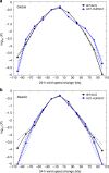
Fig. 1
Fig. 1
Observed 24-intensity change probability densities. a, b Common logarithm of the probability densities calculated from IBTrACS (black) and ADT-HURSAT (blue) 24-h intensity changes. a Global and b Atlantic basin results for the period 1982–2009 are plotted. Data are binned in 20 knot increments between −110 and 110 knots. The dashed lines indicate the 90% confidence interval (between 5th and 95th percentiles of the data) (Methods). All distributions are bounded below by 10−5
Fig. 2
Fig. 2
Quantile regression of 24-h intensity changes. ad Slope of the quantiles for 24-h intensity changes during the period 1982–2009. Slopes are shown for IBTrACS (a, c) and ADT-HURSAT (b, d) globally (a, b) and in the Atlantic basin (c, d). The black dots represent the slope derived from least squares regression of intensity change as a function of year for each quantile from 0.05 to 0.95 in steps of 0.05. Shading represents the 5th and 95th percentiles of the regressions with randomly perturbed observational data (Methods). The red solid line shows the (constant value) trend in the mean as measured by ordinary least squares regression, and the red dotted lines show the 90% confidence interval
Fig. 3
Fig. 3
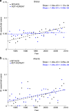
Rapid intensification ratio trends. a, b Observed trends in the rapid intensification (RI) ratio of ADT-HURSAT (black) and IBTrACS (blue) over the 28-year period 1982–2009 using a global and b Atlantic data. RI ratio is defined as the number of 24-h intensity changes above 30 knots divided by the total number of 24-h intensity changes. Trends in the time series of the annual mean RI ratio are denoted by dashed lines. The slopes of the trend lines as well as their 90% confidence intervals are provided. The slopes and confidence intervals are calculated using 1000 randomly perturbed samples of the observational data. Shading represents the 5th and 95th percentiles of the 1000 regressions with these randomly perturbed observational data (Methods)
Fig. 4
Fig. 4
The effects of quantile mapping on 24-intensity change probability densities. a, b Common logarithm of the probability densities calculated from IBTrACS (black), ADT-HURSAT (blue), HiFLOR 1990CTL (ORIG), HiFLOR QDM-corrected 1990CTL, and HiFLOR BCQM-corrected 1990CTL 24-h intensity changes. a Global and b Atlantic basin results are plotted. QDM and BCQM are quantile mapping designed to bias correct 1990CTL to more closely represent the distribution of IBTrACS. ADT-HURSAT and IBTrACS probabilities are computed using the 17-year period centered around 1990 (1982–1998). HiFLOR probability density curves are generated using 250 years of intensity changes from the 1990CTL. Data is binned in 20 knot increments between −110 and 110 knots, and each bin entry is plotted as a dot on a curve. All distributions are bounded below by 10−5
Fig. 5
Fig. 5
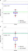
Observed trends in RI ratio vs. 1860CTL natural variability. a, b Box and whisker plot represents the distribution of slopes of RI ratio in the QDM-corrected 1860 HiFLOR control simulation. a Global and b Atlantic basin results are plotted. Each slope is calculated by applying least squares regression analysis to annual RI ratio values in overlapping 28-year periods. Thus, the number of slopes for a control simulation is the number of available years subtracted by 28 (i.e., 1860CTL has 1422 slopes). The red line in each box indicates the median of the slopes. The box is bounded by the 25th and 75th percentiles of the data, and the whiskers bracket approximately 99% of the data. Red plus signs indicate outliers whose values are outside of whiskers’ range. IBTrACS and ADT-HURSAT trends in annual mean RI ratio between 1982 and 2009 are respectively represented by blue and green dotted lines and the corresponding p values are listed below each line
Fig. 6
Fig. 6
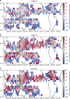
Anthropogenic forcing’s effects on RI ratio in HiFLOR. ac Simulated changes in RI ratio by the 1940CTL (a), 1990CTL (b), and 2015CTL (c) relative to the 1860CTL. Percent difference in RI ratio between HiFLOR 1860CTL and each climate change simulation is plotted in each 5° × 5° grid box. Data is only plotted in a grid box if at least one TC passes through the grid box every 50 years in the two experiments used to calculate percent difference. Red (blue) squares indicate grid boxes where a larger (smaller) percentage of 24-h intensity changes exceed 30 knots in the climate change simulations than in the 1860CTL. Grid boxes that achieve a p value of 0.05 using a binomial proportion test are considered statistically significant. White “Xs” are located in grid boxes that are not statistically significant

References

    1. Saffir HS. Hurricane wind and storm surge. Mil. Eng. 1973;423:4–5.
    1. Simpson RH. The hurricane disaster potential scale. Weather Wise. 1974;27:169–186. doi: 10.1080/00431672.1974.9931702. - DOI
    1. Kaplan J, DeMaria M. Large-scale characteristics of rapidly intensifying tropical cyclones in the North Atlantic basin. Weather Forecast. 2003;18:1093–1108. doi: 10.1175/1520-0434(2003)018<1093:LCORIT>2.0.CO;2. - DOI
    1. Lee CY, Tippett MK, Sobel AH, Camargo SJ. Rapid intensification and the bimodal distribution of tropical cyclone intensity. Nat. Commun. 2016;7:10625. doi: 10.1038/ncomms10625. - DOI - PMC - PubMed
    1. Emanuel K. Will global warming make hurricane forecasting more difficult? Bull. Am. Meteor. Soc. 2017;98:495–501. doi: 10.1175/BAMS-D-16-0134.1. - DOI

Publication types