. 2019 Mar;25(3):487-495.
doi: 10.1038/s41591-019-0381-y. Epub 2019 Mar 6.

A clinically meaningful metric of immune age derived from high-dimensional longitudinal monitoring

Affiliations

A clinically meaningful metric of immune age derived from high-dimensional longitudinal monitoring

Ayelet Alpert et al. Nat Med. 2019 Mar.

Abstract

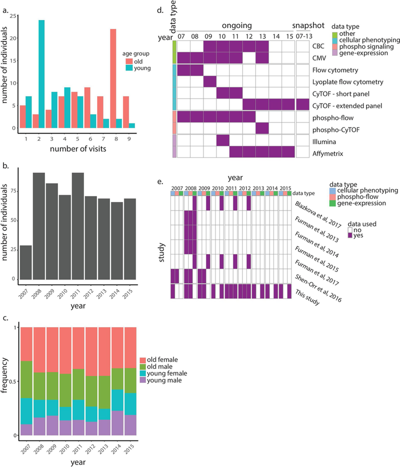
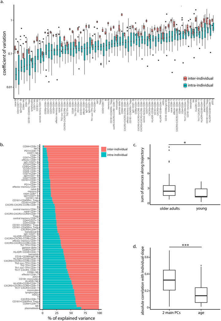
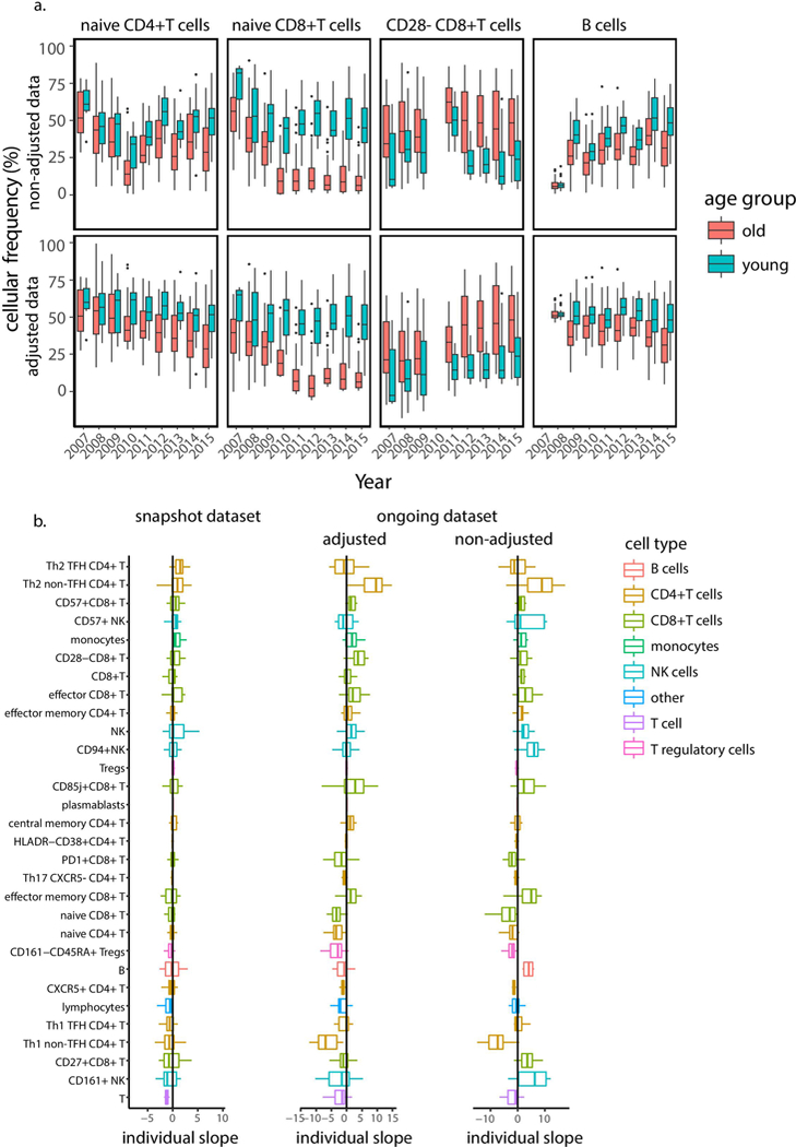
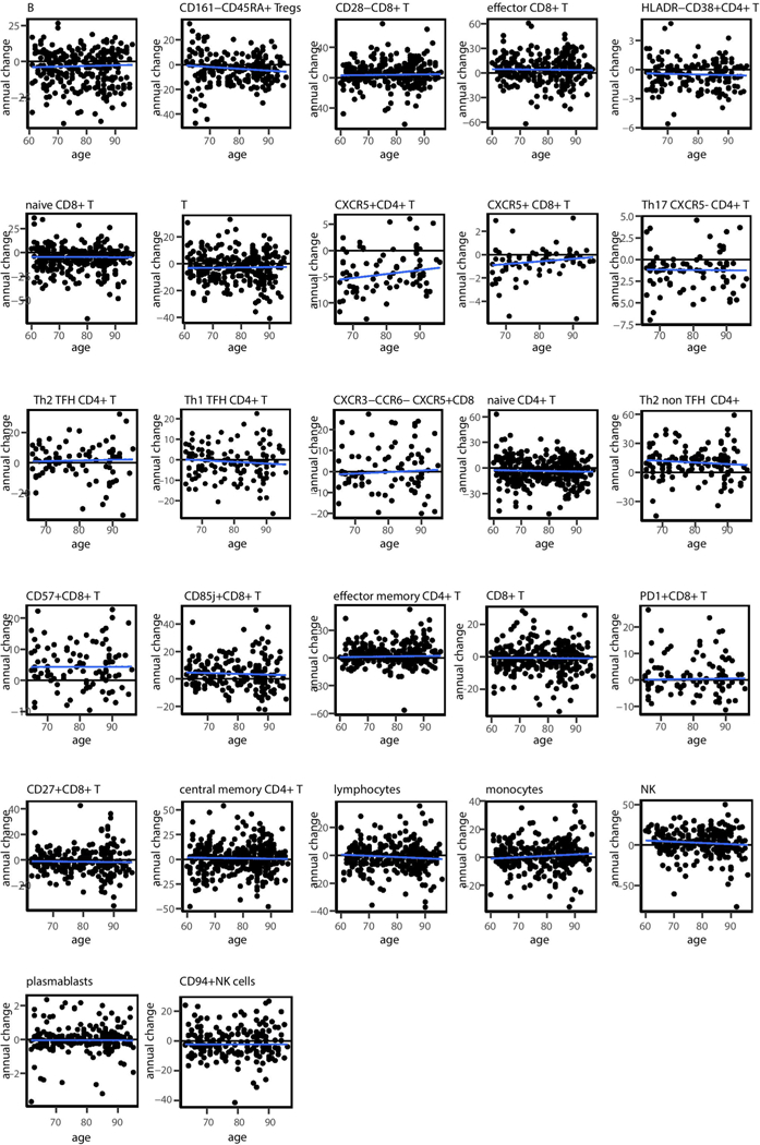
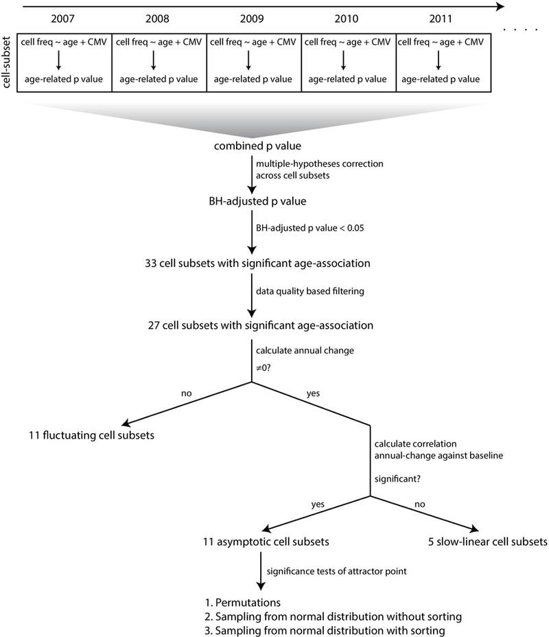
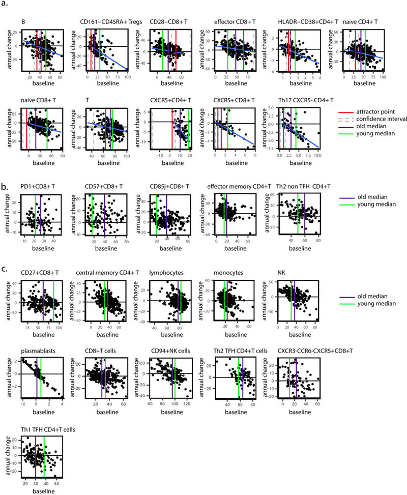
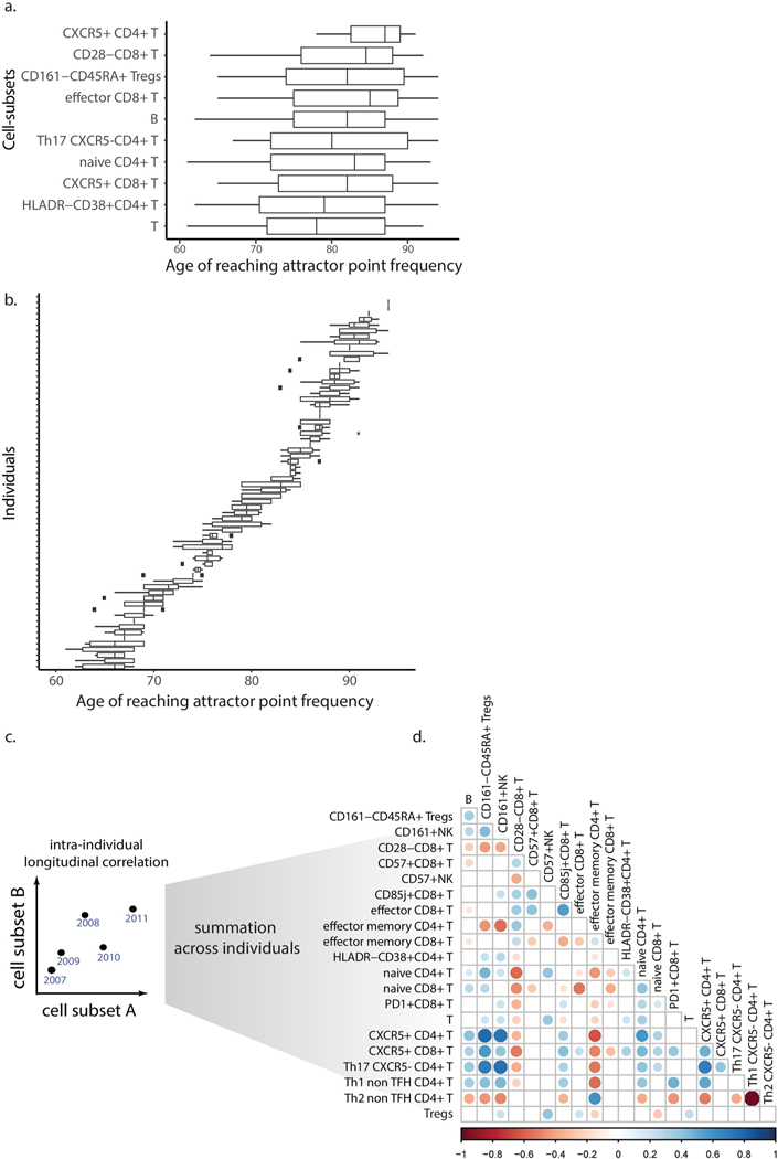
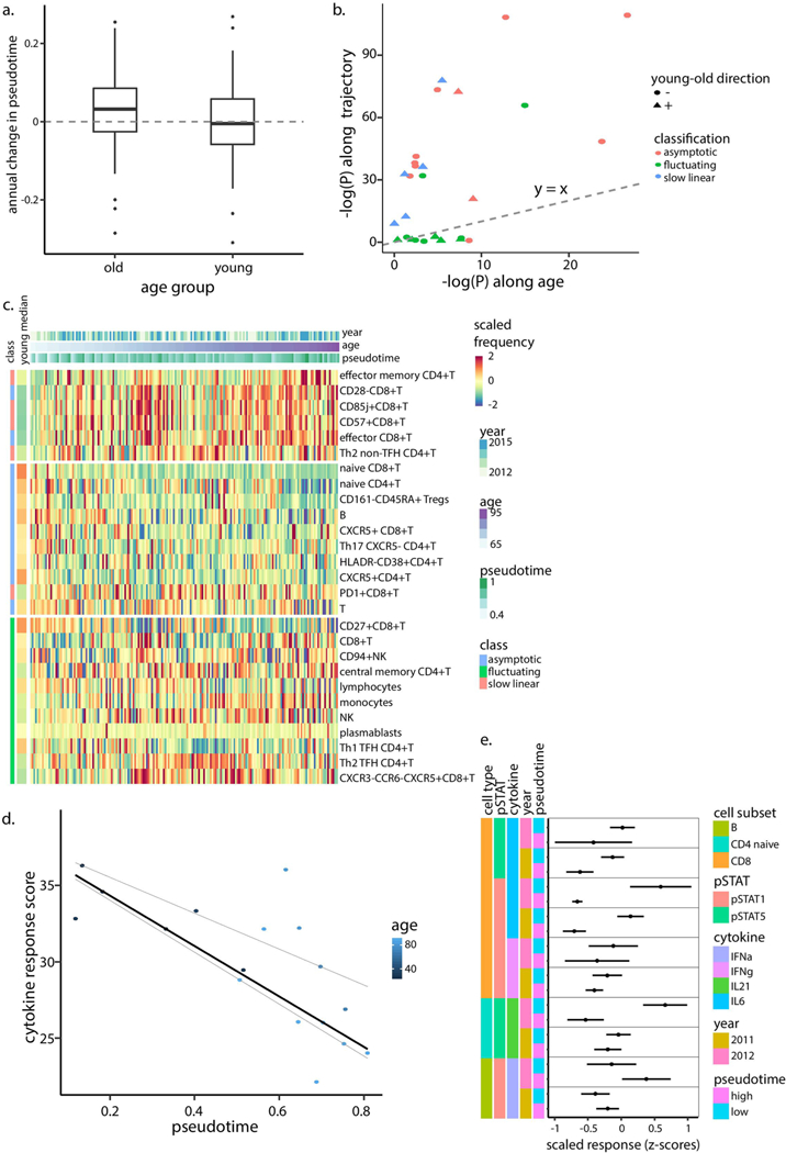
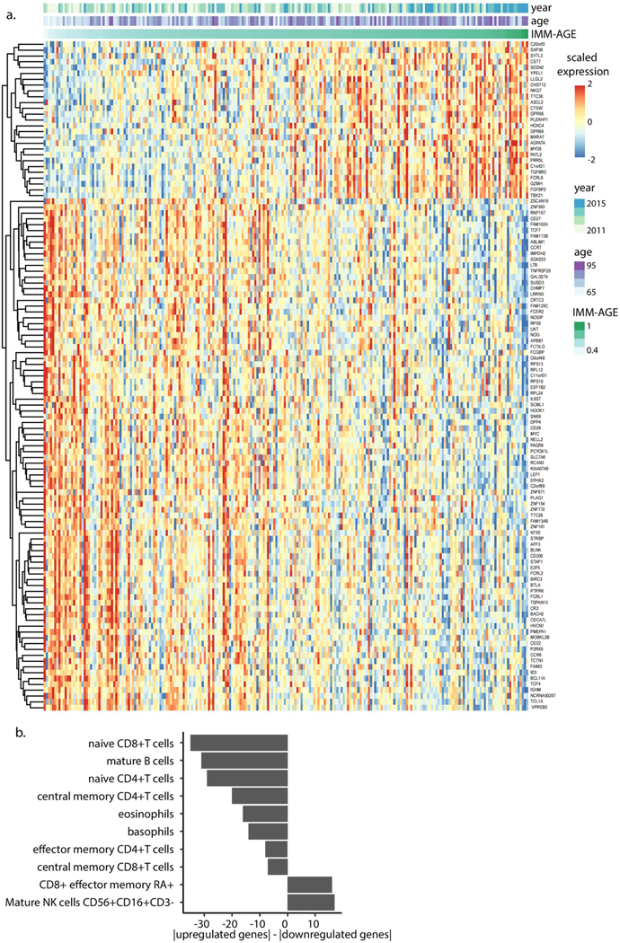
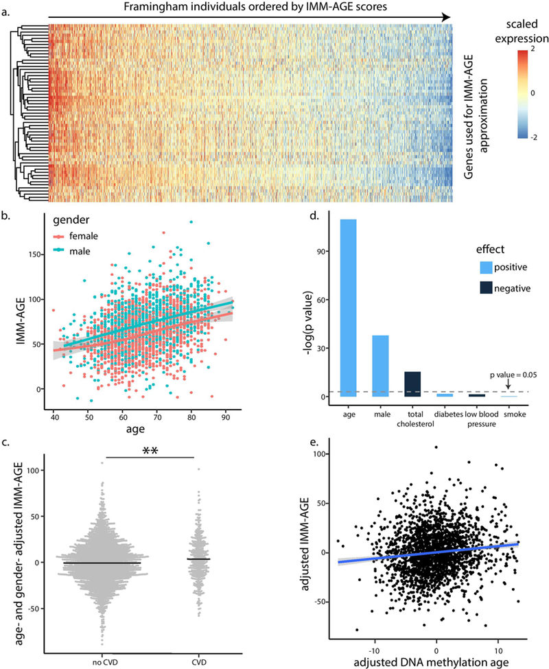
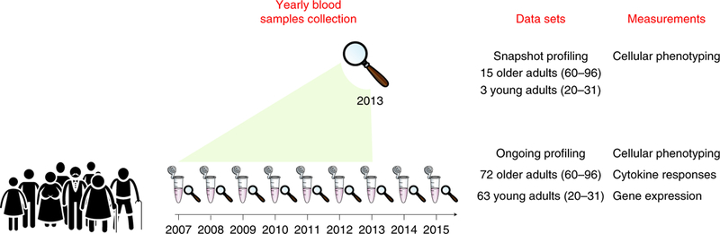
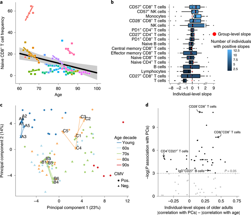
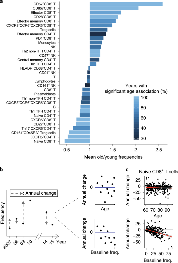
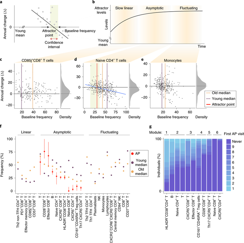
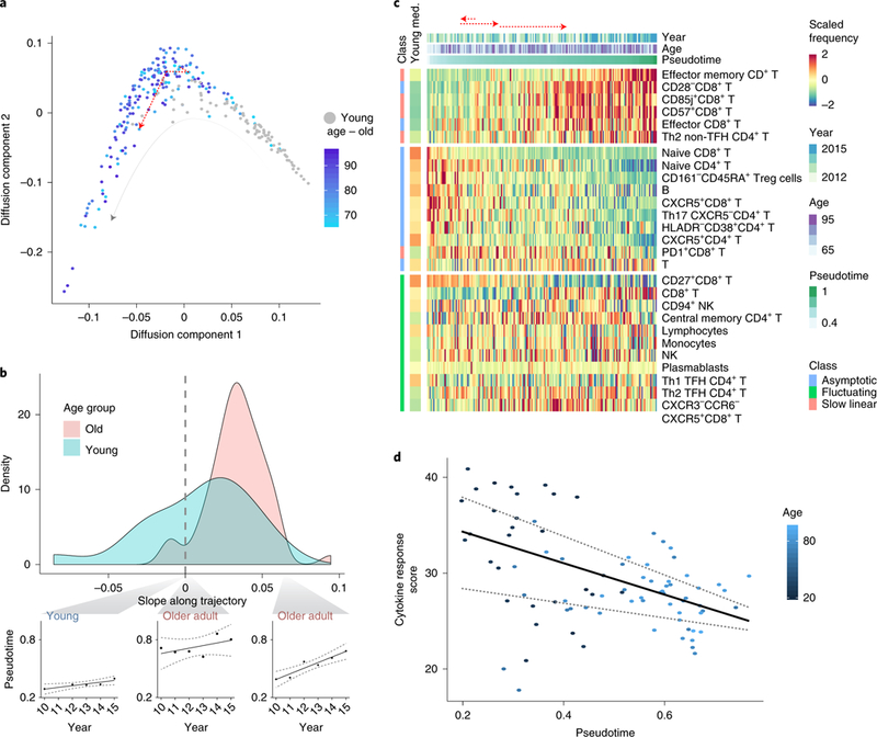
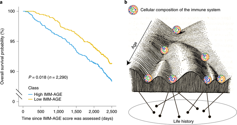
Immune responses generally decline with age. However, the dynamics of this process at the individual level have not been characterized, hindering quantification of an individual's immune age. Here, we use multiple 'omics' technologies to capture population- and individual-level changes in the human immune system of 135 healthy adult individuals of different ages sampled longitudinally over a nine-year period. We observed high inter-individual variability in the rates of change of cellular frequencies that was dictated by their baseline values, allowing identification of steady-state levels toward which a cell subset converged and the ordered convergence of multiple cell subsets toward an older adult homeostasis. These data form a high-dimensional trajectory of immune aging (IMM-AGE) that describes a person's immune status better than chronological age. We show that the IMM-AGE score predicted all-cause mortality beyond well-established risk factors in the Framingham Heart Study, establishing its potential use in clinics for identification of patients at risk.


Figures

Extended Data Figure 1 |
Extended Data Figure 1 |. Study demographics and experimental platforms.
a, Histogram summarizes number of visits (years in which immune profiling was conducted) across individuals stratified by age group. b, Histogram summarizes total number of individuals profiled per year. c, Age and gender distributions of individuals profiled per year. d, Data types and platforms used for immune profiling in each year for snapshot (right column) and ongoing data sets (left columns). e, Data types and relevant years of the Stanford University’s longitudinal study of aging and vaccination that were analyzed in our study (bottom row) and other studies (top rows). CBC, complete blood count.
Extended Data Figure 2 |
Extended Data Figure 2 |. Snapshot cohort analysis.
a, Interindividual (pink, n = 18 individuals) and intraindividual (blue, n = 6 years) variation distributions, calculated using coefficient of variation per cell subset. Boxes represent 25th and 75th percentiles around the median (line). Whiskers, 1.5× interquantile, range. b, Percentage of total variance per cell subset explained by interindividual variation (total sum of squares attributed to subject) and intraindividual, variation (residual sum of squares). c, Lengths of within-individual trajectories in young adults versus older adults as measured in the PCA twodimensional, space (P = 0.03, two-tailed t-test, n = 3 young adults and n = 15 older adults). Boxes represent 25th and 75th percentiles around the median, (line). Whiskers, 1.5× interquantile range. d, Spearman correlations of individual-level slopes of cell subsets highly correlated with the first two principal, components with age and the individual’s baseline position along the PCA two-dimensional axes (right and left boxplots, respectively, P = 1.7 × 10⁻⁴, twotailed, paired t-test, n = 39). Boxes represent 25th and 75th percentiles around the median (line). Whiskers, 1.5× interquantile range. *P < 0.05, ***P = 0.001.
Extended Data Figure 3 |
Extended Data Figure 3 |. Adjustment of the ongoing dataset using young individuals improves its correlation with the snapshot dataset.
a,, Boxplots of representative cell-subset frequencies in 72 old (pink) and 63 young (light blue) adults before (upper panels) and after (lower panels) adjustment for young individuals. Boxes represent 25th and 75th percentiles around the median (line). Whiskers, 1.5× interquantile range. b, Individual slopes of frequencies of 30 immune cell subsets identified as associated with age calculated based on the snapshot (left), adjusted ongoing (middle) and nonadjusted ongoing (right) data sets. Adjustment of the ongoing data set improved the correlation between the slopes measured in the snapshot and ongoing data sets from 0.29 (linear regression P = 0.12, n = 30) to 0.54 (linear regression P = 0.004, n = 30). Boxes represent 25th and 75th percentiles around the median (line). Whiskers, 1.5× interquantile range.
Extended Data Figure 4 |
Extended Data Figure 4 |. Age poorly affects longitudinal dynamics in cellular frequencies.
Scatter plots of annual change versus individual age for each cell subset identified as significantly age dependent. Blue lines denote linear regression lines.
Extended Data Figure 5 |
Extended Data Figure 5 |. Classification scheme of cell subsets based on their dynamics.
Cell subsets identified as significantly age dependent in a combinatorial analysis across years were filtered based on annual-change data quality. Cell subsets exhibiting an annual change not significantly different from 0 were classified as fluctuating, whereas those exhibiting a significant nonzero annual change were subjected to an additional analysis testing the relationship of their annual change with baseline frequencies. Cell subsets with a nonsignificant association were classified as linear whereas those exhibiting a significant association were classified as asymptotic and were subjected to three additional tests analyzing the significance of their identified attractor point locations.
Extended Data Figure 6 |
Extended Data Figure 6 |. Three stages of longitudinal dynamics of cell subsets’ frequencies are captured in the ongoing dataset.
a, Scatter plots of annual change versus baseline frequencies for cell subsets classified as asymptotic. Blue, red, green and purple lines correspond to linear regression lines, attractor point frequencies and median frequency in young and older adults, respectively. Confidence intervals for attractor points are delimited by grey dashed lines. b, Scatter plots of annual change versus the baseline frequencies for cell subsets classified as slow linear. Green and purple lines denote median frequency in young and older adults, respectively. c, Scatter plots of annual change versus the baseline frequencies for cell subsets classified as fluctuating. Green and purple lines denote median frequency in young and older adults, respectively.
Extended Data Figure 7 |
Extended Data Figure 7 |. Inherent correlations between cell subsets.
Boxplots denote ages at which cell subsets reached their corresponding attractor point frequencies stratified by either cell subset (median interquartile range of 14.75 years; naive CD8+ T cells were excluded as most individuals did not reach the attractor point frequencies; n = 72 individuals) (a) or individuals (median interquartile range of 2 years; n = 10 cell subsets) (b). Boxes represent 25th and 75th percentiles around the median (line). Whiskers, 1.5× interquantile range. c, Scheme describing longitudinal correlations calculated between every pair of cell subsets. d, Longitudinal pairwise Spearman correlations between cell subsets are indicated by circle color whereas circle size corresponds to P value (calculated by permutations; only correlations (P<0.05) are shown; n = 69 individuals).
Extended Data Figure 8 |
Extended Data Figure 8 |. A linear trajectory explains the dynamics of cellular frequencies in healthy aging.
a, Annual change in pseudotime calculated for young (two-tailed binomial test p = 0.648, n = 77) and older (two-tailed binomial test p = 0.0018, n = 210) individuals. Boxes represent 25th and 75th percentiles around the median (line). Whiskers, 1.5× interquantile range. b, Linear-model-derived significance levels (n = 294 samples, calculated as -log[P]) of cellular frequencies that were regressed either versus age (x-axis) or pseudotime (y-axis). Each dot denotes a cell subset with shape corresponding to the direction of young-old differences and color corresponding to the cell subset classification. Dashed line is the y = x line. c, Scaled frequencies of cell subsets classified as asymptotic, slow linear or fluctuating (left bar) along the age axis. Median values of scaled frequencies calculated using young individuals are in the left bar. d, Cytokine response score of year 2012 samples colored by age and median regression line versus pseudotime (quantile regression P = 0.021, 0.77 (n = 17) for pseudotime and age, respectively). Quantile regression lines of quantiles 0.25 and 0.75 are shown as dashed lines. e, Scaled individual phospho-flow cytokine responses measured in years 2011–2012 in individuals positioned in either half of the trajectory as divided by the median (n = 28 and n = 6 in each group for 2011 and 2012, respectively). Dots and error bars correspond to median and s.d., respectively.
Extended Data Figure 9 |
Extended Data Figure 9 |. Identification of a gene-set whose expression correlates with IMM-AGE.
a, Scaled gene expression by individuals ordered based on their IMM-AGE scores for genes identified as consistently changing along the trajectory. Information about individuals’ IMM-AGE, age and year appears on top. b, Difference between number of up- and downregulated genes of the identified gene set expressed by different cell types in the DMAP data set. Only cell types exhibiting significant enrichment either for up- or downregulated genes are displayed.
Extended Data Figure 10 |
Extended Data Figure 10 |. Clinical associations of iMM-AGE scores in the Framingham Heart Study dataset.
a, Expression levels of genes used for IMM-AGE approximation in gene expression samples of Framingham Heart Study participants ordered by approximated IMM-AGE scores. b, Correlation of estimated IMM-AGE scores with age and gender (linear regression P = 7×10−63 and 7.22 ×10⁻²⁷ (n = 2,292) for age and gender, respectively). Points correspond to individuals; color denotes gender. c, Age- and gender-adjusted IMM-AGE score of individuals stratified based on cardiovascular disease (dots); bold lines denote mean values (P= 0.0023, n = 2,292, two-tailed f-test). d, IMM-AGE score association with cardiovascular risk factors as obtained by linear regression. Bar colors denote positive (light blue) or negative (dark blue) associations. e, Linear regression of IMM-AGE versus DNA methylation age, where both variables were adjusted for cardiovascular risk factors and cardiovascular disease (n = 2,139 individuals). **P<0.01; CVD, cardiovascular disease.
Fig. 1 |
Fig. 1 |. Study design.
Peripheral blood samples from 135 healthy individuals (63 young and 72 older adults) were collected over 9years. The snapshot cohort included 18 individuals that were profiled at the end of the seventh year (2013) by cell subset phenotyping, whereas the entire ongoing cohort was profiled annually for cell subset phenotyping, functional responses of cells to cytokine stimulations, and whole-blood gene expression.
Fig. 2 |
Fig. 2 |. Individuals’ cellular immune profiles exhibit inter-individual variability both at baseline and in their rate of change.
PBMC samples of 18 individuals sampled annually over a 7-year period of the snapshot data set were profiled at high resolution by mass cytometry and manually gated into 73 distinct cell populations. a, Individuals vary in their rate of change of naive CD8+ T cells over time. Shown are the group-level longitudinal regression line (black line, derived from mixed-linear model) and the individual-level lines of each individual (colored by individual). Shaded area denotes confidence interval. b, The frequencies of multiple cell subsets changed at different rates (slopes) among older adults. Boxplots show the distribution of individual- level longitudinal slopes of cell-subset frequencies for 17 immunosenescence-associated cell subsets (n = 15 older adults; boxes represent 25th and 75th percentiles around the median (line); whiskers, 1.5× interquantile range). Group level slopes per cell subset are red dots, whereas boxplot color denotes number of individuals exhibiting a positive individual slope. c, PCA of individuals’ cellular profiles using all cell-subsets’ frequencies. The single time points of an individual are colored by an individual’s age (in decades) at recruitment, with shape denoting CMV serology (pos., positive; neg., negative). Three representative trajectories are shown as bold lines connecting the single time points labeled by visit number and subject identifier and are colored by individual’s decade of age. d, Cell subsets (dots) are scattered by their significance of correlation with the main two principal components (y-axis, P values were calculated using linear regression followed by Fisher’s combination and BH correction, n = 18 individuals) and the difference between the Pearson correlation values of their individual-level slopes calculated either versus individuals’ baseline positions in the PCA space or versus age (x-axis). P value threshold of 0.05 is displayed by a horizontal dashed line.
Fig. 3 |
Fig. 3 |. Annual change of immune cell–subset frequency depends, on baseline levels rather than on age.
a, Some 33 cell subsets were, consistently correlated with age across 9 years of data (linear models, BHadjusted, combined P < 0.05). Cell subsets are ordered by the mean ratio, of cellular frequencies between older and young adults with color denoting, percentage of years in which a significant correlation versus age was identified. b, Analysis pipeline for estimating immune cell–subset temporal, dynamics in the ongoing data set. Cell-subset dynamics were estimated by regressing the annual change per cell subset for each of two consecutive years (delta) versus the individual’s age (top) or baseline levels of cellular frequency (median linear regression, bottom). c, Correlation between, annual change of naive CD8+ T cells either versus age (top) or versus, baseline frequencies (freq., bottom). Linear regression lines are in red. Th1,, T-helper 1 cells; Th2, T-helper 2 cells; Th17, T-helper 17 cells; Treg cells, regulatory T cells; TFH, T follicular helper cells.
Fig. 4 |
Fig. 4 |. Immune cell dynamics in older adults yield a convergence on an attractor point.
a, Some cell subsets exhibit baseline-dependent dynamics, enabling inference of an attractor point corresponding to the stable frequency on which the system converges, along with a corresponding confidence interval (shaded box). b, A generalized model of cell-subset dynamics in healthy aging enables classification of cell subsets into three classes that differ in their ordering of reaching the attractor points: slow linear, asymptotic and fluctuating. c-e, Annual change versus baseline scatter plots along with annual change versus density distribution plots of three representative cell subsets assigned to the different classes. CD85j+CD8+ T cells (Pannual change = 343 × 10−8) naive CD4+ T cells (Pannual change = 594× 10−5 Pliner model = 5.33 × 10⁻⁷) and monocytes (Pannual change = 0.14) were classified as slow linear, asymptotic and fluctuating, respectively. Dashed orange and purple lines correspond to median abundance in old and young adults, respectively, whereas red line and shaded box correspond to attractor point and the confidence interval, respectively. f, Cell-subset classification along with the median cellular frequencies measured in young (purple, n = 63 individuals) and older (orange, n = 72 individuals) adults. For the asymptotic cell subsets, attractor point and corresponding confidence interval are in red. g, Ordering of asymptotic cell-subset modules by the time at which they reached attractor-point levels. Color represents first visit in which the cell subset reached the attractor point within an individual. Cell-subset assignments into modules appear on top. AP, attractor point.
Fig. 5 |
Fig. 5 |. A linear trajectory explains dynamics of cellular frequencies in healthy aging.
a, Diffusion-map dimensionality reduction of young (gray) and old (colored by age) individuals calculated using scaled cellular frequencies. Red dashed line denotes longitudinal immune profile of one old individual along the trajectory. b, Density plots of individual-longitudinal slopes along the trajectory calculated on young (light blue) and old (pink) individuals. Specific examples of longitudinal dynamics along the trajectory of one young individual (left) and two older adults are shown on bottom. c, Scaled frequencies of cell subsets classified as slow linear, asymptotic or fluctuating (left bar) along the pseudotime axis corresponding to the trajectory. Median values of scaled frequencies measured in young individuals are in left bar whereas longitudinal measurements of one older adult appear on top as dashed, red arrows. d, Cytokine response score of 2011 samples colored by age and median regression line versus pseudotime (quantile regression P= 0.028, 0.41 (n = 83 cytokine response scores) for pseudotime and age, respectively). Quantile regression lines of quantiles 0.25 and 0.75 are shown as dashed lines.
Fig. 6 |
Fig. 6 |. IMM-AGE score predicts all-cause mortality risk beyond well-established risk factors.
a, Kaplan-Meier overall survival curves for Framingham, Heart Study participants stratified based on median values of their IMM-AGE scores adjusted to cardiovascular risk factors and cardiovascular disease. Yellow and blue curves correspond to individuals with low and high IMM-AGE scores, respectively (P = 0.018, n = 2,290, two-sided log-rank test). b, Interaction between age and life history creates an immunological landscape dictating the composition of the cellular immune system.

Comment in

  • Immunoprofiling comes of age.
    Raychaudhuri S, Gupta RM. Raychaudhuri S, et al. Nat Med. 2019 Mar;25(3):362-364. doi: 10.1038/s41591-019-0387-5. Nat Med. 2019. PMID: 30842672 Free PMC article.

References

    1. Goronzy JJ & Weyand CM Understanding immunosenescence to improve responses to vaccines. Nat. Immunol. 14, 428–436 (2013). - PMC - PubMed
    1. Deleidi M, Jggle M & Rubino G Immune ageing, dysmetabolism and inflammation in neurological diseases. Front. Neurosci. 9, 172 (2015). - PMC - PubMed
    1. Dorshkind K, Montecino-Rodriguez E & Signer RAJ The ageing immune system: is it ever too old to become young again? Nat. Rev. Immunol. 9, 57–62 (2009). - PubMed
    1. Gruver AL, Hudson LL & Sempowski GD Immunosenescence of ageing. J. Pathol. 211, 144–156 (2007). - PMC - PubMed
    1. McElhaney JE Influenza vaccine responses in older adults. Ageing Res. Rev. 10, 379–388 (2011). - PMC - PubMed

Publication types