. 2018;27(4):910-922.
doi: 10.1080/10618600.2018.1473780. Epub 2018 Aug 20.

Superheat: An R package for creating beautiful and extendable heatmaps for visualizing complex data

Affiliations

Superheat: An R package for creating beautiful and extendable heatmaps for visualizing complex data

Rebecca L Barter et al. J Comput Graph Stat. 2018.

Abstract

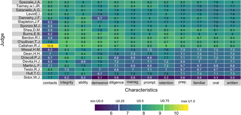
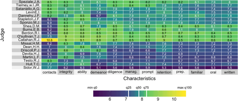
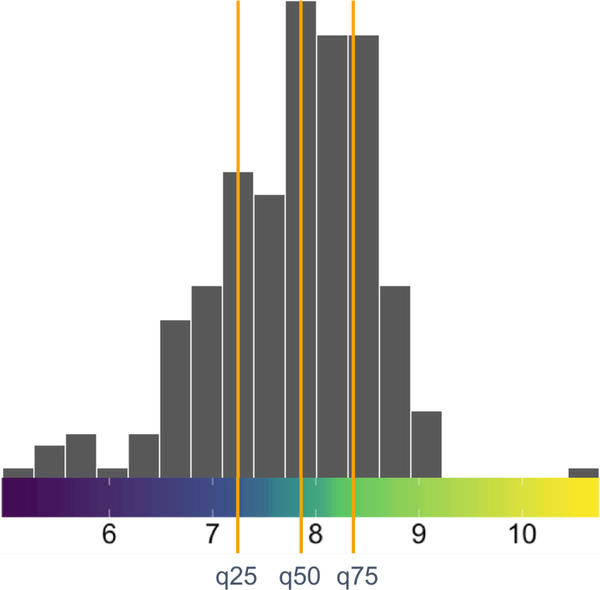
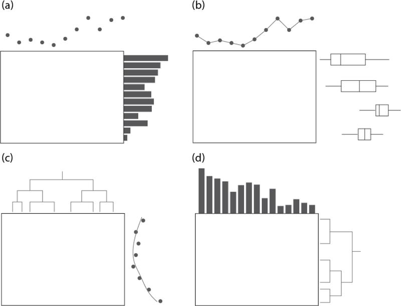
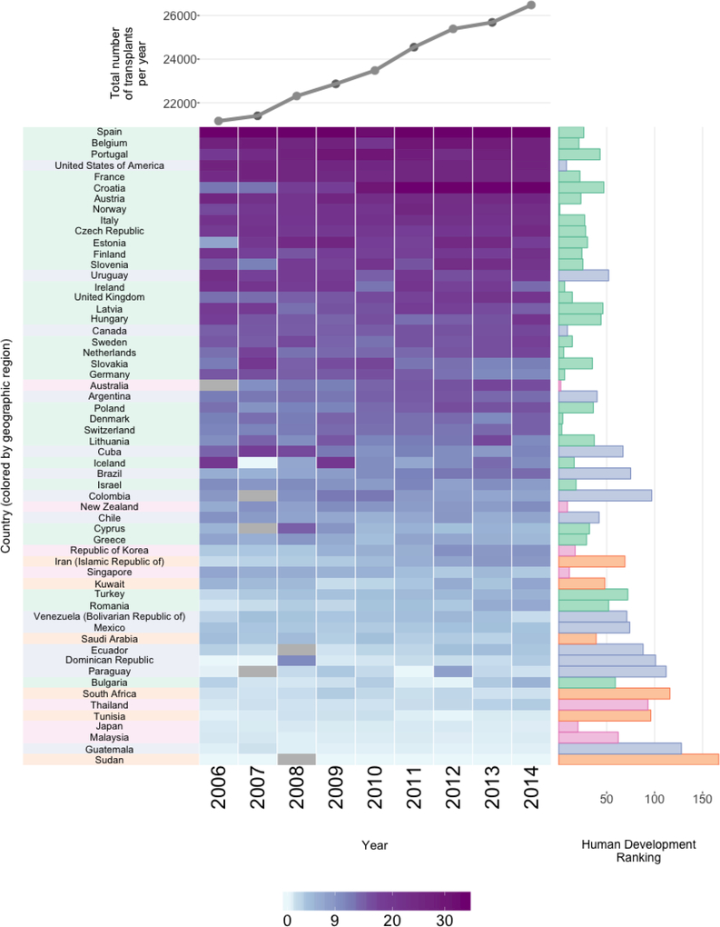
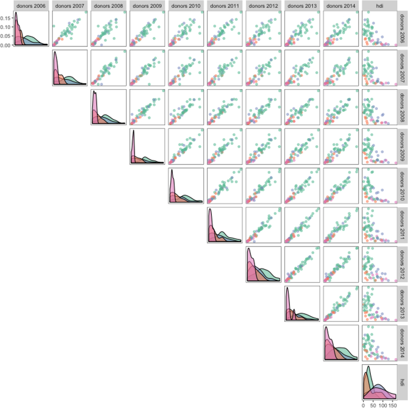
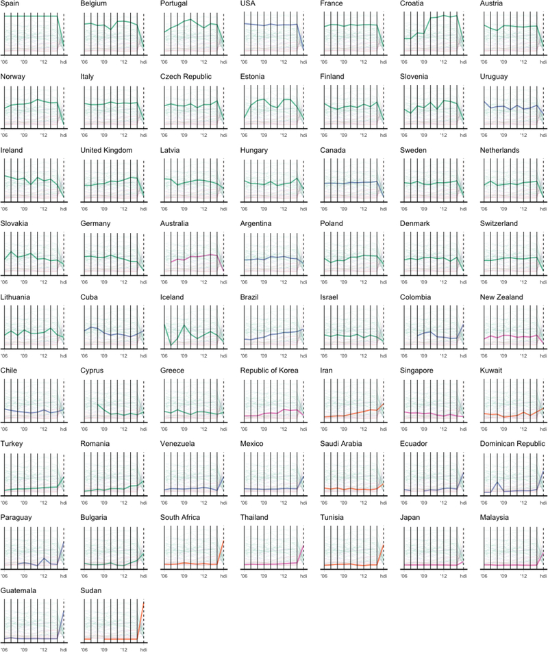
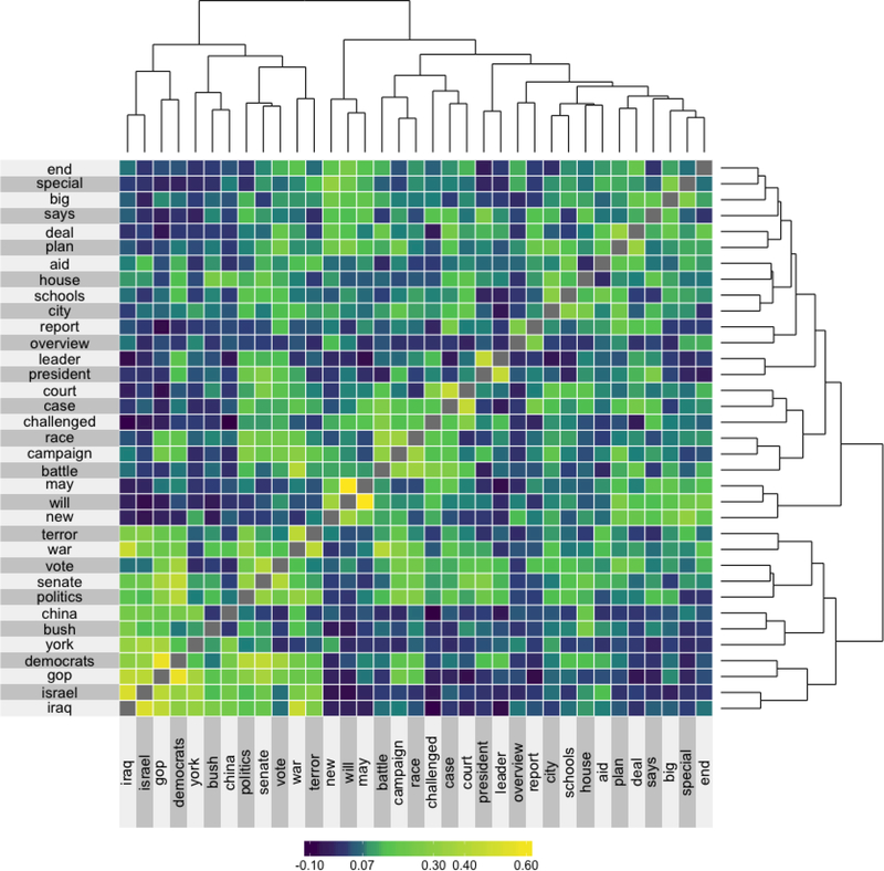
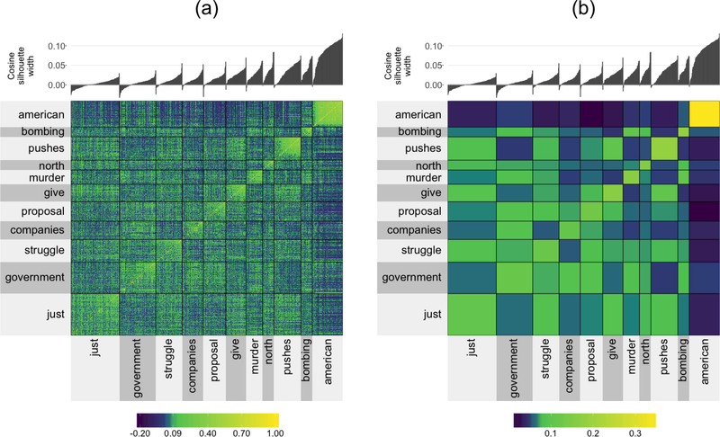
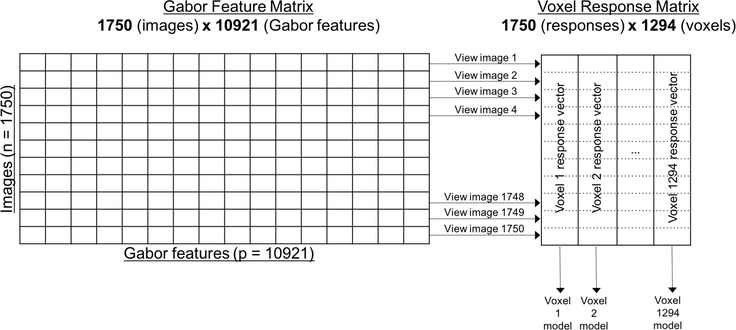
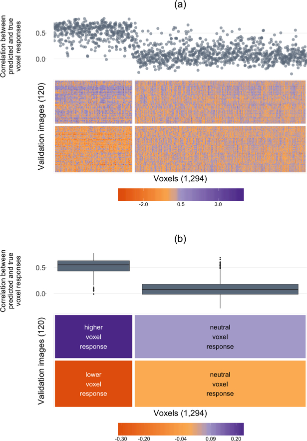
The technological advancements of the modern era have enabled the collection of huge amounts of data in science and beyond. Extracting useful information from such massive datasets is an ongoing challenge as traditional data visualization tools typically do not scale well in high-dimensional settings. An existing visualization technique that is particularly well suited to visualizing large datasets is the heatmap. Although heatmaps are extremely popular in fields such as bioinformatics, they remain a severely underutilized visualization tool in modern data analysis. This paper introduces superheat, a new R package that provides an extremely flexible and customizable platform for visualizing complex datasets. Superheat produces attractive and extendable heatmaps to which the user can add a response variable as a scatterplot, model results as boxplots, correlation information as barplots, and more. The goal of this paper is two-fold: (1) to demonstrate the potential of the heatmap as a core visualization method for a range of data types, and (2) to highlight the customizability and ease of implementation of the superheat R package for creating beautiful and extendable heatmaps. The capabilities and fundamental applicability of the superheat package will be explored via three reproducible case studies, each based on publicly available data sources.

Keywords: Data Visualization; Exploratory Data Analysis; Heatmap; Multivariate Data.


Figures

Figure 1:
Figure 1:
A heatmap with a viridis color space and linear color map of the lawyers’ ratings of 20 state Judges in the US Superior Court. The white vertical bars in the legend represent the positions of three central (equidistant) colors in color space.
Figure 2:
Figure 2:
A heatmap with a viridis color space and quantile color map of the Lawyers’ ratings of 20 state Judges in the US Superior Court. The numbers in the cells show the actual ratings. The white vertical bars in the legend represent the same three colors from Figure 1, and in this example, their positions are mapped from the 25th, 50th, and 75th quantiles in the data.
Figure 3:
Figure 3:
The distribution as a histogram of the lawyer’s ratings on US superior court judges placed on top of the quantile color map (from Figure 2). The quantiles are highlighted by vertical orange lines.
Figure 4:
Figure 4:
Four examples of superheat layouts. Panel (a) shows a scatterplot added to the columns, and a bar plot added to the rows. Panel (b) shows a scatter-line plot added to the columns and grouped boxplots added to the rows. Panel (c) shows a dendrogram added to the columns and a scatter-smooth plot (a scatterplot with a smoothed curve) added to the rows. Panel (d) shows a bar plot added to the columns and a dendrogram added to the rows.
Figure 5:
Figure 5:
Organ donations and HDI by country. The right-hand bar plot displays the HDI ranking (lower is better). Each heatmap cell shows the number of organ donations from deceased donors per 100K. Grey cells correspond to missing values. The rows (countries) are ordered by average transplants per 100K. The country labels and HDI bar plot are colored based on region: Europe (green), Eastern Mediterranean (purple), Western Pacific (yellow), America (orange), South East Asia (pink) and Africa (light green). The upper line plot shows total organs donated per year.
Figure 6:
Figure 6:
A scatterplot matrix of the organ donation data created using the ggpairs function from the GGally R package. The matrix contains of pairwise scatterplots for the following variables: the number of organ donations for each country each year from 2006 to 2014 and the country’s HDI ranking. Each point is colored by region as in Figure 5.
Figure 7:
Figure 7:
A series of parallel coordinates plots of the organ donation data built using the ggplot2 R package. Each country corresponds to a line that traverses a path from one variable to another. Each variable has been scaled so that the bottom of the vertical line representing the variable corresponds to the smallest observed value and the top corresponds to the largest observed value. Each country is colored based on region as in Figure 5.
Figure 8:
Figure 8:
The cosine similarity matrix for the 35 most common words from the NY Times headlines that also appear in the Google News corpus. The rows and columns are ordered based on hierarchical clustering. This hierarchical clustering is displayed via dendrograms.
Figure 9:
Figure 9:
A clustered cosine similarity matrix for the 855 most common words from the NY Times headlines that also appear in the Google News corpus. The clusters were generated using PAM and the cluster label is given by the medoid word of the cluster. Panel (a) displays the raw clustered 855×855 cosine similarity matrix, while panel (b) displays a “smoothed” version where the cells in the cluster are aggregated by taking the median of the values within the cluster.
Figure 10:
Figure 10:
A diagram describing the fMRI data: a design matrix with 1,750 observations (images) and 10,921 features (Gabor wavelets) for each image, and a voxel response matrix consisting of 1,294 distinct voxel response vectors, where, for each voxel, the responses to each of the 1,750 images were collected. We fit a predictive model for each voxel using the Gabor feature matrix (1,294 models). The heatmap in Figure 11 corresponds to the voxel response matrix.
Figure 11:
Figure 11:
A superheatmap displaying the validation set voxel response matrix (Panel (a) displays the raw matrix, while Panel (b) displays a smoothed version). The images (rows) and voxels (columns) are each clustered into two groups (using K-means). The left cluster of voxels are more “sensitive” wherein their response is different for each group of images (higher than the average response for top cluster images, and lower than the average response for bottom cluster images), while the right cluster of voxels are more “neutral” wherein their response is similar for both image clusters. Voxel-specific Lasso model performance is plotted as correlations above the columns of the heatmap (as a scatterplot in (a) and cluster-aggregated boxplots in (b)).

References

    1. Abouna GM (2008). Organ Shortage Crisis: Problems and Possible Solutions. Transplantation Proceedings 40(1), 34–38. - PubMed
    1. Andrews DF (1972). Plots of High-Dimensional Data. Biometrics 28(1), 125–136.
    1. Brinton W (1914). Graphic Methods for Presenting Facts,. New York: The Engineering Magazine Company.
    1. Bujack R, Turton TL, Samsel F, Ware C, Rogers DH, and Ahrens J (2018, January). The Good, the Bad, and the Ugly: A Theoretical Framework for the Assessment of Continuous Colormaps. IEEE Transactions on Visualization and Computer Graphics 24(1), 923–933. - PubMed
    1. Chen C (2002). Generalized Association Plots: Information Visualization via Iteratively Gener-ated Correlation Matrices. Statistica Sinica (12), 7–29.