. 2019 Apr 9;9(1):5806.
doi: 10.1038/s41598-019-42086-0.

Using sensory discrimination in a foraging-style task to evaluate human upper-limb sensorimotor performance

Affiliations

Using sensory discrimination in a foraging-style task to evaluate human upper-limb sensorimotor performance

Dylan T Beckler et al. Sci Rep. .

Abstract

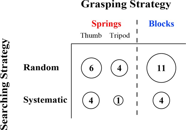
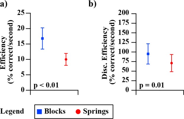
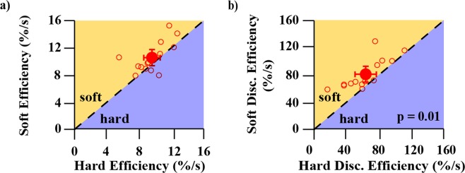
Object stiffness discrimination is fundamental to shaping the way we interact with our environment. Investigating the sensorimotor mechanisms underpinning stiffness discrimination may help further our understanding of healthy and sensory-impaired upper limb function. We developed a metric that leverages sensory discrimination techniques and a foraging-based analysis to characterize participant accuracy and discrimination processes of sensorimotor control. Our metric required searching and discriminating two variants of test-object: rubber blocks and spring cells, which emphasized cutaneous-force and proprioceptive feedback, respectively. We measured the number of test-objects handled, selection accuracy, and foraging duration. These values were used to derive six indicators of performance. We observed higher discrimination accuracies, with quicker search and handling durations, for blocks compared to spring cells. Correlative analyses of accuracy, error rates, and foraging times suggested that the block and spring variants were, in fact, unique sensory tasks. These results provide evidence that our metric is sensitive to the contributions of sensory feedback, motor control, and task performance strategy, and will likely be effective in further characterizing the impact of sensory feedback on motor control in healthy and sensory-impaired populations.


Conflict of interest statement

The authors declare no competing interests.

Figures

Figure 1
Figure 1
Schematic of the experimental setup. A two-compartment Box-and-Block-style setup had one compartment filled with polyurethane rubber blocks that the participant would discriminate, transfer over the center partition, and release in the drop-off area. The participant wore frosted goggles and noise cancelling headphones, and two digital recorders captured video data.
Figure 2
Figure 2
Spring cell design. (a) The overall dimensions of the assembled spring cells detailing diameters of the inner tube and outer tube, as well as the overall height. (b) An exploded assembly view of the spring cell components detailing the end caps, inner tube, outer tube, and spring.
Figure 3
Figure 3
Foraging cycle. A breakdown of the foraging phases and time outcome measures extracted from review of experimental video footage. Where TS, TR, TH, and TI denote search time, recognition time, handling time, and involvement time, respectively. The gray dashed box represents the time periods during testing that defined involvement time.
Figure 4
Figure 4
A breakdown of the six metrics collected during testing, for both blocks (blue) and springs (red). Panel (a) shows the average of all participants’ selection accuracies for both blocks and springs. The fill of the object segments represents the average number of correct objects the participants identified per trial (out of five blocks or four spring cells), whereas the y-axis indicates the percentage of correctly selected objects that the participants identified from all trials (as a percentage). Panel (b) shows average Type I error rate (α) and Type II error rate (β) of all participants. P-value indicates significantly lower error rates. Panel (c) shows the average time participants spent in each foraging phase for both blocks and springs. The staggered bar plots represent different foraging phases and correspond to the labels on the left. The sum of each set of three bars represents the average total foraging time per respective test-object. Note that the error bars describe the variability of each foraging phase independently, and are not additive. P-value indicates significance level of both * (the top bars) and ** (the bottom bars). All error bars represent ±1 standard deviation of the respective plotted variable.
Figure 5
Figure 5
Correlations between block and spring performance for the six metrics collected during the test. Block performance is shown on the y-axes and spring performance is shown on the x-axes. Axes are scaled to include all data and maximize viewing area. Each marker indicates the block and spring performance of a different participant. The dotted lines are the trend lines. The correlation coefficient (r) and significance level of the correlation is labelled for each plot. The two plots at the bottom (Panels (e and f)) show significant correlations between blocks and springs for those for metrics. The label “prob.” denotes probability.
Figure 6
Figure 6
Soft blocks vs. hard blocks performance for five different metrics. All y-axes represent soft performance and all x-axes represent hard performance. For all panels, axes have been scaled/reversed such that better performance is to the top and right. Each open square marker represents a different participant. Larger filled square markers represent the average of all participants and the error bars represent 95% confidence intervals of the respective averaged data. The dotted 1:1 line in each plot represents equal performance between soft and hard blocks. Markers that lie above the dotted 1:1 line in the shaded orange region labelled soft indicate that participant performance for that metric was better for soft blocks, whereas markers that lie below the dotted 1:1 line in the shaded purple region labelled hard indicate that participant performance for that metric was better for hard blocks. Subplots 6a and 6c show statistically better performance for soft blocks than hard blocks, with labelled p-values indicating the significance level. The label “prob.” denotes probability.
Figure 7
Figure 7
Soft springs vs. hard springs performance for five different metrics. All y-axes represent soft performance and all x-axes represent hard performance. For all panels, axes have been scaled/reversed such that better performance is to the top and right. Open circle markers each represent a different participant. Larger filled circle markers represent the average of all participants and error bars represent 95% confidence intervals of the respective averaged data. The dotted 1:1 line in each plot represents equal performance between soft and hard springs. Markers that lie above the dotted 1:1 line in the shaded orange region labelled soft indicate that participant performance for that metric was better for soft springs, whereas markers that lie below the dotted 1:1 line in the shaded purple region labelled hard indicate that participant performance for that metric was better for hard springs. Subplots 7a and 7c show statistically better performance for soft springs than hard springs, with labelled p-values indicating the significance level. The label “prob.” denotes probability.
Figure 8
Figure 8
Group mean performance during the first third and the last third of the experiment. Group mean performance was examined for accuracy, encounters per selection, and foraging time. The block test performance is shown as blue squares and the spring test performance is shown as red squares. Empty markers represent performance during the first third of the test, which was approximately 33 trials, and filled markers represent performance during the last third of the test (also 33 trials). Error bars represent 95% confidence intervals of the respective plotted variables. Axes are scaled to maximize viewing area.
Figure 9
Figure 9
Comparing each participant’s learning time to their overall performance for blocks and springs. Learning time was measured in number of trials, and performance was examined in three different measures (accuracy, encounters per selection, and foraging time per object). Blue blocks represent participant data from the block test (ac) and red circles represent participant data from the spring test (df). For (af), the x-axis shows the number of trials spent “learning”, that is, the number of trials it took each participant for their performance to stabilize within the 95% confidence intervals of their final performance. (g) Shows an example participant to illustrate how learning time was determined. The number of trials for the participant’s running average performance to enter and stay within the 95% confidence intervals of their final performance was considered to be the number of trials spent “learning”. Stable performance for this participant is indicated by the red vertical line.
Figure 10
Figure 10
Observed proportions of participants using different grasping and searching strategies. Participants were classified into two strategies of grasping (top: thumb versus tripod) and two strategies of searching (left: random versus systematic). The total number of participants using each searching strategy or each grasping strategy is shown by adding the numbers across each row or each column, respectively. The number of participants using particular combinations of grasp and search strategies can be seen by looking at specific cells (e.g., the number of people who searched systematically with a tripod grasp is shown in the bottom center cell.)
Figure 11
Figure 11
Group-mean performance in efficiency and discrimination efficiency for blocks (blue) and springs (red). Panel (a) shows average efficiency of all participants. P-value indicates significantly higher efficiency in the block test. Panel (b) shows the average discrimination efficiency of all participants for blocks (blue) and springs (red). P-value indicates significant difference in group means.
Figure 12
Figure 12
Correlation between block and spring performance for efficiency and discrimination efficiency. Block performance is shown on the y-axes and spring performance is shown on the x-axes. Axes are scaled to include all data and maximize viewing area. Each marker indicates the block and spring performance of a different participant. The dotted lines are the trend lines. The correlation coefficient (r) and significance level of the correlation is labelled for both plots. Both metrics showed significant correlation across the block and spring tasks.
Figure 13
Figure 13
Soft blocks vs. hard blocks performance for efficiency and discrimination efficiency metrics. Both y-axes represent soft performance and both x-axes represent hard performance. For both panels, axes have been scaled such that better performance is to the top and right. Each open square marker represents a different participant. Larger filled square markers represent the average of all participants and the error bars represent 95% confidence intervals of the respective averaged data. The dotted 1:1 line in each plot represents equal performance between soft and hard blocks. Markers that lie above the dotted 1:1 line in the shaded orange region labelled soft indicate that participant performance for that metric was better for soft blocks, whereas markers that lie below the dotted 1:1 line in the shaded purple region labelled hard indicate that participant performance for that metric was better for hard blocks. Average participant discrimination efficiency (subplot 13b) was significantly higher for soft blocks compared to hard blocks
Figure 14
Figure 14
Soft springs vs. hard springs performance for efficiency and discrimination efficiency metrics. Both y-axes represent soft performance and both x-axes represent hard performance. For both panels, axes have been scaled such that better performance is to the top and right. Open circle markers each represent a different participant. Larger filled circle markers represent the average of all participants and error bars represent 95% confidence intervals of the respective averaged data. The dotted 1:1 line in each plot represents equal performance between soft and hard springs. Markers that lie above the dotted 1:1 line in the shaded orange region labelled soft indicate that participant performance for that metric was better for soft springs, whereas markers that lie below the dotted 1:1 line in the shaded purple region labelled hard indicate that participant performance for that metric was better for hard springs. Average participant discrimination efficiency (subplot 14b) was significantly higher for soft springs compared to hard springs.

References

    1. Srinivasan, M. A. & Lamotte, R. H. Tactual Discrimination of Softness. Neurophysiology73 (1995). - PubMed
    1. Johansson RS, Flanagan JR. Tactile Sensory Control of Object Manipulation in Humans. Senses A Compr. Ref. 2010;6:67–86.
    1. Robertson SL, Jones LA. Tactile sensory impairments and prehensile function in subjects with left-hemisphere cerebral lesions. Arch. Phys. Med. Rehabil. 1994;75:1108–1117. doi: 10.1016/0003-9993(94)90086-8. - DOI - PubMed
    1. Tyson SF, Hanley M, Chillala J, Selley AB, Tallis RC. Sensory loss in hospital-admitted people with stroke: Characteristics, associated factors, and relationship with function. Neurorehabil. Neural Repair. 2008;22:166–172. doi: 10.1177/1545968307305523. - DOI - PubMed
    1. Carey LM, Matyas TA, Oke LE. Sensory loss in stroke patients: effects of training of tactile and propriceptive discrimmination. Arch Phys Med Rehabil. 1993;74:602–611. doi: 10.1016/0003-9993(93)90158-7. - DOI - PubMed

Publication types