. 2019 Apr 24:8:e45133.
doi: 10.7554/eLife.45133.

Tracking the popularity and outcomes of all bioRxiv preprints

Affiliations

Tracking the popularity and outcomes of all bioRxiv preprints

Richard J Abdill et al. Elife. .

Abstract

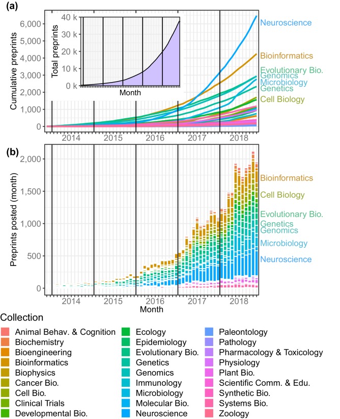
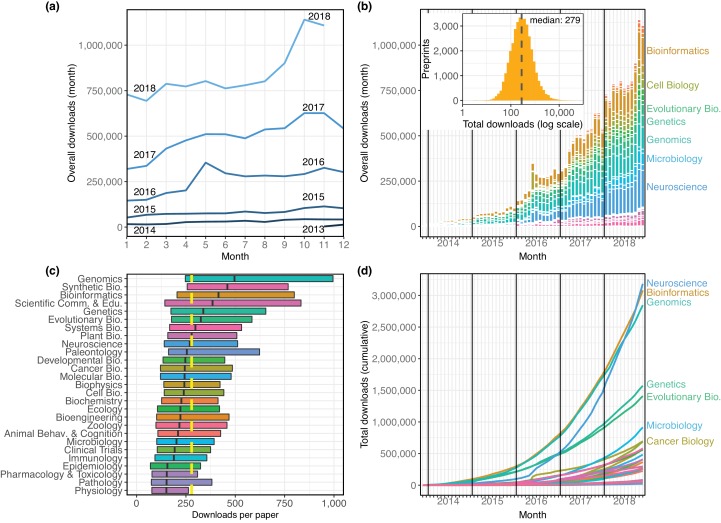
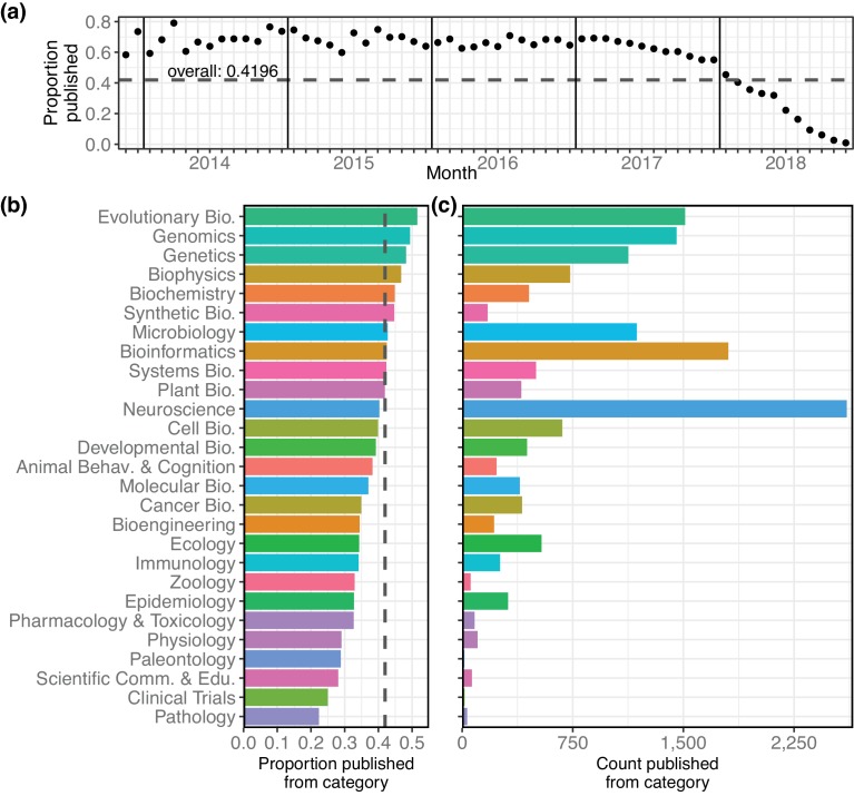
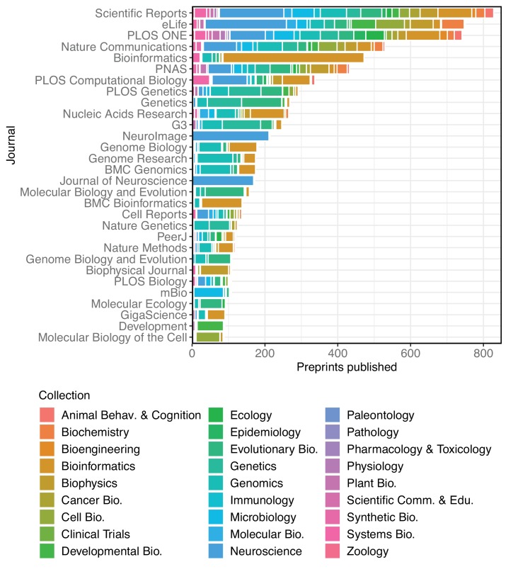
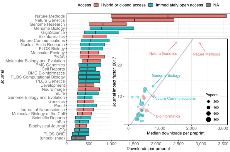
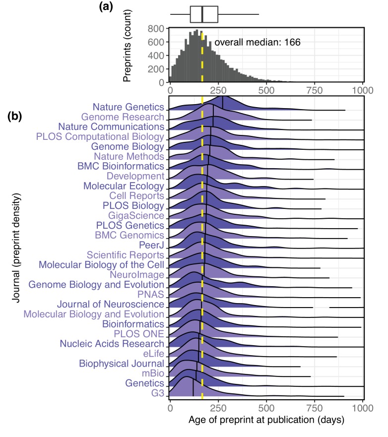
The growth of preprints in the life sciences has been reported widely and is driving policy changes for journals and funders, but little quantitative information has been published about preprint usage. Here, we report how we collected and analyzed data on all 37,648 preprints uploaded to bioRxiv.org, the largest biology-focused preprint server, in its first five years. The rate of preprint uploads to bioRxiv continues to grow (exceeding 2,100 in October 2018), as does the number of downloads (1.1 million in October 2018). We also find that two-thirds of preprints posted before 2017 were later published in peer-reviewed journals, and find a relationship between the number of downloads a preprint has received and the impact factor of the journal in which it is published. We also describe Rxivist.org, a web application that provides multiple ways to interact with preprint metadata.

Keywords: bibliometrics; bioRxiv; meta-research; none; preprints; publishing; web scraping.


Conflict of interest statement

RA, RB No competing interests declared

Figures

Figure 1.
Figure 1.. Total preprints posted to bioRxiv over a 61 month period from November 2013 through November 2018.
(a) The number of preprints (y-axis) at each month (x-axis), with each category depicted as a line in a different color. Inset: The overall number of preprints on bioRxiv in each month. (b) The number of preprints posted (y-axis) in each month (x-axis) by category. The category color key is provided below the figure.
Figure 2.
Figure 2.. The distribution of all recorded downloads of bioRxiv preprints.
(a) The downloads recorded in each month, with each line representing a different year. The lines reflect the same totals as the height of the bars in Figure 2b. (b) A stacked bar plot of the downloads in each month. The height of each bar indicates the total downloads in that month. Each stacked bar shows the number of downloads in that month attributable to each category; the colors of the bars are described in the legend in Figure 1. Inset: A histogram showing the site-wide distribution of downloads per preprint, as of the end of November 2018. The median download count for a single preprint is 279, marked by the yellow dashed line. (c) The distribution of downloads per preprint, broken down by category. Each box illustrates that category’s first quartile, median, and third quartile (similar to a boxplot, but whiskers are omitted due to a long right tail in the distribution). The vertical dashed yellow line indicates the overall median downloads for all preprints. (d) Cumulative downloads over time of all preprints in each category. The top seven categories at the end of the plot (November 2018) are labeled using the same category color-coding as above.
Figure 2—figure supplement 1.
Figure 2—figure supplement 1.. The distribution of downloads that preprints accrue in their first months on bioRxiv.
Figure 2—figure supplement 2.
Figure 2—figure supplement 2.. The proportion of downloads that preprints accrue in their first months on bioRxiv.
Figure 2—figure supplement 3.
Figure 2—figure supplement 3.. Multiple perspectives on per-preprint download statistics.
Figure 2—figure supplement 4.
Figure 2—figure supplement 4.. Total downloads per preprint, segmented by the year in which each preprint was posted.
Figure 3.
Figure 3.. Characteristics of the bioRxiv preprints published in journals, across the 27 subject collections.
(a) The proportion of preprints that have been published (y-axis), broken down by the month in which the preprint was first posted (x-axis). (b) The proportion of preprints in each category that have been published elsewhere. The dashed line marks the overall proportion of bioRxiv preprints that have been published and is at the same position as the dashed line in panel 3a. (c) The number of preprints in each category that have been published in a journal.
Figure 3—figure supplement 1.
Figure 3—figure supplement 1.. Observed annual publication rates and estimated range for actual publication rates.
Figure 4.
Figure 4.. A stacked bar graph showing the 30 journals that have published the most bioRxiv preprints.
The bars indicate the number of preprints published by each journal, broken down by the bioRxiv categories to which the preprints were originally posted.
Figure 5.
Figure 5.. A modified box plot (without whiskers) illustrating the median downloads of all bioRxiv preprints published in a journal.
Each box illustrates the journal’s first quartile, median, and third quartile, as in Figure 2c. Colors correspond to journal access policy as described in the legend. Inset: A scatterplot in which each point represents an academic journal, showing the relationship between median downloads of the bioRxiv preprints published in the journal (x-axis) against its 2017 journal impact factor (y-axis). The size of each point is scaled to reflect the total number of bioRxiv preprints published by that journal. The regression line in this plot was calculated using the ‘lm’ function in the R ‘stats’ package, but all reported statistics use the Kendall rank correlation coefficient, which does not make as many assumptions about normality or homoscedasticity.
Figure 6.
Figure 6.. The interval between the date a preprint is posted to bioRxiv and the date it is first published elsewhere.
(a) A histogram showing the distribution of publication intervals. The x-axis indicates the time between preprint posting and journal publication; the y-axis indicates how many preprints fall within the limits of each bin. The yellow line indicates the median; the same data is also visualized using a boxplot above the histogram. (b) The publication intervals of preprints, broken down by the journal in which each appeared. The journals in this list are the 30 journals that have published the most total bioRxiv preprints; the plot for each journal indicates the density distribution of the preprints published by that journal, excluding any papers that were posted to bioRxiv after publication. Portions of the distributions beyond 1,000 days are not displayed.

References

    1. Aksnes DW. When different persons have an identical author name. How frequent are homonyms? Journal of the American Society for Information Science and Technology. 2008;59:838–841. doi: 10.1002/asi.20788. - DOI
    1. Altmetric Support How is the altmetric attention score calculated? [November 30, 2018];2018 https://help.altmetric.com/support/solutions/articles/6000060969-how-is-...
    1. Anaya J. 674d5aaPrePubMed: Analyses. 2018 https://github.com/OmnesRes/prepub/tree/master/analyses/preprint_data.txt
    1. Barsh GS, Bergman CM, Brown CD, Singh ND, Copenhaver GP. Bringing PLOS Genetics Editors to Preprint Servers. PLOS Genetics. 2016;12:e1006448. doi: 10.1371/journal.pgen.1006448. - DOI - PMC - PubMed
    1. Berg JM, Bhalla N, Bourne PE, Chalfie M, Drubin DG, Fraser JS, Greider CW, Hendricks M, Jones C, Kiley R, King S, Kirschner MW, Krumholz HM, Lehmann R, Leptin M, Pulverer B, Rosenzweig B, Spiro JE, Stebbins M, Strasser C, Swaminathan S, Turner P, Vale RD, VijayRaghavan K, Wolberger C. Preprints for the life sciences. Science. 2016;352:899–901. doi: 10.1126/science.aaf9133. - DOI - PubMed

Publication types

MeSH terms