. 2019 Mar;10(2):278-285.
doi: 10.1055/s-0039-1687862. Epub 2019 Apr 24.

Composer-Visual Cohort Analysis of Patient Outcomes

Affiliations

Composer-Visual Cohort Analysis of Patient Outcomes

Jen Rogers et al. Appl Clin Inform. 2019 Mar.

Abstract

Objective: Visual cohort analysis utilizing electronic health record data has become an important tool in clinical assessment of patient outcomes. In this article, we introduce Composer, a visual analysis tool for orthopedic surgeons to compare changes in physical functions of a patient cohort following various spinal procedures. The goal of our project is to help researchers analyze outcomes of procedures and facilitate informed decision-making about treatment options between patient and clinician.

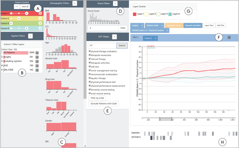
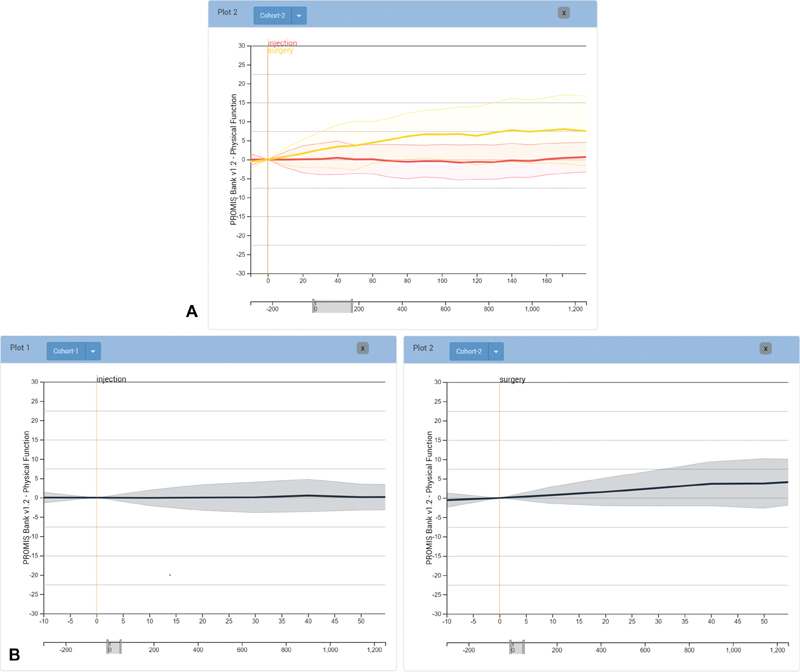
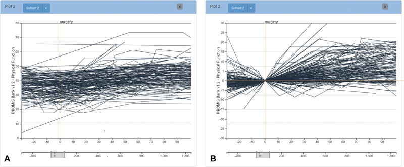
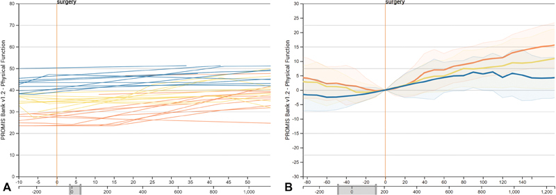
Methods: In collaboration with orthopedic surgeons and researchers, we defined domain-specific user requirements to inform the design. We developed the tool in an iterative process with our collaborators to develop and refine functionality. With Composer, analysts can dynamically define a patient cohort using demographic information, clinical parameters, and events in patient medical histories and then analyze patient-reported outcome scores for the cohort over time, as well as compare it to other cohorts. Using Composer's current iteration, we provide a usage scenario for use of the tool in a clinical setting.

Conclusion: We have developed a prototype cohort analysis tool to help clinicians assess patient treatment options by analyzing prior cases with similar characteristics. Although Composer was designed using patient data specific to orthopedic research, we believe the tool is generalizable to other healthcare domains. A long-term goal for Composer is to develop the application into a shared decision-making tool that allows translation of comparison and analysis from a clinician-facing interface into visual representations to communicate treatment options to patients.


Conflict of interest statement

None declared.

Figures

Fig. 1
Fig. 1
Composer overview. Composer consists of interfaces for flexibly defining cohorts, and for displaying the physical function scores of patients treated for back problems over time in these cohorts. ( A ) Patient cohorts can be added and branched in the cohort control interface. ( B ) A history of all filters applied to the selected cohort. Cohorts can be defined using ( C ) filters applied to demographic information, ( D ) recorded score frequencies, ( E ) and presence or absence of procedural codes. ( F ) The main interface is a chart showing either individual lines or aggregated areas. A zero-point for the PROMIS scores, indicated by the horizontal red line , can be flexibly defined to align all patients by a specific event, such as a medical intervention. ( G ) The layer panel provides the ability to hide layers corresponding to the cohorts. ( H ) Users can select individual patient lines to show orders associated with their medical records in the timeframe specified in the timeline below the main plot. Selected patients are identified by their patient id, shown on the left-hand side of the event line.
Fig. 2
Fig. 2
Differences in PROMIS scores after surgery and injection compared by ( A ) layering and ( B ) juxtaposition of multiple plots. Both methods allow for comparison of score change after different treatment events. ( A ) Treatment options in layers. ( B ) Juxtaposition in multiple plots.
Fig. 3
Fig. 3
View of score plots using ( A ) absolute and ( B ) relative scales. Each line represents an individual patient. Relative scales show change in PROMIS PF score, calculated from the score at the day zero event. In this case the patient score trajectories are aligned by the day of surgery. With a larger cohort, the general trend for patient progression can be difficult to see, which we address by providing aggregation functionality. ( A ) Absolute score scale. ( B ) Relative score scale.
Fig. 4
Fig. 4
View of patient scores separated and color coded by quantiles. The PROMIS PF scores were separated into quartiles, shown as individual lines in ( A ) and aggregated area charts in ( B ). The orange marks represent the top quartile, the yellow marks the interquartile range, and the blue marks the bottom quartile. ( A ) Quantiles color coded. ( B ) Quantiles aggregated.

References

    1. Lee J, Maslove D M, Dubin J A. Personalized mortality prediction driven by electronic medical data and a patient similarity metric. PLoS One. 2015;10(05):e0127428. - PMC - PubMed
    1. Gallego B, Walter S R, Day R O et al.Bringing cohort studies to the bedside: framework for a ‘green button’ to support clinical decision-making. J Comp Eff Res. 2015;4(03):191–197. - PubMed
    1. Cella D, Riley W, Stone A et al.The Patient-Reported Outcomes Measurement Information System (PROMIS) developed and tested its first wave of adult self-reported health outcome item banks: 2005-2008. J Clin Epidemiol. 2010;63(11):1179–1194. - PMC - PubMed
    1. Thadhani R, Tonelli M. Cohort studies: marching forward. Clin J Am Soc Nephrol. 2006;1(05):1117–1123. - PubMed
    1. Perer A, Wang F, Hu J. Mining and exploring care pathways from electronic medical records with visual analytics. J Biomed Inform. 2015;56:369–378. - PubMed

Publication types