. 2019 Apr 24;8(4):315-328.e8.
doi: 10.1016/j.cels.2019.03.010.

Performance Assessment and Selection of Normalization Procedures for Single-Cell RNA-Seq

Affiliations

Performance Assessment and Selection of Normalization Procedures for Single-Cell RNA-Seq

Michael B Cole et al. Cell Syst. .

Abstract

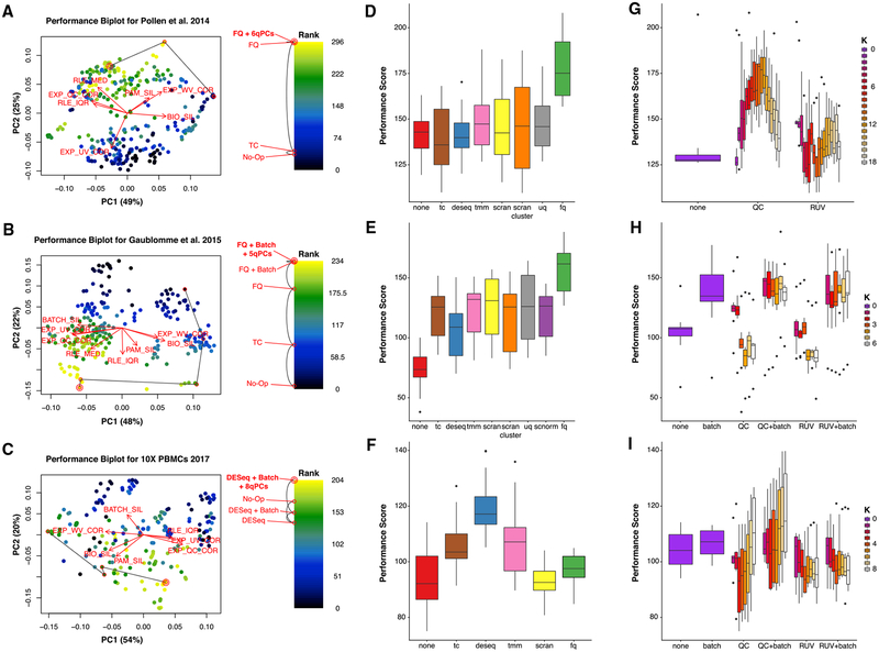
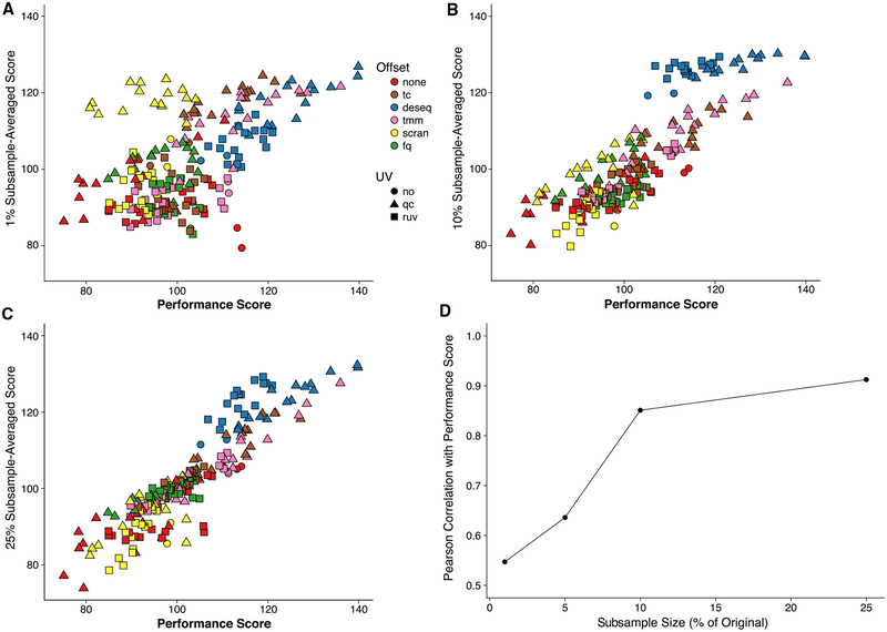
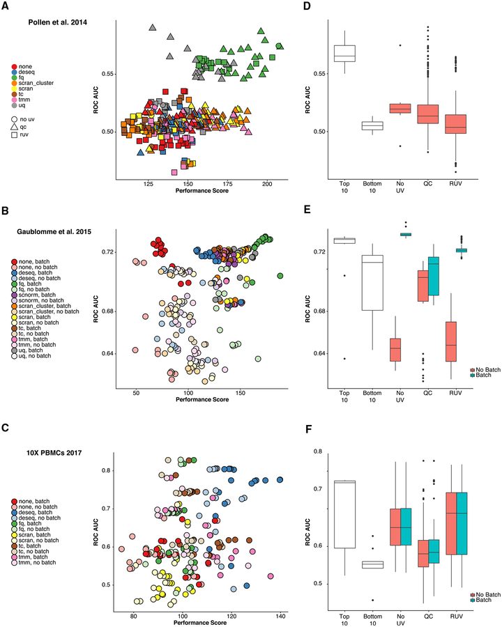
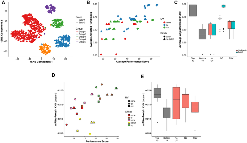
Systematic measurement biases make normalization an essential step in single-cell RNA sequencing (scRNA-seq) analysis. There may be multiple competing considerations behind the assessment of normalization performance, of which some may be study specific. We have developed "scone"- a flexible framework for assessing performance based on a comprehensive panel of data-driven metrics. Through graphical summaries and quantitative reports, scone summarizes trade-offs and ranks large numbers of normalization methods by panel performance. The method is implemented in the open-source Bioconductor R software package scone. We show that top-performing normalization methods lead to better agreement with independent validation data for a collection of scRNA-seq datasets. scone can be downloaded at http://bioconductor.org/packages/scone/.

Keywords: RNA-seq; methods; normalization; preprocessing; quality control; scRNA-seq; single-cell.


Conflict of interest statement

DECLARATION OF INTERESTS

The authors declare no competing interests.

Figures

Figure 1.
Figure 1.. Exploratory Data Analysis of Mouse Th17 Dataset (Gaublomme et al., 2015) and “scone” Workflow
(A)Principal-component analysis (PCA) of the log-transformed, total-count-normalized (TC) read count data for all genes and cells passing quality filtering (see STAR Methods). Cells are color-coded by biological condition; shape represents the donor mouse (batch). For two of the three conditions, samples were extracted from only one mouse (IL1B_IL6_IL23–48h-IL-17A/GFP+ and TGFB1_IL6–48h-IL-17A/GFP+ from mice 7 and 8), while samples from the third condition (TGFB1_IL6–48h) came from two distinct mice (mice 5 and 6). Cells cluster by both biological condition and batch, the latter representing unwanted variation. (B) Absolute Spearman correlation coefficient between the first three principal components (PCs) of the expression measures (as computed in A) and a set of quality control (QC) measures (Table S1). (C) Heatmap of pairwise Pearson correlation coefficients between QC measures. (D) PCA of the QC measures for all cells in (A). PCs of QC measures are labeled “qPCs” to distinguish them from expression PCs. Single-cell QC profiles cluster by batch, representing aspects of batch covariation. (E) Boxplot of the first qPC, stratified by both biological condition and batch. Note that there are different numbers of cells in each stratum. (F) Schematic view of the “scone” workflow. The yellow box summarizes the five main steps of the “scone” workflow. (i) QC measures are obtained for each sample, using Picard tools (Table S1), Cell Ranger (Table S2), or other tools such as scater. (ii) (Optional) Sample-level QC measures are used to filter out low-quality samples. Subsequently, lowly expressed genes are identified and filtered out to reduce the impact of noisy features on downstream analysis. (iii) Data are normalized via many combinations of scaling procedures and regression-based procedures, modeling both known and unknown variation as indicated in the regression model diagram. (iv) Normalized data are evaluated and ranked according to a panel of eight performance metrics, spanning three categories: (1) Clustering properties (e.g., removing batch effects and preserving biological heterogeneity), (2) association with control genes and QC metrics (e.g., preserving association with positive controls and removing association with QC measures), and (3) global distributional properties (e.g., reducing global expression variability). (v) One or more highly ranked normalization procedures are analyzed in parallel, and downstream conclusions are compared.
Figure 2.
Figure 2.. Normalization Performance Assessment for Three scRNA-Seq Datasets (Pollen et al., 2014; Gaublomme et al., 2015; Zheng et al., 2017)
(A–C) Biplot (Gabriel, 1971) showing the first two PCs of eight rank-transformed “scone” performance metrics, or fewer if some are undefined or invariant: preservation of biological clustering (“BIO_SIL”), batch effect removal (“BATCH_SIL”), cluster heterogeneity (“PAM_SIL”), preservation of association with positive control genes (“EXP_WV_COR”), removal of unwanted associations (negative control genes, “EXP_UV_COR,” or sample-level QC measures, “EXP_WC_COR”), and global distributional uniformity (“RLE_MED” and “RLE_IQR”). Each point corresponds to a normalization procedure and is color coded by the rank of the “scone” performance score (mean of eight “scone” performance metric ranks). The red arrows correspond to the PCA loadings for the eight performance metric ranks. The direction and length of a red arrow can be interpreted as a measure of how much each metric contributes to the first two PCs. Red circles mark the best normalization (w/double circle), no normalization, and other normalization procedures relating the two (see labels). Abbreviations are as follows: No-Op, no normalization; TC, total-count normalization; FQ, full-quantile normalization; DESeq, relative log-expression scaling (Anders and Huber, 2010); Batch, regression-based batch normalization; and kqPCs, regression-based adjustment for first k qPCs. (D–F) Boxplot of “scone” performance score, stratified by scaling normalization method, for the three scRNA-seq datasets presented in the same order as in (A)–(C). (G–I) Boxplot of “scone” performance score, stratified by regression-based normalization method (batch, QC, and RUV), for the three scRNA-seq datasets presented in the same order as in (A)–(C).
Figure 3.
Figure 3.. “scone” Analyses for Subsamples of 10× PBMC Dataset (Zheng et al., 2017)
(A–C) Average subsample performance score versus full-sample performance score. We randomly extracted 10 subsamples from the full dataset corresponding to a fixed percentage of the original sample size, applied “scone” independently for each subsample, and averaged the 10 performance scores to obtain a final performance score per procedure. Plots are shown for subsamples comprising (A) 1%, (B) 10%, and (C) 25% of the original sample. (D) Pearson correlation coefficient between average subsample performance score and full-sample performance score for different subsample percentages. When sampling at least 10% of the cells, we observed correlations greater than 0.8 with scores for the full data.
Figure 4.
Figure 4.. Relationship between “scone” Performance Scores and External Differential Expression Validation in Three scRNA-Seq Datasets (Pollen et al., 2014; Gaublomme et al., 2015; Zheng et al., 2017)
(A–C) ROC AUC versus “scone” performance score. Normalization procedures in the top-right corner are deemed best both by “scone” and by independent differential expression (DE) validation. (A) Comparing GW16 (gestational week 16) and GW21+3 (gestational week 21, cultured for 3 weeks) cells in Pollen et al. (2014), highlighting performance differences between scaling methods and the type of regression-based adjustment. (B) Comparing pathogenic and non-pathogenic cells in Gaublomme et al. (2015), performance differs between scaling methods and regression-based batch adjustment. (C) Comparing B cells and dendritic cells in 10× dataset (Zheng et al., 2017); performance differs between scaling methods but not by batch adjustment. (D–F) Boxplots of ROC AUC for the bottom 10 (bot10) and top 10 (top10) procedures as ranked by “scone” and for procedures with RUV, QC adjustment, and neither (RUV, QC, or No_UV respectively). Boxplots are further stratified by batch adjustment, when appropriate. Datasets are presented in the same order as in (A)–(C).
Figure 5.
Figure 5.. Validating “scone” Performance with Simulated Data and External Cell-Level Data
(A) t-distributed stochastic neighbor embedding (tSNE) of the first 10 PCs of the log-transformed, TC-normalized UMI counts for a dataset simulated using “splatter,” with parameters inferred from the 10× PBMC dataset (Zheng et al., 2017). (B) Average adjusted Rand index (ARI) between the true simulated clusters and k-means clusters (k = 5) for normalized data versus “scone” performance score (without BIO_SIL score) across 10 “splatter” simulations (see STAR Methods). A Pearson correlation of 0.73 between the two metrics highlights the ability of “scone” to select procedures that optimize aspects of clustering that are not explicitly accounted for in the performance panel. The top-performing procedure was FQ with adjustment for batch and 1 qPC. (C) Boxplot of average ARI for the bottom 10 (bot10) and top 10 (top10) procedures as ranked by “scone” and for procedures with RUV, QC adjustment, and neither (“RUV,” “QC,” and “No_UV,” respectively). The boxplot is stratified by batch adjustment for the latter 3 categories. (D) Jaccard score between kNN graph of protein abundance measures and kNN graph of normalized expression measures (k = 792, 10% of samples; see STAR Methods) versus “scone” performance score. A Pearson correlation of 0.60 between these metrics demonstrates how “scone” selects procedures that improve local representations of cell-cell similarity. (E) Boxplot of Jaccard score for the bottom 10 (bot10) and top 10 (top10) procedures as ranked by “scone,” procedures with no non-batch unwanted variation normalization (No_UV) and procedures with RUV or QC adjustment (QC or RUV).
Figure 6.
Figure 6.. “scone” Results for Human Induced Pluripotent Stem Cells (iPSC) Dataset with Nested Study Design (Tung et al., 2017)
(A) PCA of the log-transformed, TC-normalized UMI counts for all genes and cells passing quality filtering, with points coded by donor (color) and batch (shade). The cells cluster by batch, indicating substantial batch effects. (B) PCA of QC measures, with points coded by donor and batch. The QC measures do not appear to capture batch effects, but rather intra-batch technical variation. (C) PCA of log-transformed expression measures after FQ normalization followed by normalization for nested batch effects (top-performing procedure in “scone”), with points coded by donor and batch. As desired, cells cluster by donor but not by batch. (D) Boxplot of “scone” performance score, stratified by regression-based normalization. Normalization procedures including a nested batch correction per-formed better than those without that step.
Figure 7.
Figure 7.. Report Browser Shiny Interface
(A) Selecting normalization procedures of interest using the interactive biplot function biplot_interactive and its drag-and-drop window selection tool. This tool is useful for exploring performance clusters and selecting procedures that perform similarly across the eight performance metrics. (B) Browsing normalized products. The SCONE Report Browser presents an interactive tree representation (top-right panel) of selected procedures. Procedures may be further selected via a sortable performance table (bottom-right panel) or a drop-down menu (side panel). The report will then produce plots corresponding to various analyses of the normalized data. (C) Report Browser “Silhouette” tab: for the selected procedure, the silhouette width of each normalized sample is computed, grouping samples by biological condition, batch, or PAM clustering. The drop-down menu in the left bar allows the user to switch between the three categorical labels; the slider in the left panel allows the user to select the number of clusters for PAM, recomputed for each normalization procedure. (D) Report Browser “Control Gene” tab: if the user provides positive and negative control genes, the gene-level expression measures for these genes are visualized using silhouette-sorted heatmaps, including annotations for biological condition, batch, and PAM clustering. (E) Report Browser “Relative Log-Expression” tab: a boxplot of relative log-expression (RLE) measures is shown for the selected normalization procedure. Boxes (per-cell) are color coded by biological condition, batch, or PAM clustering (drop-down selection in the left panel). If the majority of genes are not expected to be differentially expressed, the RLE distributions of the samples should be similar and centered around zero.

References

    1. Afik S, Yates KB, Bi K, Darko S, Godec J, Gerdemann U, Swadling L, Douek DC, Klenerman P, Barnes EJ, et al. (2017). Targeted reconstruction of T cell receptor sequence from single cell RNA-seq links CDR3 length to T cell differentiation state. Nucleic Acids Res. 45, e148. - PMC - PubMed
    1. Anders S, and Huber W (2010). Differential expression analysis for sequence count data. Genome Biol. 11, R106. - PMC - PubMed
    1. Bacher R, Chu L-F, Leng N, Gasch AP, Thomson JA, Stewart RM, Newton M, and Kendziorski C (2017). SCnorm: robust normalization of single-cell RNA-seq data. Nat. Methods 14, 584–586. - PMC - PubMed
    1. Bacher R, and Kendziorski C (2016). Design and computational analysis of single-cell RNA-sequencing experiments. Genome Biol. 17. - PMC - PubMed
    1. Buettner F, Natarajan KN, Casale FP, Proserpio V, Scialdone A, Theis FJ, Teichmann SA, Marioni JC, and Stegle O (2015). Computational analysis of cell-to-cell heterogeneity in single-cell RNA-sequencing data reveals hidden subpopulations of cells. Nat. Biotechnol 33, 155–160. - PubMed

Publication types