. 2019 Jul;101(1):137-147.
doi: 10.4269/ajtmh.18-0901.

Malaria Burden through Routine Reporting: Relationship between Incidence and Test Positivity Rates

Affiliations

Malaria Burden through Routine Reporting: Relationship between Incidence and Test Positivity Rates

Simon P Kigozi et al. Am J Trop Med Hyg. 2019 Jul.

Abstract

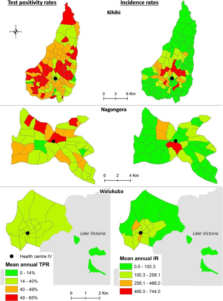
Test positivity rate (TPR)-confirmed cases per 100 suspected cases tested, and test-confirmed malaria case rate (IR)-cases per 1,000 population, are common indicators used routinely for malaria surveillance. However, few studies have explored relationships between these indicators over time and space. We studied the relationship between these indicators in children aged < 11 years presenting with suspected malaria to the outpatient departments of level IV health centers in Nagongera, Kihihi, and Walukuba in Uganda from October 2011 to June 2016. We evaluated trends in indicators over time and space, and explored associations using multivariable regression models. Overall, 65,710 participants visited the three clinics. Pairwise comparisons of TPR and IR by month showed similar trends, particularly for TPRs < 50% and during low-transmission seasons, but by village, the relationship was complex. Village mean annual TPRs remained constant, whereas IRs drastically declined with increasing distance from the health center. Villages that were furthest away from the health centers (fourth quartile for distance) had significantly lower IRs than nearby villages (first quartile), with an incidence rate ratio of 0.40 in Nagongera (95% CI: 0.23-0.63; P = 0.001), 0.55 in Kihihi (0.40-0.75; P < 0.001), and 0.25 in Walukuba (0.12-0.51; P < 0.001). Regression analysis results emphasized a nonlinear (cubic) relationship between TPR and IR, after accounting for month, village, season, and demographic factors. Results show that the two indicators are highly relevant for monitoring malaria burden. However, interpretation differs with TPR primarily indicating demand for malaria treatment resources and IR indicating malaria risk among health facility catchment populations.


Figures

Figure 1.
Figure 1.
Location of the three sites of Nagongera (farthest east), Walukuba (central), and Kihihi (southwest) in Uganda, with the respective locations of the health facilities included. Red dots represent the site study health facilities, each being a level IV health center for the health subdistrict to which the respective subcounty (our catchment area) belongs—all shown on the inset map of Uganda in black. Kihihi (in shades of yellow) is located southwest of Uganda with a 2002 estimated annual entomological innoculation rate (aEIR) of 6 infective bites per person; it is home to Queen Elizabeth National Park at the border between Uganda and Democratic Republic of Congo. Walukuba (orange area) is located in the central part of Uganda at the shores of Lake Victoria with an aEIR of 6, whereas Nagongera (light-green area) is located far east close to the border between Uganda and Kenya with an aEIR of 562. This figure appears in color at www.ajtmh.org.
Figure 2.
Figure 2.
Trial profile indicating the participants included in the study and the exclusion criteria at the two levels of time and space–time evaluations. VOR = patients’ village of residence.
Figure 3.
Figure 3.
Trends in incidence and test positivity rates (TPRs) over time (monthly), by site. In Figure 3, the solid orange line represents TPR, whereas the dashed red line represents incidence rate, both overlaid on bar plots of total number of children < 11 years tested for malaria per month. A scale of monthly numbers tested is shown on the left y axis, whereas that for the two incidence measures (indicators) is on the right y axis. The green dotted line represents the time of a universal long-lasting insecticidal-treated net distribution campaign in each site, whereas the purple dotted lines represent the timing of indoor residual spraying in Nagongera. This figure appears in color at www.ajtmh.org.
Figure 4.
Figure 4.
Plots of test positivity rate (TPR) against test-confirmed malaria case rate with points as months and point sizes accounting for the number tested for malaria by month. Each red dot here represents a month during the study duration, and the size of dots is relative to the number of suspected cases for independent episodes tested for malaria within each month. The gray curve is the fitted curve of the estimated relationship between the two measures of TPR and incidence rate. This figure appears in color at www.ajtmh.org.
Figure 5.
Figure 5.
Comparison of the spatial distribution of incidence rate (IR) and test positivity rate (TPR) based on the village-level annual mean of each indicator in the three sites of Kihihi, Nagongera, and Walukuba. Three sites of Kihihi, Nagongera, and Walukuba shown side by side to depict a comparison between the spatial distribution of the village mean annual TPR (left) against IR (right). Village boundaries for each site are represented with the gray lines, whereas the respective site study health facility location is represented by the black dot. A single legend per indicator is placed at the bottom on respective sides. This figure appears in color at www.ajtmh.org.
Figure 6.
Figure 6.
Plot of the distance between the village and health facility against the average annual test positivity rate (TPR), by site. Each point or circle corresponds to a village located in the site catchment area. The y axis is the average annual TPR, whereas the x axis is the distance of each village from the health facility in kilometers. The size of points is relative to the number of suspected cases tested for independent episodes of illness from the village overall. This figure appears in color at www.ajtmh.org.
Figure 7.
Figure 7.
Plot of the distance between the village and health facility against the average annual incidence rate (IR), by site. Each point or circle corresponds to a village located in the site catchment area. The y axis is the average annual IR, whereas the x axis is the distance of each village from the health facility in kilometers. The size of points is relative to the number of suspected cases tested for independent episodes from the village overall. This figure appears in color at www.ajtmh.org.

References

    1. WHO , 2016. World Malaria Report 2016. Geneva, Switzerland: World Health Organization, 38–44.
    1. WHO , 2014. World Malaria Report 2014. Geneva, Switzerland: World Health Organization, xii.
    1. Zu Erbach-Schoenberg E, et al. 2016. Dynamic denominators: the impact of seasonally varying population numbers on disease incidence estimates. Popul Health Metr 14: 35. - PMC - PubMed
    1. WHO , 2015. Guidelines for the Treatment of Malaria, 3rd edition Geneva, Switzerland: World Health Organization.
    1. Boyce RM, Reyes R, Matte M, Ntaro M, Mulogo E, Lin FC, Siedner MJ, 2016. Practical implications of the non-linear relationship between the test positivity rate and malaria incidence. PLoS One 11: e0152410. - PMC - PubMed

Publication types