doi: 10.1007/978-1-4939-9454-0_20.
Supervised Machine Learning with CITRUS for Single Cell Biomarker Discovery
Affiliations
- PMID: 31077114
- PMCID: PMC7458409
- DOI: 10.1007/978-1-4939-9454-0_20
Item in Clipboard
Supervised Machine Learning with CITRUS for Single Cell Biomarker Discovery
Methods Mol Biol.
2019.
Abstract
CITRUS is a supervised machine learning algorithm designed to analyze single cell data, identify cell populations, and identify changes in the frequencies or functional marker expression patterns of those populations that are significantly associated with an outcome. The algorithm is a black box that includes steps to cluster cell populations, characterize these populations, and identify the significant characteristics. This chapter describes how to optimize the use of CITRUS by combining it with upstream and downstream data analysis and visualization tools.
Keywords: Biomarker discovery; CITRUS; Supervised machine learning; viSNE.
Figures

Single cell biomarker discovery pipeline with CITRUS. Key steps outlined for biomarker discovery analysis pipeline. (a) Experimental setup (b) data tidying and quality control and (c) exploratory data analysis, clustering and biomarker discovery, and visualizations to communicate results. Steps (a) and (b) are required before initiating any of the components in step (c). Each part of step (c) (i–iii) may be initiated following experimental setup and data tidying/quality control

Flowchart to determine correlative vs. predictive CITRUS and CITRUS models to use. The CITRUS models to select are determined by the overall analysis goals. Use the above flowchart to determine which models will address the scientific question. Regardless of the model selection, significant populations identified by CITRUS can be visualized on viSNE maps

Technical control evaluation. Peripheral blood from one healthy donor was collected and cryopreserved to use as a technical control in this study. A different antibody cocktail was prepared for each of the five indicated staining batches and evaluated for differences across batch using the technical control. (a) Pre- normalized data for technical control samples shown. Histograms displaying a few measured markers are examined across batch. Intensity of indicated marker and the negative and positive spread are compared across batch. The red line indicates the middle of the plot. Data reveal staining differences. (b) Pre and post- normalization viSNE maps are compared by coloring across channel. Here, only CD19 expression is displayed. Technical control samples per batch were assessed using viSNE as an exploratory data analysis tool. Row 1 show data pre-normalization and row 2 show data post z-score normalization by batch. Data post- normalization highlight more uniform intensity of CD19 expression and reveal more uniform viSNE “island” shapes. The effect of normalization can be quantified using a clustering algorithm to define cell populations and then measuring the correlation of the cell populations across the batches pre- and post-normalization

Determine required pre-gating using event count. For example, we use the following logic to determine how many events are needed to be able to detect Tregs with a desired 5% CV starting with all CD3+ T cells for 50 samples. Let’s say the file with the lowest number of CD3+ T cells has 50,000 events in this population, and the maximum number of events we can include on viSNE is 1.3 M. (a) 1.3 M max events/ 50 samples = 26,000 events, which is <50,000. (b) We estimate that Tregs have a frequency of about 2% of CD3+ T cells. Thus, the # of events needed per file to detect Tregs is 20,000. 26,000 events is greater than the 20,000 events needed per file. (ii) No additional pre-gating is required in this example. If our samples did not meet these conditions, we could (i) reduce the number of samples being analyzed, or (c) perform further pre-gating to isolate a smaller and more specific group of cells containing the Treg cells

Using viSNE for Exploratory Data Analysis. Synthetic example viSNE grid, colored by marker expression, shown for patients with B cell malignancies. Two individuals from each group of interest are shown—two patients from Outcome A (therapy responders) and two patients from Outcome B (therapy non-responders). PBMCs were isolated from each patient prior to therapy (baseline) and stimulated with anti-BCR, to see if baseline stimulation responses will correlate with the outcome of therapy. Expression of each marker is indicated by scale bar (red for high, blue for low). In this example, each column represents the expression of the indicated marker (p-S6, p-PLCγ, p-ERK) for intact live cells from peripheral blood mononuclear cells (PBMCs). The B cell “island” of the viSNE map is circled in blue and reveals the inter- and intra-heterogeneity in expression of measured markers between groups and across patients. This exploratory data analysis highlights how patients who responded to therapy (from outcome group A) were able to respond to BCR stimulation prior to therapy; whereas, patients from outcome group B were not. The strongest response from patients in outcome group A was for p-S6 expression

Biomarker discovery results visualization. CITRUS using SAM with a 5% FDR was run on non-T cell subsets (i.e., CD3 negative pre-gated cells in PBMC samples) to look for any differences in abundances of non-T cells among three different disease types—Group A, Group B, Group C. (a) Display of the CITRUS defined clusters. Highlighted clusters show cell subsets that had a significantly different abundance among the Fig. 6 three cohorts. The parent clusters (which are “highest” up the tree), 1 and 2, are highlighted in orange and blue, respectively. (b) Boxplot displays show that the both clusters are most abundant in Group A and least abundant in Group C. (c) viSNE plots for each sample were concatenated and the expression of the displayed marker for the combined assessed patient population is displayed (e.g., CD11c, CD14). The significant clusters identified by CITRUS are shown on the viSNE coordinates in the bottom row to the right. Comparison of these plots helps identify the phenotype of these significant clusters. (d) Heatmap and (e) histograms show the expression of the indicated marker on the significant clusters (1 and 2) vs. all other non-T cells
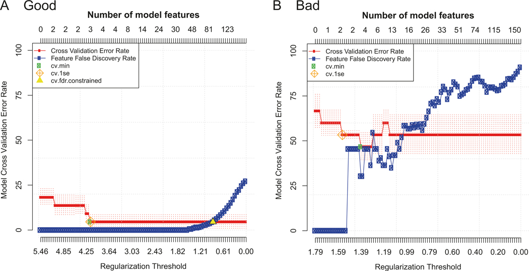
“Good” vs. “bad” example model error rate plots. Two examples of model error rate plots output from predictive CITRUS analyses using PAM and an FDR of 5% with equally balanced groups. In each plot, the cross-validation error rate (red line) and false discovery rate (blue line) are shown as the number of features in the model is increased (top x-axis) according to the regularization threshold used to build the model (bottom x-axis). (a) A “good” model error rate plot. An FDR constrained model (yellow triangle) was identified with more features than the CV constrained models (cv.min, cv.1se). The CV min model had a CV error rate of around 5% using three features (cluster abundances in this example), which was considered excellent for this context. (b) A “bad” model error rate plot. The CV error rate never drops below 50%, meaning the model fails to accurately predict the groups 50% of the time. No FDR constrained model was identified (no yellow triangle), meaning that the features included in the CV constrained models are not statistically significant
References
MeSH terms
Substances
Grants and funding
LinkOut - more resources
Full Text Sources