

Understanding test accuracy research: a test consequence graphic
- PMID: 31093552
- PMCID: PMC6460548
- DOI: 10.1186/s41512-017-0023-0
Understanding test accuracy research: a test consequence graphic
Abstract
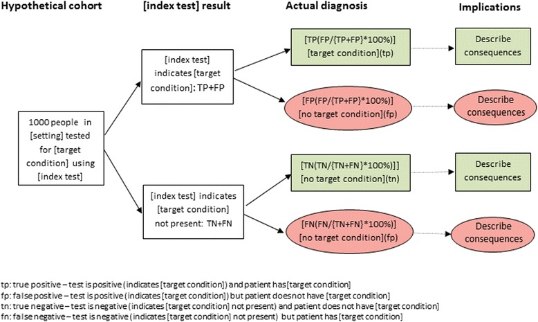
Background: Presenting results of diagnostic test accuracy research so that it is accessible to users is challenging. Commonly used accuracy measures (e.g. sensitivity and specificity) are poorly understood by health professionals and the public. Evidence suggests that presenting probabilities as natural frequencies rather than percentages facilitates understanding. We present a test consequence graphic to display results based on natural frequencies and test consequences.
Methods: The graphic was developed as part of a project to develop guidance for writing plain language summaries for Cochrane diagnostic test accuracy (DTA) reviews. Using a mixed methods approach (focus groups, user testing, web-based surveys, public engagement and piloting), the graphic emerged as a clear preference out of a range of methods for presenting probabilistic information (text only, numbers embedded in text, annotated graphic) across patient representatives, media representatives and health professionals. The structure of the graphic was refined during the research process.
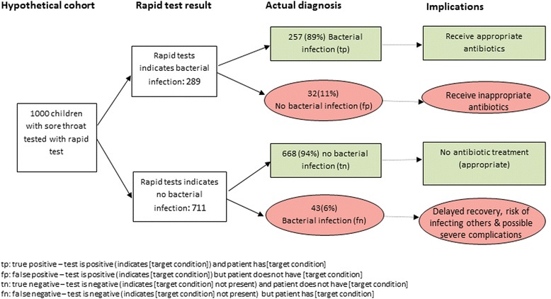
Results: The test consequence graphic displays the results of diagnostic test accuracy study or review as natural frequencies based on a hypothetical cohort of 1000 patients receiving the test.
Conclusions: The test consequence graphic provides a tool to help researchers communicate the results of diagnostic research in a simple, easy to access format and encourage meaningful application of research findings to practice. Key to this is linking estimates of test accuracy to potential downstream consequences of testing.
Keywords: Diagnosis; Graphical display; Natural frequencies.
Conflict of interest statement
Not applicableNot applicableThe authors declare that they have no competing interests.Springer Nature remains neutral with regard to jurisdictional claims in published maps and institutional affiliations.
Figures
References
LinkOut - more resources
Full Text Sources