. 2018 Nov;86(6):2161-2219.
doi: 10.3982/ECTA15022.

Provider Incentives and Healthcare Costs: Evidence from Long-Term Care Hospitals

Affiliations

Provider Incentives and Healthcare Costs: Evidence from Long-Term Care Hospitals

Liran Einav et al. Econometrica. 2018 Nov.

Abstract

We study the design of provider incentives in the post-acute care setting - a high-stakes but under-studied segment of the healthcare system. We focus on long-term care hospitals (LTCHs) and the large (approximately $13,500) jump in Medicare payments they receive when a patient s stay reaches a threshold number of days. Discharges increase substantially after the threshold, with the marginal discharged patient in relatively better health. Despite the large financial incentives and behavioral response in a high mortality population, we are unable to detect any compelling evidence of an impact on patient mortality. To assess provider behavior under counterfactual payment schedules, we estimate a simple dynamic discrete choice model of LTCH discharge decisions. When we conservatively limit ourselves to alternative contracts that hold the LTCH harmless, we find that an alternative contract can generate Medicare savings of about $2,100 per admission, or about 5% of total payments. More aggressive payment reforms can generate substantially greater savings, but the accompanying reduction in LTCH profits has potential out-of-sample consequences. Our results highlight how improved financial incentives may be able to reduce healthcare spending, without negative consequences for industry profits or patient health.

Keywords: Healthcare; financial incentives; nonlinear contracts; post-acute care.


Figures

Figure 1:
Figure 1:. LTCH payment schedules before and after PPS
Figure presents the payment schedule in both the pre-PPS and PPS periods. Sample pools admissions that are associated with different short stay outlier (SSO) thresholds, and x-axis is normalized by counting days relative to the threshold. The linear payment schedule begins with the first day of admission, and the y-axis is normalized to zero for day −16.
Figure 2:
Figure 2:. Patient flow into and out of Post-Acute Care
Top panel shows patient flow from acute care hospitals (ACHs) to the different destinations: post-acute care (PAC) facilities; home and home health agencies; and death or hospice. Post-acute care facilities include Long-Term Care Hospitals (LTCHs), Skilled Nursing Facilities (SNFs) and Inpatient Rehabilitation Facilities (IRFs). Bottom panel shows how the patient flow pattern is different, within PAC, between Long-Term Care Hospitals (LTCHs) and other PAC facilities (SNFs and IRFs). All numbers are calculated using the universe of Traditional Medicare admissions during the PPS period (October 2007 to July 2012). Numbers are shares of total discharges from each type of facility, excluding a small share of discharges (never greater than 5%) that are more difficult to classify. See Appendix A for more details.
Figure 3:
Figure 3:. Discharge patterns by length of stay
Figure presents the distribution of the time of discharge relative to the SSO threshold. That is, each line shows the number of discharges on a given (relative) day divided by the total number of LTCH admissions. Sample pools admissions that are associated with different SSO thresholds, and x-axis is normalized by counting days relative to the threshold. The top left panel presents the distribution for all discharges, the top right and bottom left panel present the same information separately for downstream (SNF, IRF, LTCH, home health, home, or other) and upstream (ACH or hospice) discharges, and the bottom right panel presents discharges due to death occurring within the LTCH.
Figure 4:
Figure 4:. Post-discharge payments
Figure presents the average post-discharge payments for patients discharged alive, by discharge day and discharge destination (upstream vs. downstream, as defined in Figure 3). We define a post-discharge episode as ongoing until there is a break of at least two days that does not involve a facility stay; see text for more details.
Figure 5:
Figure 5:. Mortality patterns by days since LTCH admission
Figure presents post-LTCH-admission mortality-hazard rates by day. Mortality includes any mortality, whether it occurs within the LTCH or after discharge. Each panel presents hazard rates for different subsequent horizons: same day (top) and 30-day forward (bottom).
Figure 6:
Figure 6:. The effect of changes in the SSO threshold on mortality
Figure shows residualized binned scatter plots (as in, for example, Chetty et al. 2014). The vertical axis shows the outcome variable net of year and DRG fixed effects, and the horizontal axis shows the SSO threshold net of year and DRG fixed effects. The panels show scatter plots where we aggregate the data by ventiles of the horizontal axis variable (SSO threshold). In the top left panel, the outcome variable is length of stay. In the remaining panels, the outcome variable is the 30-, 60-, and 90-day mortality rates (unconditional on location of care). The plots also display the best fit line from estimating equation (1), along with the estimated slope coefficient and heteroskedasticity-robust standard errors in parentheses.
Figure 7:
Figure 7:. Implied health processes and optimal discharge policy
Figure shows the policy function implied by the estimated model. The top black line approximates the health level above which a patient is discharged to d, and the bottom black line approximates the health level below which a patient is discharged to u. Higher h denotes better health (lower mortality). Recall that the policy function is not a deterministic function of h; given the ϵ’s in the LTCH’s flow payoff function (see equation (3)), h is related to discharge stochastically. The policy lines in the above figure are drawn so that at that given level of h, 50% of the patients are discharged to d (top line) and u (bottom line).
Figure 8:
Figure 8:. Choice-specific continuation values as a function of the state variables
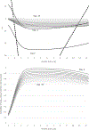
Top panel presents choice-specific continuation values as a function of the state variables: health status of the patient (on the horizontal axis) and the number of days until the SSO threshold (shown in separate lines) from day −15 through day 0. The dashed lines are the continuation values from discharging the patient upstream (left dashed line) and downstream (right dashed line), and these (by design) do not change with time to the SSO threshold. The solid lines are the continuation values from retaining the patient at the LTCH, and these do vary over time. They are monotone in days; within a day the pattern of continuation values by health status changes at day −1 (the day before the SSO threshold) when the large payment is guaranteed, and continues with a similar pattern (but much lower level) of continuation values on the threshold day (day 0). Continuation values after day 0 are identical to those shown for day 0 given the stationary nature of the problem after the threshold. The bottom panel of the figure presents the probability of the patient being retained at the LTCH until the SSO threshold (conditional on the optimal discharge policy).
Figure 9:
Figure 9:. Counterfactual payment schedules
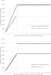
Figure shows the observed (PPS) payment schedule (thick gray line in both panels) and the first two counterfactual payment schedules we consider (black line in each panel). Both counterfactual schedules eliminate the jump in payments at the SSO threshold, but do this in different ways.
Figure 10:
Figure 10:. Counterfactual policy functions and discharge patterns
Top left panel shows the implied discharge policy function from the two “no jump” counterfactual payment schedules described in the main text and illustrated in Figure 9. The discharge policy function associated with the observed contract design is shown in gray and is the same as the one reported in Figure 7. The three other panels show discharges (upstream, downstream, and to death) under these two counterfactual payment schedules. The solid black line reports results that are based on our parameter estimates (reported in Table 3) and the observed payment schedule, and each other line reports the results under a different counterfactual payment schedule.
Figure 11:
Figure 11:. “Win-win” payment schedules
The top panel shows some examples of the 21 potential “win-win” contracts we consider. All contracts pay a constant amount up to a threshold length of stay, where they are capped (so that per diem rate drops to zero) with no jump at the threshold. We consider threshold days ranging from +/− 10 days of the current threshold, with the unique payment schedule defined for each threshold day as the one that would hold payments to the LTCH (i.e., LTCH revenue) fixed if they did not change their discharge behavior under the observed contracts. The bottom panels show outcomes (given the LTCH’s counterfactual behavior) under these various potential “win-win” payment schedules shown in the top panel. For each schedule (represented by a dot which is labeled with the day the payment schedule switches from a per-day rate to a cap) the bottom left panel shows LTCH payments per admission against (the negative of) total Medicare payments (including estimated post-discharge payments) for the episode of care; and the bottom right panel shows LTCH profits per admission against total Medicare payments.

References

    1. American Hospital Association (AHA). 2010. “TrendWatch: Maximizing the Value of Post-Acute Care.” Available at http://www.aha.org/research/reports/tw/10nov-tw-postacute.pdf.
    1. Arcidiacono Peter, and Ellickson Paul B.. 2011. “Practical Methods for Estimation of Dynamic Discrete Choice Models.” Annual Review of Economics 3: 363–394.
    1. Bajari Patrick, Hong Han, Park Minjung, and Town Robert. 2017. “Estimating Price Sensitivity of Economic Agents using Discontinuity in Nonlinear Contracts.” Quantitative Economics 8(2): 397–433.
    1. Boards of Trustees for Medicare. 2002. “The 2002 Annual Report of the Boards of Trustees of the Federal Hospital Insurance Trust Fund and the Federal Supplementary Medical Insurance Trust Fund.”
    1. Boards of Trustees for Medicare. 2014. “The 2014 Annual Report of the Boards of Trustees of the Federal Hospital Insurance Trust Fund and the Federal Supplementary Medical Insurance Trust Fund.”

LinkOut - more resources