

doi: 10.1257/app.20170295.
Health Care Spending and Utilization in Public and Private Medicare
Affiliations
- PMID: 31131073
- PMCID: PMC6532061
- DOI: 10.1257/app.20170295
Item in Clipboard
Health Care Spending and Utilization in Public and Private Medicare
Am Econ J Appl Econ.
2019 Apr.
Abstract
We compare healthcare spending in public and private Medicare using newly available claims data from Medicare Advantage (MA) insurers. MA insurer revenues are 30 percent higher than their healthcare spending. Adjusting for enrollee mix, healthcare spending per enrollee in MA is 9 to 30 percent lower than in traditional Medicare (TM), depending on the way we define "comparable" enrollees. Spending differences primarily reflect differences in healthcare utilization, with similar reductions for "high value" and "low value" care, rather than healthcare prices. We present evidence consistent with MA plans encouraging substitution to less expensive care and engaging in utilization management. (JEL H11, H42, H51, I11, I13).
Figures
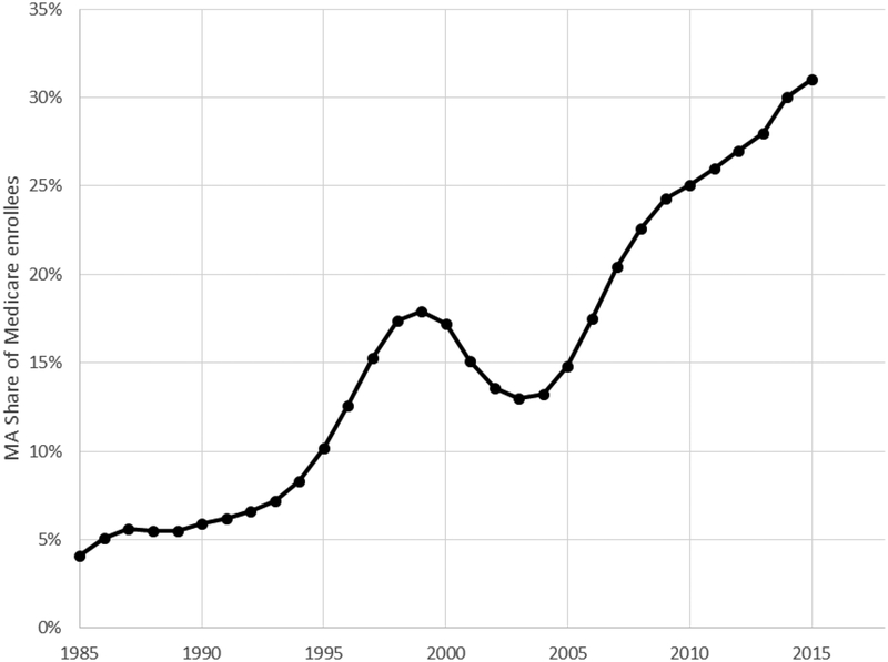
Figure shows the share of Medicare beneficiaries enrolled in Medicare
Advantage plans, year by year. The data source is CMS’ Medicare Managed
Care Contract Plans Monthly Summary Reports. All data are from December of the
year indicated.
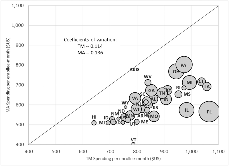
Figure plots MA spending per enrollee-month against TM spending per
enrollee-month for each of the 36 states in our baseline sample. Coefficients of
variation across states in spending are computed using total Medicare enrollees
in the state as a weight. The size of each bubble is proportional to the number
of total Medicare enrollees in the state.
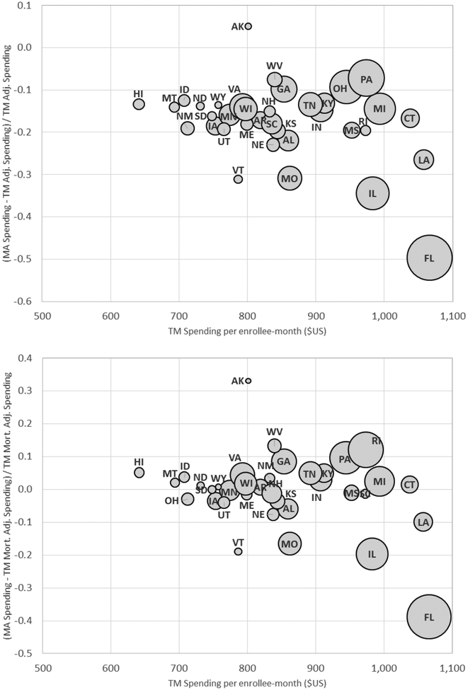
Figure plots the (percentage) difference between average MA spending
and (re-weighted) TM spending per enrollee- month against average TM spending
for each of the 36 states in our baseline sample. The y-axis in the top panel
compares MA spending to TM spending that is re-weighted to match the MA
population on county and risk score, using our preferred weighting (see Table 2, Panel A, column (4)). The bottom
panel does the same but using predicted mortality to adjust for selection on
unobservables (see Table 2, Panel B,
column (4)), as described in Section III. The size of each bubble is
proportional to the number of total Medicare enrollees in the state. The x-axis
reports average (unadjusted) TM spending in the state (see Table 2, Panel A, column (1)).
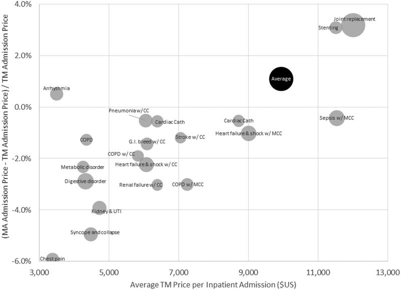
Figure plots the (percentage) difference between average MA prices and
TM prices for a hospital admission, overall and for the 20 most common DRGs in
MA. Average MA or TM prices for a given DRG are computed using a common (MA)
basket of state admission shares for that DRG. The national average price in MA
or TM is computed by weighting each DRG (including the less common ones not
shown here) by its (national) share of MA admissions. The size of each bubble
(except for the overall “Average” bubble) is proportional to the
number of MA admissions with that DRG.
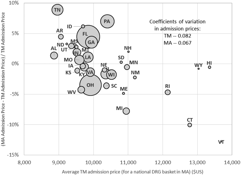
Figure plots the (percentage) difference between average MA prices and
TM prices for a hospital admission for each state in our baseline sample (except
Alaska which is omitted because it has too few inpatient admissions for us to
report). Averages are computed for each state using a common (MA)
“basket” of DRG admission shares. The size of each bubble is
proportional to the number of MA admissions in that state. Coefficients of
variation across states in prices are computed using total Medicare enrollees in
the state as a weight.
References
-
- Baker Laurence C., Bundorf M. Kate, Devlin Aileen M., and Kessler Daniel P.. 2016. “Medicare Advantage Plans Pay Hospitals Less than Traditional Medicare Pays.” Health Affairs 35(8): 1444–51. - PubMed
-
- Boards of Trustees. 2011. “2011 Annual Report of the Boards of Trustees of the Federal Hospital Insurance and Federal Supplementary Medical Insurance Trust Funds.” Report by the Boards of Trustees, Federal Hospital Insurance and Federal Supplementary Medical Insurance Trust Funds. https://www.cms.gov/Research-Statistics-Data-and-Systems/Statistics-Tren... (accessed January 9, 2018).
-
- Berenson Robert A., Sunshine Jonathan H, Helms David, and Lawton Emily. 2015. “Why Medicare Advantage Plans Pay Hospitals Traditional Medicare Prices.” Health Affairs 34(8): 1289–95. - PubMed
-
- Billings John., Parikh Nina, and Mijanovich Tod. 2000. Emergency Room Use: The New York Story. Commonwealth Fund. http://www.commonwealthfund.org/publications/issue-briefs/2000/nov/emerg... - PubMed
Grants and funding
LinkOut - more resources
Full Text Sources