Review
. 2019 Jun 19;15(6):e8746.
doi: 10.15252/msb.20188746.

Current best practices in single-cell RNA-seq analysis: a tutorial

Affiliations
Review

Current best practices in single-cell RNA-seq analysis: a tutorial

Malte D Luecken et al. Mol Syst Biol. .

Abstract

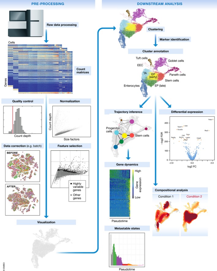
Single-cell RNA-seq has enabled gene expression to be studied at an unprecedented resolution. The promise of this technology is attracting a growing user base for single-cell analysis methods. As more analysis tools are becoming available, it is becoming increasingly difficult to navigate this landscape and produce an up-to-date workflow to analyse one's data. Here, we detail the steps of a typical single-cell RNA-seq analysis, including pre-processing (quality control, normalization, data correction, feature selection, and dimensionality reduction) and cell- and gene-level downstream analysis. We formulate current best-practice recommendations for these steps based on independent comparison studies. We have integrated these best-practice recommendations into a workflow, which we apply to a public dataset to further illustrate how these steps work in practice. Our documented case study can be found at https://www.github.com/theislab/single-cell-tutorial This review will serve as a workflow tutorial for new entrants into the field, and help established users update their analysis pipelines.

Keywords: analysis pipeline development; computational biology; data analysis tutorial; single‐cell RNA‐seq.


Conflict of interest statement

The authors declare that they have no conflict of interest.

Figures

Figure 1
Figure 1. Schematic of a typical single‐cell RNA‐seq analysis workflow
Raw sequencing data are processed and aligned to give count matrices, which represent the start of the workflow. The count data undergo pre‐processing and downstream analysis. Subplots are generated using the best‐practices workflow on intestinal epithelium data from Haber et al (2017).
Figure 2
Figure 2. Plots of quality control metrics with filtering decisions for a mouse intestinal epithelium dataset from Haber et al (2017)
(A) Histograms of count depth per cell. The smaller histogram is zoomed‐in on count depths below 4,000. A threshold is applied here at 1,500 based on the peak detected at around 1,200 counts. (B) Histogram of the number of genes detected per cell. A small noise peak is visible at approx. 400 genes. These cells are filtered out using the depicted threshold (red line) at 700 genes. (C) Count depth distribution from high to low count depths. This visualization is related to the log–log plot shown in Cell Ranger outputs that is used to filter out empty droplets. It shows an “elbow” where count depths start to decrease rapidly around 1,500 counts. (D) Number of genes versus the count depth coloured by the fraction of mitochondrial reads. Mitochondrial read fractions are only high in particularly low count cells with few detected genes. These cells are filtered out by our count and gene number thresholds. Jointly visualizing the count and gene thresholds shows the joint filtering effect, indicating that a lower gene threshold may have sufficed.
Figure 3
Figure 3. UMAP visualization before and after batch correction
Cells are coloured by sample of origin. Separation of batches is clearly visible before batch correction and less visible afterwards. Batch correction was performed using ComBat on mouse intestinal epithelium data from Haber et al (2017).
Figure EV1
Figure EV1. The number of highly variable genes (HVGs) used for datasets of different sizes
The data were obtained by a brief manual survey of recent scRNA‐seq analysis papers. The plotted data, along with further information on scRNA‐seq technology, publication year, reference and the number of reads per cell, are available in Dataset EV1.
Figure 4
Figure 4. Common visualization methods for scRNA‐seq data
Mouse intestinal epithelium regions data from Haber et al (2017) visualized on the first two components for: (A) PCA, (B) t‐SNE, (C) diffusion maps, (D) UMAP and (E) A force‐directed graph layout via ForceAtlas2. Cells are coloured by count depth. (F) Variance explained by the first 31 principal components (PCs). The “elbow” of this plot, which is used to select relevant PCs to analyse the dataset, lies between PCs 5 and 7.
Figure EV2
Figure EV2. Change in coefficient of variation (CoV) of gene expression data upon batch correction and denoising
Negative values represent a reduction in CoV upon data correction. The top row shows CoV changes upon ComBat batch correction for (A) mouse intestinal epithelium (mIE) and (B) mouse embryonic stem cell (mESC) data. The lower row depicts CoV changes upon DCA denoising for (C) mIE and (D) mESC data. mIE data were obtained from Haber et al (2017) and mESC from Klein et al (2015).
Figure 5
Figure 5. Overview of downstream analysis methods
Methods are divided into cell‐ and gene‐level analysis. Cell‐level analysis approaches are again subdivided into cluster and trajectory analysis branches, which include also gene‐level analysis methods. All methods with a blue background are gene‐level approaches.
Figure 6
Figure 6. Cluster analysis results of mouse intestinal epithelium dataset from Haber et al (2017)
(A) Annotated cell‐identity clusters found by Louvain clustering visualized in a UMAP representation. (B) Cell‐identity marker expression to identify stem cells (Slc12a2), enterocytes (Arg2), goblet cells (Tff3) and Paneth cells (Defa24). Corrected expression levels are visualized from low expression (grey) to high expression (red). Marker genes may be expressed also in other cell‐identity populations as shown for goblet and Paneth cells. (C) Cell‐identity composition heat maps of proximal (upper) and distal (lower) intestinal epithelium regions. High relative cell density is shown as dark red.
Figure 7
Figure 7. Trajectory analysis and graph abstraction of mouse intestinal epithelium data from Haber et al (2017)
(A) Distal and proximal enterocyte differentiation trajectories inferred by Slingshot. The Distal lineage is shown coloured by pseudotime from red to blue. Other cells in the dataset are grey. (B) Slingshot trajectories over clusters in PCA space. Clusters are abbreviated as follows: EP—enterocyte progenitors; Imm. Ent.—immature enterocytes; Mat. Ent.—mature enterocytes; Prox.—proximal; Dist.—distal. (C) Density over pseudotime for the distal enterocyte trajectory from Fig 7A. Colours represent the dominant cluster labels in each pseudotime bin. (D) Abstracted graph representation of the dataset projected onto a UMAP representation. Clusters are shown as coloured nodes. Clusters that appear in other trajectories are labelled for comparison. “TA” denotes transit amplifying cells. (E) Gene expression dynamics over pseudotime in a general enterocyte trajectory using the “GAM” R library.

References

    1. Aibar S, González‐Blas CB, Moerman T, Huynh‐Thu VA, Imrichova H, Hulselmans G, Rambow F, Marine J‐C, Geurts P, Aerts J et al (2017) SCENIC: single‐cell regulatory network inference and clustering. Nat Methods 14: 1083–1086 - PMC - PubMed
    1. Alpert A, Moore LS, Dubovik T, Shen‐Orr SS (2018) Alignment of single‐cell trajectories to compare cellular expression dynamics. Nat Methods 15: 267–270 - PubMed
    1. An Y, Furber KL, Ji S (2017) Pseudogenes regulate parental gene expression via ceRNA network. J Cell Mol Med 21: 185–192 - PMC - PubMed
    1. Andrews TS, Hemberg M (2018) False signals induced by single‐cell imputation. F1000Res 7: 1740 - PMC - PubMed
    1. Angelidis I, Simon LM, Fernandez IE, Strunz M, Mayr CH, Greiffo FR, Tsitsiridis G, Graf E, Strom TM, Eickelberg O et al (2019) An atlas of the aging lung mapped by single cell transcriptomics and deep tissue proteomics. Nat Commun 10: 963 - PMC - PubMed

Publication types