. 2019 May 30:810:1-124.
doi: 10.1016/j.physrep.2019.03.001. Epub 2019 Mar 14.

A high-bias, low-variance introduction to Machine Learning for physicists

Affiliations

A high-bias, low-variance introduction to Machine Learning for physicists

Pankaj Mehta et al. Phys Rep. .

Abstract

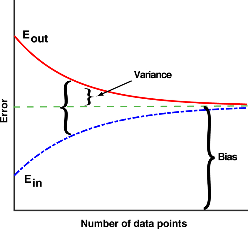
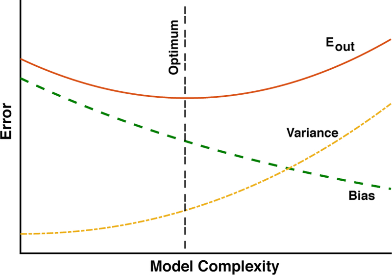
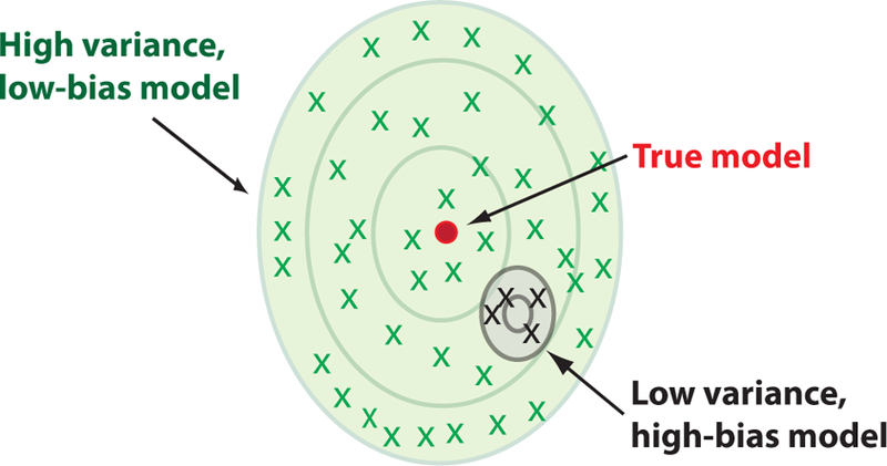
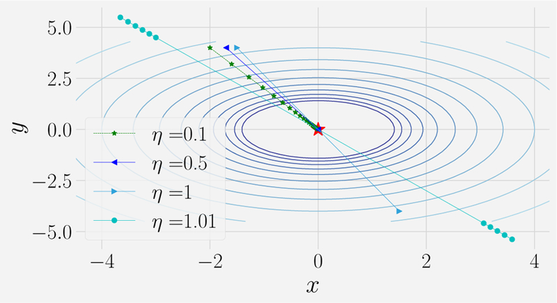
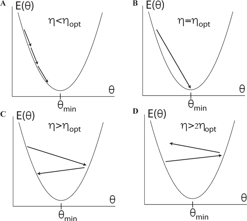
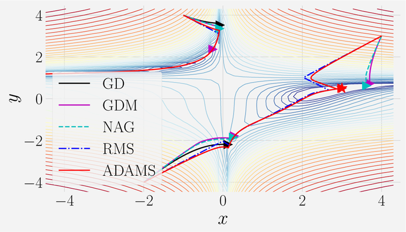
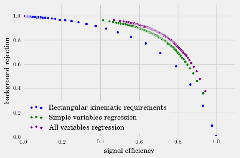
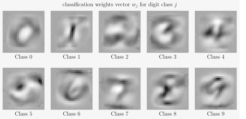
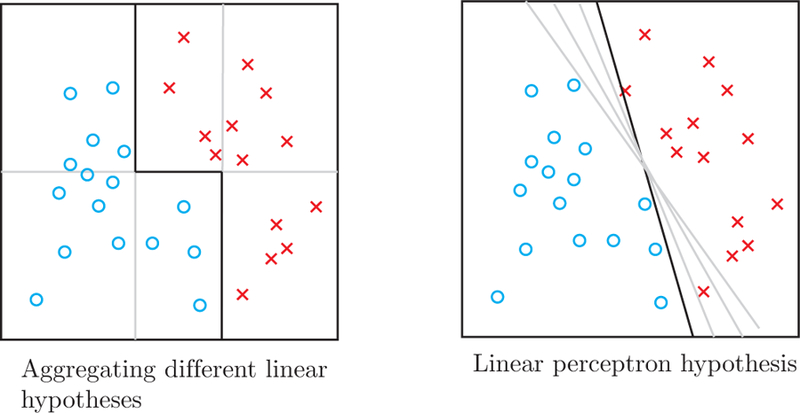
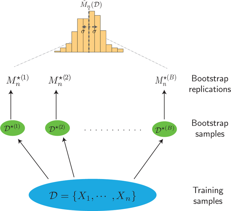
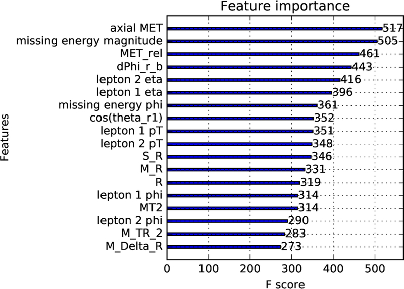
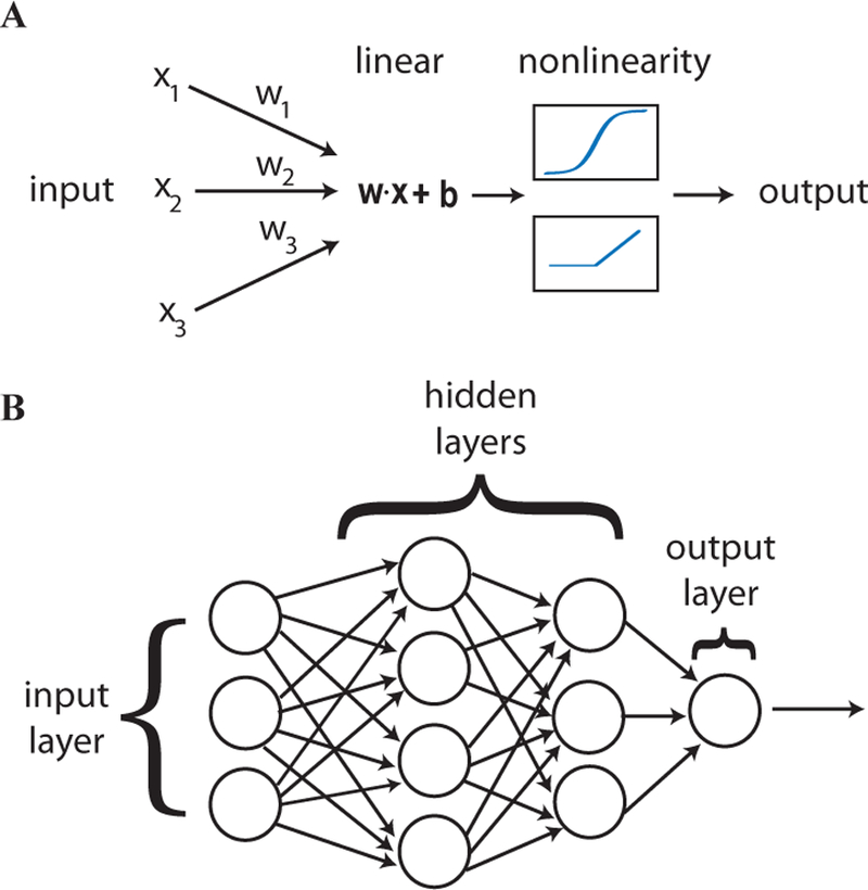
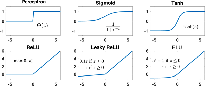
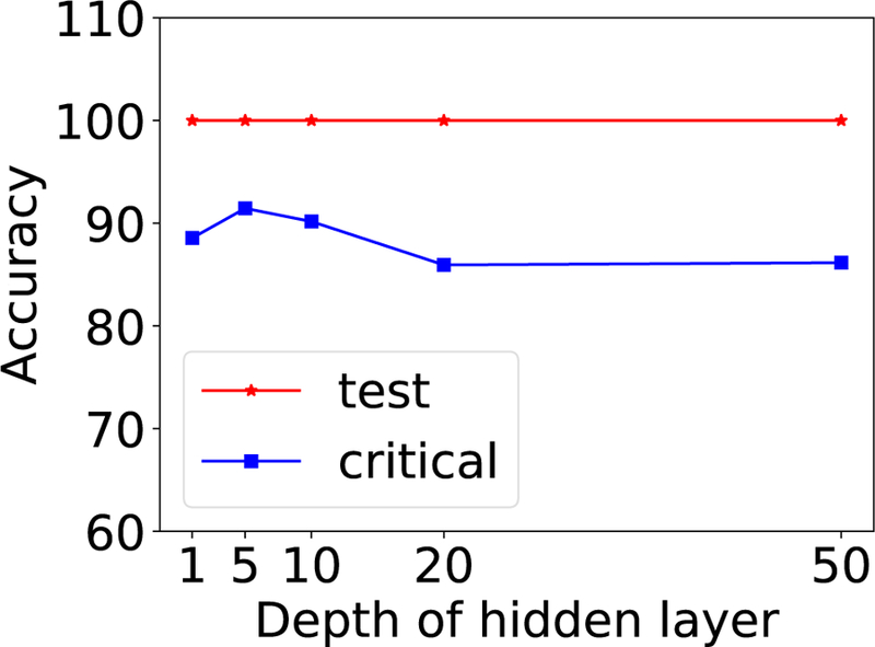
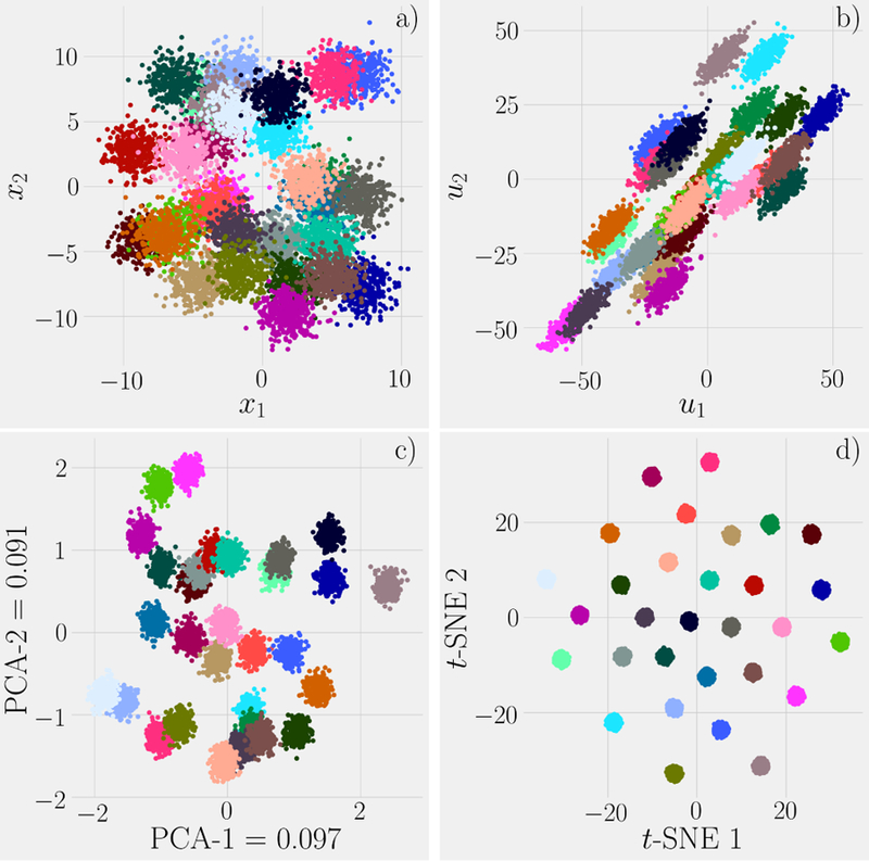
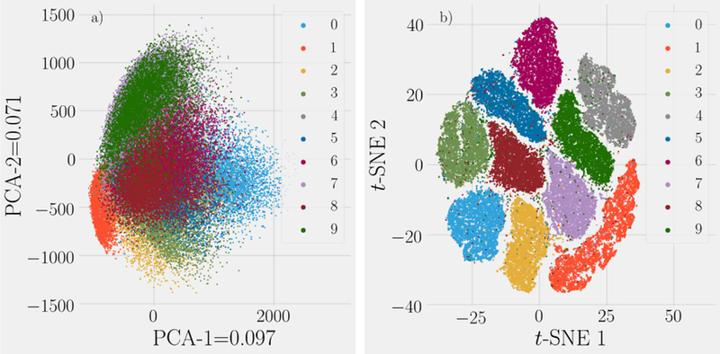
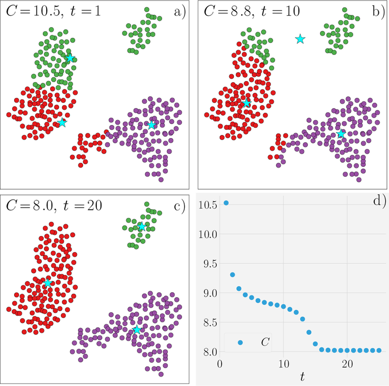
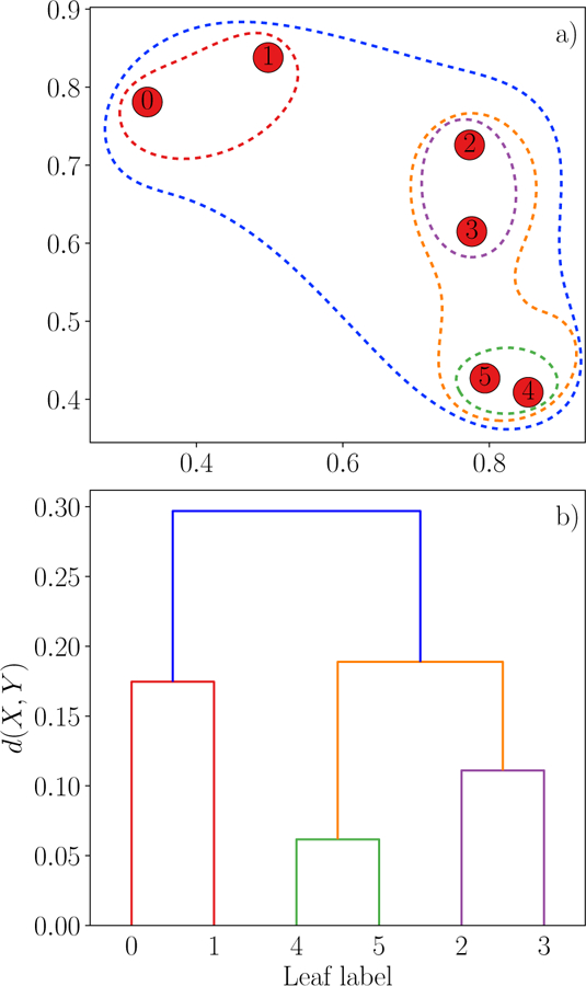
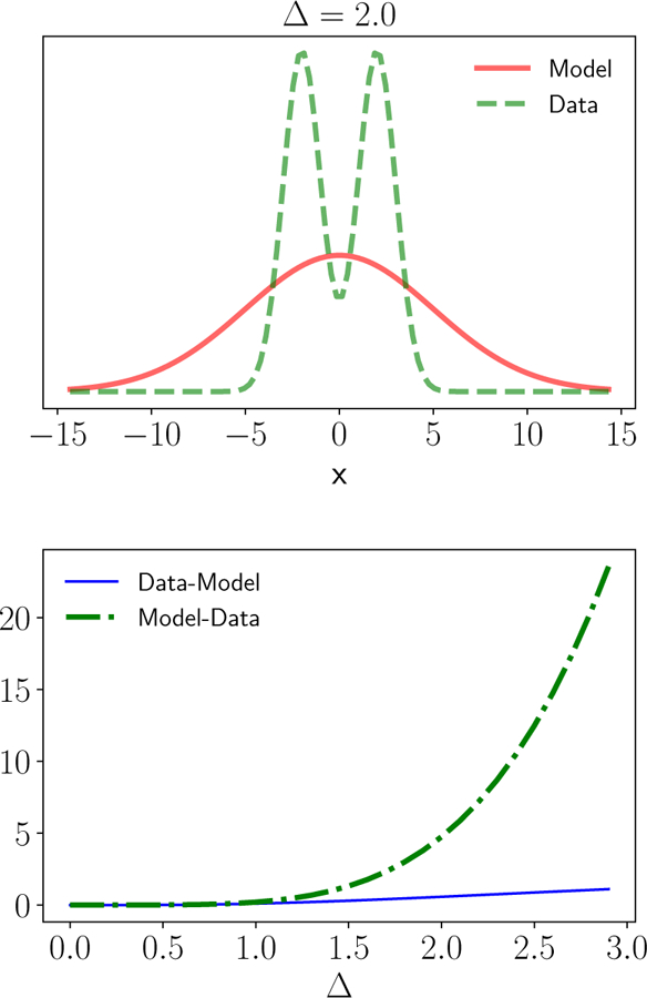
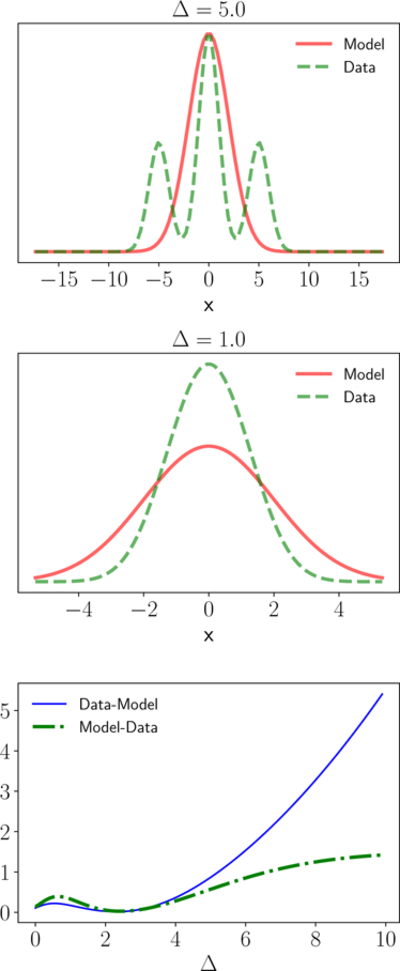
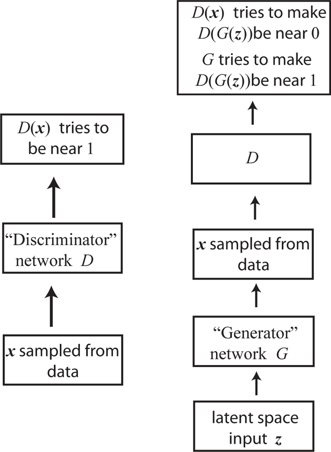
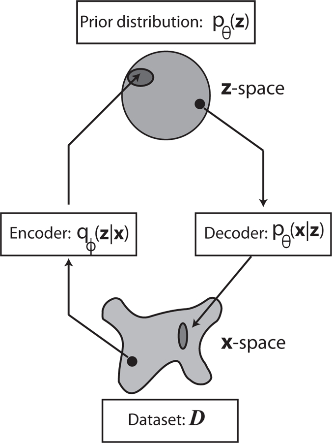
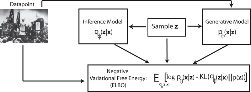
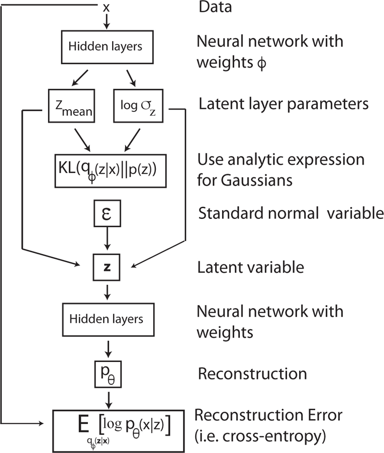
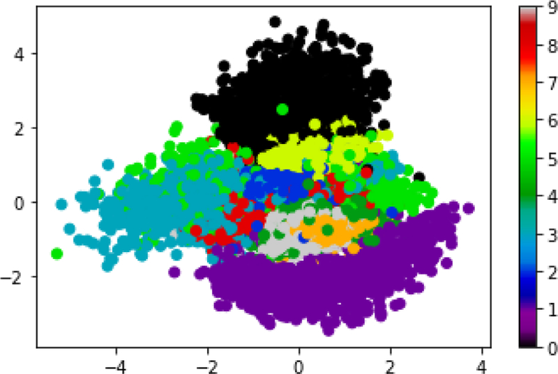
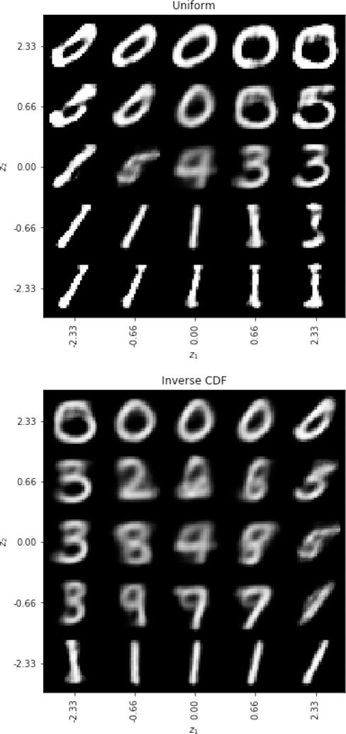
Machine Learning (ML) is one of the most exciting and dynamic areas of modern research and application. The purpose of this review is to provide an introduction to the core concepts and tools of machine learning in a manner easily understood and intuitive to physicists. The review begins by covering fundamental concepts in ML and modern statistics such as the bias-variance tradeoff, overfitting, regularization, generalization, and gradient descent before moving on to more advanced topics in both supervised and unsupervised learning. Topics covered in the review include ensemble models, deep learning and neural networks, clustering and data visualization, energy-based models (including MaxEnt models and Restricted Boltzmann Machines), and variational methods. Throughout, we emphasize the many natural connections between ML and statistical physics. A notable aspect of the review is the use of Python Jupyter notebooks to introduce modern ML/statistical packages to readers using physics-inspired datasets (the Ising Model and Monte-Carlo simulations of supersymmetric decays of proton-proton collisions). We conclude with an extended outlook discussing possible uses of machine learning for furthering our understanding of the physical world as well as open problems in ML where physicists may be able to contribute.


Figures

FIG. 1
FIG. 1. Fitting versus predicting for noiseless data.
Ntrain = 10 points in the range x ϵ [0, 1] were generated from a linear model (top) or tenth-order polynomial (bottom). This data was fit using three model classes: linear models (red), all polynomials of order 3 (yellow), all polynomials of order 10 (green) and used to make prediction on Ntest = 20 new data points with xtest ϵ [0, 1.2] (shown on right). Notice that in the absence of noise (σ = 0), given enough data points that fitting and predicting are identical.
FIG. 2
FIG. 2. Fitting versus predicting for noisy data.
Ntrain = 100 noisy data points (σ = 1) in the range x ϵ [0, 1] were generated from a linear model (top) or tenth-order polynomial (bottom). This data was fit using three model classes: linear models (red), all polynomials of order 3 (yellow), all polynomials of order 10 (green) and used to make prediction on Ntest = 20 new data points with xtest ϵ [0, 1.2](shown on right). Notice that even when the data was generated using a tenth order polynomial, the linear and third order polynomials give better out-of-sample predictions, especially beyond the x range over which the model was trained.
FIG. 3
FIG. 3. Fitting versus predicting for noisy data.
Ntrain = 104 noisy data points (σ = 1) in the range x ϵ [0, 1] were generated from a tenth-order polynomial. This data was fit using three model classes: linear models (red), all polynomials of order 3 (yellow), all polynomials of order 10 (green) and used to make prediction on Ntest = 100 new data points with xtest ϵ [0, 1.2](shown on right). The tenth order polynomial gives good predictions but the model’s predictive power quickly degrades beyond the training data range.
FIG. 4
FIG. 4. Schematic of typical in-sample and out-of-sample error as a function of training set size.
The typical in-sample or training error, Ein, out-of-sample or generalization error, Eout, bias, variance, and difference of errors as a function of the number of training data points. The schematic assumes that the number of data points is large (in particular, the schematic does not show the initial drop in Ein for small amounts of data), and that our model cannot exactly fit the true function f (x).
FIG. 5
FIG. 5. Bias-Variance tradeoff and model complexity.
This schematic shows the typical out-of-sample error Eout as function of the model complexity for a training dataset of fixed size. Notice how the bias always decreases with model complexity, but the variance, i.e. fluctuation in performance due to finite size sampling effects, increases with model complexity. Thus, optimal performance is achieved at intermediate levels of model complexity.
FIG. 6
FIG. 6. Bias-Variance tradeoff.
Another useful depiction of the bias-variance tradeoff is to think about how Eout varies as we consider different training data sets of a fixed size. A more complex model (green) will exhibit larger fluctuations (variance) due to finite size sampling effects than the simpler model (black). However, the average over all the trained models (bias) is closer to the true model for the more complex model.
FIG. 7
FIG. 7. Gradient descent exhibits three qualitatively different regimes as a function of the learning rate.
Result of gradient descent on surface z = x2 + y21 for learning rate of η = 0.1, 0.5, 1.01. Notice that the trajectory converges to the global minima in multiple steps for small learning rates (η = 0.1). Increasing the learning rate further (η = 0.5) causes the trajectory to oscillate around the global minima before converging. For even larger learning rates (η = 1.01) the trajectory diverges from the minima. See corresponding notebook for details.
FIG. 8
FIG. 8. Effect of learning rate on convergence.
For a one dimensional quadratic potential, one can show that there exists four different qualitative behaviors for gradient descent (GD) as a function of the learning rate η depending on the relationship between η and ηopt=[θ2E(θ)]1. (a) For η < ηopt, GD converges to the minimum. (b) For η = ηopt, GD converges in a single step. (c) For ηopt < η < 2ηopt, GD oscillates around the minima and eventually converges. (d) For η > 2ηopt, GD moves away from the minima. This figure is adapted from (LeCun et al., 1998b).
FIG. 9
FIG. 9. Comparison of GD and its generalization for Beale’s function.
Trajectories from gradient descent (GD; black line), gradient descent with momentum (GDM; magenta line), NAG (cyan-dashed line), RMSprop (blue dash-dot line), and ADAM (red line) for Nsteps = 104. The learning rate for GD, GDM, NAG is η = 10−6 and η = 10−3 for ADAM and RMSprop. β = 0.9 for RMSprop, β1 = 0.9 and β2 = 0.99 for ADAM, and g = 10−8 for both methods. Please see corresponding notebook for details.
FIG. 10
FIG. 10
Geometric interpretation of least squares regression. The regression function g defines a hyperplane in p (green solid line, here we have p = 2) while the residual of data point x(i) (hollow circles) is its projection onto this hyperplane (barended dashed line).
FIG. 11
FIG. 11
The projection matrix PX projects the response vector y onto the column space spanned by the columns of X, span({ X:,1, …, X:,p}) (purple area), thus forming a fitted vector y^. The residuals in Eq. (37) are illustrated by the red vector yy^.
FIG. 12
FIG. 12
[Adapted from (Friedman et al., 2001)] Comparing LASSO and Ridge regression. The black 45 degree line is the unconstrained estimate for reference. The estimators are shown by red dashed lines. For LASSO, this corresponds to the soft-thresholding function Eq. (54) while for Ridge regression the solution is given by Eq. (46)
FIG. 13
FIG. 13
[Adapted from (Friedman et al., 2001)] Illustration of LASSO (left) and Ridge regression (right). The blue concentric ovals are the contours of the regression function while the red shaded regions represent the constraint functions: (left) |w1| + |w2| ≤ t and (right)w12+w22t. Intuitively, since the constraint function of LASSO has more protrusions, the ovals tend to intersect the constraint at the vertex, as shown on the left. Since the vertices correspond to parameter vectors w with only one non-vanishing component, LASSO tends to give sparse solution.
FIG. 14
FIG. 14
Performance of LASSO and ridge regression on the diabetes dataset measured by the R2 coefficient of determination. The best possible performance is R2 = 1. See Notebook 3.
FIG. 15
FIG. 15
Regularization parameter λ affects the weights (features) we learned in both Ridge regression (left) and LASSO regression (right) on the Diabetes dataset. Curves with different colors correspond to different wi’s (features). Notice LASSO, unlike Ridge, sets feature weights to zero leading to sparsity. See Notebook 3.
FIG. 16
FIG. 16
Performance of OLS, Ridge and LASSO regression on the Ising model as measured by the R2 coefficient of determination. Optimal performance is R2 = 1.See Notebook 4.
FIG. 17
FIG. 17
Learned interaction matrix Jij for the Ising model ansatz in Eq. (56) for ordinary least squares (OLS) regression (left), Ridge regression (middle) and LASSO (right) at different regularization strengths λ. OLS is λ-independent but is shown for comparison throughout.See Notebook 4.
FIG. 18
FIG. 18
Pictorial representation of four data categories labeled by the integers 0 through 3 (above), or by one-hot vectors with binary inputs (below).
FIG. 19
FIG. 19
Classifying data in the simplest case of only two categories, labeled “noise” and “signal” (or “cats” and “dogs”), is the subject of Logistic Regression.
FIG. 20
FIG. 20
Examples of typical states of the 2D Ising model for three different temperatures in the ordered phase (T/J = 0.75, left), the critical region (T/J = 2.25, middle) and the disordered phase (T/J = 4.0, right). The linear system dimension is L = 40 sites.
FIG. 21
FIG. 21
Accuracy as a function of the regularization parameter λ in classifying the phases of the 2D Ising model on the training (blue), test (red), and critical (green) data. The solid and dashed lines compare the ‘liblinear’ and ‘SGD’ solvers, respectively.
FIG. 22
FIG. 22
The probability of an event being a classified as a signal event for true signal events (left, blue) and background events (right, red).
FIG. 23
FIG. 23
ROC curves for a variety of regularization parameters with L2 regularization using TensorFlow (top) or Sci-Kit Learn (bottom).
FIG. 24
FIG. 24
Comparison of leading vs. sub-leading lepton pT for signal (blue) and background events (red). Recall that these variables have been scaled to have a mean of one.
FIG. 25
FIG. 25
A comparison of discrimination power from using logistic regression with only simple kinematic variables (green), logistic regression using both simple and higher-order kinematic variables (purple), and a cut-based approach that varies the requirements on the leading lepton pT.
FIG. 26
FIG. 26
Visualization of the weights wj after training a SoftMax Regression model on the MNIST dataset (see Notebook 7). We emphasize that SoftMax Regression does not have explicit 2D spatial knowledge; the model learns from data points flattened out in a one-dimensional array.
FIG. 27
FIG. 27
Why combining models? On the left we show that by combining simple linear hypotheses (grey lines) one can achieve better and more flexible classifications (dark line), which is in stark contrast to the case in which one only uses a single perceptron hypothesis as shown on the right.
FIG. 28
FIG. 28
Shown here is the procedure of empirical bootstrapping. The goal is to assess the accuracy of a statistical quantity of interest, which in the main text is illustrated as the sample median M^n(D). We start from a given dataset D and bootstrap B size n datasets D(1),,D(B) called the bootstrap samples. Then we compute the statistical quantity of interest on these bootstrap samples to get the median Mn(k), for k = 1, …, B. These are then used to evaluate the accuracy of M^n(D) (see also box on Bootstrapping in main text). It can be shown that in the n → ∞ limit the distribution of Mn(k) would be a Gaussian centered around M^n(D) with variance σ2 defined by Eq. (102) scales as 1/n.
FIG. 29
FIG. 29. Bagging applied to the perceptron learning algorithm (PLA).
Training data size n = 500, number of bootstrap datasets B = 25, each contains 50 points. Colors corresponds to different classes while the marker indicates how these points are labelled: cross for true label and circle for that obtained by bagging. Each gray dashed line indicates the prediction made, based on every bootstrap set while the dark dashed black line is the average of these.
FIG. 30
FIG. 30
Example of a decision tree. For an input observation x, its label y is predicted by traversing it from the root all the way down the leaves, following branches it satisfies.
FIG. 31
FIG. 31
Classifying Iris dataset with aggregation models for scikit learn tutorial. This dataset seeks to classify iris flowers into three types (labeled in red, blue, or yellow) based on a measurement of four features: septal length septal width, petal length, and petal width. To visualize the decision surface, we trained classifiers using only two of the four potential features (e..g septal length, septal width). Each row corresponds to a different subset of two features and the columns to a Decision Tree with 10-fold CV (first column), Random Forest with 30 trees and 10-fold CV (second column) and AdaBoost with 30 base hypotheses (third column). Decision surface learned is highlighted by color shades. See the corresponding tutorial for more details (Pedregosa et al., 2011)
FIG. 32
FIG. 32
Using Random Forests (RFs) to classify Ising Phases. (Top) Accuracy of RFs for classifying the phase of samples from the Ising mode for the training set (blue), test set (red), and critical region (green) using coarse trees with a few leaves (triangles) and fine decision trees with many leaves (filled circles). RFs were trained on samples from ordered and disordered phases but were not trained on samples from the critical region. (Bottom) The time it takes to train RFs scales linearly with the number of estimators in the ensemble. For the upper panel, note that the train case (blue) overlaps with the test case (red). Here ‘fine’ and ‘coarse’ refer to trees with 2 and 10,000 leaves, respectively. For implementation details, see Jupyter notebooks 9
FIG. 33
FIG. 33
Feature Importance Scores in SUSY dataset from applying XGBoost to 100, 000 samples. See Notebook 10 for more details.
FIG. 34
FIG. 34. Basic architecture of neural networks.
(A) The basic components of a neural network are stylized neurons consisting of a linear transformation that weights the importance of various inputs, followed by a non-linear activation function. (b) Neurons are arranged into layers with the output of one layer serving as the input to the next layer.
FIG. 35
FIG. 35. Possible non-linear activation functions for neurons.
In modern DNNs, it has become common to use non-linear functions that do not saturate for large inputs (bottom row) rather than saturating functions (top row).
FIG. 36
FIG. 36
An example of an input datapoint from the MNIST data set. Each datapoint is a 28 × 28-pixel image of a handwritten digit, with its corresponding label belonging to one of the 10 digits. Each pixel contains a greyscale value represented by an integer between 0 and 255.
FIG. 37
FIG. 37
Model accuracy of the DNN defined in the main text to study the MNIST problem as a function of the training epochs.
FIG. 38
FIG. 38
Model loss of the DNN defined in the main text to study the MNIST problem as a function of the training epochs.
FIG. 39
FIG. 39. Dropout
During the training procedure neurons are randomly “dropped out” of the neural network with some probability p giving rise to a thinned network. This prevents overfitting by reducing correlations among neurons and reducing the variance in a method similar in spirit to ensemble methods.
FIG. 40
FIG. 40
Grid search results for the test set accuracy of the DNN for the SUSY problem as a function of the learning rate and the size of the dataset. The data used includes all high-and low-level features.
FIG. 41
FIG. 41
Grid search results for the test set accuracy (top) and the critical set accuracy (bottom) of the DNN for the Ising classification problem as a function of the learning rate and the number of hidden neurons.
FIG. 42
FIG. 42. Architecture of a Convolutional Neural Network (CNN).
The neurons in a CNN are arranged in three dimensions: height (H), width (W ), and depth (D). For the input layer, the depth corresponds to the number of channels (in this case 3 for RGB images). Neurons in the convolutional layers calculate the convolution of the image with a local spatial filter (e.g. 3 × 3 pixel grid, times 3 channels for first layer) at a given location in the spatial (W, H)-plane. The depth D of the convolutional layer corresponds to the number of filters used in the convolutional layer. Neurons at the same depth correspond to the same filter. Neurons in the convolutional layer mix inputs at different depths but preserve the spatial location. Pooling layers perform a spatial coarse graining (pooling step) at each depth to give a smaller height and width while preserving the depth. The convolutional and pooling layers are followed by a fully connected layer and classifier (not shown).
FIG. 43
FIG. 43. Two examples to illustrate a one-dimensional convolutional layer with ReLU nonlinearity.
Convolutional layer for a spatial filter of size F for a one-dimensional input of width W with stride S and padding P followed by a ReLU non-linearity.
FIG. 44
FIG. 44. Illustration of Max Pooling.
Illustration of max-pooling over a 2 × 2 region. Notice that pooling is done at each depth (vertical axis) separately. The number of outputs is halved along each dimension due to this coarse-graining.
FIG. 45
FIG. 45. Single-layer convolutional network for classifying phases in the Ising mode.
Accuracy on test set and critical samples for a convolutional neural network with single layer of varying depth with filters of size 2, max-pool layer with receptive field of size 2, followed by soft-max classifier. Notice that the test accuracy is 100% even for a CNN of depth one with a single set of weights. Accuracy on the near-critical dataset is significantly below that for the test set.
FIG. 46
FIG. 46. Organizing a workflow for Deep Learning.
Schematic illustrating a deep learning workflow inspired by navigating the bias-variance tradeoff (Figure based on An-drew Ng’s talk at the 2016 Deep Learning School available at https://www.youtube.com/watch?v=F1ka6a13S9I.) In this diagram, we have assumed that there in no mismatch between the distributions the training and test sets are drawn from.
FIG. 47
FIG. 47. Large neural networks can exploit the vast amount of data now available.
Schematic of how neural network performance depends on amount of available data (Figure based on Andrew Ng’s talk at the 2016 Deep Learning School available at https://www.youtube.com/watch?v=F1ka6a13S9I.)
FIG. 48
FIG. 48
The “Swiss roll”. Data distributed in a threedimensional space (a) that can effectively be described on a two-dimensional surface (b). A common goal of dimensional reduction techniques is to preserve ordination in the data: points that are close-by in the original space are also near-by in the mapped (latent) space. This is true of the mapping (a) to (b) as can be seen by inspecting the color gradient.
FIG. 49
FIG. 49
Illustration of the crowding problem. (Left) A two-dimensional dataset X consisting of 3 equidistant points. (Right) Mapping X to a one-dimensional space while trying to preserve relative distances leads to a collapse of the mapped data points.
FIG. 50
FIG. 50
PCA seeks to find the set of orthogonal directions with largest variance. This can be seen as “fitting” an ellipse to the data with the major axis corresponding to the first principal component (direction of largest variance). PCA assumes that directions with large variance correspond to the true signal in the data while directions with low variance correspond to noise.
FIG. 51
FIG. 51
(a) The first 2 principal component of the Ising dataset with temperature indicated by the coloring. PCA was performed on a joined dataset of 1000 samples taken at each temperatures T = 0.25, 0.5, …, 4.0. Almost all the variance is explained in the first component which corresponds to the magnetization order parameter (linear combination of the features with weights all roughly equal). The paramagnetic phase corresponds to the middle cluster and the left and right clusters correspond to the symmetry-related ferromagnetic phases (b) Log of the spectrum of the covariance matrix versus rank ordering. Only one dimension has high-variance.
FIG. 52
FIG. 52
Illustration of the t-SNE embedding. xi points correspond to the original high-dimensional points while the yi points are the corresponding low-dimensional map points produced by t-SNE. Here we consider two points, x1, x2, that are respectively “close” and “far” from x0. The high-dimensional Gaussian (short-tail) distribution p(x) of x0’s neighbors is shown in blue. The low-dimensional Cauchy (fat-tail) distribution q(y) of x0’s neighbors is shown in red. The map point yi, are obtained by minimizing the difference |q(y) p(xi)| (similar to minimizing the KL divergence). We see that point x1 is mapped to short distances |y1y0|. In contrast, far-away points such as x2 are mapped to relatively large distances |y2y0|.
FIG. 53
FIG. 53
Different visualizations of a Gaussian mixture formed of K = 30 mixtures in a D = 40 dimensional space. The Gaussians have the same covariance but have means drawn uniformly at random in the space [‒10, 10]40. (a) Plot of the first two coordinates. The labels of the different Gaussian is indicated by the different colors. Note that in a realistic setting, label information is of course not available, thus making it very hard to distinguish the different clusters. (b) Random projection of the data onto a 2 dimensional space. (c) projection onto the first 2 principal components. Only a small fraction of the variance is explained by those components (the ratio is indicated along the axis). (d) t-SNE embedding (per-plexity = 60, # iteration = 1000) in a 2 dimensional latent space. t-SNE captures correctly the local structure of the data.
FIG. 54
FIG. 54
Visualization of the MNIST handwritten digits training dataset (here N = 60000). (a) First two principal components. (b) t-SNE applied with a perplexity of 30, a Barnes-Hut angle of 0.5 and 1000 gradient descent iterations. In order to reduce the noise and speed-up computation, PCA was first applied to the dataset to project it down to 40 dimensions. We used an open-source implementation to produce the results (Linderman et al., 2017), see https://github.com/KlugerLab/FIt-SNE.
FIG. 55
FIG. 55
K-means with K = 3 applied to an artificial two-dimensional dataset. The cluster means at each iteration are indicated by cyan star markers. t indicates the iteration number C and the value of the objective function. (a) The algorithm is initialized by randomly partitioning the space into 3 sectors to generate an initial assignment. (b)-(c) For well separated clusters, the algorithm converges rapidly to the true clusters. (d) The objective function as a function of the iteration. C converges after t = 18 iterations for this choice of random seed (for center initialization).
FIG. 56
FIG. 56
Hierarchical clustering example with single linkage. (a) The data points are successively grouped as denoted by the colored dotted lines. (b) Dendrogram representation of the hierarchical decomposition. Each node of the tree represents a cluster. One has to specify a scale cut-off for the distance measure d(X, Y ) (corresponding to a horizontal cut in the dendrogram) in order to obtain a set of clusters.
FIG. 57
FIG. 57
(a) Illustration of DBSCAN algorithm with minPts= 4. Two ε-neighborhood are represented as dashed circles of radius ε. Red points are the core points and blue points are density-reachable point that are not core points. Outliers are gray colored. (b) Application of DB-(minPts=40) to a noisy dataset with two non-convex clusters. Density profile is shown for clarity. Outliers are indicated by black crosses.
FIG. 58
FIG. 58
(a) Application of gaussian mixture modelling to the Ising dataset. The normalized histogram corresponds to the first principal component distribution of the dataset (or equivalently the magnetization in this case). The 1D data is fitted with a K = 3-component gaussian mixture. The likehood of the fitted gaussian mixture is represented in red and is obtained via the expectation-maximization algorithm (a) The gaussian mixture model can be used to compute posterior probability (responsibilities), i.e. the probability of being in one of the phases. Note that the point where γ(1) = γ(2) = γ(3) can be interpreted as the critical point. Indeed the crossing occurs at T ≈ 2.26.
FIG. 59
FIG. 59
Convergence of EM algorithm. Starting from θ(t), E-step (blue) establishes −Fq (θ(t)) which is always a lower bound of Fp:=logp(x|θ)Px (green). M-step (red) is then applied to update the parameter, yielding θ(t+1). The updated parameter θ(t+1) is then used to construct ‒Fq (θ(t+1)) in the subsequent E-step. M-step is performed again to update the parameter, etc.
FIG. 60
FIG. 60
Examples of handwritten digits (“reconstructions”) generated using various energy-based models using the powerful Paysage package for unsupervised learning. Examples from top to bottom are: the original MNIST database, an RBM with Gaussian units which is equivalent to a Hopfield Model, a Restricted Boltzmann Machine (RBM), a RBM with an L1 penalty for regularization, and a Deep Boltzmann Machine (DBM) with 3 layers. All models have 200 hidden units. See Sec. XVI and corresponding notebook for details
FIG. 61
FIG. 61
A Restricted Boltzmann Machine (RBM) consists of visible units vi and hidden units hµ that interact with each other through interactions of the form Wvihµ. Importantly, there are no interactions between visible units themselves or hidden units themselves.
FIG. 62
FIG. 62
(Top) To draw fantasy particles (samples from the model) we can perform alternating (block) Gibbs sampling between the visible and hidden layers starting with a sample from the data using the marginal distributions p(h|v) and p(v|h). The “time” t corresponds to the time in the Markov chain for the Monte Carlo and measures the number of passes between the visible and hidden states. (Middle) In Contrastive Divergence (CD), we approximately sample the model by terminating the Gibbs sampling after n steps (CD-n) starting from the data. (C) In Persistent Contrastive Divergence (PCD), instead of restarting the Gibbs sampler from the data, we initialize the sampler with the fantasy particles calculated from the model at the last SGD step.
FIG. 63
FIG. 63
Deep Boltzmann Machine contain multiple hidden layers. To train deep networks, first we perform layerwise training where each two layers are treated as a RBM. This can be followed by fine-tuning using gradient descent and persistent contrastive divergence (PCD).
FIG. 64
FIG. 64
Fantasy particles (samples) generated using the indicated model trained on the MNIST dataset. Samples were generated by running (alternating) layerwise Gibbs sampling for 100 steps. This allows the final sample to be very far away from the starting point in our feature space. Notice that the generated samples look much less like hand-written reconstructions than in Fig. 60 which uses a single max-probability iteration of the Gibbs sampler, indicating that training is much less effective when exploring regions of probability space faraway from the training data. In the Sec. XVII, we will argue that this is likely a generic feature of Likelihood-based training.
FIG. 65
FIG. 65
Images from MNIST were randomly corrupted by adding noise. These noisy images were used as inputs to the visible layer of the generative model. The denoised images are obtained by a single “deterministic” (max probability) iteration vhv′.
FIG. 66
FIG. 66
MC samples, their reconstructions and fantasy particles generated by a Deep Boltzmann Machine in the ordered phase of the the 2D Ising data set at T/J = 1.75. We used two hidden layers of 1000 and 100 layers, respectively.
FIG. 67
FIG. 67
MC samples, their reconstructions and fantasy particles generated by a Deep Boltzmann Machine in the critical regime of the the 2D Ising data set at T/J = 2.25. We used two hidden layers of 1000 and 100 layers, respectively.
FIG. 68
FIG. 68
MC samples, their reconstructions and fantasy particles generated by a Deep Boltzmann Machine in the disordered phase of the the 2D Ising data set at T/J = 2.75. We used two hidden layers of 1000 and 100 layers, respectively.
FIG. 69
FIG. 69
KL-divergences between the data distribution pdata and the model pθ. Data is drawn from a bimodal Gaus-sian distribution with unit variances peaked at ±∆ with ∆ = 2.0 and the model pθ(x) is a Gaussian with mean zero and same variance as pθ(x). (Top) pdata and pθ for ∆ = 2. (Bottom) DKL(pdata||pθ) (Data-Model) and DKL(pθ||pdata) (Model-Data) as a function of ∆. Notice that DKL(pdata||pθ) is insensitive to placing weight in the model distribution in regions where pdata ≈ 0 whereas DKL(pθ||pdata) punishes this harshly.
FIG. 70
FIG. 70
KL-divergences between the data distribution pdata and the model pθ. Data is drawn from a Gaussian mixture of the form pdata=0.25N(Δ)+0.25N(Δ)+0.5N(0) where N(a) is a normal distribution with unit variance centered at x = a. pθ(x) is a Gaussian with σ2 = 2. (Top) pdata and pθ for ∆ = 5. (Middle) pdata and pθ for ∆ = 1. (Bottom) DKL(pdata||pθ) [Data-Model] and DKL(pθ||pdata) [Model-Data] as a function of ∆. Notice that DKL(pθ||pdata) is insensitive to placing weight in the model distribution in regions where pθ 0 whereas DKL(pdata||pθ) punishes this harshly.
FIG. 71
FIG. 71
A GAN consists of two differentiable functions (usually represented as deep neural networks): a generator function G(z; θG) that takes as an input a z sampled from some prior on the latent space and outputs a point x. The generator function (neural network) has parameters θG. The discriminator function D(x; θD) discriminates between x from the data and samples from the model: x = G(z; θG). The two networks are trained by “playing a game” where the discriminator is trained to distinguish between synthetic and real examples while the generator is trained to try to fool the discriminator. Importantly, the cost function for the discriminator depends on the generator parameters and vice versa.
FIG. 72
FIG. 72
VAEs learn a joint distribution pθ(x, z) between latent variables z with prior distribution p(z) and data x. The conditional distribution pθ(x|z) can be thought of as a stochastic “decoder” that maps latent variables to new examples. The stochastic “encoder” qϕ(z|x) approximates the true but intractable pθ(z|x) – much like mean-field theories in statistical physics approximate true distributions with analytically tractable approximations. Figure based on Kingma’s Ph.D. dissertation Chapter 2. (Kingma et al., 2017).
FIG. 73
FIG. 73
Schematic explaining the computational flow of VAEs. Figure based on Kingma’s Ph.D. dissertation Chapter 2. (Kingma et al., 2017).
FIG. 74
FIG. 74
Computational graph for a VAE with Gaussian hidden units (i.e. p(z) are standard normal variables N(0,1) and Gaussian variational encoder whose posterior takes the form qϕ(z|x)=N(μ(x),σ2(x)).
FIG. 75
FIG. 75
Embedding of MNIST dataset into a two-dimensional latent space using a VAE with two latent dimensions (see Notebook 19 and main text for details.) Data points are colored by their identity [0–9].
FIG. 76
FIG. 76
(Top) Fantasy particle generated by uniform sampling of the latent space z. (Bottom) Fantasy particles generated by uniform sampling of probability p(z) mapped to latent space using the inverse Cumulative Distribution Function (CDF) of the Gaussian.
FIG. 77
FIG. 77
(Top) Embedding of the Ising dataset into a two-dimensional latent space using a VAE with two latent dimensions (see Notebook 20 and main text for details.) Data points are colored by temperature sample was drawn at. (Bottom) Correlation between the latent dimensions and the magnetization for each sample. Notice the first principle component corresponds to the magnetization.
FIG. 78
FIG. 78
Fantasy particles for the Ising model generated by uniform sampling of probability p(z) mapped to latent space using the inverse Cumulative Distribution Function (CDF) of the Gaussian.

References

    1. Abu-Mostafa, Yaser S, Magdon-Ismail Malik, and Hsuan-Tien Lin (2012), Learning from data, Vol. 4 (AMLBook New York, NY, USA:).
    1. Ackley, David H, Hinton Geoffrey E, and Sejnowski Terrence J (1987), “A learning algorithm for boltzmann machines,” in Readings in Computer Vision (Elsevier; ) pp. 522–533.
    1. Adam, Alison (2006), Artificial knowing: Gender and the thinking machine (Routledge; ).
    1. Advani Madhu, and Ganguli Surya (2016), “Statistical mechanics of optimal convex inference in high dimensions,” Physical Review X 6 (3), 031034.
    1. Advani Madhu, Lahiri Subhaneil, and Ganguli Surya (2013), “Statistical mechanics of complex neural systems and high dimensional data,” Journal of Statistical Mechanics: Theory and Experiment 2013 (03), P03014.

LinkOut - more resources