Editorial
. 2019 Sep 26;15(9):e1007244.
doi: 10.1371/journal.pcbi.1007244. eCollection 2019 Sep.

Ten simple rules to create biological network figures for communication

Affiliations
Editorial

Ten simple rules to create biological network figures for communication

G Elisabeta Marai et al. PLoS Comput Biol. .

Abstract

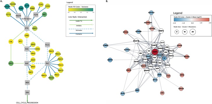
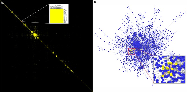
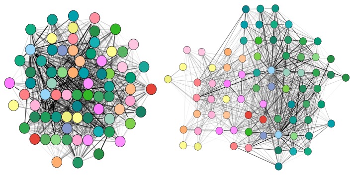
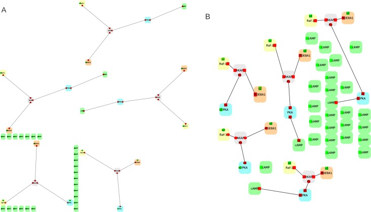
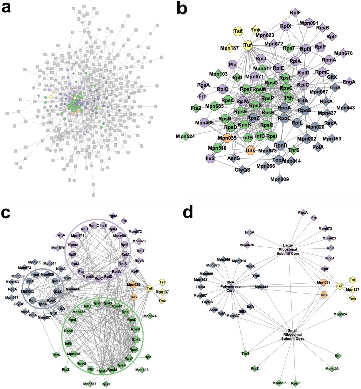
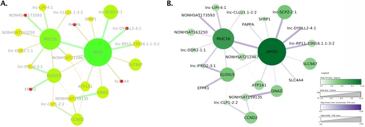
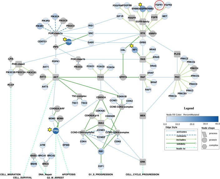
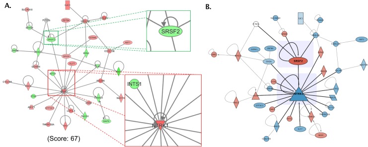
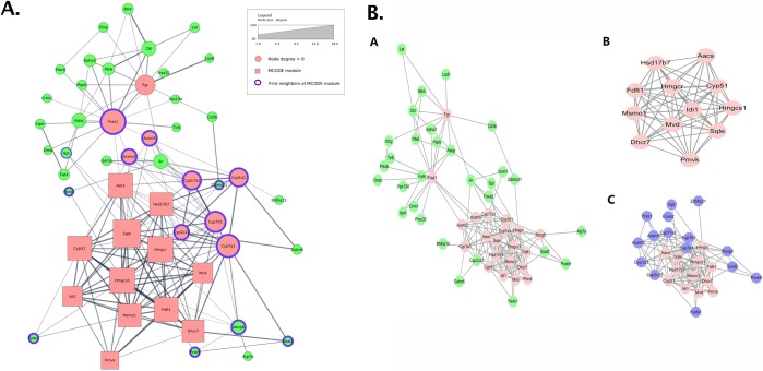
Biological network figures are ubiquitous in the biology and medical literature. On the one hand, a good network figure can quickly provide information about the nature and degree of interactions between items and enable inferences about the reason for those interactions. On the other hand, good network figures are difficult to create. In this paper, we outline 10 simple rules for creating biological network figures for communication, from choosing layouts, to applying color or other channels to show attributes, to the use of layering and separation. These rules are accompanied by illustrative examples. We also provide a concise set of references and additional resources for each rule.


Conflict of interest statement

The authors have declared that no competing interests exist.

Figures

Fig 1
Fig 1. First, determine the figure purpose and assess the network.
Two representations of proteins involved in GBM. The left image (A) shows a curated cancer signaling pathway taken from the TCGA's original Mondrian plugin to Cytoscape (Cytoscape Consortium; https://cytoscape.org/). The node color represents the overall variance of expression across a set of patients, and the lines and arrows represent the function of the interactions between the proteins. In the right image (B), a PPI network was created using the Cytoscape stringApp and annotated with data downloaded from TCGA. The colors represent the fold change for subtype 3 of GBM, the node sizes vary with the number of mutations, and the edges represent functional associations. GBM, glioblastoma multiforme; PPI, protein–protein interaction.
Fig 2
Fig 2. Consider alternative layouts.
These two images represent the same data from Collins and colleagues [6]. The image on the left (A) shows an adjacency matrix representation of the network. The inset within the image shows a cluster identified on the diagonal that represents the exosome complex. The image on the right (B) is of the same data depicted as a node-link diagram with the same nodes highlighted. Notice how difficult it is to see the close interaction between the nodes, even in the inset in this second image, due to the clutter resulting from other nodes. These images were produced in Cytoscape (Cytoscape Consortium; https://cytoscape.org/) with the clusterMaker2 app and postprocessed in Photoshop (Adobe; https://wwww.adobe.com/) to merge in the insets.
Fig 3
Fig 3. Beware of unintended spatial interpretations.
This figure shows two illustrations representing the same region of the normalized structural mouse brain connectivity data set described by Ganglberger and colleagues [17]. The data are derived from the Allen Mouse Brain Connectome dataset [18]. The illustrations have been generated using the Cytoscape.js (Cytoscape Consortium; https://cytoscape.org/) implementation of the force-directed layout algorithm CoSE. The left image uses connectivity strength as the driving force for the layout, posing strongly connected nodes closely together, but at the same time neglecting the spatial context of the network. Instead, the second layout in the right image is driven by the spatial relation of brain regions, generating automatically a "flattened" mouse brain representation as seen from above. Symmetry and spatial positions are approximately reproduced. Structural connectivity strength is encoded by the gray-level color scale of the edges. CoSE, compound spring embedder.
Fig 4
Fig 4. Provide readable labels and captions.
(A) An example network based on PPI data from Andrei and colleagues [34], in which the node labels are too small to be legible. (B) The same network, but this time the layout has been improved to make better use of the available space, resulting in larger labels. The two images have been generated using the open-source software Porgy (http://porgy.labri.fr). PPI, protein–protein interaction.
Fig 5
Fig 5. Choose the right level of detail.
Example aggregation using data from Kuhner and colleagues [21], which replicates the sequence of steps described in Gehlenborg and colleagues [20], from a hardly readable network (A), gradually through (B) and (C), to a legible, aggregated version of the same network (D).
Fig 6
Fig 6. Use color responsibly.
Two network images based on data from Khaled and colleagues [22]. (A) is a recreation of the original Fig 3B shown in the paper, including the color-blind and saturated color scheme, which makes it difficult to perceive the relative importance of the nodes. The colormap also groups unrelated edges and nodes together through similar colors, whereas the node labels in light gray have low luminance contrast with the white background and are difficult to read. (B) shows an improved version, including a legend and appropriate and separate quantitative colormaps for edges and nodes. Both images were created with Cytoscape (Cytoscape Consortium; https://cytoscape.org/) and postprocessed using Photoshop (Adobe; https://www.adobe.com/) to assemble them.
Fig 7
Fig 7. Use other visual marks and channels appropriately.
In this Cytoscape (Cytoscape Consortium; https://cytoscape.org/) recreation of Fig 3 from Morris and colleagues [26], the authors used several different marks to explain the data in the network, including stars to indicate highly mutated nodes (in addition to the color gradient) and a red circle to indicate the subject of one of the scenarios outlined in the paper. The authors also used different node shapes to distinguish among complexes, proteins, and processes, and different line and line ending styles to indicate the relationship among the nodes.
Fig 8
Fig 8. Use layering and separation.
(A) Reconstruction of Fig 5A from Preston and colleagues [28], which contains the largest subnetwork resulting from a pathway and enrichment analysis. Callouts call attention to the neighborhoods around SRSF2 and NTRK1. (B) Modified image after changing the color scheme to avoid color-blind issues, decreasing the weight of the edges that do not connect to the key nodes and increasing the size of the key nodes. Nonkey nodes and self-edges were also de-emphasized by making them slightly transparent. Subtle shading behind the two key nodes was applied to provide additional separation.
Fig 9
Fig 9. Use multiple figures.
(A) An image constructed from the data provided by Zhu and colleagues [29] but constrained to show everything in a single view. The result is a very confusing image, and, from the viewer’s perspective, it is hard to determine what is important. (B) The original image from Zhu and colleagues. Fig 5, where the authors split the network into 3 views, each view with a different focus. The first view (A) highlights the high degree nodes, the second view (B) shows the MCODE component, and the third view (C) adds the first neighbors to that component. MCODE, molecular complex detection algorithm.
Fig 10
Fig 10. Do not use unjustified 3D.
A 2D network displayed along an additional dimension in 3D. The height of each 3D cylinder is mapped to the size of a network attribute. Note the significant number of occlusions. This figure was generated using the open-source software Tulip (see the online Tulip user documentation, Chapter "Tulip in Practice: Four case studies" http://tulip.labri.fr).

References

    1. Aerts J, Gehlenborg N, Marai GE, Nieselt KK. Visualization of Biological Data—Crossroads (Dagstuhl Seminar 18161). Dagstuhl Reports. 2018;8(4):32–71. 10.4230/DagRep.8.4.32 - DOI
    1. Rougier N.P.,Droettboom M., Bourne P.E. Ten simple rules for better figures. Public Library of Science; 2014. 10.1371/journal.pcbi.1003833 - DOI - PMC - PubMed
    1. Lortie C.J. Ten simple rules for short and swift presentations. Public Library of Science; 2017. 10.1371/journal.pcbi.1005373 - DOI - PMC - PubMed
    1. Nathalie Henry Riche; Christophe Hurter; Nicholas Diakopoulos; Sheelagh Carpendale. Data-Driven Storytelling. AK Peters; 2018.
    1. Munzner T. Visualization Analysis & Design A K Peters Visualization; CRC Press; 2014.

Publication types