. 2019 Nov 14;179(5):1207-1221.e22.
doi: 10.1016/j.cell.2019.10.026.

Clonal Decomposition and DNA Replication States Defined by Scaled Single-Cell Genome Sequencing

Collaborators, Affiliations

Clonal Decomposition and DNA Replication States Defined by Scaled Single-Cell Genome Sequencing

Emma Laks et al. Cell. .

Abstract

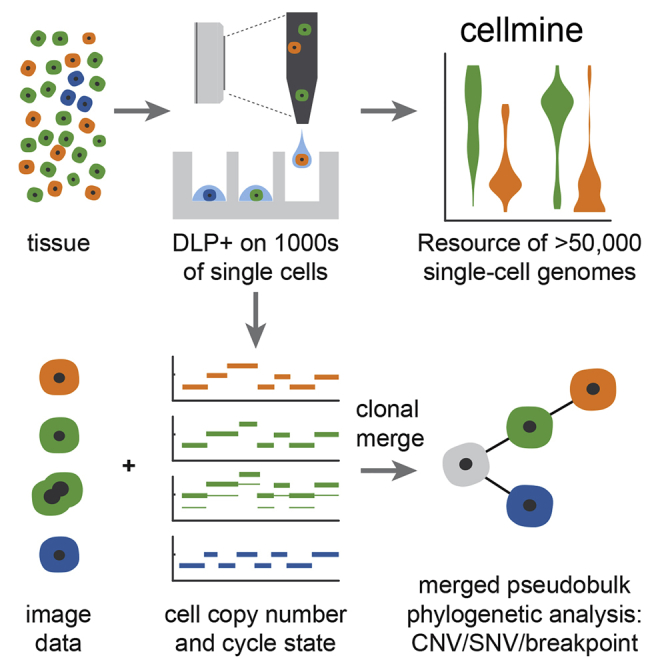
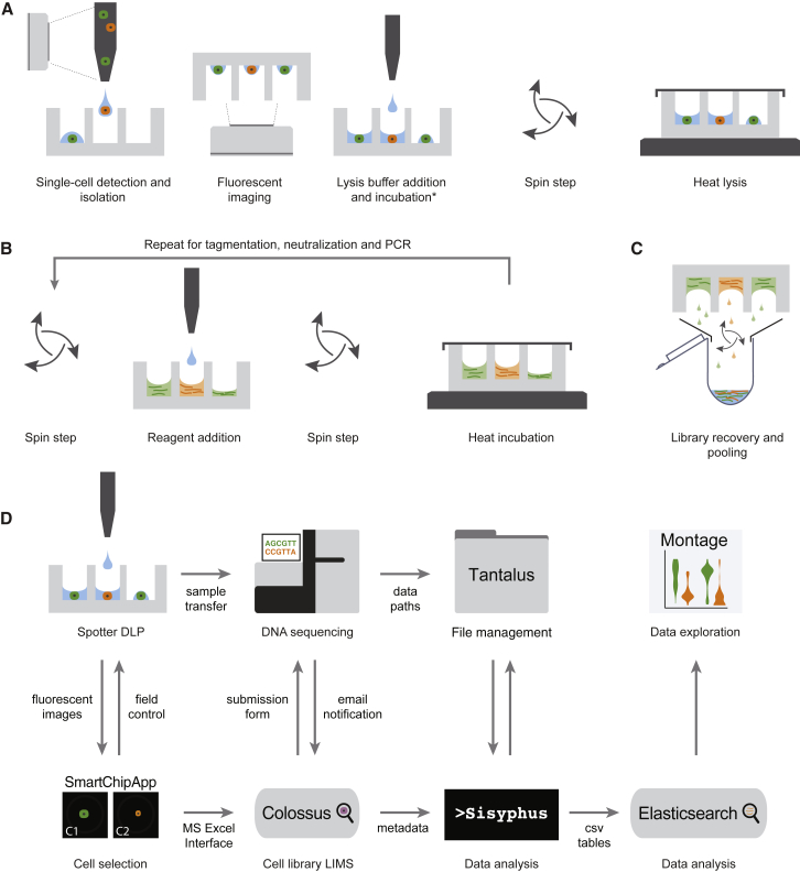
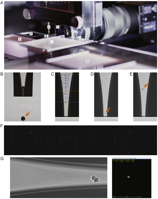
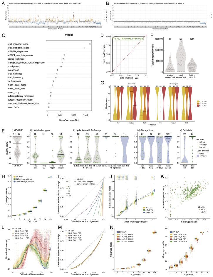
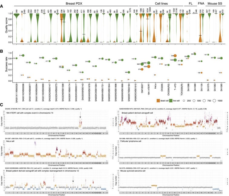
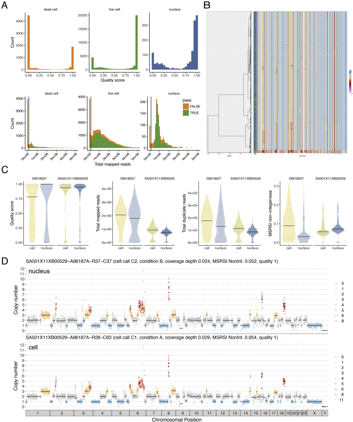
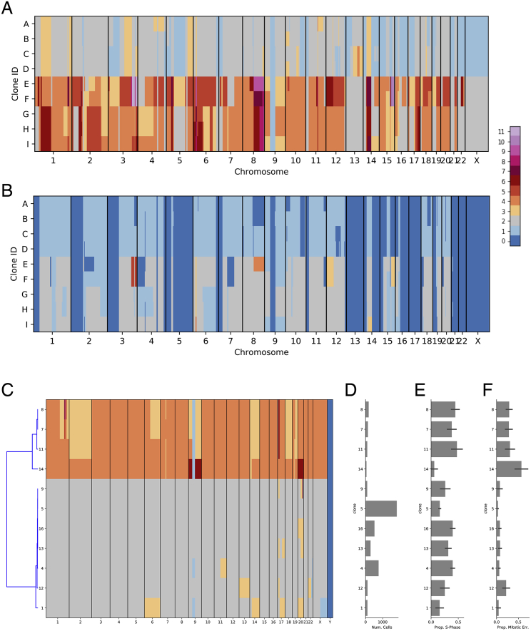
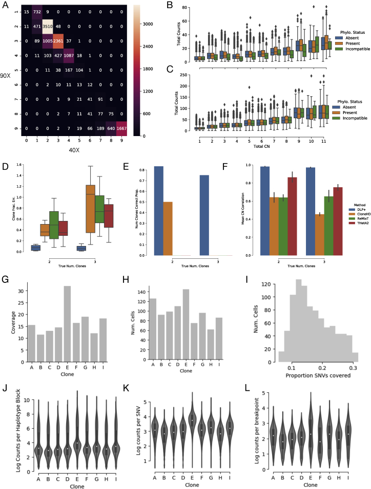
Accurate measurement of clonal genotypes, mutational processes, and replication states from individual tumor-cell genomes will facilitate improved understanding of tumor evolution. We have developed DLP+, a scalable single-cell whole-genome sequencing platform implemented using commodity instruments, image-based object recognition, and open source computational methods. Using DLP+, we have generated a resource of 51,926 single-cell genomes and matched cell images from diverse cell types including cell lines, xenografts, and diagnostic samples with limited material. From this resource we have defined variation in mitotic mis-segregation rates across tissue types and genotypes. Analysis of matched genomic and image measurements revealed correlations between cellular morphology and genome ploidy states. Aggregation of cells sharing copy number profiles allowed for calculation of single-nucleotide resolution clonal genotypes and inference of clonal phylogenies and avoided the limitations of bulk deconvolution. Finally, joint analysis over the above features defined clone-specific chromosomal aneuploidy in polyclonal populations.

Keywords: DNA sequencing; aneuploidy; cancer genomics; cell cycle; copy number; genomic instability; single cell; tumor evolution; tumor heterogeneity.


Conflict of interest statement

S.P.S. and S.A. are founders and shareholders of Contextual Genomics Inc.

Figures

None
Graphical abstract
Figure 1
Figure 1
Concept Schematic of the Experimental and Computational Processes for DLP+ (A) Cell isolation and lysis. (B) Open-array library construction. DLP+ libraries from unamplified single cells are built by carrying the chip through a series of reagent addition, spin, seal, and heat incubation steps. (C) Pooled recovery for sequencing. (D) Computational pipeline workflow for single-cell genome data management, alignment, and post-processing.
Figure S1
Figure S1
Spotter Setup and Single-Cell Isolation, Related to Figure 1 and STAR Methods, Method Details (A) Spotting robot setup featuring: (I) nanowell open-array chip located on customized chip-holder, (II) wash-solution reservoir, (III) active fresh-water wash station, (IV) dispensing nozzle, (V) droplet camera, (VI) chilled target holder. (B) Brightfield image of the dispensing nozzle. Orange arrow highlights ejected droplet which can range from 300- 550 pL in size depending on instrument settings. (C) Overlay of a brightfield image showing the dispensing nozzle and the mapping density of detected cells. Green dots indicate ejected cells; blue dots indicate cells that were again detected after ejecting a single droplet; dotted blue line shows boundary of cell ejection area/volume; dotted orange line indicates sedimentation boundary. (D) Automated imaging permits the identification of single cells and target deposition into a nanowell. Cells were deposited if a single cell was detected in the ejection area and no particle was present in the sedimentation area. Orange arrow highlights selected single cell for deposition. e Brightfield image showing contaminating debris (orange arrow). (F) Montage of 186 fluorescent images of isolated single cells in the bottom of a nanowell using the cellenONE software. Images are aligned according to the array layout. (G) Left image: Nozzle image of an example doublet cell identified at spotting. Right image: CFSE stained plate image of the nanowell corresponding to the doublet, identified by the image processing SmartChipApp.
Figure S2
Figure S2
Optimization of DLP+ Single-Cell Whole-Genome Sequencing Library Construction for the Open-Array Format, Related to Figure 2 Examples of (A) high-quality and (B) poor quality single-cell genome libraries from a diploid GM18507 lymphoblastoid (male) cell line. Colors correspond to integer HMM copy number states (Ha et al., 2012); black lines indicate segment medians. (C) Random forest classifier feature importance, total mapped reads is of highest importance. Definitions of the features are in methods. (D) OC from 10 ten-fold cross-validation on Random Forest (AUC 0.997) (E) Quality score distribution over GM18507 cells of (i) the original MF-DLP data (Zahn et al., 2017)), (ii) lysis buffer types, (iii) Tn5 concentrations and increased lysis presoak times (iv) on-chip storage of isolated cells and nuclei that were dispensed into nanowells and stored either overnight or for 63 days prior to lysis and library construction, and (v) cell state (live or dead). Numbers of cells are indicated above each violin plot, where black lines show medians and dots indicate individual cells (green circle = live, orange diamond = dead, gray square = no cell state data). Grey background indicates where cells underwent heat lysis immediately after lysis buffer addition, and blue background indicates cells kept in lysis buffer for 19 h at 4°C before heat lysis. (F) Effect of cell dispensing method on total mapped reads, with active selection (cellenONE, spotted in a block of wells or a scatter pattern) or passive limiting dilution dispensing. Black lines show median. (G) Effect of protease concentration on cells. Quality scores of single-cell libraries built with a low, medium, or high concentration of protease in the lysis buffer and lysed for either 2 or 19 h, followed by library construction with a range of protease concentrations. (H) Distribution of coverage breadth of bootstrap sampling of GM18507 libraries using a 2 h and overnight presoak lysis compared to a microfluidic device (MF-DLP (n= 122, (Zahn et al., 2017)), DLP+ 2 h (n= 148), DLP+ overnight (n= 133). (I) The effect of lysis time on coverage breadth of merged single-cell genomes. Bootstrap sampling of single-cell GM18507 libraries prepared using a 2 h and overnight cold lysis conditions; DLP+ 2 h (n= 148), DLP+ overnight (n= 133), MF-DLP Zahn et al. (2017) (n= 122). Single-cell libraries were downsampled to a similar median coverage depth. Boxplots show median and quartiles, the whiskers show the remaining distribution, and dots indicate outliers. Lorenz curves shows coverage uniformity for merged single-cell genomes. Curves are median merged genomes. Experimental condition and number of merged cells are indicated in the plot. Dotted black line indicates perfectly uniform genome. (J) Distribution of fraction duplicate reads for GM18507 cells (2.2 nL Tn5, n= 587 (green); 3.5 nL Tn5, n= 571 (blue)) and on a microfluidic device (n= 141, (Zahn et al., 2017) (yellow)). The top column labels state the numbers of cells per condition. (K) Fraction duplicate reads versus coverage breadth of deeply sequenced GM18507 libraries (3.5 nL Tn5, n= 571), 10 HiSeqX lanes) with low quality (< 0.75) and high quality ( 0.75) indicated. (L) GC bias of GM18507 libraries as a function of Tn5 concentrations and 8 or 11 PCR amplification cycles. (M) Lorenz curves showing genome-wide coverage uniformity of merged single-cell libraries over Tn5 concentrations and 8 or 11 PCR amplification cycles (downsampled to 64 cells per experimental condition). Dotted straight black line indicates perfectly uniform genome. (N) Effect of Tn5 concentration and PCR cycles time on coverage of merged single-cell genomes. Bootstrap sampling of single-cell GM18507 libraries prepared using a range of Tn5 concentrations and PCR indexing cycles on the open-array and compared to the MF-DLP dataset (7); DLP+ 2.2 nL Tn5, 8 PCR (n=188), 3.5 nL Tn5, 8 PCR (n= 190), 6.5 nL Tn5, 8 PCR (n= 197), 2.2 nL Tn5, 11 PCR (n= 198), and MF-DLP (7) (n= 122). Single-cell libraries were downsampled to a similar median mean coverage depth. Coverage depth and coverage breadth are shown in boxplots.
Figure 2
Figure 2
DLP across Different Tissue Types Split by Viability: Live Cells (n= 35,973, Green) and Dead Cells (n= 8,877, Orange) (A) Violin plots showing the quality score of single-cell libraries across various tissue types, split by cell viability status (live or dead), with number of cells shown above the violin. Black lines show median. (B) Fraction of successful cells in a sample (quality > 0.75), split by cell viability. The size of the bubble represents the total number of successful cells. Violin and bubble colors indicate cell viability. (C) Example single-cell copy number profiles from cell lines, breast PDX, follicular lymphoma, and mouse synovial sarcoma. Colors correspond to integer HMM copy number states; black lines indicate segment medians. Arrows highlight regions of complex copy number change.
Figure S3
Figure S3
DLP+ Produces High-Quality Libraries from Cells and Nuclei, while Dead Cells Drop Out with Low Read Count, Related to Figure 2 (A) Quality score distribution of optimized single-cell libraries, split by dead cells, live cells, and nuclei shows live cells and nuclei have a similar distribution, while dead cells have lower quality. Total mapped reads distribution (orange is cells with quality score less than 0.75, and green is cells with quality score higher than 0.75), cells with low read counts have low-quality score, vertical line represents 125,000 reads. (B) Heatmap of copy number profiles from cells and nuclei shows that cells (green in side bar) and nuclei (blue) cluster together using hierarchical clustering. (C) Sequencing metrics of single-cell and single-nucleus libraries produced from the same samples. (D) Example copy number profile from a nucleus and a cell derived from the same sample showing the same copy number clone type.
Figure S4
Figure S4
Pseudo-bulk Supplementary Analysis Depicting Properties of Clonal Populations of OV2295 and 184-htert Cells, Related to Figure 3 (A) Total copy number heatmap for each clone of OV2295 (y axis) across the genome (x axis). (B) Minor copy number heatmap for each clone of OV2295 (y axis) across the genome (x axis). (C) Total copy number of 34 clones comprising 14,703 cells, with hierarchical clustering dendrogram (left). (D) Number of cells in each clone. (E) Estimated proportion of cells in S-phase with 90% confidence interval error bars. (F) Estimated proportion of cells in with mitotic error with 90% confidence interval error bars.
Figure S5
Figure S5
Pseudo-bulk Supplementary Analysis Showing Comparison of Pseudo-bulk SNV Detection between 2 and 4 Lanes of Sequencing; Relative Performance of Bulk Deconvolution for In-silico Mixtures, Related to Figure 3 (A) Heatmap of the number of SNVs (values in heatmap) that are detected in the 2 lane dataset (x axis) versus the 4 lane dataset (y axis) for three related ovarian cell lines. (B) Counts of the total number of reads (sum of reference and alternate allele, x axis) for SNVs detected in the 2 lane dataset for three ovarian cell lines, split by total copy number of the encompassing region (y axis) and the phylogenetic status of each SNV (hue). (C) Similar to b, for the 4 lane ovarian cell line dataset. (D) Total clone fraction error (y axis) as boxplots for the 2 and 3 clone mixtures (y axis, n = 6, n = 9) for each method. (E) Proportion of mixtures for which the number of predicted clones was correct (y axis) for the 2 and 3 clone mixtures (y axis) for each method. (F) Mean correlation between predicted and clone copy number (y axis) for the 2 and 3 clone mixtures (y axis) for each method. (G) Coverage in reads reference nucleotide for OV2295 clones. (H) Cell count for OV2295 clones. i Histogram of the proportion of SNVs with 1 or more covering reads across cells. (J) Distribution of log read counts per haplotype block as boxplots for OV2295 clones. (J) Distribution of log read counts per SNV as boxplots for OV2295 clones. (L) Distribution of log unique read counts per detected breakpoint for OV2295 clones.
Figure 3
Figure 3
Features from Merging of Clones of OV2295, OV2295(R2), and TOV2295(R) Cell Lines Based on Single-Cell CNV (n= 891) (A) Raw total copy number for clone E (y axis) across the genome (x axis) colored by inferred total copy number. (B) Minor allele frequency of clone E (y axis) across the genome (x axis) with inferred minor copy number ratio (minor copy number / total copy number) shown as blue lines. (C) Presence of breakpoints (y axis) in each clone (x axis). (D) Presence and state of SNVs (y axis) in each clone (x axis) with SNVs with no coverage in a clone shown in red, heterozygous and homozygous SNVs as determined by reference and alternate allele counts shown in dark and light blue respectively. (E) Cell counts per clone per sample. (F) Reduced dimensionality representation of n = 1,345 cells passing preliminary filtering, with cells excluded by additional filtering in gray, as calculated using UMAP. (G) Correlation between counts of breakpoints and SNVs on the branches of the identically structured phylogeny inferred for both variant types. The shaded region represents the 95% confidence interval of the regression line. (H) Phylogenetic tree with branch lengths calculated as counts of SNVs originating on each branch.
Figure 4
Figure 4
Features from Merging of Clones of SA1135 Fine Needle Aspirate of a Breast Cancer Shown for each panel is total clonal copy number (top) and haplotype block allele ratios (bottom) for clones identified in a fine breast cancer needle aspirate. n = number of cells in clone. (A) Diploid heterozygous copy number and of normal cells. (B–D) Aneuploid copy number and Loss of Heterozygosity (LOH) profiles of 3 tumor clones B, C, D. Annotated are clonal amplifications in MCL1, MYC and CCNE1, subclonal amplifications of RAD18 and RAB18, and clonal LOH of BRCA2 coincident with a germline loss of function mutation.
Figure 5
Figure 5
Single Whole-Chromosome Aneuploidies in Single-Cell Genomes (A) Three examples of cells from diploid cell types exhibiting whole-chromosome gain or loss patterns. (B) Quantification of single chromosome gain and loss patterns in diploid cell types. Left panel, vertical axis, chromosomal gains (orange) and losses (blue), horizontal axis chromosome number, in single GM18507 lymphoid cells. (C) As for panel c, cell type 184-hTERT. (D) As for panel c, cell type 184-hTERT/TP53−/− 95.22 (SA906). (E) Percentage of each chromosome affected by whole-chromosome gains (orange) and losses (blue) across all cells in 184-hTERT, 184-hTERT TP53 null 95.22 (SA906), and GM18507. Boxplots show median and quartiles, the whiskers show the remaining distribution, dots represent outlier chromosomes. (F) Event number per cell (horizontal axis), for gains (solid line) and losses (dotted line), vertical axis, percentage of cells affected. Line colors represent the three cell types in the key. (G) Loss event ratio (losses versus gain) per chromosome for 184-hTERT, 184-hTERT TP53 null 95.22 (SA906), and GM18507, showing the higher rate of losses in 184-hTERT TP53 null. Boxplots show median and quartiles, the whiskers show the remaining distribution, dots represent chromosomes with outlier loss ratios.
Figure 6
Figure 6
Sequencing of Cell-Cycle-Sorted Populations from a Diploid Lymphoblastoid Cell Line Reveals Early Replicating Regions (n = 1701) (A) GC bias correction for merged GM18507 genomes from each flow sorted cell cycle state reveals S-phase GC bias correction artifacts. Bins from X and Y chromosomes are shown in purple. (B) Single-cell GC bias regression curves reveal S-phase cells consistently exhibit a steeper slope due to early-replicating regions with high GC content. (C) Ploidy-corrected read counts for the merged GM18507 genomes from each state (G1 n= 437, S n= 393, G2, n= 359, dead n= 512) reveal early replicating regions in S-phase. Colored points (diamonds) denote previously characterized early replicating regions (Hansen et al., 2010), bins from X and Y chromosomes are shown in purple, while gray points (circles) denote late replicating regions. Violin plots show the distribution of late and early replicating regions for 2-copy regions. (D) Ploidy corrected read counts for chromosome 4 of the merged GM18507 genomes from each state.
Figure S6
Figure S6
Sequencing of Cell-Cycle-Sorted Populations from the Aneuploid T-47D Breast Cancer Cell Line Reveals Early Replicating Regions (n= 3202) (A) GC bias correction for merged T-47D genomes from each flow sorted cell cycle state reveals S-phase GC bias correction artifacts. (B) Single-cell GC bias regression curves reveal S-phase cells consistently exhibit a steeper slope due to early-replicating regions with high GC content. (C) Ploidy-corrected read counts for the merged T-47D genomes from each state (G1 n=571, S n=625, G2 n=807, dead n=1039) reveal early replicating regions in S-phase. Colored points (diamonds) denote previously characterized early replicating regions (Hansen et al., 2010), while gray points (circles) denote late replicating regions. Violin plots show the distribution of late and early replicating regions for 2-copy regions. (D) Ploidy corrected read counts for chromosome 4 of the merged T-47D genomes from each state.
Figure S7
Figure S7
Feature-based Classifier of Cell Cycle State Flow sort gating for cell cycle analysis of G1, S, G2 phase and dead cells by DLP+. (A) Gate for cells. Side scatter area (SSC) versus forward scatter area (FSC) is used to gate out debris (gray) but not dead cells (red) because we will sort them. (B) Gate for single cells. On the cell gate in a, we can use FSC width versus FSC area to gate out doublets if needed for single-cell sorting in a plate. (C) Gate for live cells. On the gate in b, we use PI versus FSC to capture the live cells which are PI low. (D) Gate for non-apoptotic cells. On the live cell gate in c, we use Caspase 3/7 (APC-A versus FSC) to exclude apoptotic cells which are Caspase 3/7 high from our live cell population. (E) Gate for cell cycle phases in live cells. On the live cell gate established in a-d, we use the DNA content of the cells measured by Hoechst 33342 staining (V459/40-A)to gate the G1 (blue), S (orange), and G2 (green) phases of the cell cycle. (F) Gate for dead cells. On the gate for single cells established in b, we gate on the PI high, Caspase 3/7 high dead cells (red). (G) Example GM18507 cells in S phase and G2 with early replicating regions leading and late replicating regions lagging, including a cell from an unsorted experiment, showing we can detect these cells without preselecting the population. Colors correspond to integer HMM copy number states (Ha et al., 2012); black lines indicate segment medians. (H) Overview of the process for calculating the top performing feature for classifying cell state, residual GC correlation after aggregate GC bias correction. Uncorrected cell data is corrected for sequencing specific GC bias using an aggregate correction curve calculated from merged library level read data. G1 phase cells show little residual correlation between GC and corrected read count, whereas S phase cells show high correlation due to GC rich early replicating regions. (I) F1 score (y axis) for a range of proportions of S-phase cells included in the calculation of aggregate GC correction during training. (J) Receive Operator Characteristic curve for the classifier showing true positive rate varying with false positive rate for a range of thresholds, and a dashed line showing a perfectly random classifier. (K) Violin plots showing the highest performing features, post-correction residual GC correlation (y axis), for each cell cycle state (x axis).
Figure 7
Figure 7
Correlative Analysis of Cell Morphology and Genomic Features (A) Scatterplot of mean nuclei diameter (x axis) by mean cell diameter (y axis) split by diploid versus tetraploid in libraries created from both cells and nuclei (Pearson-r = 0.76, p value = 10-2). The shaded regions shows the 95% confidence interval of the regression line. (B) Variation in cell diameter for GM18507 cells in G1, G2, S phase, and dead (cell state D) cells (n = 2,266). Boxplots show median and quartiles, whiskers show the remaining distribution, dots show outliers. (C) Cell diameter is larger in cells with ploidy > 2 for breast xenograft samples (n = 1,620). Boxplots defined as for B. (D) Nuclei diameter is larger in cells with ploidy > 2 for breast xenograft samples (n = 731). Boxplots defined as for B. (E) Copy number profile (left), spotter nozzle image (middle), and well CFSE staining image (right) re-confirming singleton status, for an example diploid cell. (F) Copy number profile (left), spotter nozzle image (middle), and well CFSE staining image (right), re-confirming singleton status, for an example tetraploid cell.

Comment in

References

    1. Ackerman M., Ben-David S. Which data sets are clusterable?: A theoretical study of clusterability. Journal of Machine Learning Research. 2009;5:1–8.
    1. Baslan T., Kendall J., Rodgers L., Cox H., Riggs M., Stepansky A., Troge J., Ravi K., Esposito D., Lakshmi B. Genome-wide copy number analysis of single cells. Nat. Protoc. 2012;7:1024–1041. - PMC - PubMed
    1. Benjamini Y., Speed T.P. Summarizing and correcting the GC content bias in high-throughput sequencing. Nucleic Acids Res. 2012;40:e72. - PMC - PubMed
    1. Breiman L. Random Forests. Mach. Learn. 2001;45:5–32.
    1. Burleigh A., McKinney S., Brimhall J., Yap D., Eirew P., Poon S., Ng V., Wan A., Prentice L., Annab L. A co-culture genome-wide RNAi screen with mammary epithelial cells reveals transmembrane signals required for growth and differentiation. Breast Cancer Res. 2015;17:4. - PMC - PubMed

MeSH terms

Substances

LinkOut - more resources