. 2019 Nov 19;14(11):e0224697.
doi: 10.1371/journal.pone.0224697. eCollection 2019.

Video abstracts and plain language summaries are more effective than graphical abstracts and published abstracts

Affiliations

Video abstracts and plain language summaries are more effective than graphical abstracts and published abstracts

Kate Bredbenner et al. PLoS One. .

Abstract

Background: Journals are trying to make their papers more accessible by creating a variety of research summaries including graphical abstracts, video abstracts, and plain language summaries. It is unknown if individuals with science, science-related, or non-science careers prefer different summaries, which approach is most effective, or even what criteria should be used for judging which approach is most effective. A survey was created to address this gap in our knowledge. Two papers from Nature on similar research topics were chosen, and different kinds of research summaries were created for each one. Questions to measure comprehension of the research, as well as self-evaluation of enjoyment of the summary, perceived understanding after viewing the summary, and the desire for more updates of that summary type were asked to determine the relative merits of each of the summaries.

Results: Participants (n = 538) were randomly assigned to one of the summary types. The response of adults with science, science-related, and non-science careers were slightly different, but they show similar trends. All groups performed well on a post-summary test, but participants reported higher perceived understanding when presented with a video or plain language summary (p<0.0025). All groups enjoyed video abstracts the most followed by plain language summaries, and then graphical abstracts and published abstracts. The reported preference for different summary types was generally not correlated to the comprehension of the summaries. Here we show that original abstracts and graphical abstracts are not as successful as video abstracts and plain language summaries at producing comprehension, a feeling of understanding, and enjoyment. Our results indicate the value of relaxing the word counts in the abstract to allow for more plain language or including a plain language summary section along with the abstract.


Conflict of interest statement

The authors have read the journal’s policy and the authors of this manuscript have the following competing interests: KB is a paid creator of video abstracts via SimpleBiologist. This does not alter the authors’ adherence to PLOS ONE policies on sharing data and materials.

Figures

Fig 1
Fig 1. Flowchart of survey assignment and pooling.
A flowchart representing the eight survey versions created for this research. Once participants click on the button “Participate in Survey”, they are randomly assorted to one of the eight possible surveys including two versions each of video abstracts, plain language summaries, graphical abstracts, and published abstracts where one version shows the Cohn et al. summary first and one shows the Takata et al. summary first. All surveys ask background questions prior to showing a summary. The asterisks denote surveys that contained an error which only showed participants with science careers both the Takata et al. and Cohn et al. summaries. All other participants were only shown the Cohn et al. summary. The error was correctly shortly after publicizing the survey. Data from both versions of each type of summary were pooled, as denoted by brackets and the phrase “Data Pooled”.
Fig 2
Fig 2. Participant reported preferences.
Reported learning preferences for all participants and update preferences of participants with science careers. (A) shows data of all participants that answered the Cohn et al. paper and the Takata et al. paper. The bar charts show the reported preference of the participants for different ways to hear about science. (B) shows the update preferences of science participants both in their field of study and outside of it. The graph on the left shows preferences for research inside the scientist’s field of study and the right shows preferences for research outside the field of study.
Fig 3
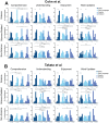
Fig 3. All data from all summaries.
Histograms of the comprehension, understanding, enjoyment, and desire for more updates data for all survey types and all career types. A shows data for the Cohn et al. paper participants. B shows data for the Takata et al. participants. Each histogram shows the data as a percentage of participants. Comprehension histograms are plotted from 1–6, and understanding, enjoyment, and want updates plots are plotted from 0–4. Comprehension scores are from a series of questions asked in the survey (Table 2, S6 File). Understanding, enjoyment, and want updates scores are numerical representations of responses where 0 was “not at all” and 4 was “very much” (Table 2, S6 File). Statistical significance is shown above each plot where p<0.01 using the Mann-Whitney U-Test. Specifically, the asterisks represent the following p-values: p<0.00001(****), p<0.0001(***), p<0.001(**), p<0.01(*).
Fig 4
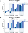
Fig 4. Correlations between reported preference and summary values.
Bar graphs of preference correlation for Cohn et al. and Takata et al. papers. Both graphs show data for videos, graphics, and published abstracts. Analysis was not completed for plain language summaries due to the overwhelming reported preference for written summaries (see Fig 2 for reported preference data). For each summary type, the reported preference for that type was tested for correlation with the comprehension score, reported understanding, reported enjoyment, or the desire for more updates of that type using a Pearson’s r correlation calculation. A shows the data for Cohn et al. B shows the data for Takata et al. Statistical significance is noted where p<0.01. Specifically, the asterisks represent the following p-values: p<0.00001(****), p<0.0001(***), p<0.001(**), p<0.01(*).
Fig 5
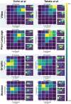
Fig 5. Heat maps of reported understanding versus comprehension score.
Heat maps of reported understanding versus comprehension score of Cohn et al. and Takata et al. separated by summary type. The larger heat maps show the summed data for all participants and the three smaller heat maps to the right show the data for each career type. Each larger heat map contains the Pearson’s r correlation value for all careers. Statistical significance is noted where p<0.05. Specifically, the asterisks represent the following p-values: p<0.00005(****), p<0.0005(***), p<0.005(**), p<0.05(*).

References

    1. State of Science Index Survey [Internet]. 3M. 2019. https://www.3m.com/3M/en_US/state-of-science-index-survey/interactive-3m...
    1. King SR, Pewsey E, Shailes S. Plain-language Summaries of Research: An inside guide to eLife digests. eLife [Internet]. 2017; https://elifesciences.org/articles/25410 - PMC - PubMed
    1. Plain language summaries: Journals and other scientific organizations. eLife [Internet]. 2019; https://docs.google.com/spreadsheets/d/1xqOMlzSI2rqxe6Eb3SZRRxmckXVXYACZ...
    1. McIlwain C, Santesso N, Simi S, Napoli M, Lasserson T, Welsh E, et al. Cochrane Standards for preparing Plain Language Summaries [Internet]. [cited 2019 Jul 12]. https://training.cochrane.org/resource/cochrane-standards-preparing-plai...
    1. Enard W, Svante P. Probing the evolution of human language in a model organism [Internet]. Cell Press; 2009. https://www.youtube.com/watch?v=k27DfgKGVp8

Publication types