. 2019 Dec 3;9(1):18472.
doi: 10.1038/s41598-019-54891-8.

Radon exposure is rising steadily within the modern North American residential environment, and is increasingly uniform across seasons

Affiliations

Radon exposure is rising steadily within the modern North American residential environment, and is increasingly uniform across seasons

Fintan K T Stanley et al. Sci Rep. .

Abstract

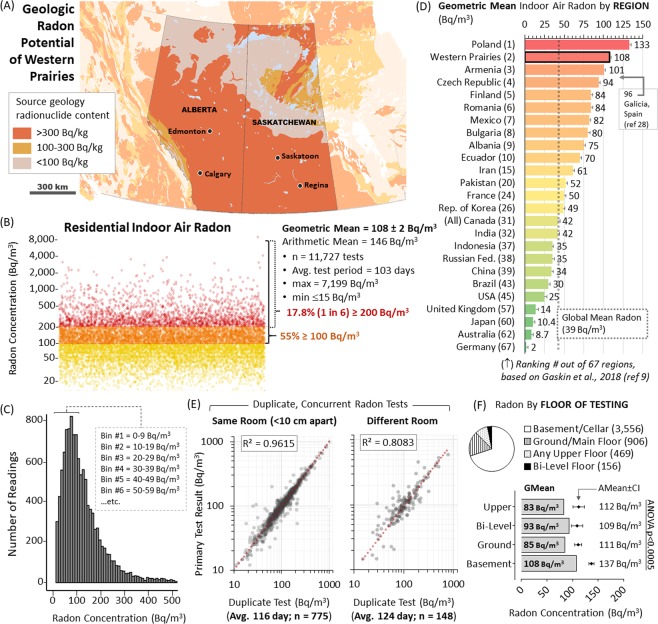
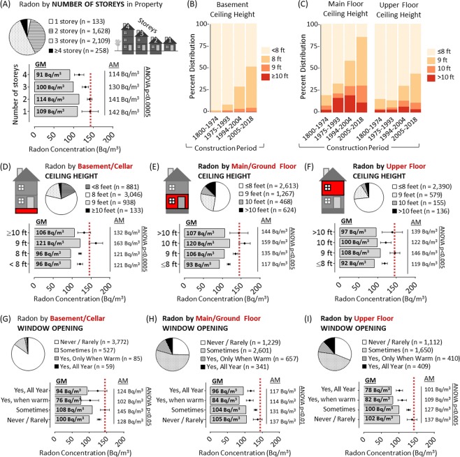
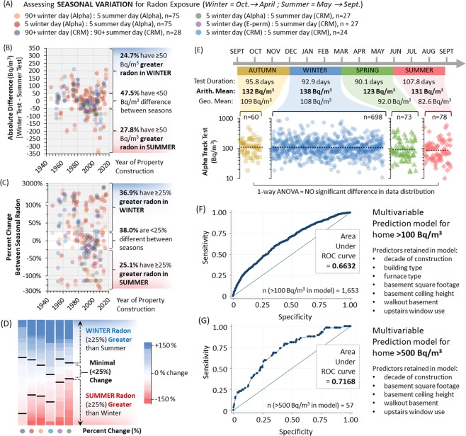
Human-made buildings can artificially concentrate radioactive radon gas of geologic origin, exposing occupants to harmful alpha particle radiation emissions that damage DNA and increase lung cancer risk. We examined how North American residential radon exposure varies by modern environmental design, occupant behaviour and season. 11,727 residential buildings were radon-tested using multiple approaches coupled to geologic, geographic, architectural, seasonal and behavioural data with quality controls. Regional residences contained 108 Bq/m3 geometric mean radon (min < 15 Bq/m3; max 7,199 Bq/m3), with 17.8% ≥ 200 Bq/m3. Pairwise analysis reveals that short term radon tests, despite wide usage, display limited value for establishing dosimetry, with precision being strongly influenced by time of year. Regression analyses indicates that the modern North American Prairie residential environment displays exceptionally high and worsening radon exposure, with more recent construction year, greater square footage, fewer storeys, greater ceiling height, and reduced window opening behaviour all associated with increased radon. Remarkably, multiple test approaches reveal minimal winter-to-summer radon variation in almost half of properties, with the remainder having either higher winter or higher summer radon. This challenges the utility of seasonal correction values for establishing dosimetry in risk estimations, and suggests that radon-attributable cancers are being underestimated.


Conflict of interest statement

The authors declare NO competing (financial or non-financial) interests or other conflicts of any kind. The funders of the study had no role in study design, data collection, analysis, interpretation, or preparing the study manuscript or figures.

Figures

Figure 1
Figure 1
Radon Potential and Domestic Exposure in North American Prairies. Panel A: Geological radon potential map of the North American prairies highlighting Alberta and Saskatchewan. Orange regions contain >300 Bq/kg radon-generating geologic material; yellow contains 100–300 Bq/kg and pale grey-yellow contains <100 Bq/kg. Panel B: Domestic indoor air radon concentrations from all buildings tested within the area highlighted in (A). Yellow dots = 0–99 Bq/m3; Orange dots = 100–199 Bq/m3; Red dots ≥ 200 Bq/m3. All dots are 50% transparent to indicate data densities. Panel C: Histogram of data distribution binned into increments as indicated. Panel D: Geometric mean radon of the Western Prairies from this study, relative to levels documented by previous national studies and summarized in. Panel E: Concurrent duplicate 90 + day radon tests plotted against each other (50% transparent black dots) with linear regression (red dotted line). Left graph shows duplicates placed <10 cm apart, right graph shows duplicates in a different room of the same building. Panel F: Pie chart shows distribution of reporting. Graph shows geometric mean radon (grey bars) and arithmetic mean radon with 95% confidence intervals (black diamonds with bars) by floor of test placement. ANOVA analysis outcomes indicate significance.
Figure 2
Figure 2
Radon test precision by duration and season of data capture. Panel A: Pie chart shows distribution of data reporting by city / region. 704 short term (5 day) alpha track radon tests were deployed <10 cm apart from (and in the latter 5 days of) a 90 + day winter alpha track test. Data points were plotted against each other (50% transparent black dots to show data density) with linear regression (red dotted line). Panel B: Standard deviations (SD) were calculated for concurrent 5 and/or 90 + day winter alpha track radon tests, using the data in Figs. 1E and 2A and as outlined in Supplementary Fig. 1. SD were extrapolated for radon doses up to 10,000 Bq/m3 for duplicate winter 90 + day tests, 5 versus 90 + day winter tests or 5 day summer tests versus 90 + day winter tests. Panel C: Upper graph indicates mean daily temperatures from March to August of 2018 for the survey region (Alberta), demarcating seasons. Lower graphs show the dataset from (A) subdivided by the specific date of the 5 day alpha track radon testing window, as indicated. Data points were plotted against each other (50% transparent black dots to show data density) with linear regression (red dotted line). Panel D: 100 × 5 day winter alpha track tests from (A) showing strong agreement with 90 + day winter tests were selected, and a second 5 day alpha track was deployed in the identical location in the same building during summer months, as indicated. Data points from 5 day winter or summer tests were plotted against the 90 + day winter test result (50% transparent blue (winter) or red (summer) dots to show data density) with linear regression (dotted lines). Panel E: The 5 day winter and summer radon data from (E) were plotted against one another as in (D).
Figure 3
Figure 3
Geospatial Analysis of the Radon Exposure by Region. Panel A: Administrative map of Canada highlighting survey region provinces, relative population densities relative to study cohort distribution. Cartogram representing the federal electoral divisions in Alberta (blue) and Saskatchewan (green), color-coded by number of radon tests per division. Panel B: Domestic indoor air radon concentrations for buildings split by cities and region. Yellow dots = 0–99 Bq/m3; Orange dots = 100–199 Bq/m3; Red dots ≥ 200 Bq/m3. All dots are 50% transparent to indicate data densities. Panel C: Upper and lower 95% confidence intervals from bootstrapped mean estimates of radon concentration plotted against the resampling size.
Figure 4
Figure 4
Western Prairie Radon Map and Radon as a Function of Year of Building Construction. Panel A: Administrative map of Western North American Prairies, indicating municipal populations, radon levels (geometric mean, arithmetic mean, min, max, number of tests) and percentage of buildings ≥either 100 or 200 Bq/m3 radon. Bar and pie charts show distribution of radon concentration readings for each region, with yellow = 0–99 Bq/m3; orange = 100–199 Bq/m3; red ≥ 200 Bq/m3. Panel B: Domestic indoor air radon concentrations for buildings split into quantiles for year of construction. Yellow dots = 0–99 Bq/m3; Orange dots = 100–199 Bq/m3; Red dots ≥ 200 Bq/m3. All dots are 50% transparent to indicate data densities. Percentages indicate proportion ≥200 Bq/m3 over time. Panel C: Using the quantile divisions of construction period as in (B), year of construction data distribution by region for either the study cohort (left) or a random sampling of buildings obtained from MLS real estate database (right). Colours are indicated in legend. Panel D: Using the quantile divisions of construction period as in (B), domestic radon concentrations (with 95% confidence intervals) divided by region. Colours are indicated in legend.
Figure 5
Figure 5
Radon as a function of structural attributes of the building. Panel A: Pie chart shows distribution of reporting. Graph shows geometric mean radon (grey bars) and arithmetic mean radon with 95% confidence intervals (black diamonds with bars) by reported surface area of basement or cellar level of building (in square feet). Panel B: Pie chart shows distribution of reporting. Graph shows geometric mean radon (grey bars) and arithmetic mean radon with 95% confidence intervals (black diamonds with bars) by reported surface area of main or upper level of building (in square feet). Panel C: Surface area of building data distribution for basement or main/upper floor (as indicated), using the quantile divisions of construction period and regional divisions as in Fig. 3B,C. Colours are indicated in legend. Panel D: Pie chart shows distribution of reporting metrics pertaining to the building materials of and general type of the buildings lowest level. Panel E: Graph shows geometric mean radon (grey bars) and arithmetic mean radon with 95% confidence intervals (black diamonds with bars) by reported foundation class, slab material or wall type for lowest level of the building. Panel F: Cartoon indicates the four classes of build type in the study cohort. Pie chart shows distribution of reporting. Graph shows geometric mean radon (grey bars) and arithmetic mean radon with 95% confidence intervals (black diamonds with bars) by reported building type. Panel G: Using the quantile divisions of construction period as in Fig. 3B, domestic radon concentrations (with 95% confidence intervals) divided by building type. Colours are indicated in legend. ANOVA analysis outcomes are indicated on all graphs.
Figure 6
Figure 6
Radon as a function of ceiling height and occupant behaviour influencing building air dynamics Panel A: Pie chart shows distribution of reporting. Graph shows geometric mean radon (grey bars) and arithmetic mean radon with 95% confidence intervals (black diamonds with bars) by reported number of storeys for the building (as indicated by the cartoon). Panel B: Using the quantile divisions of construction period as in Fig. 4B, data distribution for basement ceiling height. Colours are indicated in legend. Panel C: Using the quantile divisions of construction period as in Fig. 3B, data distribution for main floor (left) and upper floor (right) ceiling height. Colours are indicated in legend. Panels D-F: Pie charts show distribution of reporting. Graph shows geometric mean radon (grey bars) and arithmetic mean radon with 95% confidence intervals (black diamonds with bars) by ceiling height (in feet) reported for either basement/cellar (D), main floor (E) or upper floor (F). Panel G-I: Pie charts show distribution of reporting. G Graph shows geometric mean radon (grey bars) and arithmetic mean radon with 95% confidence intervals (black diamonds with bars) by window opening behaviour reported for either basement/cellar (G), main floor (H) or upper floor (I). ANOVA analysis outcomes are indicated on all graphs. Red dotted lines are a reference point of arithmetic mean radon for cohort.
Figure 7
Figure 7
Seasonal variations in radon test outcome and multivariate model. Panel A: All radon testing technologies and test duration permutations used in our study where winter (defined as between October to April) AND summer (defined as May to September) readings were available were paired and colour coded as indicated. Panel B: Using the matched seasonal data pairs defined in (A), the absolute difference between a winter radon test result minus the value summer radon test result were calculated, plotting data out by year of building construction. Percentages indicate those with <50 Bq/m3 difference between seasons, ≥50 Bq/m3 in winter (positive values), or ≥50 Bq/m3 in summer (negative values). Panel C: Using the matched seasonal data pairs defined in (A), the percent change between a winter radon test and summer radon test result were calculated, plotting data out by year of building construction. Percentages indicate those with <25% overall difference between seasons, ≥25% more radon winter (positive values), or ≥25% greater radon in summer (negative values). Panel D: Heat map analysis of data in (C), with values denoted by colours indicated by the legend. Increasing red denotes higher summer radon, increasing blue denotes higher winter radon increasing white denotes lack of change across seasons. Panel E: 90 + day alpha track radon test results were split by season, where the majority (90%) of the 90 + day test window corresponds to one of four seasonal periods defined as: autumn (yellow: Sept, Oct, Nov), winter (blue: Dec, Jan, Feb), spring (green: March, April, May) or summer (red: June, July, Aug). Test duration as well as arithmetic and geometric mean radon levels for all tests in each period are indicated. 1-way ANOVA analysis reveals no statistically significant difference in data distribution or overall radon between these four long term test periods. Panels F-G: Receiver Operator Characteristic Curves for models examining ≥100 Bq/m3 and ≥500 Bq/m3, as indicated.

References

    1. World Health Organization. WHO handbook on indoor radon: a public health perspective, xiv, 94 p. (World Health Organization, Geneva, Switzerland, 2009). - PubMed
    1. Pearson, D. D., Anikin, A. & Goodarzi A. A. Environmental sources of ionizing radiation and their health consequences. in Genome Stability (eds. I, K. & O, K.) 712 (Elsevier, 2016).
    1. Wang J, et al. Genetic predisposition to lung cancer: comprehensive literature integration, meta-analysis, and multiple evidence assessment of candidate-gene association studies. Sci Rep. 2017;7:8371. doi: 10.1038/s41598-017-07737-0. - DOI - PMC - PubMed
    1. Lorenzo-Gonzalez M, et al. Lung cancer and residential radon in never-smokers: A pooling study in the Northwest of Spain. Environ Res. 2019;172:713–718. doi: 10.1016/j.envres.2019.03.011. - DOI - PubMed
    1. Lorenzo-Gonzalez M, et al. Residential radon, genetic polymorphisms in DNA damage and repair-related. Lung Cancer. 2019;135:10–15. doi: 10.1016/j.lungcan.2019.07.003. - DOI - PubMed

Publication types

Grants and funding