. 2019 Dec;37(12):1482-1492.
doi: 10.1038/s41587-019-0336-3. Epub 2019 Dec 3.

Visualizing structure and transitions in high-dimensional biological data

Affiliations

Visualizing structure and transitions in high-dimensional biological data

Kevin R Moon et al. Nat Biotechnol. 2019 Dec.

Erratum in

Abstract

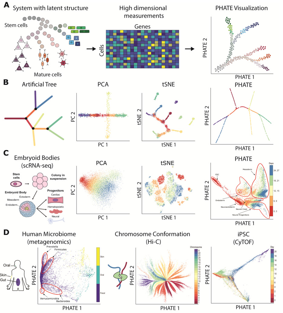
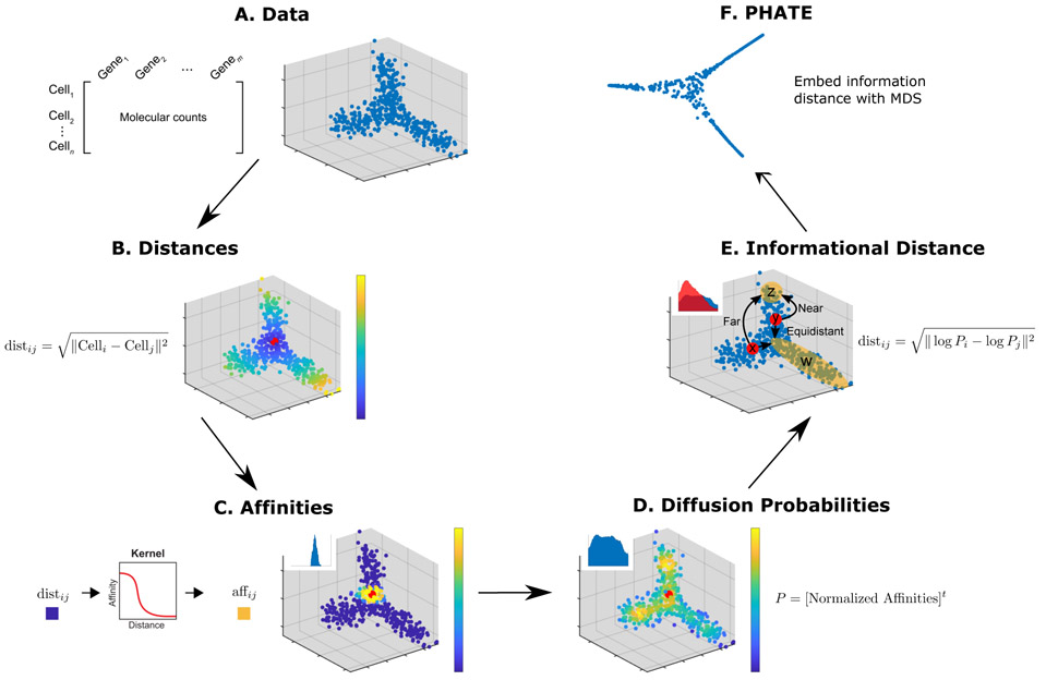
The high-dimensional data created by high-throughput technologies require visualization tools that reveal data structure and patterns in an intuitive form. We present PHATE, a visualization method that captures both local and global nonlinear structure using an information-geometric distance between data points. We compare PHATE to other tools on a variety of artificial and biological datasets, and find that it consistently preserves a range of patterns in data, including continual progressions, branches and clusters, better than other tools. We define a manifold preservation metric, which we call denoised embedding manifold preservation (DEMaP), and show that PHATE produces lower-dimensional embeddings that are quantitatively better denoised as compared to existing visualization methods. An analysis of a newly generated single-cell RNA sequencing dataset on human germ-layer differentiation demonstrates how PHATE reveals unique biological insight into the main developmental branches, including identification of three previously undescribed subpopulations. We also show that PHATE is applicable to a wide variety of data types, including mass cytometry, single-cell RNA sequencing, Hi-C and gut microbiome data.


Figures

Figure 1
Figure 1
Overview of PHATE and its ability to reveal structure in data. (A) Conceptual figure demonstrating the progression of stem cells into different cell types and the corresponding high dimensional single-cell measurements rendered as a visualization by PHATE. (B) (Left) A 2D drawing of an artificial tree with color-coded branches. Data is uniformly sampled from each branch in 60 dimensions with Gaussian noise added (see Methods). (Right) Comparison of PCA, t-SNE, and the PHATE visualizations for the high-dimensional artificial tree data. PHATE is best at revealing global and branching structure in the data. In particular, PCA cannot reveal fine-grained local features such as branches while t-SNE breaks the structure apart and shuffles the broken pieces within the visualization. See Figure S3 for more comparisons on artificial data. (C) Comparison of PCA, t-SNE, and the PHATE visualizations for new embryoid body data showing similar trends as in (B). (D) PHATE applied to various datatypes. Left: PHATE on human microbiome data shows clear distinctions between skin, oral and fecal samples, as well as different enterotypes within the fecal samples. Middle: PHATE on Hi-C chromatin conformation data shows the global structure of chromatin. The embedding is colored by the different chromosomes. Right: PHATE on induced pluripotent stem cell (iPSC) CyTOF data. The embedding is colored by time after induction. See Figures 5, S8, S10, and S11 for more applications to real data.
Figure 2
Figure 2
Steps of the PHATE algorithm. (A) Data. (B) Euclidean distances. Data points are colored by their Euclidean distance to the highlighted point. (C) Markovnormalized affinity matrix. Distances are transformed to local affinities via a kernel function and then normalized to a probability distribution. Data points are colored by the probability of transitioning from the highlighted point in a single step random walk. (D) Diffusion probabilities. The normalized affinities are diffused to denoise the data and learn long-range relationships between points. Data points are colored by the probability of transitioning from the highlighted point in a t step random walk. (E) Informational distance. An informational distance (e.g. the potential distance) that measures the dissimilarity between the diffused probabilities is computed. The informational distance is better suited for computing differences between probabilities than the Euclidean distance. See the text for a discussion. (F) The final PHATE embedding. The informational distances are embedded into low dimensions using MDS. Note that distances or affinities can be directly input to the appropriate step in cases of connectivity data. Therefore, the Euclidean distance or our constructed affinities can be replaced with distances or affinities that best describe the data. For example, in Figure S11D we replace our affinity matrix with the Facebook connectivity matrix.
Figure 3
Figure 3
Extracting branches and branchpoints from PHATE. (A) Methods for identifying suggested endpoints, branch points, and branches. (i) PHATE computes a specialized diffusion operator as an intermediate step (Figure 2D). We use this diffusion operator to find endpoints. Specifically we use the the extrema of the corresponding diffusion components (eigenvectors of the diffusion operator) to identify endpoints [56]. (ii) Local intrinsic dimensionality is used to find branchpoints in a PHATE visual. As there are more degrees of freedom at branch points, the local intrinsic dimension is higher than through the rest of a branch. (iii) Cells in the PHATE embedding can be assigned to branches by considering the correlation between distances of neighbors to reference cells (e.g. branch points or endpoints). (B) Detected branches in the (i) artificial tree data, (ii) bone marrow scRNA-seq data from [16], and (iii) iPSC CyTOF data from [17].
Figure 4
Figure 4
PHATE most accurately represents manifold distances in a 2D embedding. (A) Schematic description of performance comparison procedure. For each method and each type of corruption, Euclidean distances in the 2D embedding are compared to geodesic distances in an equivalent noiseless simulation by Spearman correlation. (B) Performance of 12 different methods across varying levels of corruption by dropout, decreased signal-to-noise ratio (BCV), randomly subsampled cells (subsample) and randomly subsampled genes (n_genes). Mean correlation of 20 runs for each configuration is shown. For further details see Table S3.
Figure 5
Figure 5
Comparison of PHATE to other visualization methods on biological datasets. Columns represent different visualization methods, rows different datasets.
Figure 6
Figure 6
PHATE analysis of embryoid body scRNA-seq data with n = 16, 285 cells. (A) i) The PHATE visualization colored by clusters. Clustering is done on a ten dimensional PHATE embedding. The number of cells in each cluster is given in Table S5. ii) The PHATE visualization colored by estimated local intrinsic dimensionality with selected branch points highlighted. iii) Branches and sub-branches chosen from contiguous clusters for analysis. (B) Lineage tree of the EB system determined from the PHATE analysis showing embryonic stem cells (ESC), the primitive streak (PS), mesoderm (ME), endoderm (EN), neuroectoderm (NE), neural crest (NC), neural progenitors (NP), and others. Red font indicates novel cell precursors. See supplemental videos S1, S2, and S3 for 3D PHATE visualizations of each stage in the tree. (C) PHATE embedding overlaid with each of the populations in the lineage tree. Other abbreviations include lateral plate ME (LP ME), hemangioblast (H), cardiac (C), epicardial precursors (EP), smooth muscle precursors (SMP), cardiac precursors (CP), and neuronal subtypes (NS). (D) Heatmap showing the EMD score between the cluster distribution and the background distribution for each gene. Relevant genes for identifying the main lineages were manually identified. Genes are organized according to their maximum EMD score. The number of cells in each cluster is given in Table S5. (E) The EMD scores of the top scoring surface markers in the targeted sub-branches (sub-branches iii and vii). (F) Scatter plots of the bulk transcription factor expression vs. the mean single-cell transcription factor expression in sub-branches iii (left, n = 2,537 cells) and vii (right, n = 1,314 cells). The Spearman correlation coefficients are calculated for n = 1,213 transcription factors.

References

    1. Maaten L. v. d. and Hinton G, “Visualizing data using t-SNE,” Journal of Machine Learning Research, vol. 9, pp. 2579–2605, 2008.
    1. Amir E.-a. D., Davis KL, Tadmor MD, Simonds EF, Levine JH, Bendall SC, Shenfeld DK, Krishnaswamy S, Nolan GP, and Pe’er D, “viSNE enables visualization of high dimensional single-cell data and reveals phenotypic heterogeneity of leukemia,” Nature Biotechnology, vol. 31, no. 6, pp. 545–552, 2013. - PMC - PubMed
    1. Linderman GC, Rachh M, Hoskins JG, Steinerberger S, and Kluger Y, “Fast interpolation-based t-sne for improved visualization of single-cell rna-seq data,” Nature Methods, p. 1, 2019. - PMC - PubMed
    1. Tenenbaum JB, De Silva V, and Langford JC, “A global geometric framework for nonlinear dimensionality reduction,” Science, vol. 290, no. 5500, pp. 2319–2323, 2000. - PubMed
    1. Becht E, McInnes L, Healy J, Dutertre C-A, Kwok IW, Ng LG, Ginhoux F, and Newell EW, “Dimensionality reduction for visualizing single-cell data using UMAP,” Nature Biotechnology, vol. 37, no. 1, p. 38, 2019. - PubMed

Publication types