. 2020 Jan;23(1):138-151.
doi: 10.1038/s41593-019-0550-9. Epub 2019 Dec 16.

A large-scale standardized physiological survey reveals functional organization of the mouse visual cortex

Saskia E J de Vries #  1 Jerome A Lecoq #  2 Michael A Buice #  3 Peter A Groblewski  4 Gabriel K Ocker  4 Michael Oliver  4 David Feng  4 Nicholas Cain  4 Peter Ledochowitsch  4 Daniel Millman  4 Kate Roll  4 Marina Garrett  4 Tom Keenan  4 Leonard Kuan  4 Stefan Mihalas  4 Shawn Olsen  4 Carol Thompson  4 Wayne Wakeman  4 Jack Waters  4 Derric Williams  4 Chris Barber  4 Nathan Berbesque  4 Brandon Blanchard  4 Nicholas Bowles  4 Shiella D Caldejon  4 Linzy Casal  4 Andrew Cho  4 Sissy Cross  4 Chinh Dang  4 Tim Dolbeare  4 Melise Edwards  4 John Galbraith  4 Nathalie Gaudreault  4 Terri L Gilbert  4 Fiona Griffin  4 Perry Hargrave  4 Robert Howard  4 Lawrence Huang  4 Sean Jewell  5 Nika Keller  4 Ulf Knoblich  4 Josh D Larkin  4 Rachael Larsen  4 Chris Lau  4 Eric Lee  4 Felix Lee  4 Arielle Leon  4 Lu Li  4 Fuhui Long  4 Jennifer Luviano  4 Kyla Mace  4 Thuyanh Nguyen  4 Jed Perkins  4 Miranda Robertson  4 Sam Seid  4 Eric Shea-Brown  4   6 Jianghong Shi  6 Nathan Sjoquist  4 Cliff Slaughterbeck  4 David Sullivan  4 Ryan Valenza  4 Casey White  4 Ali Williford  4 Daniela M Witten  5   7 Jun Zhuang  4 Hongkui Zeng  4 Colin Farrell  4 Lydia Ng  4 Amy Bernard  4 John W Phillips  4 R Clay Reid  4 Christof Koch  4
Affiliations

A large-scale standardized physiological survey reveals functional organization of the mouse visual cortex

Saskia E J de Vries et al. Nat Neurosci. 2020 Jan.

Abstract

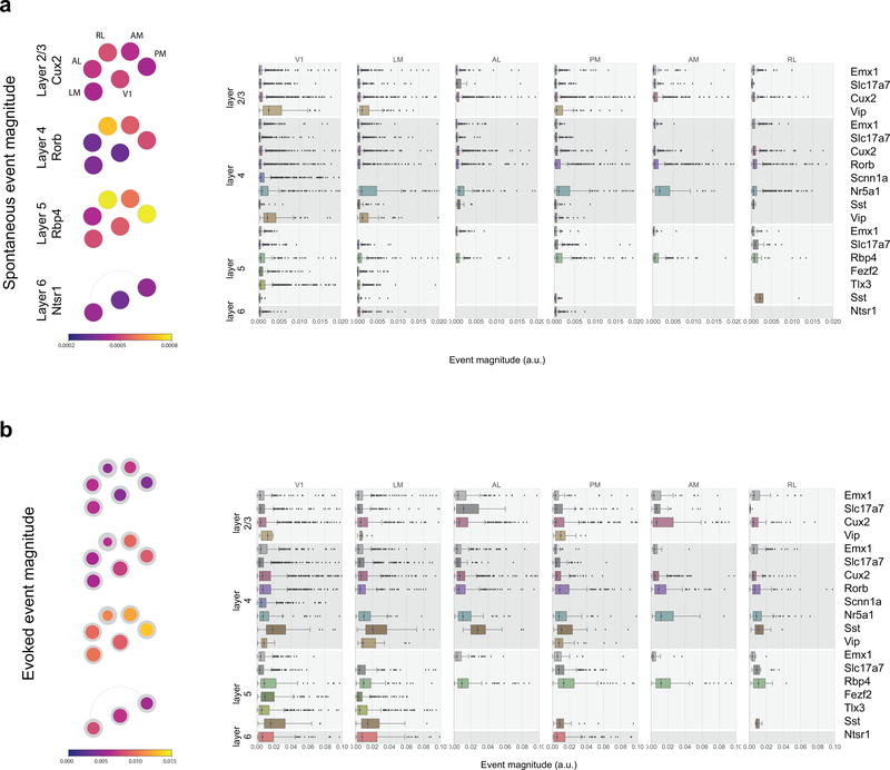
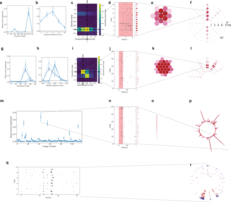
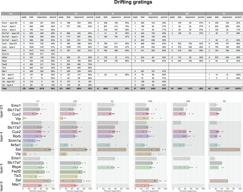
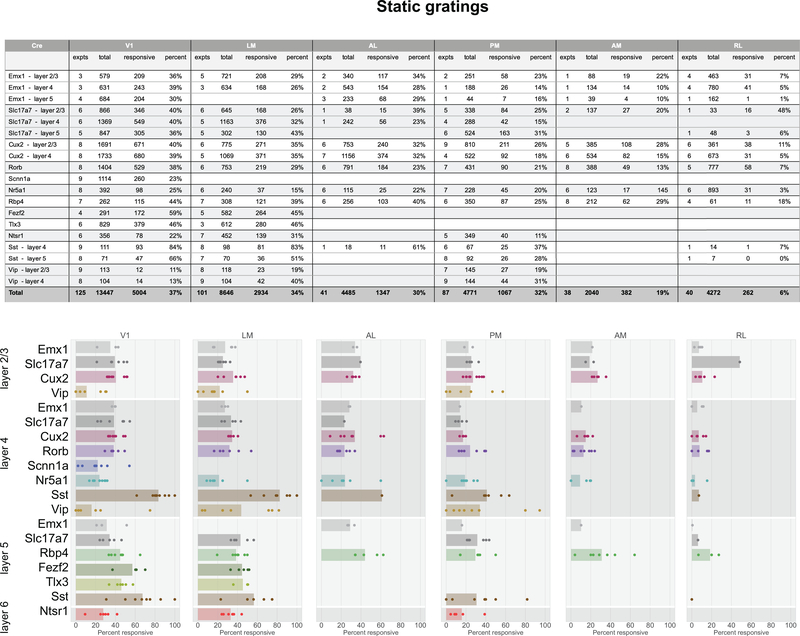
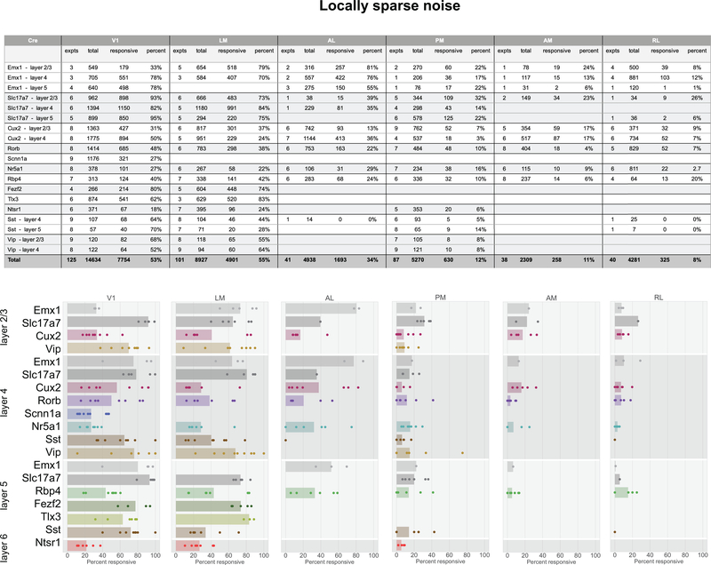
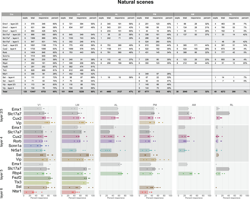
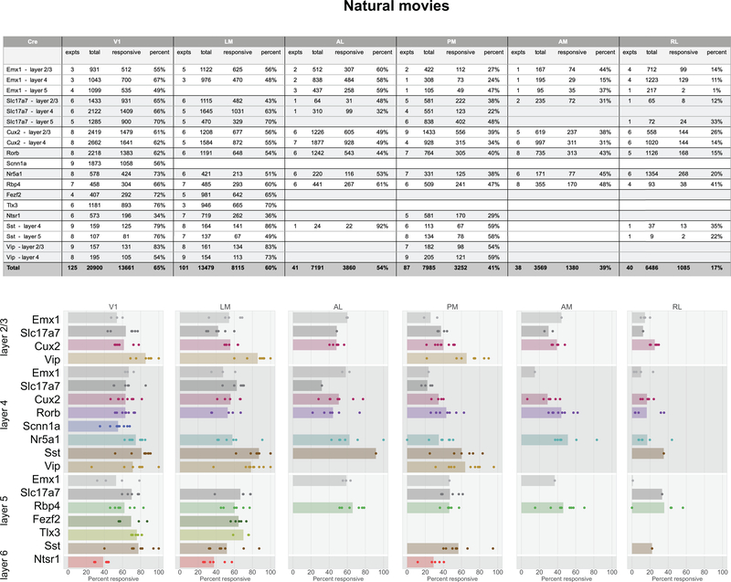
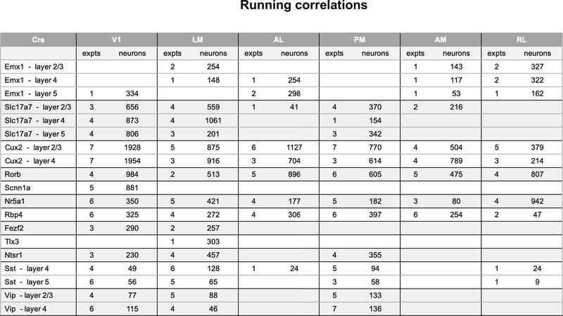
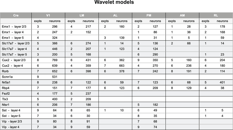
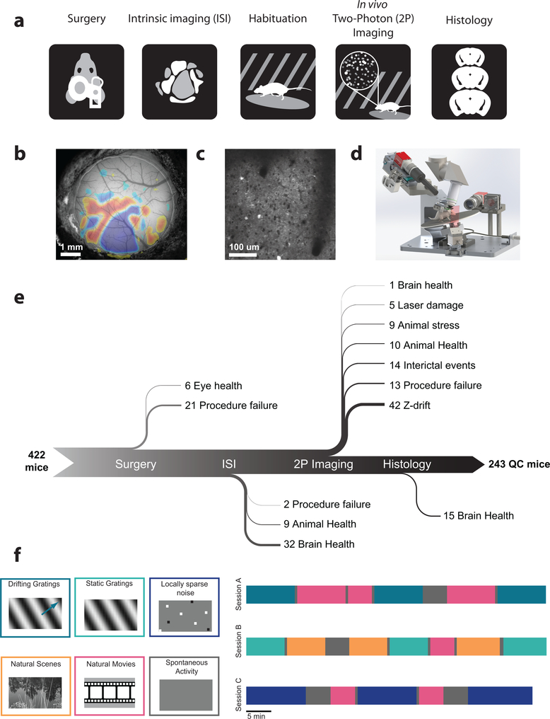
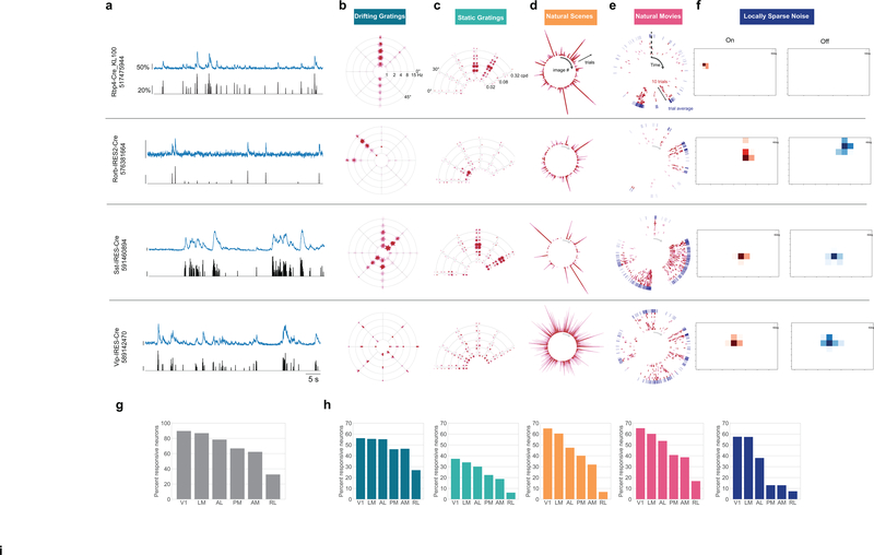
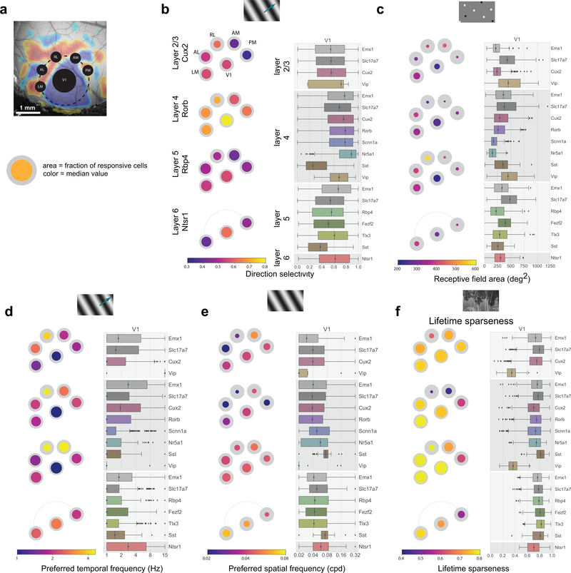
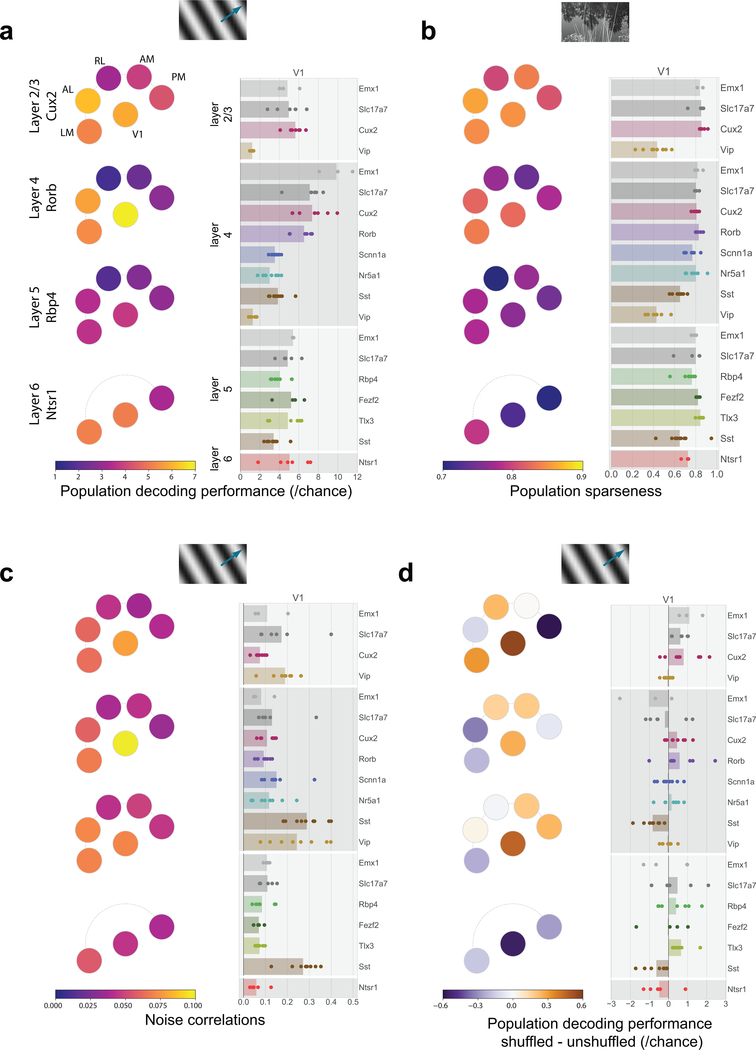
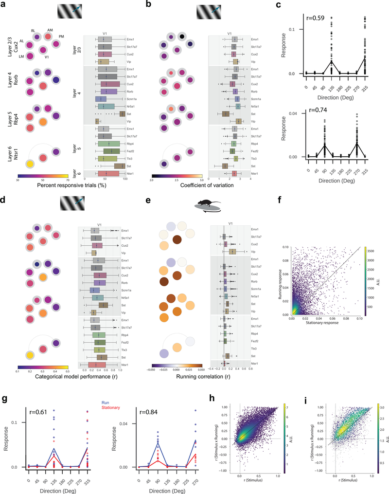
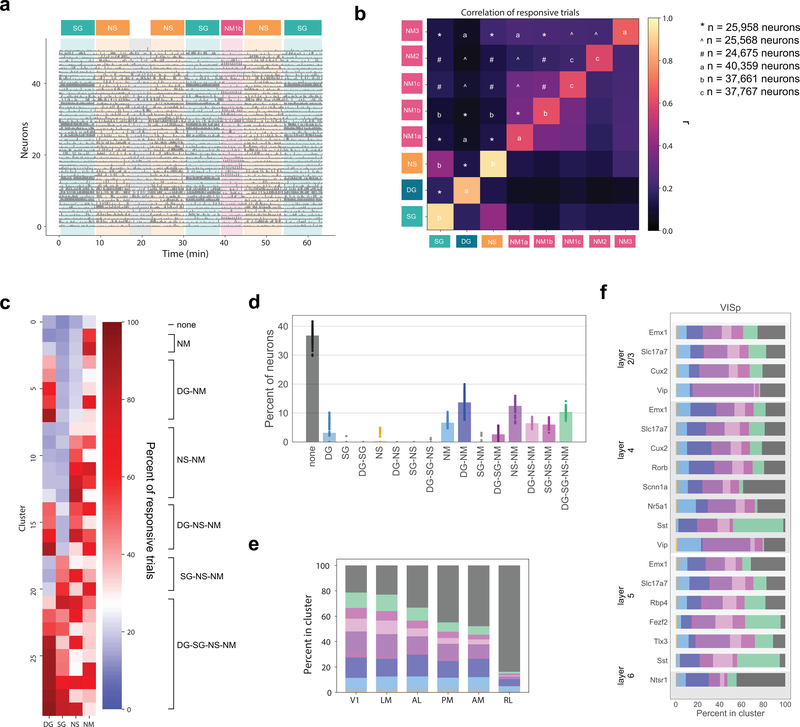
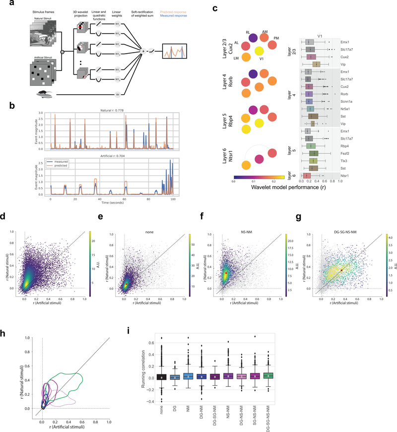
To understand how the brain processes sensory information to guide behavior, we must know how stimulus representations are transformed throughout the visual cortex. Here we report an open, large-scale physiological survey of activity in the awake mouse visual cortex: the Allen Brain Observatory Visual Coding dataset. This publicly available dataset includes the cortical activity of nearly 60,000 neurons from six visual areas, four layers, and 12 transgenic mouse lines in a total of 243 adult mice, in response to a systematic set of visual stimuli. We classify neurons on the basis of joint reliabilities to multiple stimuli and validate this functional classification with models of visual responses. While most classes are characterized by responses to specific subsets of the stimuli, the largest class is not reliably responsive to any of the stimuli and becomes progressively larger in higher visual areas. These classes reveal a functional organization wherein putative dorsal areas show specialization for visual motion signals.


Conflict of interest statement

Competing Financial Interests Statement

The authors declare no competing interests

Figures

Extended Data Fig. 1
Extended Data Fig. 1. Spontaneous and evoked event magnitude
(a) Pawplot and box plots summarizing the mean event magnitude for neurons during the 5 minute spontaneous activity (mean luminance gray) stimulus. For a description of the visualization see Figure 3. The box shows the quartiles of the data, and the whiskers extend to 1.5 times the interquartile range. Points outside this range are shown as outliers. See Extended Data Figure 3 for sample sizes. (b) Pawplot and box plots summarizing the maximum evoked event magnitude for neurons’ responses to drifting gratings. See Extended Data Figure 3 for sample sizes.
Extended Data Fig. 2
Extended Data Fig. 2. Response visualizations
Conventional tuning curves for drifting grating responses for one neuron. (a) Direction tuning plotted at the preferred temporal frequency (4 Hz) (mean ± sem across 15 trials). Dotted line represents the mean response to the blank sweep. (b) Temporal frequency tuning plotted at the preferred grating direction (270°) (mean ± sem). (c) Heatmap of the direction and temporal frequency responses for cell, showing any possible interaction of direction and temporal frequency. (d) All 15 trials at the preferred direction and temporal frequency, 2 second grating presentation is indicated by pink shading. The mean event magnitude is represented by intensity of the dot to the right of the trial. (e) All trials are clustered, with the strongest response in the center and weaker responses on the outside. (f) Clusters are plotted on a “Star plot”. Arms indicated the direction of grating motion, arcs indicate the temporal frequency of the grating, with the lowest in the center and the highest at the outside. Clusters of red dots are located at the intersection and arms and arcs, representing the trial responses at that condition. Tuning curves for static gratings for one neuron. (g) Orientation tuning plotted at the preferred spatial frequency (0.04 cpd) for each of the four phases. (mean ± sem across 50 trials) Dotted line represents the mean response to the blank sweep. (h) Spatial frequency tuning plotted at the preferred orientation (90°) for each of the four phases (mean ± sem). (i) Heatmap of the orientation and spatial frequency at the preferred phase (j) All trials at the preferred orientation, spatial frequency and phase, the 250 ms grating presentation is indicated by pink shading. The mean event magnitude is represented by the intensity of the dot to the right of the trial. (k) All trials are clustered, with the strongest response in the center and weaker responses on the outside. (l) Clusters are placed on a “Fan plot”. Arms represent the orientation and arcs represent the spatial frequency of the grating. At each intersection, there are four lobes of clustered dots, one for each phase at that grating condition. Responses to natural scenes for one neuron. (m) Responses to each image presented (mean ± sem across 50 trials). Dotted line represents the mean response to the blank sweep. (n) All trials of the image which elicited the largest mean response, the 250ms image presentation is indicated by pink shading. The mean event magnitude is represented by the intensity of the dot to the right of the trial. Trials are sorted (o) and are plotted on a “Corona plot” (p). Each ray represents the response to one image, with the strongest response on the inside and weaker responses at the outside. Responses to natural movies for one neuron. (q) Responses of one neuron’s response to each of 10 trials of the natural movie. (r) Responses are plotted on a “Track plot”. Each red ring represents the activity of the cell to one trial, proceed clockwise from the top of the track. The outer blue track represents the mean response across all ten trials.
Extended Data Fig. 3
Extended Data Fig. 3. Responsiveness to drifting gratings
(a) Table summarizing the numbers of experiments (expts) and neurons imaged for each Cre line, layer, area combination in response to drifting grating stimulus and the number, and percent, of neurons that were responsive to the drifting grating stimulus. (b) Strip plots of the percent of neurons responsive to the drifting grating stimulus for each experiment.
Extended Data Fig. 4
Extended Data Fig. 4. Responsiveness to static gratings
(a) Table summarizing the numbers of experiments and neurons imaged for each Cre line, layer, area combination in response to static grating stimulus and the number, and percent, of neurons that were responsive to the static grating stimulus. (b) Strip plots of the percent of neurons responsive to the static grating stimulus for each experiment.
Extended Data Fig. 5
Extended Data Fig. 5. Responsiveness to locally sparse noise
(a) Table summarizing the numbers of experiments (expts) and neurons imaged for each Cre line, layer, area combination in response to locally sparse noise stimulus and the number, and percent, of neurons that were responsive to the locally sparse noise stimulus. (b) Strip plots of the percent of neurons responsive to the locally sparse noise stimulus for each experiment.
Extended Data Fig. 6
Extended Data Fig. 6. Responsiveness to natural scenes
(a) Table summarizing the numbers of experiments (expt) and neurons imaged for each Cre line, layer, area combination in response to the natural scenes stimulus and the number, and percent, of neurons that were responsive to the natural scenes stimulus. (b) Strip plots of the percent of neurons responsive to the natural scenes stimulus for each experiment.
Extended Data Fig. 7
Extended Data Fig. 7. Responsiveness to natural movies
(a) Table summarizing the numbers of experiments (expts) and neurons imaged for each Cre line, layer, area combination in response to any of the natural movie stimuli and the number, and percent, of neurons that were responsive to the natural movie stimuli. (b) Strip plots of the percent of neurons responsive to the natural movie stimuli for each experiment.
Extended Data Fig. 8
Extended Data Fig. 8. Populations for running correlation analysis
Table summarizing the number of experiments and neurons, for each Cre line, layer, area combination, included in the running correlation analysis. These are from sessions in which the mouse was running between 20–80% of the time.
Extended Data Fig. 9
Extended Data Fig. 9. Populations for wavelet model analysis
Table summarizing the number of experiments and neurons for each Cre line, layer, area combination for which wavelet models were fit. The neurons had to be present in all three imaging sessions to be included.
Figure 1:
Figure 1:. A standardized systems neuroscience data pipeline to map visual responses
(a) Schematic describing the workflow followed by each mouse going through our large scale data pipeline. (b) Example intrinsic imaging map labelling individual visual brain areas. (c) Example averaged two photon imaging field of view (400 μm x 400 μm) showcasing neurons labeled with GCaMP6f. (d) Custom design apparatus to standardize the handling of mice in two photon imaging. We engineered all steps of the pipeline to co-register data and tools, enabling reproducible data collection (Supplementary Figures 13–16). (e) Number of mice passing Quality Control (QC) criteria established by Standardized Operating Procedures (SOPs) at each step of the data collection pipeline with their recorded failure reason. The data collection pipeline is closely monitored to maintain consistently high data quality. (f) Standardized experimental design of sensory visual stimuli to map responses properties of neurons across the visual cortex. 6 blocks of different stimuli were presented to mice (left) and were distributed into 3 separate imaging session called session A, session B and session C across different days (right).
Figure 2:
Figure 2:. Neurons exhibit diverse responses to visual stimuli.
(a) Activity for four example neurons, two excitatory neurons (Rorb, layer 4, Rbp4, layer 5) and two inhibitory neurons (Sst layer 4, and Vip layer 2/3). ΔF/F (top, blue) and extracted events (bottom, black) for each cell. (b) “Star” plot summarizing orientation and temporal frequency tuning for responses to the drifting gratings stimulus. The arms of the star represent the different grating directions, the rings represent the different temporal frequencies. At each intersection, the color of the circles represent the strength of the response during a single trial of that direction and temporal frequency. (For details on response visualizations see Extended Data 2). (c) “Fan” plot summarizing orientation and spatial frequency tuning for responses to static gratings. The arms of the fan represent the different orientations and the arcs the spatial frequencies. At each condition, four phases of gratings were presented. (d) “Corona” plot summarizing responses to natural scenes. Each arm represents the response to an image, with individual trials being represented by circles whose color represents the strength of the response on that trial. (e) “Track” plot summarizing responses to natural movies. The response is represented as a raster plot moving clockwise around the circle. Ten trials are represented in red, along with the mean PSTH in the outer ring, in blue. (f) Receptive field subfields mapped using locally sparse noise. (g) Percent of neurons that responded to at least one stimulus across cortical areas. (h) Percent of neurons that responded to each stimulus across cortical areas. Colors correspond to the labels at the top of the figure. See Extended Data Figure 3–7 for sample sizes.
Figure 3:
Figure 3:. Tuning properties reveal functional differences across areas and Cre lines.
(a) “Pawplot” visualization summarizes median value of a tuning metric across visual areas. Top, each visual area is represented as a circle, with V1 in the center and the higher visual areas surrounding it according to their location on the surface of the cortex. Bottom, each paw-pad (visual area) has two concentric circles. The area of the inner, colored, circle relative to the outer circle represents the proportion of responsive cells for that layer and area. The color of the inner circle reflects the median value of the metric for the responsive cells, indicated by the colorscale at the bottom of the plot. For a metric’s summary plot, four pawplots are shown, one for each layer. Only data from one Cre line is shown for each layer. For each panel, a pawplot is paired with a box plot or a strip plot (for single cell and population metrics respectively) showing the full distribution for each Cre line and layer in V1. Data is assigned to cortical layers based on both the Cre line and the imaging depth. Data collected above 250um from the surface is considered to be in layer 2/3. Data collected between 250μm and 365μm is considered to be in layer 4. Data collected between 375μm and 500μm is considered to be in layer 5. Data collected at 550μm in considered to be in layer 6. The box shows the quartiles of the data, and the whiskers extend to 1.5 times the interquartile range. Points outside this range are shown as outliers. For other cortical areas, see Supplementary Figure 1. (b) Pawplot and box plot summarizing direction selectivity. See Extended Data Figure 3 for sample sizes. (c) Pawplot and box plot summarizing receptive field area. See Extended Data Figure 5 for sample sizes. (d) Pawplot and box plot summarizing preferred temporal frequencies. See Extended Data Figure 3 for sample sizes. (e) Pawplot and box plot summarizing preferred spatial frequencies. See Extended Data Figure 4 for sample sizes. (f) Pawplot and box plot summarizing lifetime sparseness of responses to natural scenes. See Extended Data Figure 6 for sample sizes.
Figure 4:
Figure 4:. Population correlations have heterogenous impact on decoding performance
(a) Pawplot and strip plot summarizing decoding performance for drifting grating direction using K-nearest neighbors. Each dot represents the mean five-fold cross-validated decoding performance of a single experiment, with the median performance for a Cre-line/layer represented by bar. See Extended Data Figure 3 for sample sizes (column ‘expts’). For other cortical areas, see Supplementary Figure 4. (b) Pawplot and strip plot summarizing the population sparseness of responses to natural scenes. See Extended Data Figure 6 for sample sizes (column ‘expts’). For other cortical areas, see Supplementary Figure 3. (c) Pawplot and strip plot summarizing noise correlations in the responses to drifting gratings. See Extended Data Figure 3 for sample sizes (column ‘expts’). (d) Pawplot and strip plot summarizing the impact of shuffling on decoding performance for drifting grating direction. See Extended Data Figure 3 for sample sizes (column ‘expts’). Note the diverging colorscale representing both negative and positive values.
Figure 5:
Figure 5:. Neural activity is extremely variable and is not accounted for by running behavior.
(a) Pawplot and box plot summarizing the percent of responsive trials that have a significant response for each neuron’s preferred drifting gratings condition. The responsiveness criterion is that a neuron responded to 25% of the trials, hence the values in the box plots are bounded at 25%. The box shows the quartiles of the data, and the whiskers extend to 1.5 times the interquartile range. Points outside this range are shown as outliers. For box plots for other cortical areas see Supplementary Figure 5. See Extended Data Figure 3 for sample sizes. (b) Pawplot and box plot summarizing the coefficient of variation for each neuron’s response to its preferred drifting grating condition. See Extended Data Figure 3 for sample sizes. (c) Two example neurons showing individual trial responses along with mean tuning curve where r is the Pearson’s correlation coefficient between the measured and predicted values. n=45 trials per stimulus condition. (d) Pawplot and box plot summarizing the categorical regression, where r is the cross-validated Pearson’s correlation between model prediction and actual response. Only neurons that are responsive to drifting gratings using our criterion are included. See Extended Data Figure 3 for sample sizes. (e) Pawplot and box plot summarizing the Pearson’s correlation of neural activity with running speed. Only neurons in imaging sessions where the running fraction is between 20 and 80% are included (Supplementary Figure 6). See Extended Data Figure 8 for sample sizes. For neurons present in multiple session that met the running criterion, mean of their running correlation across those sessions is used here. Note the diverging colorscale representing both negative and positive values. (f) Density plot of the evoked response to a neuron’s preferred drifting grating condition when the mouse is running (running speed > 1 cm/s) compared to when it is stationary (running speed <1 cm/s). Only neurons that are responsive to drifting gratings, and have sufficient number of running and stationary trials for their preferred condition are included, n=10,440. (g) Categorical model for two example neurons (same as in c) in which the running (blue) and stationary (red) trials have been segregated where r is the Pearson’s correlation coefficient between the measured and predicted values. n=14 (left) or 7 (right) trials per condition. (h) Density plot of r for the categorical regression for drifting gratings using only the stimulus condition (horizontal axis) and stimulus condition × running state (vertical axis). Only neurons that are responsive to drifting gratings and have sufficient number of running and stationary trials across stimulus conditions, are included. n=11,799. (i) Same as h. Only neurons that are significantly modulated by running are shown in the density (n=2,791), the other neurons are in gray.
Figure 6:
Figure 6:. Correlated response variability reveals functional classes of neurons
(a) Responses of 50 neurons during one imaging session (Cux2, layer 2/3 in V1) with stimulus epochs shaded using stimulus colors from Figure 1f. (b) Heatmap of the Pearson’s correlation of the percent of responsive trials for neurons’ responses to each pair of stimuli. The diagonal is the mean correlation between bootstrapped samples of the percent responsive trials for the given stimulus. (c) Mean percent responsive trials for each cluster per stimulus for one example clustering from the Gaussian mixture model (n=25,958). On the right, classes are identified according to the response profile of each cluster. (d) Strip plot representing the percent of neurons belonging to each class predicted by the model over 100 repeats. The mean across all repeats is indicated by the bar. Clustering was performed on 25,958 neurons imaged in sessions A and B. (e) The percent of neurons belonging to each class per cortical area. Colors correspond to panel d. (f) The percent of neurons belong to each class for each transgenic Cre line within V1. Colors correspond to panel d. For other cortical areas see Supplementary Figure 8.
Figure 7:
Figure 7:. Class labels are validated by model performance.
(a) Schematic for the wavelet models. (b) Example model performance for one neuron for both natural (top) and artificial (bottom) stimuli where r is the Pearson’s correlation coefficient between the measured and predicted values. (c) Pawplot and box plot of model performance, r, for wavelet models trained on natural stimuli. The box shows the quartiles of the data, and the whiskers extend to 1.5 times the interquartile range. Points outside this range are shown as outliers. Only neurons imaged in all three sessions are included (n=15,921, See Extended Data 9 for sample sizes). For other cortical areas, see Supplementary Figure 10. (d) Density plot comparing the r values for model trained and tested on natural stimuli to the r values for model trained and tested on artificial stimuli, n=15,921. R is the Pearson’s correlation coefficient between the measured and predicted values. (e) Same as d. Only neurons in the “none” class are shown in the density (n=5,566), all other neurons are in gray. The red dot marks the median model performance for neurons in this class. (f) Same as e for the “NS-NM” class (n=2,412). (g) Same as e for the “DG-SG-NS-NM” class (n=1,451). (h) Contours for the density of model performance, as in e-g, for all classes (n=15,921). The contours mark the boundaries of each class within which 66% of datapoints lie. Linewidths reflect the number of neurons in each class as provided in Figure 6d. R is the Pearson’s correlation coefficient between the measured and predicted values. (i) Box plot of running correlation for each class.

References

    1. Hubel D & Wiesel T Receptive fields of single neurones in the cat’s striate cortex. J. Physiol 148, 574–591 (1959). - PMC - PubMed
    1. Hubel DH & Wiesel TN Receptive fields, binocular interaction and functional architecture in the cat’s visual cortex. J. Physiol 160, 106–154.2 (1962). - PMC - PubMed
    1. Felleman DJ & Van Essen DC Distributed Hierarchical Processing in the Primate Cerebral Cortex. Cereb. Cortex 1, 1–47 (1991). - PubMed
    1. DiCarlo JJ, Zoccolan D & Rust NC How does the brain solve visual object recognition? Neuron 73, 415–434 (2012). - PMC - PubMed
    1. Olshausen B & Field D What is the other 85 % of V1 doing? in 23 Problems in Systems Neuroscience (eds. van Hemmen J & Sejnowski T) (Oxford University Press, 2006). doi:10.1093/acprof:oso/9780195148220.003.0010 - DOI

Methods-only References

    1. Madisen L et al. A robust and high-throughput Cre reporting and characterization system for the whole mouse brain. Nat. Neurosci 13, 133–140 (2010). - PMC - PubMed
    1. Madisen L et al. Transgenic mice for intersectional targeting of neural sensors and effectors with high specificity and performance. Neuron 85, 942–958 (2015). - PMC - PubMed
    1. Daigle TL et al. A Suite of Transgenic Driver and Reporter Mouse Lines with Enhanced Brain-Cell-Type Targeting and Functionality. Cell 174, 465–480.e22 (2018). - PMC - PubMed
    1. Franco SJ et al. Fate-restricted neural progenitors in the mammalian cerebral cortex. Science (80-. ). 337, 746–749 (2012). - PMC - PubMed
    1. Harris JA et al. Anatomical characterization of Cre driver mice for neural circuit mapping and manipulation. Front. Neural Circuits 8, 1–16 (2014). - PMC - PubMed

Publication types

LinkOut - more resources