. 2020 Feb;15(2):398-420.
doi: 10.1038/s41596-019-0246-3. Epub 2020 Jan 13.

FLOW-MAP: a graph-based, force-directed layout algorithm for trajectory mapping in single-cell time course datasets

Affiliations

FLOW-MAP: a graph-based, force-directed layout algorithm for trajectory mapping in single-cell time course datasets

Melissa E Ko et al. Nat Protoc. 2020 Feb.

Abstract

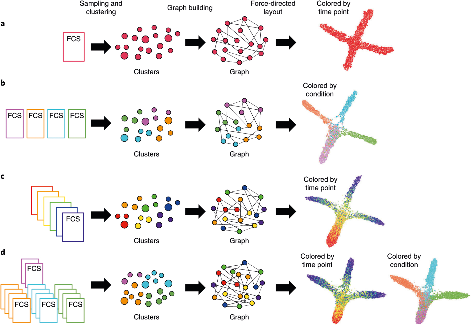
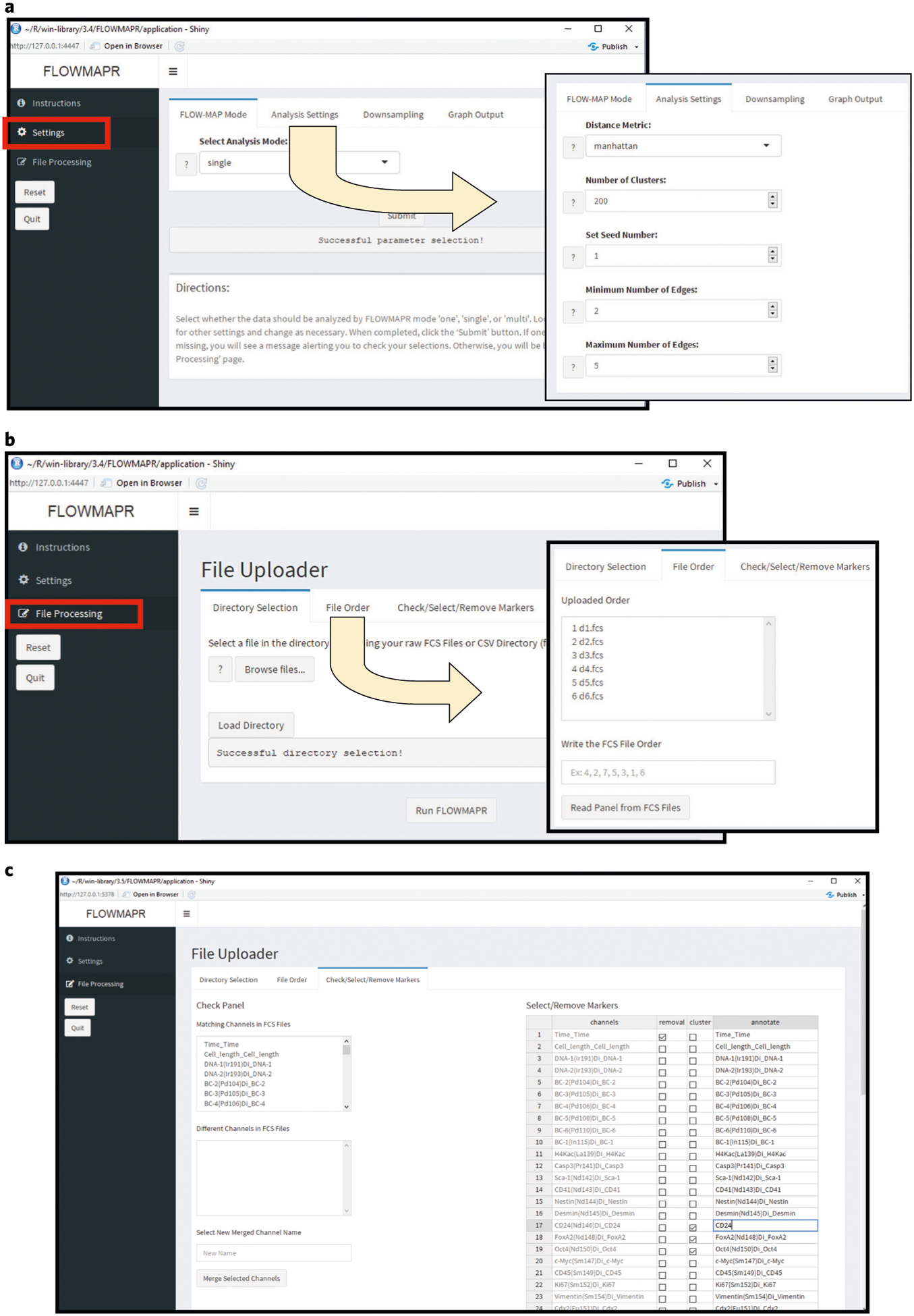
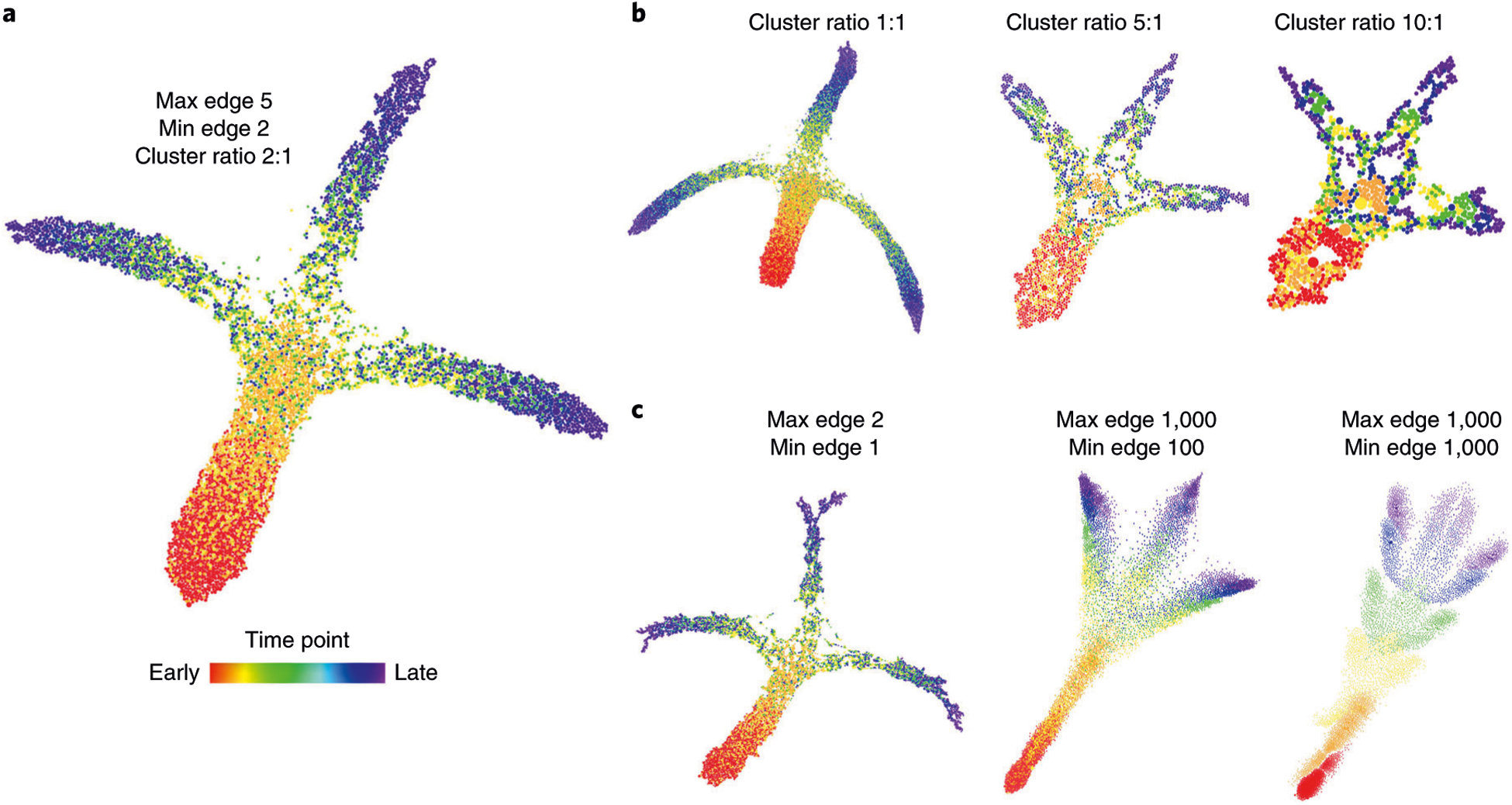
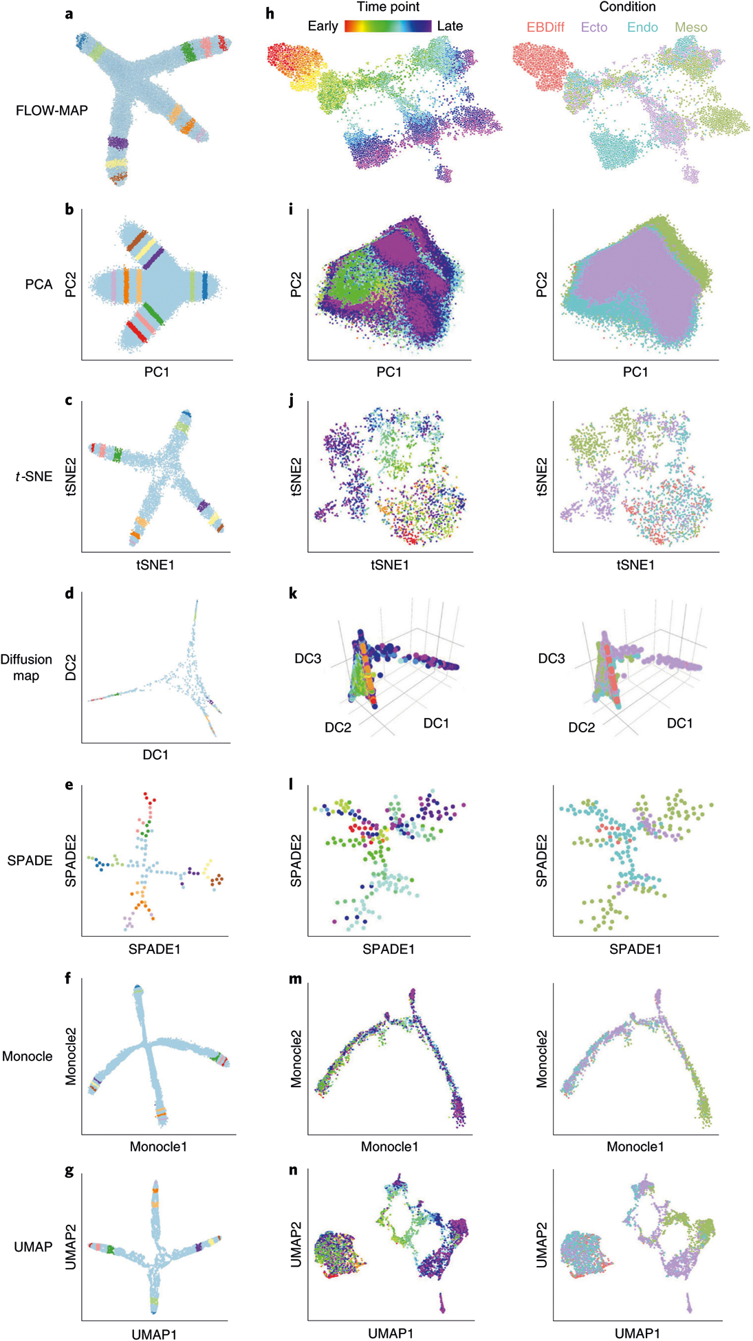
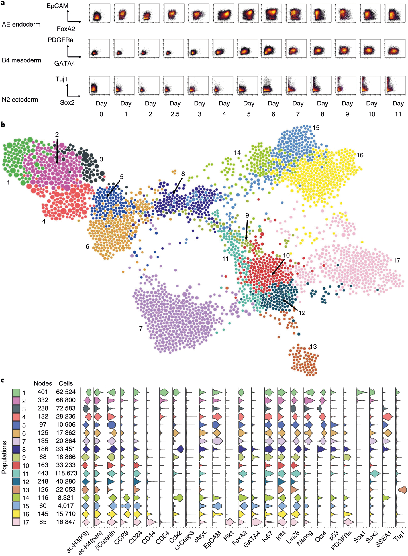
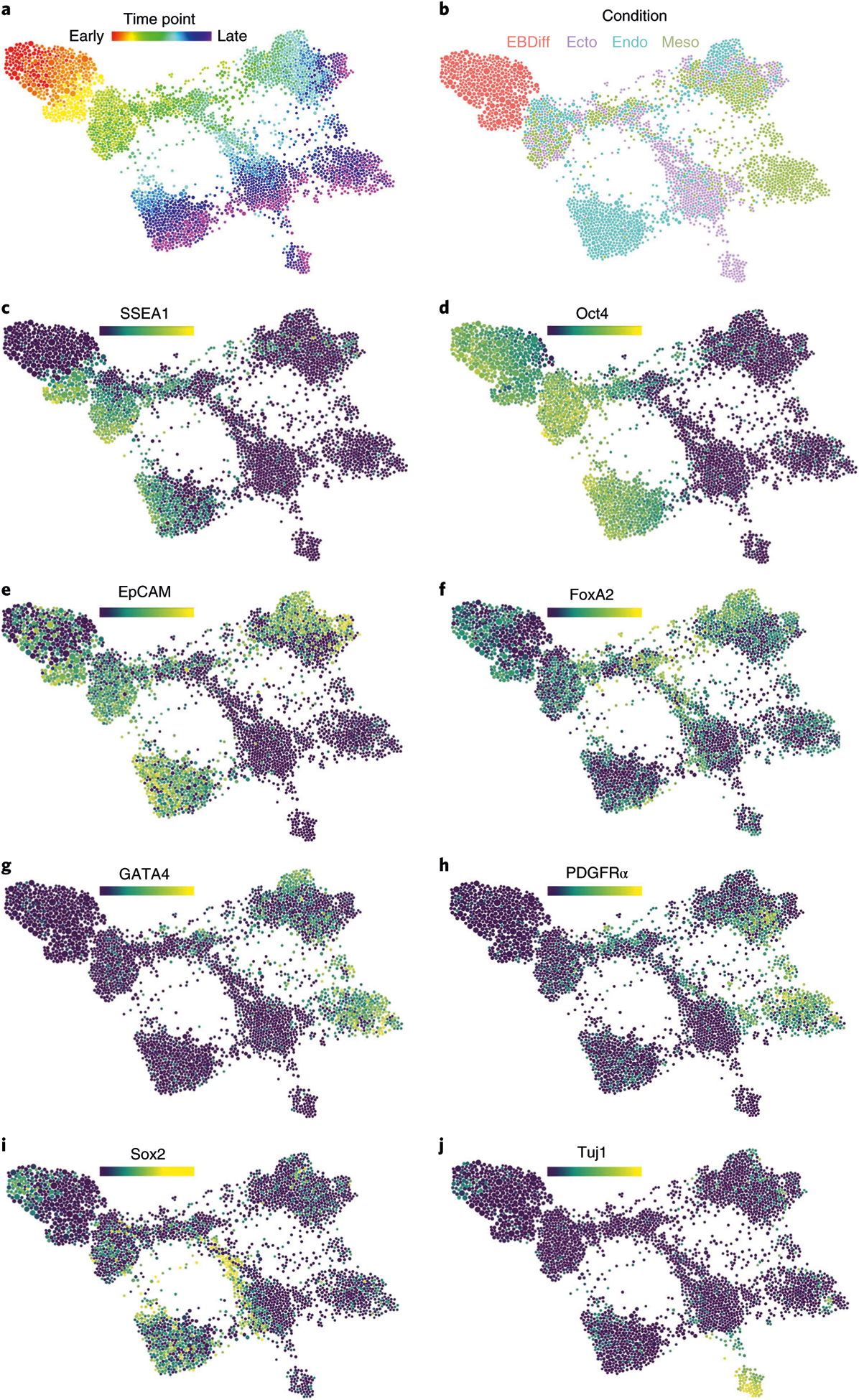
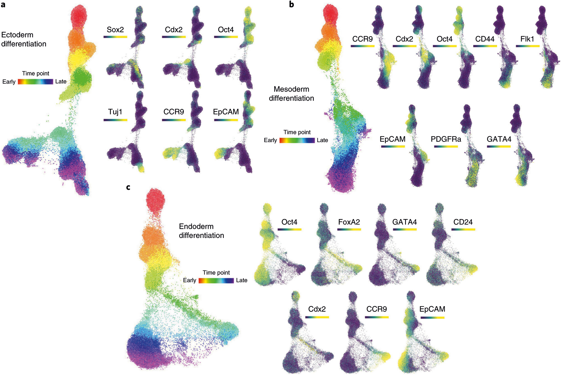
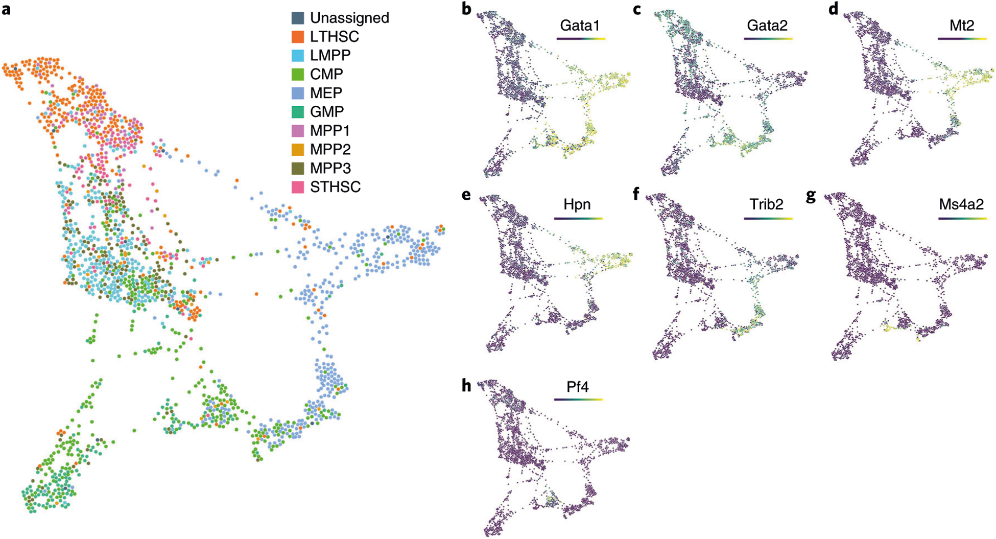
High-dimensional single-cell technologies present new opportunities for biological discovery, but the complex nature of the resulting datasets makes it challenging to perform comprehensive analysis. One particular challenge is the analysis of single-cell time course datasets: how to identify unique cell populations and track how they change across time points. To facilitate this analysis, we developed FLOW-MAP, a graphical user interface (GUI)-based software tool that uses graph layout analysis with sequential time ordering to visualize cellular trajectories in high-dimensional single-cell datasets obtained from flow cytometry, mass cytometry or single-cell RNA sequencing (scRNAseq) experiments. Here we provide a detailed description of the FLOW-MAP algorithm and how to use the open-source R package FLOWMAPR via its GUI or with text-based commands. This approach can be applied to many dynamic processes, including in vitro stem cell differentiation, in vivo development, oncogenesis, the emergence of drug resistance and cell signaling dynamics. To demonstrate our approach, we perform a step-by-step analysis of a single-cell mass cytometry time course dataset from mouse embryonic stem cells differentiating into the three germ layers: endoderm, mesoderm and ectoderm. In addition, we demonstrate FLOW-MAP analysis of a previously published scRNAseq dataset. Using both synthetic and experimental datasets for comparison, we perform FLOW-MAP analysis side by side with other single-cell analysis methods, to illustrate when it is advantageous to use the FLOW-MAP approach. The protocol takes between 30 min and 1.5 h to complete.


Conflict of interest statement

Competing interests

G.P.N. is a paid consultant for Fluidigm, the manufacturer that produced some of the reagents and instrumentation used in this study. The remaining authors declare no competing interests.

Figures

Fig. 1 |
Fig. 1 |. Conceptual overview of FLOWMAPR software.
The FLOW-MAP algorithm has three major stages: data preprocessing, including optional subsampling or density-dependent downsampling and clustering (Steps 1–3); graph building between nodes from adjacent time points, allotting edges in a density-dependent manner (Step 4); and graph visualization after iterative force-directed layout and postprocessing (Steps 5–9). Workflow and example outputs are shown for the four available modes: a, single time point, single condition; b, single-time point, multiple conditions; c, multiple time points, single condition; and d, multiple-time points, multiple conditions. The default input for FLOW-MAP is an FCS file, but the tool can be applied to other formats. Example FLOW-MAPs are shown on synthetic 2D datasets.
Fig. 2 |
Fig. 2 |. FLOW-MAP software GUI interface.
a, Initial interface and file selection for FLOWMAPR GUI. The user should first ensure that all FCS files to be analyzed are in one folder. Choose the FCS file directory and a separate directory for FLOWMAP results. Recommended defaults are: distance metric = Manhattan, FLOW-MAP mode = selection depends on data (see text) and color palette = blue and red. b, Parameter selection and running FLOWMAP in R Shiny. After completing steps detailed in a, FCS files in the selected folder will be listed here. Reorder FCS files if desired and then select ‘Generate Parameters’ to populate FCS file fields. c, Once files are selected, shared channels across FCS files will be under the ‘Similar Fields’ section, and any different channels across FCS files will be under the ‘Different Fields’ section. There is an option to merge different channels across FCS files under a user-generated merge name. For each channel in the FCS file(s), the user can rename, remove or specify its use as a clustering variable.
Fig. 3 |
Fig. 3 |. FLOW-MAP output with extreme parameter settings.
The effects of extreme parameter selection on global graph shape. a, FLOW-MAP analysis of a 2D synthetic time course dataset (Supplementary Data 2), with settings Min edge = 2, Max edge = 5 and Cluster ratio = 2:1. b, Changing Cluster ratio while holding Min edge and Max edge constant. c, Changing the Max edge and Min edge parameters while holding Cluster ratio constant.
Fig. 4 |
Fig. 4 |. Comparison of FLOW-MAP to other single-cell analysis tools.
a, FLOW-MAP plot produced from a 2D synthetic time course dataset (Supplementary Data 2) with nodes colored by index values to denote the same points across different visualizations. The FLOW-MAP graph was generated from random subsampling to 800 cells each in the first two time points and 2,400 cells each in the remaining time points, followed by clustering to 400 clusters and 1,200 clusters, respectively, with edge settings of Min = 2 and Max = 5, using marker 1 and marker 2 as clustering variables. b, PCA results produced from a dataset containing all time points merged. c, t-SNE results produced from 5,000 cells randomly subsampled from merged time point files (perplexity = 250). d, Diffusion maps produced in destiny from 1,000 cells subsampled from a dataset containing all time points merged, using most informative axes DC1 and DC2. e, SPADE analysis from 2,000 cells after density-dependent downsampling of merged time point files with 100 target nodes. f, Monocle analysis of 50,000 cells randomly subsampled from merged time point files. Monocle analysis was produced using the Monocle package in R using transformed data assuming Gaussian-distributed expression. g, UMAP results produced from 10,000 cells randomly subsampled from merged time point files (n_neighbor = 500). All analyses were created using marker 1 and marker 2 as clustering/informative variables and colored by time point from which cells came. h, mESC differentiation measured by mass cytometry (Supplementary Data 3) and then analyzed by FLOW-MAP algorithm, colored by time point and condition. The FLOW-MAP graph was generated from random subsampling to 100 nodes (with no clustering) from each time point and condition, respectively, with edge settings of Min = 2 and Max = 100, using the following parameters for graph building: Nestin, FoxA2, Oct4, CD45, Vimentin, Cdx2, Nanog, Sox2, Flk1, Tuj1, PDGFRa, EpCAM, CD44, GATA4 and CCR9. i, PCA results produced from all conditions and time points merged. j, t-SNE results produced from 200 cells subsampled from each condition and time point (perplexity = 50). k, Diffusion maps produced in destiny from 100 cells subsampled from each condition and time point using the most informative axes DC2, DC3 and DC4. l, SPADE analysis from 50,000 cells after density-dependent downsampling of merged time point/condition files with 200 target nodes. m, Monocle analysis of 100 cells subsampled from each condition and time point. Monocle analysis in Monocle was produced with Gaussian family expression. n, t-SNE results produced from 200 cells subsampled from each condition and time point. Unless otherwise mentioned, default parameters were used for each analysis. All analyses were created using the same markers listed above for FLOW-MAP as clustering/informative variables and colored by time point and condition from which cells came.
Fig. 5 |
Fig. 5 |. FLOW-MAP analysis of combined mESC differentiation time course.
a, Representative biaxial plots across all time points: FoxA2 versus EpCAM for endoderm-promoting activin-EGF condition (AE), GATA4 versus PDFGFRα for mesoderm-promoting BMP4 condition (B4) and Sox2 versus Tuj1 for ectoderm-promoting N2B27 basal condition (N2). b, FLOW-MAP plot colored by distinct graph regions identified in Gephi through the Louvain Modularity community detection algorithm with the following settings: randomization on, use edge weights on and resolution = 1.0. The FLOW-MAP graph layout was generated using the same parameter settings described in Fig. 4h. c, Violin plots showing marker expression distributions in each separate graph region identified by Gephi community detection. The color code matches identified graph regions shown in b.
Fig. 6 |
Fig. 6 |. Comparison of protein expression levels in combined mESC differentiation time course.
The same FLOW-MAP graph layout as in Figs. 4h and 5b, now colored by, time point (a), culture condition (b) and the median expression levels of SSEA1 (c), Oct4 (d), EpCAM (e), FoxA2 (f), GATA4 (g), PDGFRα (h), Sox2 (i) and Tuj1 (j).
Fig. 7 |
Fig. 7 |. FLOW-MAP analysis of mESC differentiation by individual culture conditions.
a, FLOW-MAP graph of ectoderm differentiation, generated from random subsampling and clustering to 2,000 cells and 1,000 clusters from each time point, with edge settings of Min = 2 and Max = 5, using the following set of clustering variables: Sca1, Nestin, FoxA2, Oct4, CD54, SSEA1, Lin28, Cdx2, CD45, Vimentin, Nanog, Sox2, Flk1, Tuj1, PDGFRa, EpCAM, CD44 and CCR9. b, FLOW-MAP graph of mesoderm differentiation, generated from random subsampling and clustering to 2,000 cells and 1,000 clusters from each time point, with edge settings of Min = 2 and Max = 5, using the following set of clustering variables: Sca1, Oct4, CD54, SSEA1, Lin28, Cdx2, CD45, Nanog, Sox2, Flk1, Tuj1, PDGFRa, EpCAM, CD44, CCR9 and GATA4. c, FLOW-MAP graph of endoderm differentiation, generated from random subsampling and clustering to 2,000 cells and 1,000 clusters from each time point, with edge settings of Min = 2 and Max = 20, using the following set of clustering variables: Sca1, FoxA2, Oct4, CD54, SSEA1, Lin28, Cdx2, CD45, Nanog, Sox2, Flk1, Tuj1, PDGFRa, EpCAM, CD44, CCR9 and GATA4.
Fig. 8 |
Fig. 8 |. FLOW-MAP analysis of hematopoietic transitions in bone marrow measured by scRNAseq.
a, FLOW-MAP analysis of FACS-sorted human bone marrow populations, measured by scRNAseq, with edge settings of Min = 2 and Max = 5. Coloring by cell types as defined by surface markers in Nestorowa et al. shows similar cell types grouped. Gata1 (b) and Gata2 (c) point to GATA factor switching in this dataset. Mt2 (d) and Hpn (e) as markers of erythroid-fated cells, Trib2 (f) as a marker of a pre-erythroid progenitor, Ms4a2 (g) as a marker of basophil-fated cells and Pf4 (h) as a marker of megakaryocyte fated cells as defined by Tusi et al.. CMP, common myeloid progenitor; GMP, granulocyte-monocyte progenitor; LMPP, lymphoid multipotent progenitor; LTHSC, long-term hematopoietic stem cell; MPP, multipotent progenitor; STHSC, short-term hematopoietic stem cell.

References

    1. Spitzer MH & Nolan GP Mass cytometry: single cells, many features. Cell 165, 780–791 (2016). - PMC - PubMed
    1. Wagner A, Regev A & Yosef N Revealing the vectors of cellular identity with single-cell genomics. Nat. Biotechnol 34, 1145–1160 (2016). - PMC - PubMed
    1. Jolliffe IT Principal Component Analysis (Springer-Verlag, 2002).
    1. Ringnér M What is principal component analysis? Nat. Biotechnol 26, 303–304 (2008). - PubMed
    1. van der Maaten L & Hinton G Visualizing data using t-SNE. J. Mach. Learn. Res 9, 2579–2605 (2008).

Publication types

Grants and funding