. 2020 Jan 16;21(1):12.
doi: 10.1186/s13059-019-1850-9.

A benchmark of batch-effect correction methods for single-cell RNA sequencing data

Affiliations

A benchmark of batch-effect correction methods for single-cell RNA sequencing data

Hoa Thi Nhu Tran et al. Genome Biol. .

Abstract

Background: Large-scale single-cell transcriptomic datasets generated using different technologies contain batch-specific systematic variations that present a challenge to batch-effect removal and data integration. With continued growth expected in scRNA-seq data, achieving effective batch integration with available computational resources is crucial. Here, we perform an in-depth benchmark study on available batch correction methods to determine the most suitable method for batch-effect removal.

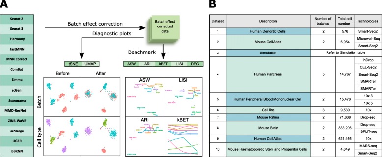
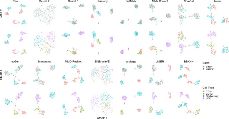
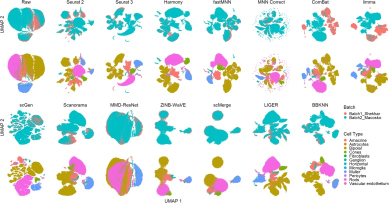
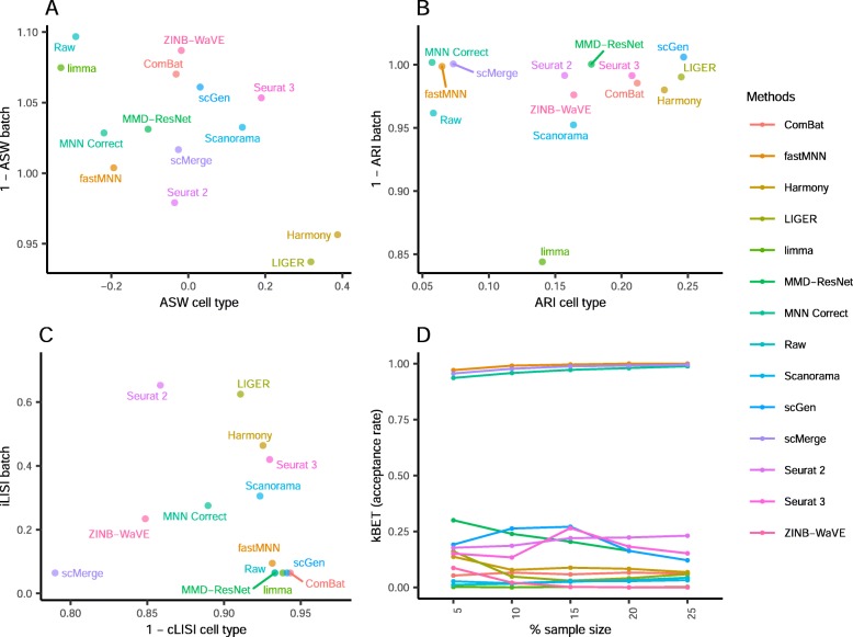
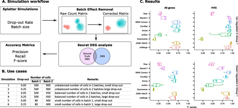
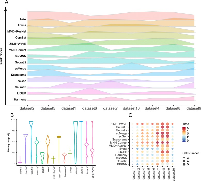
Results: We compare 14 methods in terms of computational runtime, the ability to handle large datasets, and batch-effect correction efficacy while preserving cell type purity. Five scenarios are designed for the study: identical cell types with different technologies, non-identical cell types, multiple batches, big data, and simulated data. Performance is evaluated using four benchmarking metrics including kBET, LISI, ASW, and ARI. We also investigate the use of batch-corrected data to study differential gene expression.

Conclusion: Based on our results, Harmony, LIGER, and Seurat 3 are the recommended methods for batch integration. Due to its significantly shorter runtime, Harmony is recommended as the first method to try, with the other methods as viable alternatives.

Keywords: Batch correction; Batch effect; Differential gene expression; Integration; Single-cell RNA-seq.


Conflict of interest statement

The authors declare that they have no competing interests.

Figures

Fig. 1
Fig. 1
Benchmarking 14 methods on ten datasets using five evaluation metrics. a Benchmarking workflow. We evaluated the performance of 14 batch correcting algorithms in terms of their ability to integrate batches while maintaining accuracy in terms of cell type separation. We employed t-SNE and UMAP visualizations in conjunction with the kBET, LISI, ASW, ARI, and DEG benchmarking metrics to evaluate the batch correction results. b Description of the ten datasets on which the batch correction algorithms were tested
Fig. 2
Fig. 2
Qualitative evaluation of 14 batch-effect correction methods using UMAP visualization for dataset 2 of mouse cell atlas. The 14 methods are organized into two panels, with the top panel showing UMAP plots of raw data, Seurat 2, Seurat 3, Harmony, fastMNN, MNN Correct, ComBat, and limma outputs, while the bottom panel shows the UMAP plots of scGen, Scanorama, MMD-ResNet, ZINB-WaVE, scMerge, LIGER, and BBKNN outputs. Each panel contains two rows of UMAP plots. In the first row, cells are colored by batch, and in the second by cell type
Fig. 3
Fig. 3
Quantitative evaluation of 14 batch-effect correction methods using the four assessment metrics a ASW, b ARI, c LISI, and d kBET on dataset 2 of mouse cell atlas. Methods appearing at the upper right quadrant of the ASW, ARI, and LISI plots are the good performing methods. Methods with higher kBET acceptance rates are the better performing methods
Fig. 4
Fig. 4
Qualitative evaluation of 14 batch-effect correction methods using UMAP visualization for dataset 5 of human peripheral blood mononuclear cells. The 14 methods are organized into two panels, with the top panel showing UMAP plots of raw data, Seurat 2, Seurat 3, Harmony, fastMNN, MNN Correct, ComBat, and limma outputs, while the bottom panel shows the UMAP plots of scGen, Scanorama, MMD-ResNet, ZINB-WaVE, scMerge, LIGER, and BBKNN outputs. Each panel contains two rows of UMAP plots. In the first row, cells are colored by batch, and in the second by cell type
Fig. 5
Fig. 5
Quantitative evaluation of 14 batch-effect correction methods using the four assessment metrics a ASW, b ARI, c LISI, and d kBET on dataset 5 of human peripheral blood mononuclear cells. Methods appearing at the upper right quadrant of the ASW, ARI, and LISI plots are the good performing methods. Methods with higher kBET acceptance rates are the better performing methods
Fig. 6
Fig. 6
Qualitative evaluation of 14 batch-effect correction methods using UMAP visualization for dataset 1 of human dendritic cells. The 14 methods are organized into two panels, with the top panel showing UMAP plots of raw data, Seurat 2, Seurat 3, Harmony, fastMNN, MNN Correct, ComBat, and limma outputs, while the bottom panel shows the UMAP plots of scGen, Scanorama, MMD-ResNet, ZINB-WaVE, scMerge, LIGER, and BBKNN outputs. Each panel contains two rows of UMAP plots. In the first row, cells are colored by batch, and in the second by cell type
Fig. 7
Fig. 7
Quantitative evaluation of 14 batch-effect correction methods using the four assessment metrics a ASW, b ARI, c LISI, and d kBET on dataset 1 of human dendritic cells. Methods appearing at the upper right quadrant of the ASW, ARI, and LISI plots are the good performing methods. Methods with higher kBET acceptance rates are the better performing methods
Fig. 8
Fig. 8
Qualitative evaluation of 14 batch-effect correction methods using UMAP visualization for dataset 6 of cell lines. The 14 methods are organized into two panels, with the top panel showing UMAP plots of raw data, Seurat 2, Seurat 3, Harmony, fastMNN, MNN Correct, ComBat, and limma outputs, while the bottom panel shows the UMAP plots of scGen, Scanorama, MMD-ResNet, ZINB-WaVE, scMerge, LIGER, and BBKNN outputs. Each panel contains two rows of UMAP plots. In the first row, cells are colored by batch, and in the second by cell type
Fig. 9
Fig. 9
Quantitative evaluation of 14 batch-effect correction methods using the four assessment metrics a ASW, b ARI, c LISI, and d kBET on dataset 6 of cell lines. Methods appearing at the upper right quadrant of the ASW, ARI, and LISI plots are the good performing methods. Methods with higher kBET acceptance rates are the better performing methods
Fig. 10
Fig. 10
Qualitative evaluation of 14 batch-effect correction methods using UMAP visualization for dataset 7 of mouse retinal cells. The 14 methods are organized into two panels, with the top panel showing UMAP plots of raw data, Seurat 2, Seurat 3, Harmony, fastMNN, MNN Correct, ComBat, and limma outputs, while the bottom panel shows the UMAP plots of scGen, Scanorama, MMD-ResNet, ZINB-WaVE, scMerge, LIGER, and BBKNN outputs. Each panel contains two rows of UMAP plots. In the first row, cells are colored by batch, and in the second by cell type
Fig. 11
Fig. 11
Quantitative evaluation of 14 batch-effect correction methods using the four assessment metrics a ASW, b ARI, c LISI, and d kBET on dataset 7 of mouse retinal cells. Methods appearing at the upper right quadrant of the ASW, ARI, and LISI plots are the good performing methods. Methods with higher kBET acceptance rates are the better performing methods
Fig. 12
Fig. 12
Qualitative evaluation of 14 batch-effect correction methods using UMAP visualization for dataset 10 of mouse hematopoietic stem and progenitor cells. The 14 methods are organized into two panels, with the top panel showing UMAP plots of raw data, Seurat 2, Seurat 3, Harmony, fastMNN, MNN Correct, ComBat, and limma outputs, while the bottom panel shows the UMAP plots of scGen, Scanorama, MMD-ResNet, ZINB-WaVE, scMerge, LIGER, and BBKNN outputs. Each panel contains two rows of UMAP plots. In the first row, cells are colored by batch, and in the second by cell type
Fig. 13
Fig. 13
Quantitative evaluation of 14 batch-effect correction methods using the four assessment metrics a ASW, b ARI, c LISI, and d kBET on dataset 10 of mouse hematopoietic stem and progenitor cells. Methods appearing at the upper right quadrant of the ASW, ARI, and LISI plots are the good performing methods. Methods with higher kBET acceptance rates are the better performing methods
Fig. 14
Fig. 14
Qualitative evaluation of 14 batch-effect correction methods using UMAP visualization for dataset 4 of human pancreatic cells. The 14 methods are organized into two panels, with the top panel showing UMAP plots of raw data, Seurat 2, Seurat 3, Harmony, fastMNN, MNN Correct, ComBat, and limma outputs, while the bottom panel shows the UMAP plots of scGen, Scanorama, MMD-ResNet, ZINB-WaVE, scMerge, LIGER, and BBKNN outputs. Each panel contains two rows of UMAP plots. In the first row, cells are colored by batch, and in the second by cell type
Fig. 15
Fig. 15
Quantitative evaluation of 14 batch-effect correction methods using the four assessment metrics a ASW, b ARI, c LISI, and d kBET on dataset 4 of human pancreatic cells. Methods appearing at the upper right quadrant of the ASW, ARI, and LISI plots are the good performing methods. Methods with higher kBET acceptance rates are the better performing methods
Fig. 16
Fig. 16
Qualitative evaluation of 14 batch-effect correction methods using UMAP visualization for dataset 8 of mouse brain. The 14 methods are organized into two panels, with the top panel showing UMAP plots of raw data, Seurat 2, Seurat 3, Harmony, fastMNN, MNN Correct, ComBat, and limma outputs, while the bottom panel shows the UMAP plots of scGen, Scanorama, MMD-ResNet, ZINB-WaVE, scMerge, LIGER, and BBKNN outputs. Each panel contains two rows of UMAP plots. In the first row, cells are colored by batch, and in the second by cell type
Fig. 17
Fig. 17
Quantitative evaluation of 14 batch-effect correction methods using the four assessment metrics a ASW, b ARI, c LISI, and d kBET on dataset 8 of mouse brain. Methods appearing at the upper right quadrant of the ASW, ARI, and LISI plots are the good performing methods. Methods with higher kBET acceptance rates are the better performing methods
Fig. 18
Fig. 18
Qualitative evaluation of 14 batch-effect correction methods using UMAP visualization for dataset 9 of human cell atlas. The 14 methods are organized into two panels, with the top panel showing UMAP plots of raw data, Seurat 2, Seurat 3, Harmony, fastMNN, MNN Correct, ComBat, and limma outputs, while the bottom panel shows the UMAP plots of scGen, Scanorama, MMD-ResNet, ZINB-WaVE, scMerge, LIGER, and BBKNN outputs. Cells are colored by batch
Fig. 19
Fig. 19
Quantitative evaluation of 14 batch-effect correction methods using the four assessment metrics a ASW, b ARI, c LISI, and d kBET on dataset 9 of human cell atlas. Methods appearing at the upper right quadrant of the ASW, ARI, and LISI plots are the good performing methods. Methods with higher kBET acceptance rates are the better performing methods
Fig. 20
Fig. 20
Evaluation of eight batch-effect correction methods using simulated datasets and differential gene expression analysis. a Evaluation workflow: six sets of simulation data with predefined batch effect and differential gene expression profiles were generated using the Splatter package with varied parameters. The eight methods that return corrected expression matrices were applied to the simulated data, and the batch-corrected output were subsequently subjected to differential gene expression analysis with the Seurat package. Differentially expressed genes (DEGs) identified from the batch-corrected matrices were compared to the ground truth DEGs, and accuracy metrics including precision, recall, and F-score were calculated. b Description of the six simulated datasets. Different combinations of parameters were used to cover different scenarios of cell population sizes and drop-out rates. c F-score boxplot for the eight methods using all genes or HVGs
Fig. 21
Fig. 21
Efficacy and efficiency of the 14 batch-effect correction methods. a Rank sum of the assessment metrics. Methods were ranked based on each of the ASW, ARI, LISI, and kBET metrics, and the rankings were then combined across all metrics using the rank sum approach. The height of the ridgelines represents the rank sum scores across different datasets, with a lower rank sum score denoting better performance. Methods are ordered from bottom to top by increasing sum of rank scores across all ten datasets. Thus, methods appearing at the bottom are the best. b Memory usage of ten methods on dataset 8. c Runtime of 14 methods on ten datasets. Color represents log10(time in seconds), node size represents log10(cell number)

References

    1. Johnson WE, Li C, Rabinovic A. Adjusting batch effects in microarray expression data using empirical Bayes methods. Biostatistics. 2007;8:118–127. doi: 10.1093/biostatistics/kxj037. - DOI - PubMed
    1. Smyth GK, Speed T. Normalization of cDNA microarray data. Methods. 2003;31:265–273. doi: 10.1016/S1046-2023(03)00155-5. - DOI - PubMed
    1. Kharchenko PV, Silberstein L, Scadden DT. Bayesian approach to single-cell differential expression analysis. Nat Methods. 2014;11:740. doi: 10.1038/nmeth.2967. - DOI - PMC - PubMed
    1. Butler A, Hoffman P, Smibert P, Papalexi E, Satija R. Integrating single-cell transcriptomic data across different conditions, technologies, and species. Nat Biotechnol. 2018;36:411–420. doi: 10.1038/nbt.4096. - DOI - PMC - PubMed
    1. Haghverdi L, Lun ATL, Morgan MD, Marioni JC. Batch effects in single-cell RNA-sequencing data are corrected by matching mutual nearest neighbors. Nat Biotechnol. 2018;36:421–427. doi: 10.1038/nbt.4091. - DOI - PMC - PubMed

Publication types