. 2020 Mar;23(3):433-442.
doi: 10.1038/s41593-019-0576-z. Epub 2020 Jan 20.

Whitening of odor representations by the wiring diagram of the olfactory bulb

Affiliations

Whitening of odor representations by the wiring diagram of the olfactory bulb

Adrian A Wanner et al. Nat Neurosci. 2020 Mar.

Abstract

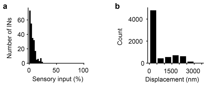
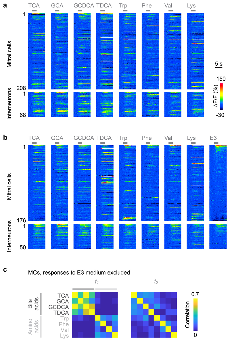
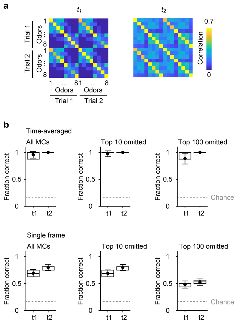
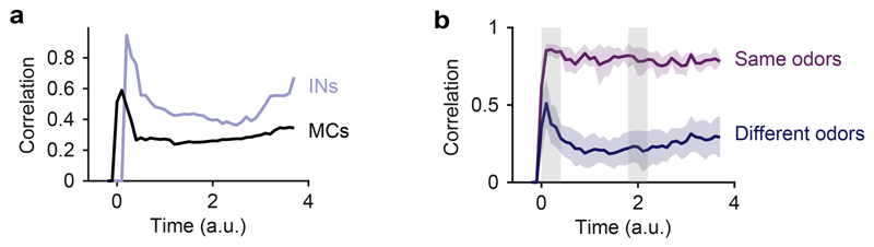
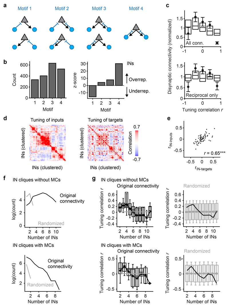
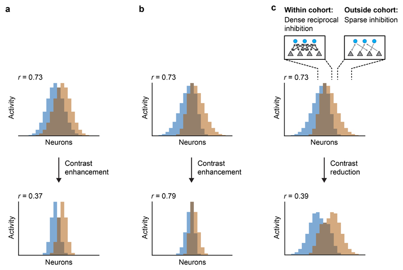
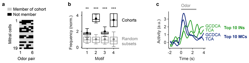
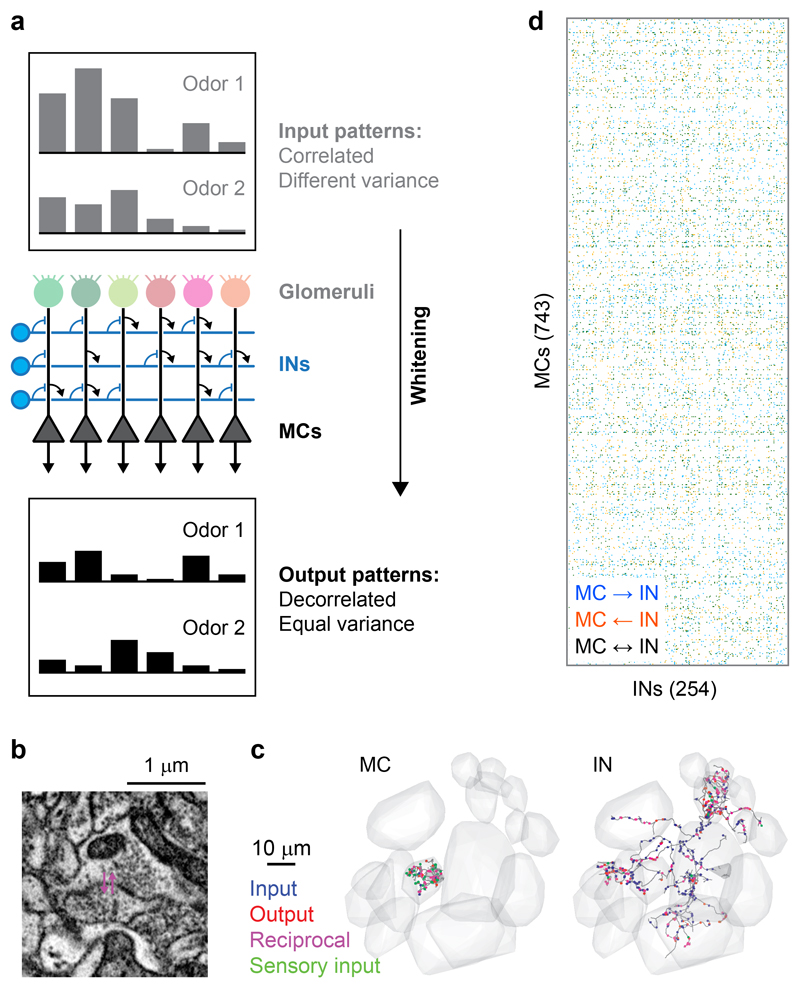
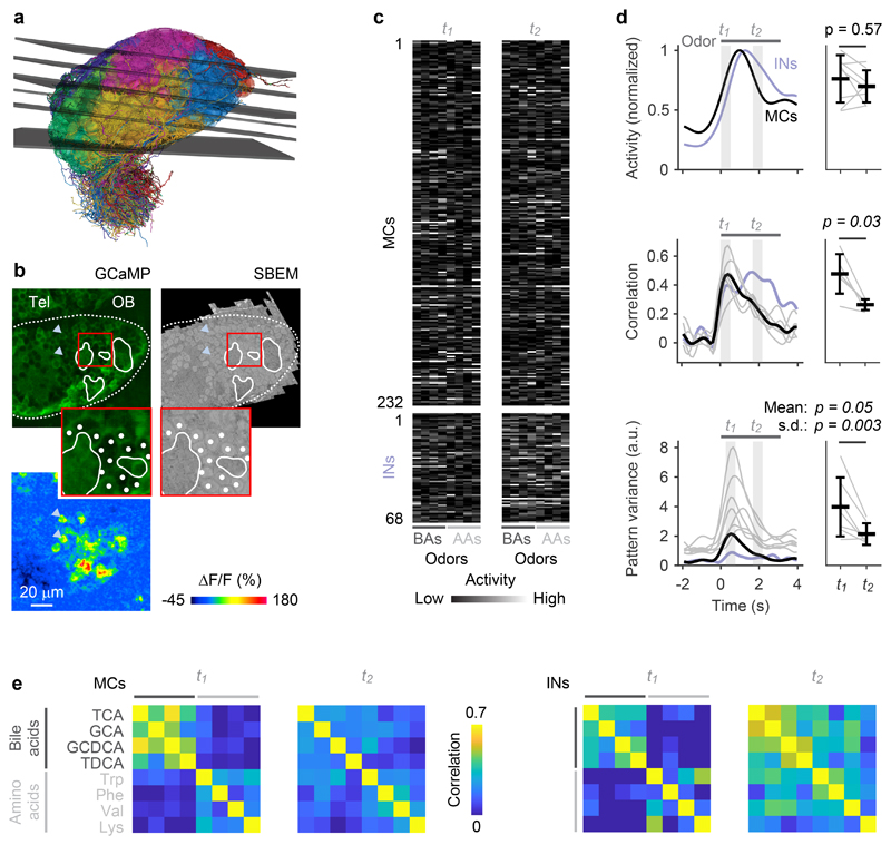
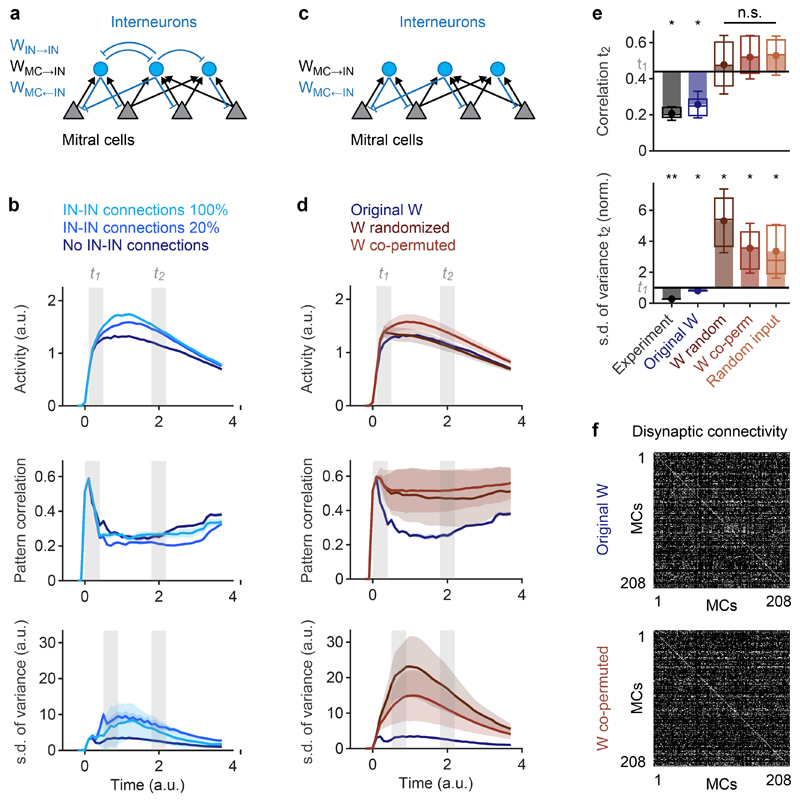
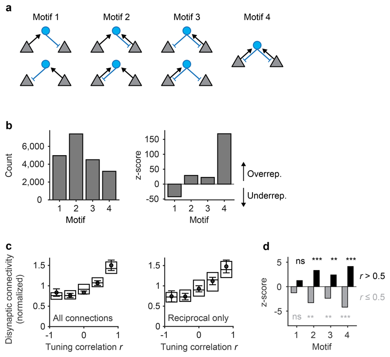
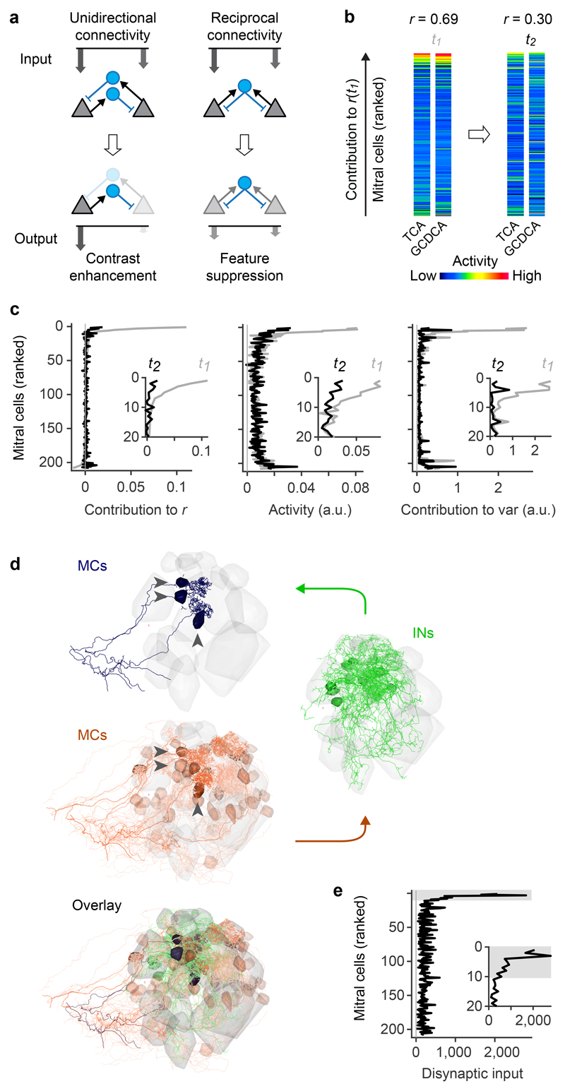
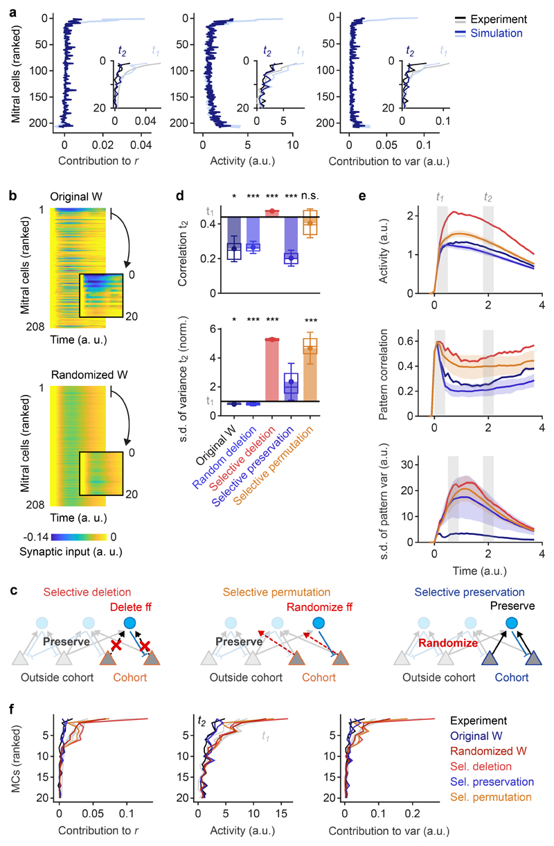
Neuronal computations underlying higher brain functions depend on synaptic interactions among specific neurons. A mechanistic understanding of such computations requires wiring diagrams of neuronal networks. In this study, we examined how the olfactory bulb (OB) performs 'whitening', a fundamental computation that decorrelates activity patterns and supports their classification by memory networks. We measured odor-evoked activity in the OB of a zebrafish larva and subsequently reconstructed the complete wiring diagram by volumetric electron microscopy. The resulting functional connectome revealed an over-representation of multisynaptic connectivity motifs that mediate reciprocal inhibition between neurons with similar tuning. This connectivity suppressed redundant responses and was necessary and sufficient to reproduce whitening in simulations. Whitening of odor representations is therefore mediated by higher-order structure in the wiring diagram that is adapted to natural input patterns.


Conflict of interest statement

Competing interests

A.A.W. is the founder and owner of ariadne-service.

Figures

Extended Data Fig. 1
Extended Data Fig. 1. Sensory input to INs and mapping of datasets.
a, Distribution of the fraction of synaptic inputs onto INs that originated from sensory axons. The average fraction of synaptic inputs onto INs that came from sensory neurons was 5.9 ± 4.6% (mean ± s.d.). This is an upper-bound estimate because structures in EM images were classified as sensory synapses even when they were small and when synaptic features such as postsynaptic densities and vesicle clusters were ambiguous. No obvious synaptic connections were observed from OB neurons onto axon terminals of sensory neurons. b, Displacement of regions of interest (ROIs) during manual proofreading. ROIs representing somata were mapped from the EM dataset to optical image planes in each trial by an affine transformation that was determined by an iterative landmark-based procedure (Methods). Subsequently, the position of each ROI was adjusted manually on the optical image (n = 7,280 ROIs; six image planes with 11 trials each). The mean displacement (± s.d.) during manual adjustment (proofreading) was small (593 ± 833 nm), implying that automated mapping was highly reliable.
Extended Data Fig. 2
Extended Data Fig. 2. Calcium imaging of odor responses.
a, Raw calcium signals (ΔF/F) evoked by eight odors in neurons that were present in all trials and included in simulations (208 MCs and 68 INs; average of two trials). Gray bars indicate odor stimulation. b, Raw calcium signals (ΔF/F) evoked by eight odors and E3 medium in neurons that were present in all trials and included in simulations (176 MCs and 50 INs; average of two trials; sorted by response to E3 medium). c, Correlation matrices of MC activity patterns at t1 and t2 after excluding 10 MCs with highest responses to E3 medium (all MCs in b except for the first 10; n = 166 MCs in total). Calcium signals were deconvolved to estimate firing rate changes as in Fig. 2. As observed in the full dataset (Fig. 2e), MC activity patterns evoked by similar odors were correlated at t1 and became decorrelated at t2. The main results were therefore not affected by possible responses to E3 medium.
Extended Data Fig. 3
Extended Data Fig. 3. Decoding of odor identity from MC activity patterns.
a, Pearson correlation matrices showing similarities of activity patterns across odors and trials at t1 and t2 (average over 100 repetitions). In each repetition, two activity patterns (trials) were generated for each odor by randomly assigning the first or second response of each neuron to each trial. Note the high correlations between activity patterns representing the same odor in different trials, particularly at t2. b, Success rates of odor identification by template matching. For each odor, the vector representing the odor in one trial (test vector) was correlated to vectors representing all odors in the other trial (templates) and assigned to the odor represented by the template with the highest correlation. Dots show the mean fraction of correct identifications, error bars show s.d., boxes show median, 25th percentile and 75th percentile (n = 100 repetitions each). Dashed gray line shows chance level. Top: identification based on patterns averaged over time windows t1 and t2 (see text). Bottom: identification based on single frames within t1 and t2. Left: tests and templates included all MCs. Center, right: the 10 or 100 MCs with the highest contribution to the initial pattern correlation (highest ri,t1) were omitted for each odor pair. Omitting the 10 MCs with the highest ri,t1 (cohorts) had almost no consequence on odor identification, confirming that information about precise odor identity is conveyed predominantly by other MCs.
Extended Data Fig. 4
Extended Data Fig. 4. Additional simulation results.
a, Mean Pearson correlation between IN activity patterns (blue) and the corresponding MC activity patterns (black) evoked by different bile acid inputs in simulations (n = 6 bile acid pairs each). Correlations between IN activity patterns remain higher than correlations between MC activity patterns. b, Mean Pearson correlation between simulated MC activity patterns evoked by inputs representing different odors (blue; all bile acid pairs) and between activity patterns evoked by inputs representing the same odors in trials with input noise (purple; all bile acids). Shading shows s.d.. Noise was modeled based on conservative estimates of the number and firing rates of olfactory sensory neurons in zebrafish larvae (Methods). Three noisy trials were simulated for each odor, resulting in n = 12 correlations between same-odor trials and n = 54 correlations between different-odor trials. Patterns evoked by different inputs were decorrelated whereas noisy versions of the same inputs were not decorrelated.
Extended Data Fig. 5
Extended Data Fig. 5. Algebraic transformations of sensory inputs.
a, Schematic: simple algebraic approach to approximate transformations of MC activity patterns by feedback inhibition. Input activity patterns (MC activity at t1) were multiplied by the feed-forward connectivity matrix WMC→IN, normalized and thresholded. Normalization and thresholding are basic operations performed by the neuronal circuits of the OB10 and by individual neurons, respectively. The resulting IN activity patterns were multiplied with the feedback connectivity matrix WMC←IN, resulting in odor-specific patterns of feedback inhibition onto MCs. Feedback inhibition was either subtracted from the MC activation patterns (subtractive inhibition), or MC activation patterns were divided by the feedback inhibition patterns (divisive inhibition), followed by thresholding. Scaling factors and thresholds were adjusted so that effects on the mean activity were small. b, Mean activity, Pearson pattern correlation and s.d. of pattern variance at t2 after algebraic transformations of input patterns as described in a (“Experiment”: experimental results). Horizontal black lines show mean experimental values at t1; activity and s.d. of pattern variance is normalized to the experimental value at t1. Dots show means, error bars show s.d., filled bars show difference to corresponding values at t1. Box plots show median, 25% percentile, and 75th percentile. For experimental results and simulations using the reconstructed wiring diagram, variability was measured across odor pairs (correlation; bile acids only; n = 6) or individual odors (s.d. of variance; n = 8). Significance tests compare values at t2 to experimental values at t1 (correlation: two-sided Wilcoxon rank-sum test; s.d. of variance: F-test with df1 = df2 = 7 degrees of freedom). For results obtained with randomized wiring diagrams (W random), variability was measured across n = 50 permutations of the wiring diagram. Significance tests compare repetitions to the mean value observed experimentally at t1 (two-sided Wilcoxon rank-sum test). *, p < 0.05; **, p < 0.01; ***, p < 0.001; n.s., not significant. In “targeted suppression”, the activity of the 10 MCs that contributed most strongly to the pattern correlation at t1 for each odor pair (“functional cohort”) was set to the population mean. No other manipulations or algebraic operations were performed. P-values: activity: 0.57, 0.57, 0.25, 0.23 0.17; Pearson correlation: 0.03, 0.04, 0.98, 0.04, 0.008; s.d. of variance: 0.003, 10-23, 10-26, 10-21, 10-16.
Extended Data Fig. 6
Extended Data Fig. 6. Occurrence of connectivity motifs as a function of tuning correlation.
Z-scores quantify the over-representation of motifs among MC pairs with signal correlations greater than a threshold between -0.8 and 0.8. For each motif, color-coded bars show z-scores for different signal correlation thresholds. Z-scores were determined by comparison against 10,000 shufflings of the tuning correlation matrix as in Fig. 4d.
Extended Data Fig. 7
Extended Data Fig. 7. Functional connectivity between interneurons.
a, IN-MC-IN triplets included in the analysis. Connections between INs were analyzed separately (see below and main text) to facilitate the comparison to MC-IN-MC triplets (Fig. 4). b, Left: number of IN-MC-IN motifs found in the wiring diagram (considering only INs with activity measurements and at least one MC→IN and MC←IN connection; n = 66). Right: z-score quantifying over- or under-representation of motifs as compared to 10,000 independent randomizations. c, Top: disynaptic connections between responsive INs as a function of tuning similarity (Pearson correlation), normalized to the mean (n = 992 neuron pairs; neurons were included only when their activity exceeded a threshold; see Methods; number of neuron pairs per bin: 192, 218, 178, 228, 176). Dots and error bars show mean ± s.e.m. when tuning curves were determined using all eight odor stimuli. Box plots show median, 25th percentile and 75th percentile across results when tuning curves were determined by all possible combinations of four odors. Bottom: result of the same analysis including only reciprocal connections (motif 4; n = 992 neuron pairs). d, Left: Pearson correlations between the mean tuning curves of MC inputs to INs (n = 57 INs). INs were ordered by optimal leaf ordering for hierarchical clustering. Right: Pearson correlations between the mean tuning curves of the MC targets of INs (same ordering of INs). INs were included in the analysis when their activity was measured, when they received input from at least 1 MC and 1 IN for which activity measurements were available, and when they targeted at least 1 MC and 1 IN for which activity measurements were available. e, X-axis: Pearson correlation between the tuning curves of each IN and the mean tuning curves of MC inputs to the same IN (rIN-inputs). Y-axis: Pearson correlation between the tuning curves of each IN and the mean tuning curves of its MC targets (rIN-targets). r, correlation coefficient; ***, p = 10-8 (two-tailed t-test, n = 63 INs). INs were included in the analysis when their activity was measured, when they received input from at least 1 MC for which activity measurements were available, and when they targeted at least 1 MC for which activity measurements were available. f, Black: number of maximal IN cliques in the wiring diagram as a function of clique size. Gray curve shows expectation based on randomized wiring diagrams (10,000 permutations). A maximal clique is a complete set of INs that are all reciprocally connected to each other. Top and bottom plots show distributions for cliques without a MC and cliques with one reciprocally connected MC, respectively. Maximal cliques with more than one MC do not exist because the wiring diagram contained no connections between MCs. g, Left: Mean Pearson correlation of tuning curves between neurons in maximal cliques as a function of clique size (n = 414; number per bin: 3, 19, 22, 44, 96, 99, 75, 29, 24, 3). Dots and error bars show mean ± s.e.m.; box plots show median, 25th percentile and 75th percentile. Gray curve shows mean after shuffling of tuning correlation matrix (right). Right: same analysis after shuffling of tuning correlation matrix (1,000 repetitions; n = 414,000; number per bin: 3,000, 19,000, 22,000, 44,000, 96,000, 99,000, 75,000, 29,000, 24,000, 3,000). Black curve shows mean of original data (left).
Extended Data Fig. 8
Extended Data Fig. 8. Effects of different transformations on pattern correlation.
a, Schematic: effect of contrast enhancement on the correlation between displaced Gaussian patterns. The X-axis represents neurons while the Y-axis represents their activity. Blue and orange bars represent overlapping activity patterns evoked by two different stimuli. The similarity of activity patterns is quantified by the Pearson correlation coefficient, r. Note that many neurons respond to both stimuli but neurons showing maximal responses differ between stimuli. Hence, strongly active neurons convey stimulus-specific information. Contrast enhancement therefore decorrelates patterns because it emphasizes strongly active neurons and suppresses weakly active neurons. b, Effect of contrast enhancement on the Pearson correlation between activity pattern that overlap in strongly active neurons. Activity patterns have the same Pearson correlation as in a but their shape is slightly different: maximal responses to the two stimuli occur in the same neuron, and tails of moderately or weakly active neurons extend in opposite directions. Hence, stimulus-specific information is conveyed primarily by moderately or weakly active neurons while strong responses are non-specific. As a consequence, contrast enhancement fails to decorrelate these patterns. c, Patterns that overlap in strongly active neurons (same as in b; r: Pearson correlation) are decorrelated by selective inhibition of strongly active neurons, which results in contrast reduction. Decorrelation occurs because the relative contribution of moderately or weakly active neurons is enhanced as the activity of strongly active neurons is suppressed. Selective inhibition of strongly active units is generated by reciprocal inhibition that is stronger or denser within cohorts of co-tuned neurons. Inhibitory feedback gain is therefore higher than the average inhibitory feedback gain within a co-tuned cohort when the stimulus feature that activates the cohort is present (feature suppression).
Extended Data Fig. 9
Extended Data Fig. 9. Further characterization of functional cohorts.
a, Composition of functional MC cohorts. For each pair of bile acid odors (X-axis), a functional MC cohort was defined as the 10 MCs that contribute most to the correlation between odor-evoked activity patterns at t1 (highest ri,t1). Gray pixels denote membership of each MC (Y-axis) in each cohort. Cohorts for different odor pairs overlapped substantially. Consistent with this observation, the mean Pearson correlation between tuning curves of MCs at t1 was significantly higher within cohorts (r = 0.56 ± 0.40; mean ± s.d.) than across all MCs (r = 0.01 ± 0.38; p = 10-84; two-sided Wilcoxon rank-sum test). Furthermore, we analyzed the mean tuning correlation at t1 among the 16 MCs that were not part of cohorts themselves but provided the highest number of disynaptic input connections to neurons inside cohorts (r = 0.23 ± 0.52; mean ± s.d.). This tuning correlation was lower than the tuning correlation within the cohort but still significantly higher than the mean tuning correlation across all MCs (p = 10-40; two-sided Wilcoxon rank-sum test). Similarly, the mean tuning correlation at t1 among the 16 MCs that received the most disynaptic output connections from neurons inside cohorts (r = 0.17 ± 0.53; mean ± s.d.) was lower than the tuning correlation within the cohort but significantly higher than the mean tuning correlation across all MCs (p = 10-17; two-sided Wilcoxon rank-sum test). b, Black: frequency of each MC-IN-MC triplet motif in MC cohorts (n = 6 cohorts for each motif). Dots show means, error bars show s.d., box plots show median, 25% percentile, and 75th percentile. Gray: frequency of MC-IN-MC triplet motifs among randomly selected MC subsets of the same size (n = 10 MCs; n = 600 repetitions for each motif). Frequency of occurrence is normalized to the mean frequency in random subsets for each motif. **, p < 0.01; ***, p < 0.001 (two-sided Wilcoxon rank-sum test). P-values: 0.002, 10-5, 0.0008, 0.0001. We also observed that the 10 INs receiving the largest number of MC inputs from each cohort were 1.7 times more likely to make direct connections than random subsets of INs (p = 0.007; two-sided Wilcoxon rank-sum test). c, Blue: mean activity of the 10 MCs in the functional cohort defined by responses to TCA and GCDCA (example odors in Fig. 5b). Green: mean activity of the 10 INs that were included in activity measurements and provided the highest synaptic input to the MC cohort. As expected, IN activity increased while MC activity decreased during odor application.
Fig. 1
Fig. 1. Neuronal organization and computations in the OB.
a, Schematic illustration of whitening in the OB. Top: correlated input patterns with different variance. Bottom: decorrelated output patterns with similar variance. Center: Highly simplified illustration of the OB circuit. MCs receive excitatory input from a single glomerulus and interact via inhibitory INs. Whitening requires multisynaptic interactions between specific subsets of MCs that are mediated by INs and defined by the wiring diagram. Interactions between INs and top-down inputs to the OB are not shown. b, Example of a reciprocal synapse between a MC and an IN. c, Reconstructions of a MC (left) and an IN (right). Gray volumes show glomeruli, dots depict synapses, colors denote synapse class (unidirectional non-sensory input [blue], unidirectional output [red], reciprocal [magenta], input from sensory neurons [green]). d, Simplified representation of the wiring diagram between MCs and INs (binarized connection strength). Colored matrix elements show MC→IN synapses (blue), MC←IN synapses (orange), and reciprocal synapses (black).
Fig. 2
Fig. 2. Odor-evoked population activity in the OB.
a, Mapping of the six optical image planes selected for calcium imaging onto the EM-based reconstructions of neurons. Thickness of planes shows range of drift between trials. b, One optical image plane showing raw GCaMP5 fluorescence (left) and the corresponding oblique slice through the EM image stack (right). Dashed line outlines ipsilateral brain hemisphere; continuous white outlines show glomerular neuropil. Tel, telencephalon; OB, olfactory bulb. Region outlined by the red square is enlarged; white dots depict somata in corresponding locations. Bottom left: fluorescence change evoked by an odor stimulus in the same field of view. Arrowheads depict locations of two responsive somata in different images. The alignment of EM images with optical images was repeated in all n = 6 image planes with similar results. c, Activity (deconvolved calcium signals) of MCs (n = 232) and INs (n = 68) in response to four bile acids (BAs) and four amino acids (AAs) during two time windows, t1 and t2. d, Left: time courses of odor-evoked activity (n = 8 odors), pattern correlation (Pearson; n = 6 bile acid pairs) and pattern variance (n = 8 odors). Activity was determined by low-pass filtering and deconvolution of somatic calcium signals. Horizontal bar indicates time of odor stimulation. Black: mean measures across MCs. Gray: individual odors (variance) or odor pairs (correlation). Light blue: mean measures across INs. Correlation was measured only between activity patterns evoked by bile acids because patterns evoked by amino acids were dissimilar already at response onset. Right: Mean measures for MCs during t1 and t2 (activity, correlation, mean variance: two-sided Wilcoxon rank-sum test; s.d. of variance: F-test with df1 = df2 = 7 degrees of freedom; F = 14.0). Black markers and error bars show mean ± s.d.; gray lines show individual datapoints. e, Matrices showing Pearson correlations between activity patterns across MCs (left; n = 232) and INs (right; n = 68) at t1 and t2. Odors: TCA, taurocholic acid; GCA, glycocholic acid; GCDCA, glycochenodeoxycholic acid; TDCA, taurodeoxycholic acid; Trp, tryptophan; Phe, phenylalanine; Val, valine; Lys, lysine.
Fig. 3
Fig. 3. Whitening depends on connectivity.
a, Architecture of the simulated network. Sensory input was targeted to MCs but not to INs. b, Time courses of simulated odor-evoked activity, pattern correlation (Pearson) and the s.d. of pattern variance obtained with different IN-IN connection strengths (100%, 20%, 0%). 100% corresponds to the same strength as MC←IN connections. Measures were calculated across all n = 208 MCs. c, Simulated network without IN-IN connections. d, Time courses of simulated activity, pattern correlation (Pearson) and s.d. of pattern variance obtained with different wiring diagrams (no IN-IN connections). Measures were calculated across all n = 208 MCs. Blue: original wiring diagram obtained by circuit reconstruction. Dark red: fully randomized connectivity. Light red: co-permutation of feed-forward (MC→IN) and feed-back (MC←IN) connectivity. Shaded areas show s.d. across permutations. e, Pattern correlation and s.d. of pattern variance at t2. Horizontal black lines show mean experimental values at t1; s.d. of pattern variance is normalized to the experimental value at t1. Statistical comparisons of correlation and s.d. of variance were performed using a two-tailed t-test and an F-test, respectively. Dots show means, error bars show s.d., filled bars show difference to corresponding values at t1, box plots show median, 25% percentile, and 75th percentile. For experimental results and simulations using the reconstructed wiring diagram, variability was measured across odor pairs (correlation; bile acids only; n = 6) or individual odors (s.d. of variance; n = 8). Significance tests compare values at t2 to experimental values at t1 (correlation: two-sided Wilcoxon rank-sum test; s.d. of variance: F-test with df1 = df2 = 7 degrees of freedom). For other simulation results, variability was measured across n = 50 different network simulations (repetitions). Significance tests compare repetitions to the mean value observed experimentally at t1 (two-tailed t-test with 49 degrees of freedom). *, p < 0.05; **, p < 0.01; ***, p < 0.001; n.s., not significant. P-values: correlation: 0.03, 0.04, 0.81 (t = 0.23), 0.51 (t = 0.66), 0.42 (t = 0.81); s.d. of variance: 0.003 (F = 14.0), 0.04 (F = 5.2), 0.01 (t = 2.56), 0.03 (t = 2.19), 0.03 (t = 2.18). f, Top: disynaptic connectivity matrix between all MCs included in activity measurements and simulations (WMC→IN * WMC←IN; Methods). Grayscale represents number of disynaptic MC-IN-MC connections (normalized). Bottom: example of a disynaptic connectivity matrix with the same order of MCs after co-permuting WMC→IN and WMC←IN.
Fig. 4
Fig. 4. Tuning-dependent disynaptic connectivity in the OB.
a, Classes of triplet connectivity motifs between MCs and INs. b, Left: number of connectivity motifs found in the wiring diagram (considering only MCs with activity measurements; n = 232). Right: z-score quantifying over- or under-representation of motifs as compared to 10,000 independent randomizations of the wiring diagram. c, Left: disynaptic connections between responsive MCs as a function of tuning similarity, normalized to the mean (n = 2,162 neuron pairs; Methods; number of neuron pairs per bin: 298, 368, 416, 502, 578). Dots and error bars show mean ± s.e.m. when tuning curves were determined using all eight odor stimuli. Box plots show median, 25th percentile and 75th percentile across results when tuning curves were determined by all possible combinations of four odors. Right: same analysis including only reciprocal connections (motif 4; n = 2,162 neuron pairs). d, Over- and under-representation of connectivity motifs among MC pairs with high tuning correlation (Pearson; r > 0.5; black) and among the remaining pairs (r ≤ 0.5; gray). Z-scores were determined by comparison against 10,000 shufflings of the tuning correlation matrix (one-tailed permutation test, n = 10,000 permutations, no adjustments for multiple comparisons). *, p < 0.05; **, p < 0.01; ***, p < 0.001; n.s., not significant. P-values for motif counts: 0.1117, 0.1105, 0.0015, 0.0014, 0.0122, 0.0109, 0.0001, 0.0004.
Fig. 5
Fig. 5. Disynaptic connectivity underlying feature suppression.
a, Schematic illustration of contrast enhancement by unidirectional lateral inhibition (left) and down-scaling of cohort activity by reciprocal inhibition (right; feature suppression). Arrow length and grayscale indicate activity. b, Example of MC activity patterns evoked by two bile acids (TCA, GCDCA) that were decorrelated between t1 and t2. MCs are ranked from top to bottom by their individual contribution to the pattern correlation r at t1 (ri,t1; Pearson correlation). c, Left: average contribution of MCs to all pairwise correlations between activity patterns evoked by bile acids at t1 and t2. MCs were ranked by ri,t1 for each pair of patterns as in b. Sorted vectors of correlation contributions were then averaged over odor pairs. Center, right: Mean bile-acid evoked activity of MCs and mean contribution of MCs to pattern variance. MCs were sorted by ri,t1 and averaged as in the left panel. Gray and black curves show correlation contribution, activity, and variance contribution at t1 and t2, respectively (same sorting of individual neurons by ri,t1 for all curves). Insets enlarge the top part of the curves (20 MCs with highest ri,t1). d, Example of disynaptic retrograde tracing of functional cohorts in the wiring diagram. Blue: three MCs with highest ri,t1 for the odor pair shown in b (“starter MCs”). Green: 12 INs with largest number of synaptic inputs to the starter MCs. Red: 48 MCs with largest number of disynaptic inputs to the starter MCs. Transparency represents the number of synaptic connections. Note that the MCs with strong disynaptic connectivity to the starter MCs include the starter MCs themselves, consistent with pronounced reciprocal connectivity among functionally related MC cohorts. e, Disynaptic MC-IN-MC connectivity as a function of correlation contribution at t1 (ri,t1; same ranking of MCs as in b and c). For each pair of bile acids, the 10 MCs with the highest ri,t1 were selected as starter cells. Disynaptic inputs from all MCs were then represented in a vector and averaged over odor pairs. Note strong overrepresentation of disynaptic connectivity within the cohort of starter cells (gray shading).
Fig. 6
Fig. 6. Mechanism of whitening analyzed by targeted manipulations of the wiring diagram.
a, Mean correlation contribution, activity, and variance contribution of MCs responding to bile acids at t1 (light blue) and t2 (dark blue) in simulations (correlation contribution: n = 6 bile acid pairs; activity and variance contribution: n = 8 odors). MCs were ranked by the correlation contribution ri,t1 observed in experimental data as in Fig. 5c. Insets enlarge the top parts of the curves (20 MCs with highest ri,t1) and compare simulation results to experimental data (gray, black) for the same 20 MCs. b, Simulated synaptic inputs as a function of time during stimulus presentation for all MCs. For each odor pair, MCs were ranked by the correlation contribution ri,t1 in experimental data as in a and Fig. 5c. Ranked matrices were normalized and averaged over odor pairs. Inset: synaptic inputs to the 20 MCs with highest ri,t1. Top: original wiring diagram; bottom: randomized wiring diagram. c, Schematic: selective deletion, selective permutation and selective preservation of MC cohort connectivity in simulations. d, Pattern correlation (Pearson) and s.d. of pattern variance (normalized) at t2 observed in simulations under different conditions. Horizontal black lines show mean values at t1. Dots show means, error bars show s.d., filled bars show difference to corresponding values at t1, box plots show median, 25% percentile, and 75th percentile. For simulations using the original wiring diagram, variability was determined across odor pairs (correlation; bile acids only; n = 6) or individual odors (s.d. of variance; n = 8). Significance tests compare values at t2 to experimental values at t1 (correlation: two-sided Wilcoxon rank-sum test; s.d. of variance: F-test with df1 = df2 = 7 degrees of freedom). For other simulation results, variability was measured across n = 50 different network simulations (repetitions). Significance tests compare repetitions to the mean value observed experimentally at t1 (two-tailed t-test with 49 degrees of freedom). *, p < 0.05, ***, p < 0.001; n.s., not significant. P-values: correlation: 0.04, 10-5 (t = 5.0), 10-13 (t = 10.5), 10-5 (t = 5.1), 0.67 (t = 0.4); s.d. of variance: 0.04 (F = 5.2), 10-7 (t = 6.3), 10-45 (t = 53.8), 0.07 (t = 1.84), 10-4 (t = 4.22). e, Time courses of mean activity, mean pattern correlation (bile acid pairs) and the s.d. of pattern variance in simulations using different wiring diagrams. Shaded area shows s.d. across different permutations (n = 50). f, Mean correlation contribution, activity, and variance contribution of the 20 MCs with the highest ri,t1 observed experimentally and in simulations using different wiring diagrams. MCs were ranked by ri,t1 observed in experimental data as in a and in Fig. 5c (same ranking under all conditions). Gray: t1; Colored: t2 (mean over 50 repetitions for all permutations).

References

    1. Simoncelli EP, Olshausen BA. Natural image statistics and neural representation. Annu Rev Neurosci. 2001;24:1193–1216. - PubMed
    1. DiCarlo JJ, Zoccolan D, Rust NC. How does the brain solve visual object recognition? Neuron. 2012;73:415–434. - PMC - PubMed
    1. Bishop CM. Neural networks for pattern recognition. Clarendon Press; Oxford: 1995.
    1. Barlow HB. In: Sensory communication. Rosenblith WA, editor. MIT Press; 1961. pp. 217–234.
    1. Atick JJ, Redlich AN. Convergent algorithm for sensory receptive-field development. Neural Comput. 1993;5:45–60.

Publication types

LinkOut - more resources