. 2020 Mar;26(3):333-340.
doi: 10.1038/s41591-020-0752-4. Epub 2020 Feb 17.

An immune-cell signature of bacterial sepsis

Affiliations

An immune-cell signature of bacterial sepsis

Miguel Reyes et al. Nat Med. 2020 Mar.

Abstract

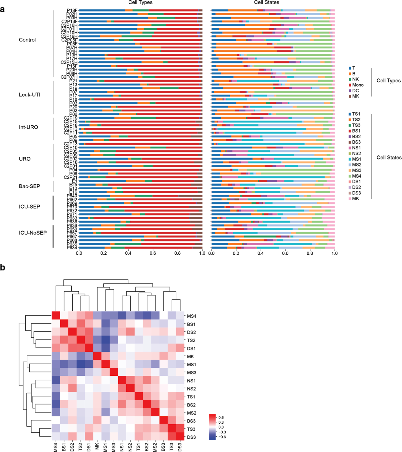
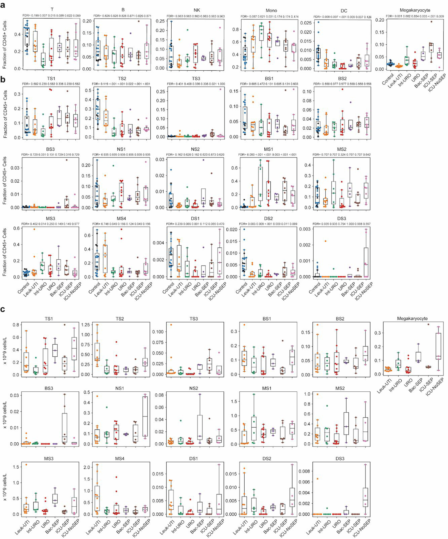
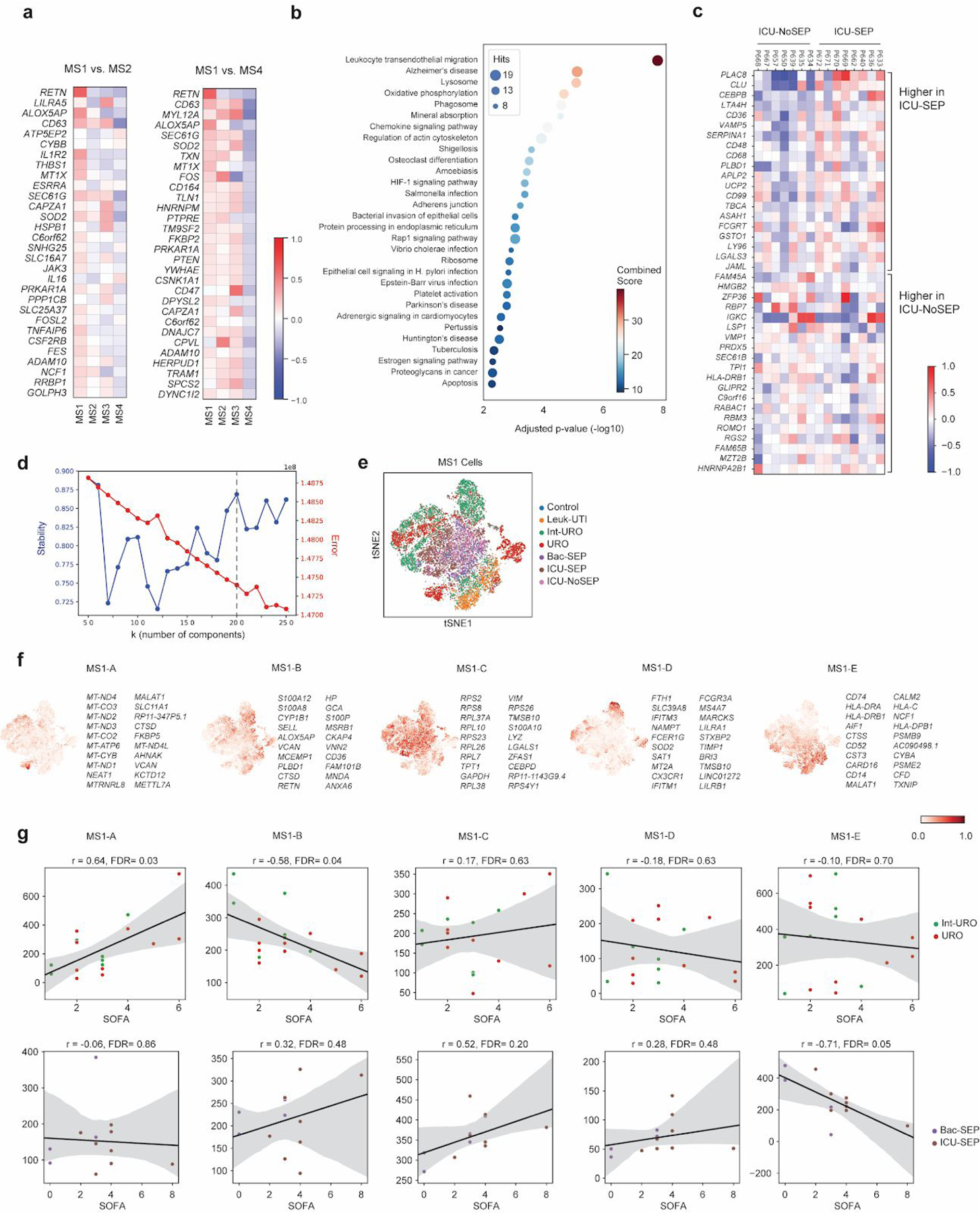
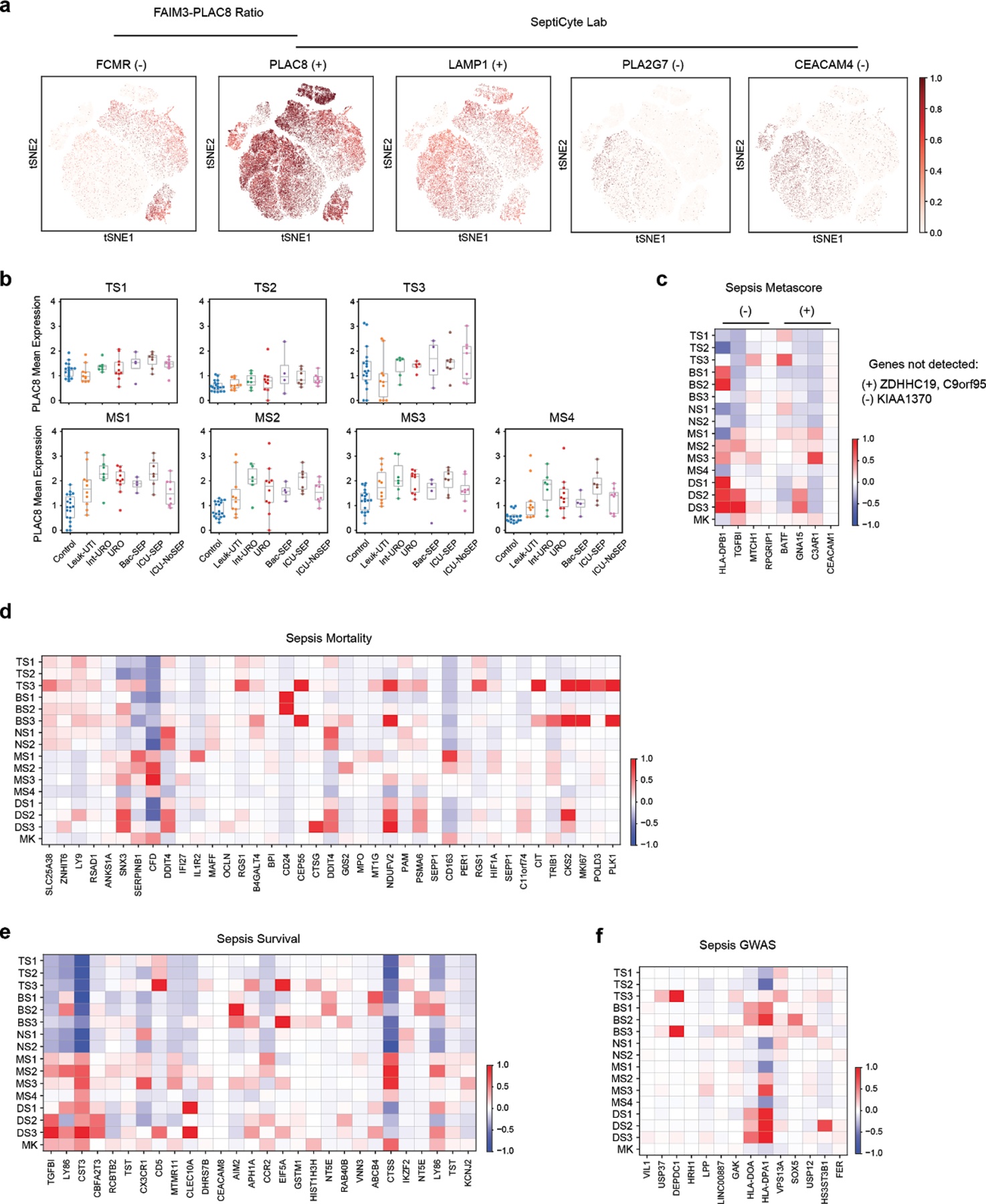
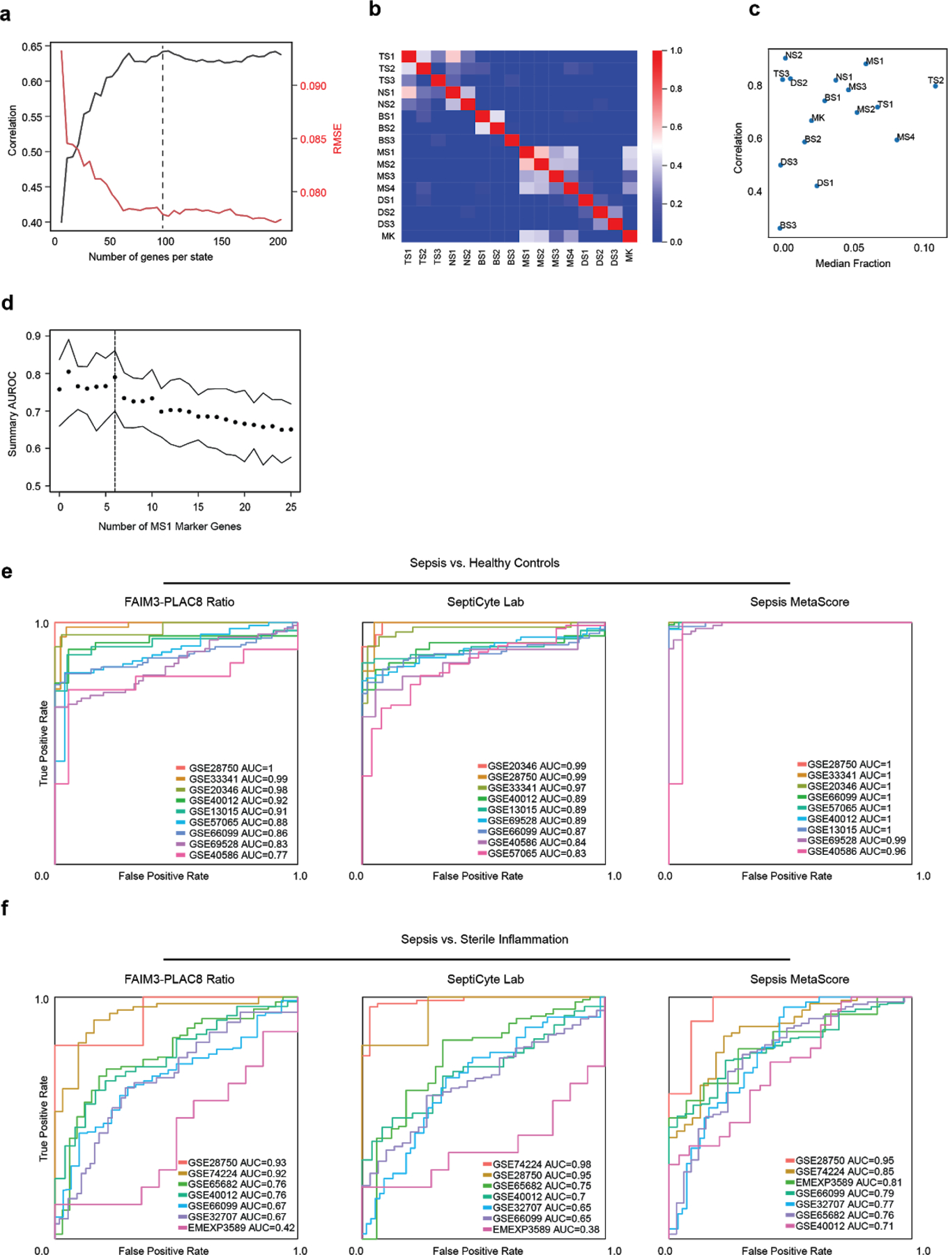
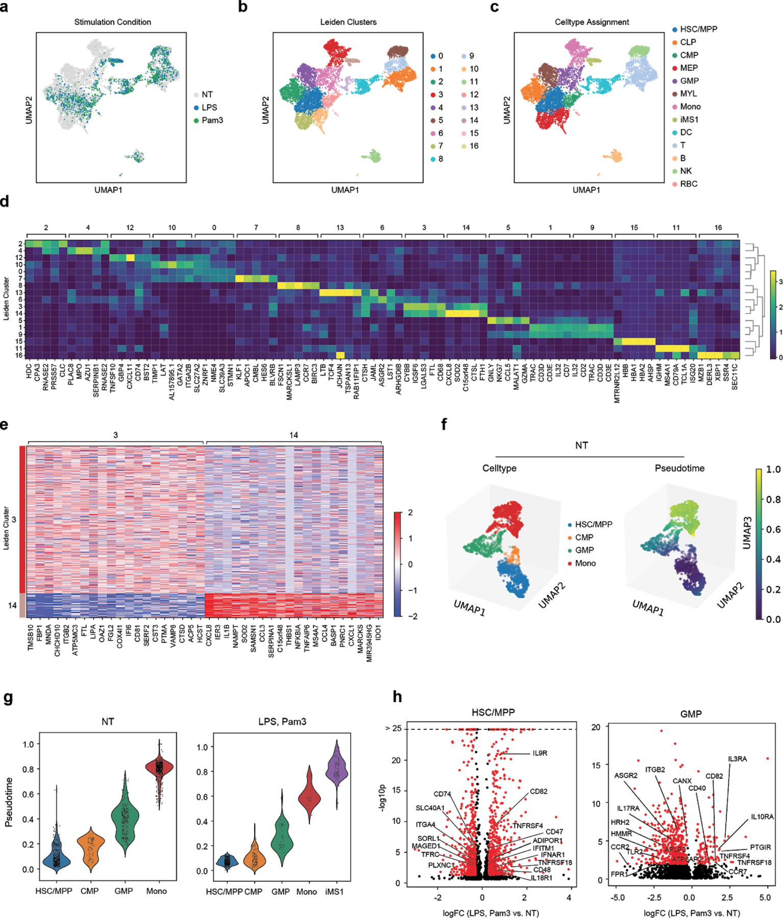
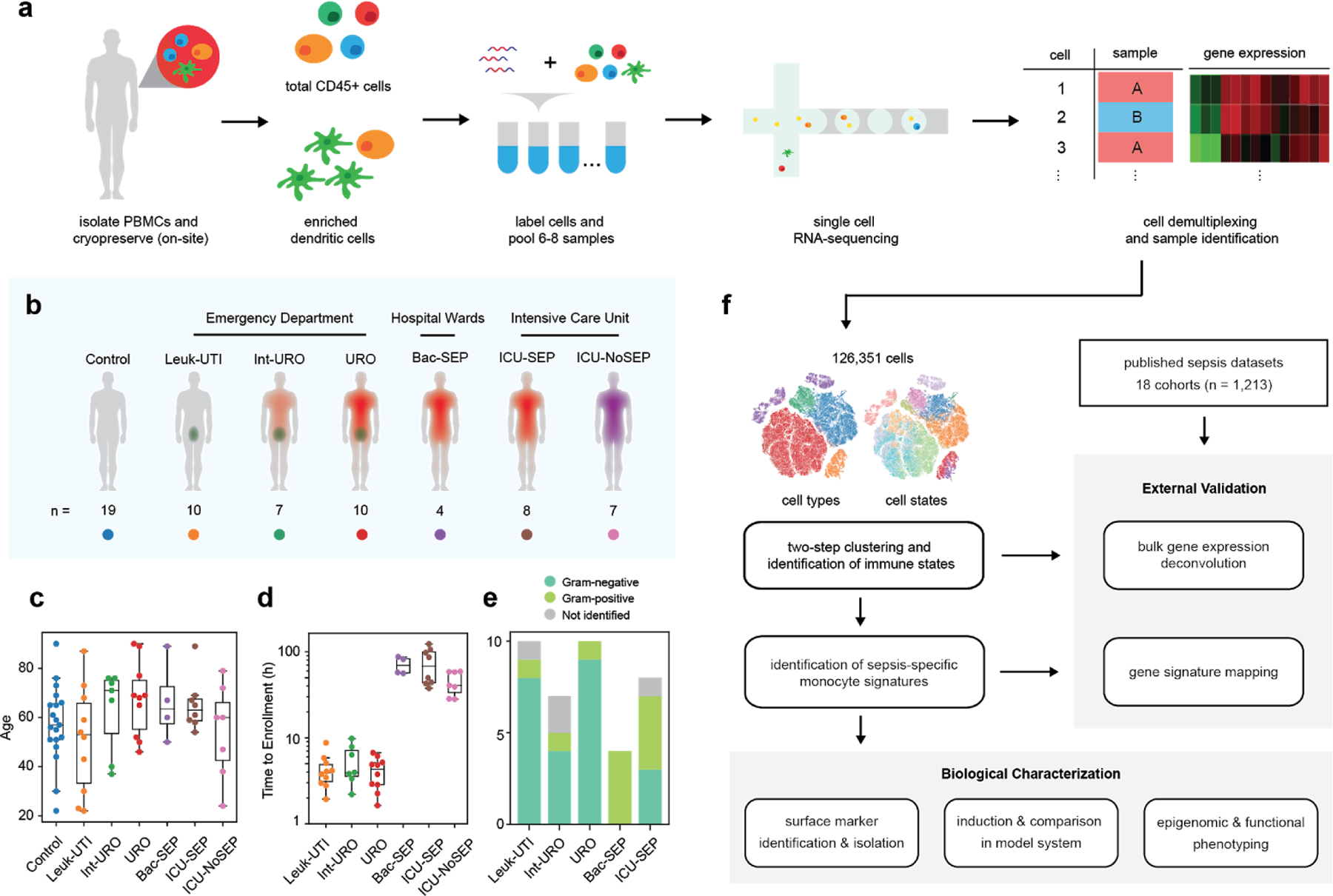
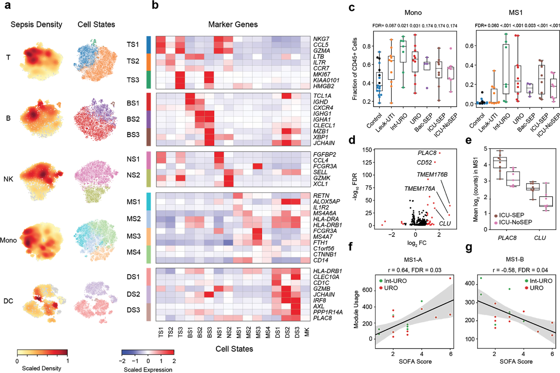
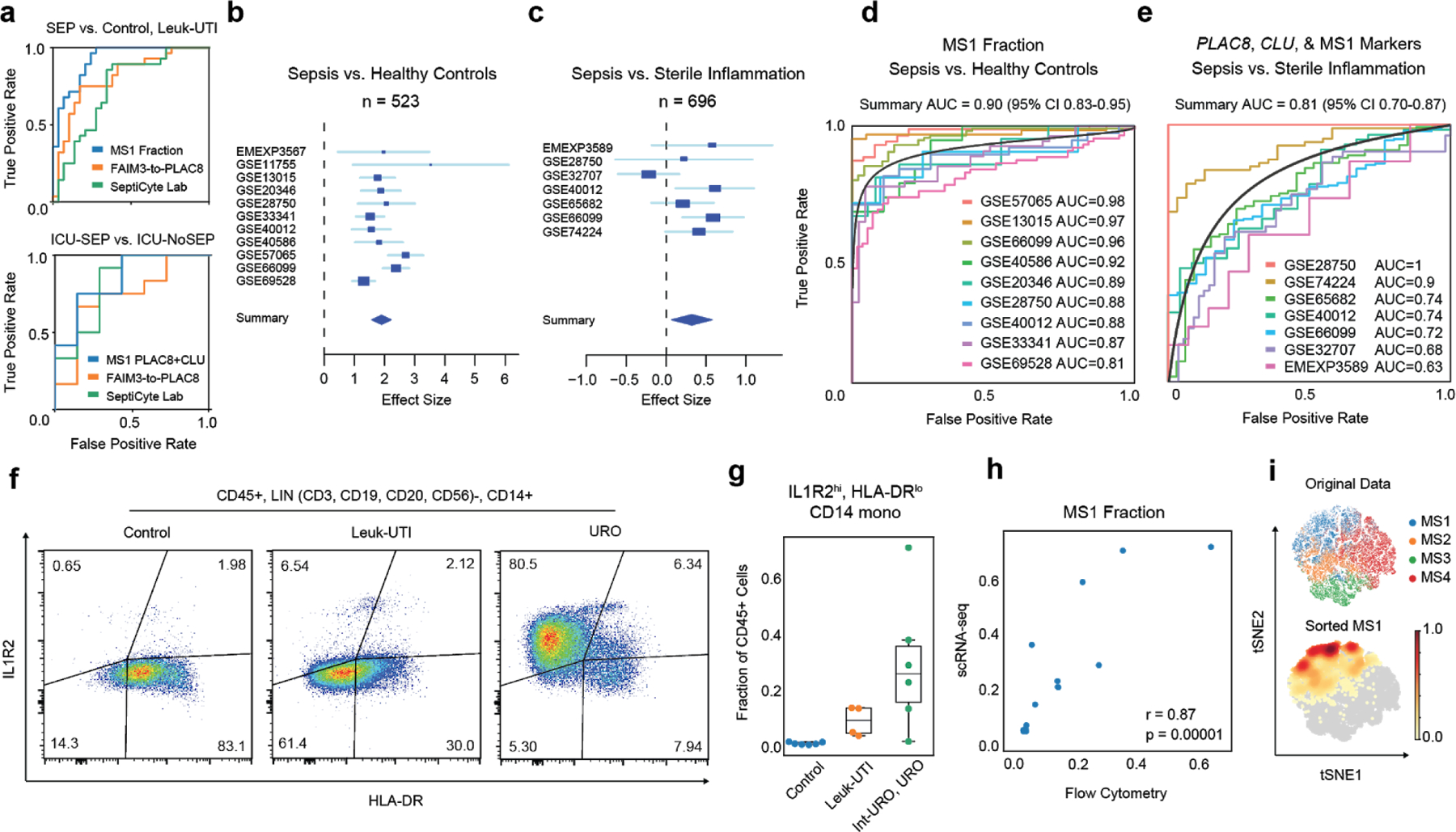
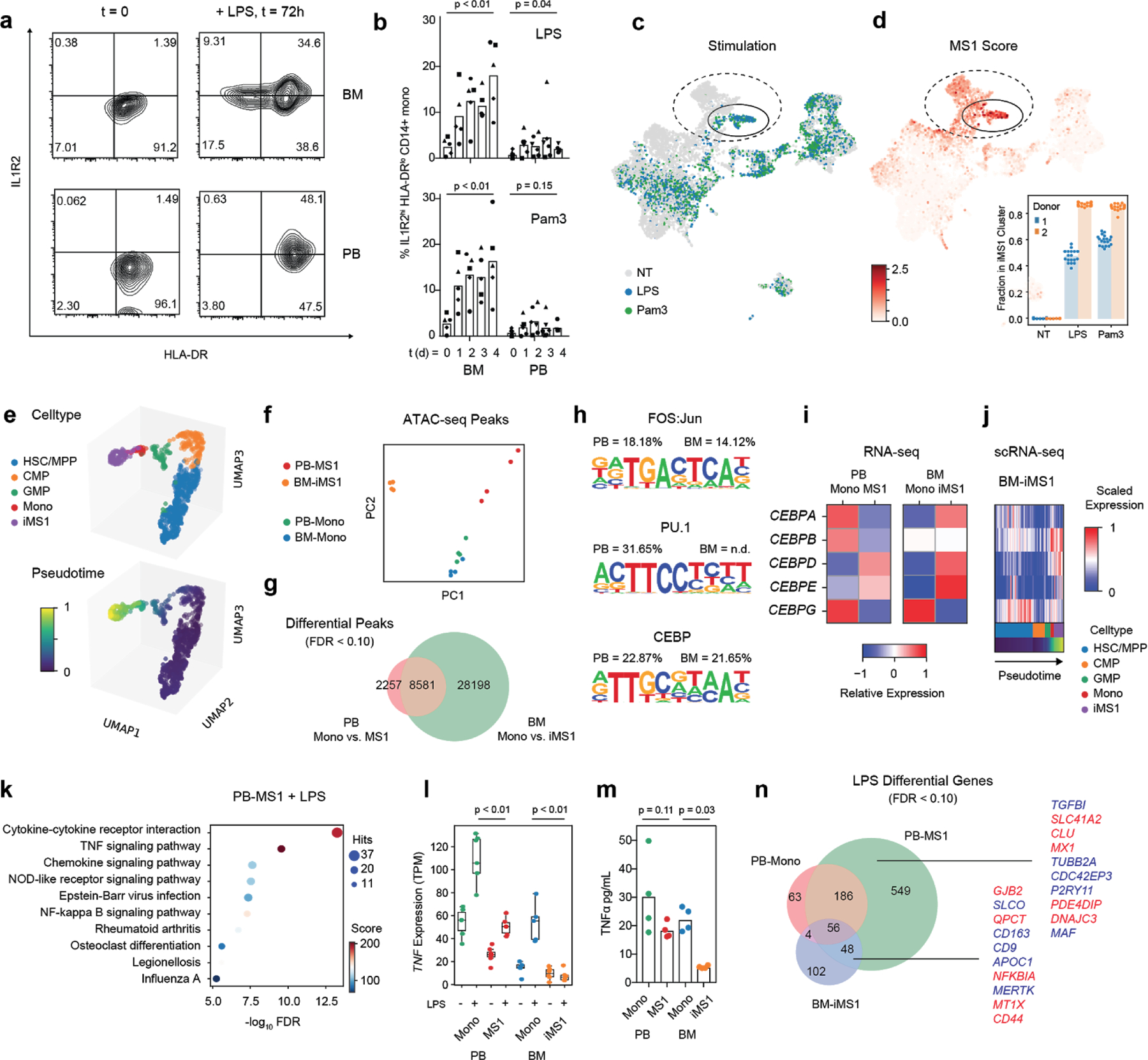
Dysregulation of the immune response to bacterial infection can lead to sepsis, a condition with high mortality. Multiple whole-blood gene-expression studies have defined sepsis-associated molecular signatures, but have not resolved changes in transcriptional states of specific cell types. Here, we used single-cell RNA-sequencing to profile the blood of people with sepsis (n = 29) across three clinical cohorts with corresponding controls (n = 36). We profiled total peripheral blood mononuclear cells (PBMCs, 106,545 cells) and dendritic cells (19,806 cells) across all subjects and, on the basis of clustering of their gene-expression profiles, defined 16 immune-cell states. We identified a unique CD14+ monocyte state that is expanded in people with sepsis and validated its power in distinguishing these individuals from controls using public transcriptomic data from subjects with different disease etiologies and from multiple geographic locations (18 cohorts, n = 1,467 subjects). We identified a panel of surface markers for isolation and quantification of the monocyte state and characterized its epigenomic and functional phenotypes, and propose a model for its induction from human bone marrow. This study demonstrates the utility of single-cell genomics in discovering disease-associated cytologic signatures and provides insight into the cellular basis of immune dysregulation in bacterial sepsis.


Conflict of interest statement

COMPETING FINANCIAL INTERESTS

The Broad Institute and MIT may seek to commercialize aspects of this work, and related applications for intellectual property have been filed. In addition, P.C.B. is a consultant to and equity holder in a company, 10X Genomics, whose products were used in this study.

Figures

Extended Data Figure 1.
Extended Data Figure 1.. scRNA-seq demultiplexing and quality assessment.
(a) Sample strategy for gating for hashtag oligo (HTO) positive cells based on UMI tag counts of each barcode. (b) Histogram of cells per 10X gel beads in emulsion (GEM) barcode for one representative channel. Data are shown for one channel with n = 15,304 detected GEMs. (c) tSNE plots of all cells (n = 126,351 cells total from 65 individuals) in the study colored by institution of origin of the cohort, hashtag barcode, and processing batch. Adjusted Rand index is shown for each when compared with cell state assignments. (d) Violin plots (n = 126,351 cells total from 65 individuals) of various quality control metrics for the full scRNA-seq dataset generated in this study. (e) Violin plots of genes detected across different cell-types (n = 32341, 7970, 9390, 58557, 14299, 3794 cells for T, B, NK, Mono, DC, and MK, respectively). Violin plots show a kernel density estimate of the data, using Scott’s rule to calculate the appropriate kernel bandwidth. The violin extends to 2x the bandwidth in both directions.
Extended Data Figure 2.
Extended Data Figure 2.. Robust identification of cell states with two-step clustering.
(a-b) Identification of immune cell types based on marker genes of low-resolution clusters. Color scale in (b) corresponds to z-scored, log2-transformed mean gene expression counts across all cells (n = 126,351 cells total from 65 individuals). (c-d) Assessment of cluster robustness for T-cells (T) (c) and monocytes (Mono) (d) (n = 32341 and 58557 cells for T and Mono, respectively). Boxplots show distributions of Rand indices when comparing clustering solutions with subsampled data (20 iterations). Boxes show the median and IQR for each resolution, with whiskers extending to 1.5 IQR in either direction from the top or bottom quartile. tSNE plots show final assigned states for each cell type. (e-f) Barplots showing the fraction of each patient (e) and batch (f) in each of the 16 cell states (number of patients or batches with each state is indicated).
Extended Data Figure 3.
Extended Data Figure 3.. Flow cytometry abundances of classical myeloid cell states.
(a) Gating strategy for determination of CD14+ mono, CD16+ mono, and dendritic cell abundance. (b) Correlation of fractional abundances defined by flow cytometry and scRNA-seq for each patient (n = 65 individuals). (c) Fractional abundance of the three cell types based on flow cytometry, grouped by disease state. Sample size (n) for each cohort is indicated in Figure 1b. Boxes show the median and IQR for each patient cohort, with whiskers extending to 1.5 IQR in either direction from the top or bottom quartile.
Extended Data Figure 4.
Extended Data Figure 4.. Differentially expressed genes in immune cell states.
Top 10 differentially expressed genes (FDR < 0.05, two-tailed Wilcoxon rank-sum test) for each cell state when compared with other cells within the same cell type. Heatmaps are grouped according to the parent cell type of the different states: (a) T cells, (b) B cells, (c) NK cells, (d) monocytes, and (e) dendritic cells. n = 32341, 7970, 9390, 58557, 14299, 3794 cells for T, B, NK, Mono, DC, and MK, respectively. cDC, conventional dendritic cells; pDC, plasmacytoid dendritic cells; AS DC, AXL-SIGLEC6 dendritic cells.
Extended Data Figure 5.
Extended Data Figure 5.. Fractional abundance of states defined by scRNA-seq.
(a) Cell type and state composition for each patient in each cohort. (b) Pearson correlation matrix of cell states across all patients (n = 65 patients).
Extended Data Figure 6.
Extended Data Figure 6.. Disease-specific abundance of cell types and states.
Boxplots showing fractional abundances of (a) cell types and (b) states among patients grouped by patient cohort. FDR values are shown when comparing each disease state with healthy controls (two-tailed Wilcoxon rank-sum test, corrected for multiple testing of states). Sample size (n) for each cohort is indicated in Figure 1b. (c) Boxplots showing absolute abundances of cell states among patients (for which leukocyte counts were available), grouped by patient cohort. Boxes show the median and IQR for each patient cohort, with whiskers extending to 1.5 IQR in either direction from the top or bottom quartile. n = 10, 6, 10, 3, 6, and 4 patients, for Leuk-UTI, Int-URO, URO, BAC-SEP, ICU-SEP and ICU-NoSEP, respectively.
Extended Data Figure 7.
Extended Data Figure 7.. In-depth analysis of the gene expression profile of MS1.
(a) Top 30 differentially expressed genes (among highly variable genes) when comparing MS1 against other CD14+ monocyte states (MS4 and MS2). (b) Dotplot showing enrichment of pathways (KEGG database) for upregulated genes in MS1 vs. MS2 (FDR < 0.1, edgeR exact test). n = 15021 and 11439 cells for MS1 and MS2, respectively. Sizes of circles are proportional to the number of gene hits in a set, whereas color represents the enrichment score of each gene set. (c) Heatmap showing the average expression of genes that are differentially expressed (FDR <0.1, two-sided Wilcoxon rank-sum test) between all MS1 cells from each patient in the ICU-SEP cohort and all MS1 cells from each patient in the ICU-NoSEP cohort (n = 2,153 and 1,442 cells from 8 and 7 ICU-SEP and ICU-NoSEP patients, respectively). To specifically identify genes that discriminate the two patient populations, genes are filtered for expression in-group fraction >0.4 and out-group fraction <0.6. (d) k-selection plot to determine the number of components for non-negative matrix factorization (NMF). Dotted line indicates selected number of components for further analysis. (e) tSNE plot of MS1 cells (n = 15021 cells) colored by patient cohort of origin. (f) Scaled usage values of each gene module derived from NMF analysis. The top 20 genes in each module are shown. (g) Scatterplots showing correlation between mean gene module usage in MS1 cells and sequential organ failure assessment (SOFA) scores for Int-URO and URO patients (top row), and Bac-SEP and ICU-SEP patients (bottom row). Sample size (n) for each cohort is indicated in Figure 1b. Significance of the correlation (Pearson r) was calculated with a two-sided permutation test. Line and shadow indicate linear regression fit and 95% confidence interval, respectively.
Extended Data Figure 8.
Extended Data Figure 8.. State-specific expression of sepsis signature genes.
(a) tSNE plots showing scaled gene expression counts across all cells (n = 126,351 total from 65 individuals) for FAIM3-PLAC8 and SeptiCyte Lab genes (+ or − indicates that a gene is up- or down-regulated, respectively, in sepsis). (b) Mean expression of PLAC8 in T cell (top row) and monocyte (bottom row) states across patients grouped by cohort. Sample size (n) for each cohort is indicated in Figure 1b. (c-f) Heatmaps show state-specific expression of Sepsis Metascore genes (c), genes previously associated with sepsis mortality (d) or survival, (e), and sepsis-linked GWAS genes (f). Color scale corresponds to z-scored, log2-transformed mean gene expression counts for cell state.
Extended Data Figure 9.
Extended Data Figure 9.. State matrix generation and performance comparison of gene-based signatures.
(a) Optimization of the number of marker genes per cell state in the basis matrix for deconvolution. Mean deconvolution accuracy is shown for pseudo-bulk gene expression data generated for each patient in our study (n = 65 patients). Accuracy is measured as high correlation or low root mean-squared error (RMSE) between predicted and true values. Dotted line indicates number of genes used for downstream analysis. (b) Gene expression correlation of all states using the signature matrix with 100 genes per cell state (1201 total, union of all genes). (c) Scatterplot showing deconvolution accuracy (measured by Pearson correlation between true and inferred fractions) increases with median fractional abundance of cell states. (d) Summary area under the receiver operating characteristic curve (AUROCs) of the mean expression of PLAC8, CLU, and the indicated number of MS1 marker genes when classifying sepsis patients against sterile inflammation in published datasets. Top and bottom lines indicate the 95% confidence interval of the summary AUROC. Dotted line indicates number of MS1 marker genes used for downstream analysis. (e-f) Individual ROC curves of FAIM3-PLAC8 Ratio, SeptiCyte Lab, and Sepsis MetaScore on published datasets comparing sepsis vs. healthy controls (e; n = 751 total patients from 9 cohorts) or sepsis vs. sterile inflammation (f; n = 696 total patients from 7 cohorts).
Extended Data Figure 10.
Extended Data Figure 10.. scRNA-seq characterization of stimulated bone-marrow mononuclear cells.
BM mononuclear cells incubated in HSC cytokine-rich media with no treatment (NT) or 100 ng/mL LPS or Pam3CSK4 for 4 days. Cells (n = 8,702) are visualized on a UMAP projection and colored by (a) treatment, (b) Leiden clusters, and (c) cell-type annotations. (d) Matrixplot showing the top 5 differentially expressed genes (FDR < 0.01, two-tailed Wilcoxon rank-sum test) for each cluster in (b). (e) Heatmap showing differentially expressed genes (FDR < 0.01, two-tailed Wilcoxon rank-sum test) between clusters 3 (CD14 monocytes, n = 786 cells) and 14 (iMS1 cluster, n = 130 cells). (f) UMAP projections of non-stimulated BM myeloid and progenitor cells (HSC/MPP, CMP, GMP, Mono; n = 1976 cells total) colored by cell type (top) and diffusion pseudotime (bottom). (g) Violin plots showing pseudotime values for each cell type in each stimulation condition. n = 1976 and 901 cells for NT and LPS or Pam3 treatments, respectively. Violin plots show a kernel density estimate of the data, using Scott’s rule to calculate the appropriate kernel bandwidth. The violin extends to 2x the bandwidth in both directions. (h) Volcano plots showing differentially expressed genes between LPS or Pam3CSK4 and untreated cells for the HSC/MPP (n = 1168 cells) and GMP populations (n = 519 cells). Differentially expressed genes (logFC > 0.3, p < 0.05; edgeR exact test) are shown in red. Known receptors (based on a previously published database) that are differentially expressed are labelled.
Figure 1.
Figure 1.. Cohort definition and analysis strategy.
(a) Processing pipeline for blood samples used in this study. Total CD45+ PBMCs and enriched dendritic cells for groups of patients were labelled with cell hashing antibodies and loaded on a droplet-based scRNA-seq platform. Cells were demultiplexed and multiplets were removed based on calls for each barcoding antibody. (b) Schematic and number of patients for each cohort profiled in this study. (c) Age distribution of patients and controls analyzed in this study. (d) Time to enrollment from hospital presentation for each patient across all cohorts. Boxes show the mean and interquartile range (IQR) for each patient cohort, with whiskers extending to 1.5 IQR in either direction from the top or bottom quartile. (e) Barplots showing fractions of Gram-positive and Gram-negative pathogens for each cohort. (f) Analysis pipeline: cell states were identified via two-step clustering, and fractional abundances thereof were compared to find sepsis-specific states. Further signatures were derived from these states using differential gene expression and gene module analysis. These signatures were validated in external sepsis datasets via a combination of bulk gene expression deconvolution, direct mapping of gene signatures, and meta-analysis. Experiments were performed to identify surface markers, develop a model system for induction, analyze the epigenomic profile, and characterize the functional phenotype of the identified cell state.
Figure 2.
Figure 2.. scRNA-seq identifies sepsis-specific immune cell states and gene signatures.
(a) t-distributed stochastic neighbor embedding (tSNE) plots for each cell type (n = 32341, 7970, 9390, 58557, and 14299, cells for T, B, NK, Mono, and DC, respectively) colored by embedding density of cells from sepsis patients (Int-URO, URO, Bac-SEP and ICU-SEP; left) and cell state (right). (b) Select marker genes that are differentially expressed (false discovery rate [FDR] < 0.05, two-tailed Wilcoxon rank-sum test) in each cell state, when compared with other cell states within the same cell type. Color scale corresponds to z-scored, log-transformed mean gene expression counts for each cell state. TS, T cell states; BS, B cell states; NS, NK cell states; MS, monocyte states; DS, dendritic cell states; MK, megakaryocytes. (c) Fraction of total CD45+ cells across each patient type for total monocytes (left) and MS1 cells (right). In Control group, points for healthy controls that were follow-up samples from enrolled Leuk-UTI, Int-URO, and URO patients are indicated as black symbols and those for matched healthy control samples from an outside source are indicated as aqua symbols. FDR values are shown when comparing each disease state with healthy controls (two-tailed Wilcoxon rank-sum test, corrected for testing of multiple states). Boxes show the median and IQR for each patient cohort, with whiskers extending to 1.5 IQR in either direction from the top or bottom quartile. Sample size (n) for each cohort is indicated in Figure 1b. (d) Volcano plot showing differential expression analysis results (two-sided Wilcoxon rank-sum test) between MS1 cells from ICU-SEP and MS1 cells from ICU-NoSEP patients. Genes with log2 FC (fold-change) > 1 are highlighted in red, and the top 5 genes with the highest positive fold-changes are labeled. n = 2,153 and 1,442 cells from the 8 ICU-SEP and 7 ICU-NoSEP patients, respectively. (e) Box and swarm plots showing the mean expression (log2 unique molecular identifier [UMI] counts) of PLAC8 and CLU in MS1 cells for each patient from the ICU-SEP and ICU-NoSEP cohorts. Boxes show the median and IQR for each patient cohort, with whiskers extending to 1.5 IQR in either direction from the top or bottom quartile. (f-g) Scatterplots showing correlation between mean gene module usage in MS1 cells and SOFA scores for Int-URO and URO patients. Line and shadow indicate linear regression fit and 95% confidence interval, respectively. Significance of the correlations (Pearson r) were calculated with a two-sided permutation test, corrected for testing of multiple modules. SOFA, sequential organ failure assessment.
Figure 3.
Figure 3.. Analysis of the MS1 cell state as a sepsis marker.
(a) Receiver-operating characteristic (ROC) curve for sepsis patient classification based on MS1 abundance (top) or mean PLAC8 and CLU expression in MS1 cells (bottom), and gene expression score-based classifiers (FAIM3-to-PLAC8, SeptiCyte Lab). MS1 is taken as the fraction of total CD45+ cells per patient as defined by scRNA-seq. Gene-set scores were calculated, as detailed in each corresponding publication, on the pseudo-bulk gene expression matrix obtained by summing read counts from all cells of each patient. SEP indicates all sepsis patients analyzed in this study (Int-URO, URO, Bac-SEP, ICU-SEP). (b-c) Forest plots showing the effect size (log2 standardized mean difference between indicated patient phenotypes) of inferred MS1 abundance in each dataset from bulk gene expression deconvolution. Accession numbers of the data from each study are listed on the left. Boxes indicate the effect size in an individual study, with whiskers extending to the 95% confidence interval. Size of the box is proportional to the relative sample size of the study. Diamonds represent the summary effect size among the patient groups, determined by integrating the standardized mean differences across all studies. The width of the diamond corresponds to its 95% confidence interval. (d) Individual ROC curves for sepsis vs. uninfected healthy controls; analysis includes each study in (b) for which the number of sepsis patients and controls were both greater than 5 (n = 751 total patients from 9 cohorts). (e) ROC curves for classifying sepsis vs. sterile inflammation (n = 696 total patients from 7 cohorts) based on the mean expression of PLAC8 , CLU, and the top 6 MS1 marker genes (RETN, CD63, ALOX5AP, SEC61G, TXN, MT1X). Black curves in (d, e) indicate the summary ROCs. (f) Flow cytometry density plots of LIN-, CD14+ monocytes gated on surface expression of IL1R2 and HLA-DR. Percentage of the population over total CD14+ monocytes in each quadrant is indicated. Each density plot shows PBMCs from a single patient analyzed in one experiment. (g) Fractional abundance of CD14+, HLA-DRlo, IL1R2hi monocytes by flow cytometry in Control, Leuk-UTI, Int-URO, and URO patients (n = 6, 4, and 6, respectively). Samples used for this analysis were from the primary cohort (Control, Leuk-UTI, Int-URO, URO). Boxes show the median and IQR for each patient cohort, with whiskers extending to 1.5 IQR in either direction from the top or bottom quartile. (h) Correlation of MS1 fractions defined by scRNA-seq (y-axis) and CD14+, HLA-DRlo, IL1R2hi monocyte fractions of CD45+ cells (x-axis) from n = 4 Leuk-UTI and n = 6 patients from (g). Significance of the correlation (Pearson r) was calculated with a two-sided permutation test. (i) scRNA-seq of sorted CD14+, HLA-DRlo, IL1R2hi, monocytes and original MS1 cells visualized with tSNE projection. Top scatterplot (n = 15,021 cells) shows original classification of cells from the patient cohorts, bottom shows embedding density of sorted cells in the same projection.
Figure 4.
Figure 4.. Induction and characterization of MS1 monocytes.
(a) Flow cytometry contour plots showing IL1R2 and HLA-DR of cells gated on the CD14+ fraction from either bone marrow (BM, top row) or peripheral blood (PB, bottom row) mononuclear cells. Cells are either freshly thawed (left column) or stimulated with 100 ng/mL LPS for 3 days in Hematopoietic Stem Cell (HSC) cytokine-rich media (right column). Each density plot shows cells from a single donor analyzed in one experiment. (b) Fractional abundance of HLA-DRlo, IL1R2hi cells among CD14+ monocytes in PB or BM mononuclear cells stimulated with either 100 ng/mL LPS (top) or Pam3CSK4 (bottom) over time (0 to 4 days). Different symbols indicate cells obtained from different healthy donors. P-values are calculated from a two-sided Wilcoxon rank-sum test between day 0 and day 4. (c-d) scRNA-seq of BM mononuclear cells (n = 8,702 cells) incubated in HSC cytokine-rich media with no treatment or 100 ng/mL LPS or Pam3CSK4 for 4 days. Cells are visualized on uniform manifold approximation and projection (UMAP) plots colored by treatment (c) or MS1 score (d). MS1 scores are given as the ratio of the average expression of the top 15 MS1 marker genes to the average expression of a randomly sampled set of 50 reference genes. In each plot, the cluster with the highest MS1 score is circled. Dotted circles indicate monocyte clusters. Inset in (d) shows the mean fractional abundance of the iMS1 cluster among monocytes across each donor and treatment condition; each individual point is calculated by randomly sampling the data and clustering the subsampled dataset (n = 20 iterations). (e) UMAP projections (n = 901 cells) of Pam3CSK4 and LPS stimulated BM myeloid and progenitor cells (HSC/MPP, CMP, GMP, Mono, and iMS1) colored by celltype (top) and diffusion pseudotime (bottom). (f) Principal component analysis (PCA) plots of assay for transposase-accessible chromatin using sequencing (ATAC-seq) peak accessibility profiles for four different sorted monocyte populations: PB-Mono, PB-MS1, BM-Mono (CD14+ monocytes from freshly thawed BM cells), and BM-iMS1 (CD14+ monocytes from BM cells stimulated for 4 days with 100 ng/mL LPS in HSC cytokine-rich media). Experiments were performed on two donors with two technical replicates each. (g) Venn diagram showing overlap of differentially accessible peaks (FDR < 0.1, edgeR exact test) from monocyte populations in PB and BM. (h) Sequence logos showing the top 3 enriched motifs in the differentially accessible peaks when comparing PB-Mono and PB-MS1. Percentages indicate the number of differential peaks that contain the motif for PB and BM (n.d. indicates that motif was not detected in the enrichment analysis). (i) Relative expression (normalized log2 transcripts per kilobase million [TPM]) of the CEBP family of transcription factors across the four monocyte populations. (j) Scaled expression (normalized log counts) of the CEBP family of transcription factors along the pseudotime trajectory in (e). (k) Top 10 enriched pathways in the differentially accessible genes (FDR < 0.1, edgeR exact test) when PB-MS1 cells are rested for 24 h and subsequently stimulated with 100 ng/mL LPS. RNA-seq experiments were performed on 2 donors with 3 technical replicates each. Sizes of circles are proportional to the number of gene hits in a set, whereas color represents the enrichment score of each gene set. (l) TNF expression and (m) TNFα protein levels in the supernatant of the indicated four sorted monocyte populations after LPS stimulation. P-values are calculated from a two-sided Wilcoxon rank-sum test between LPS-stimulated Mono and iMS1 cells. Protein measurements were performed on 2 donors with 2 technical replicates each. (n) Venn diagram showing overlap of differentially accessible genes (FDR < 0.1, edgeR exact test) from the indicated sorted monocyte populations after LPS stimulation. Top 10 genes with highest significance are indicated in red for the PB-MS1-exclusive set of genes and the overlap between BM-iMS1 and PB-MS1. HSC/MPP, hematopoietic stem cells and multipotent progenitors; CMP, common myeloid progenitors; GMP, granulocyte-macrophage progenitor.

References

    1. Rudd KE et al. The global burden of sepsis: barriers and potential solutions. Crit. Care 22, 232 (2018). - PMC - PubMed
    1. Filbin MR et al. Presenting Symptoms Independently Predict Mortality in Septic Shock: Importance of a Previously Unmeasured Confounder. Crit. Care Med 46, 1592–1599 (2018). - PubMed
    1. Seymour CW et al. Derivation, Validation, and Potential Treatment Implications of Novel Clinical Phenotypes for Sepsis. JAMA (2019) doi: 10.1001/jama.2019.5791. - DOI - PMC - PubMed
    1. Sweeney TE et al. Unsupervised Analysis of Transcriptomics in Bacterial Sepsis Across Multiple Datasets Reveals Three Robust Clusters. Crit. Care Med 46, 915–925 (2018). - PMC - PubMed
    1. Opal SM, Dellinger RP, Vincent J-L, Masur H & Angus DC The next generation of sepsis clinical trial designs: what is next after the demise of recombinant human activated protein C?*. Crit. Care Med 42, 1714–1721 (2014). - PMC - PubMed

Publication types