. 2020 Feb 26;16(2):e1007672.
doi: 10.1371/journal.pcbi.1007672. eCollection 2020 Feb.

From cells to tissue: How cell scale heterogeneity impacts glioblastoma growth and treatment response

Affiliations

From cells to tissue: How cell scale heterogeneity impacts glioblastoma growth and treatment response

Jill A Gallaher et al. PLoS Comput Biol. .

Abstract

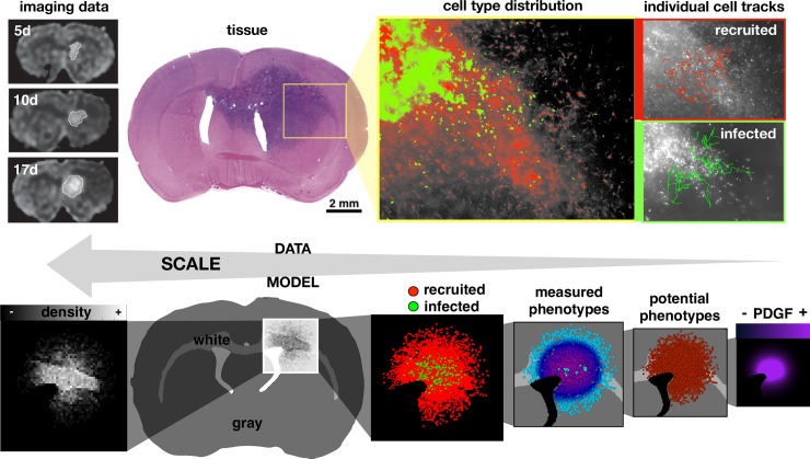
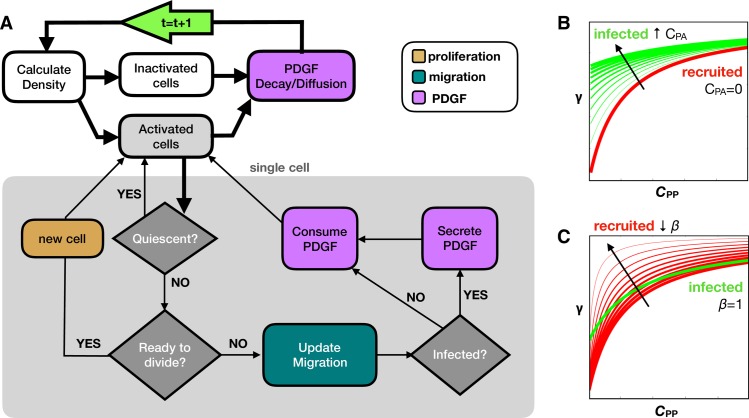
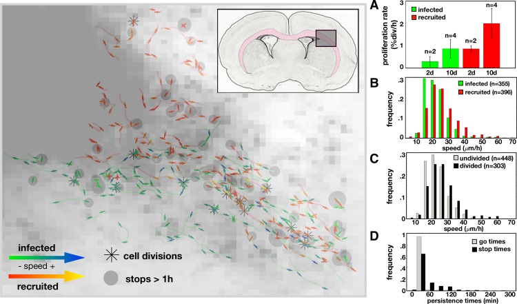
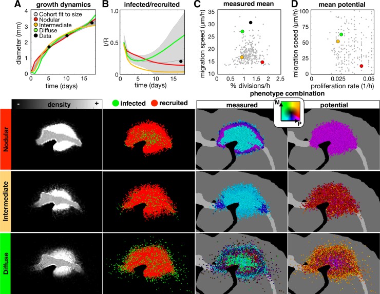
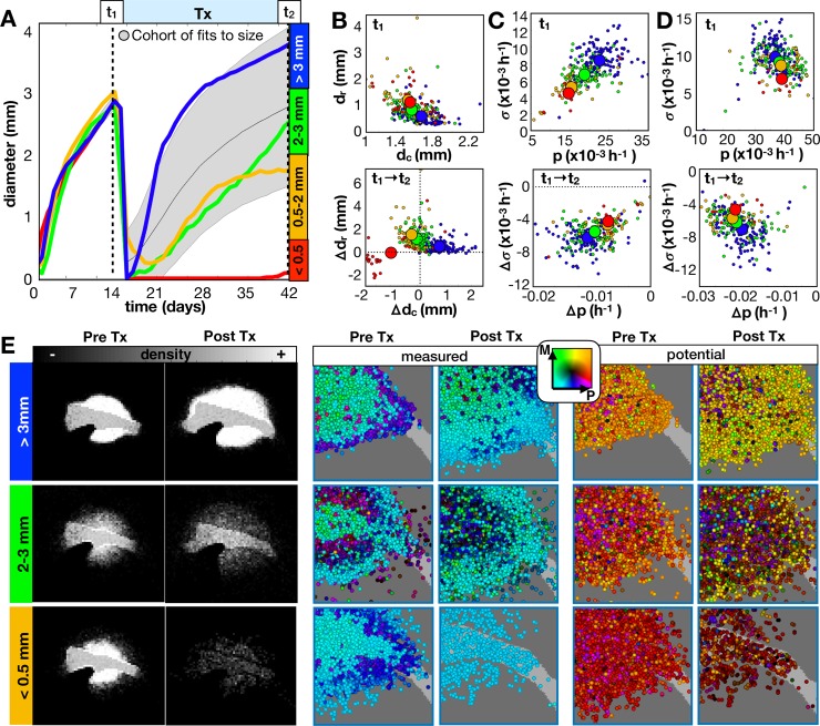
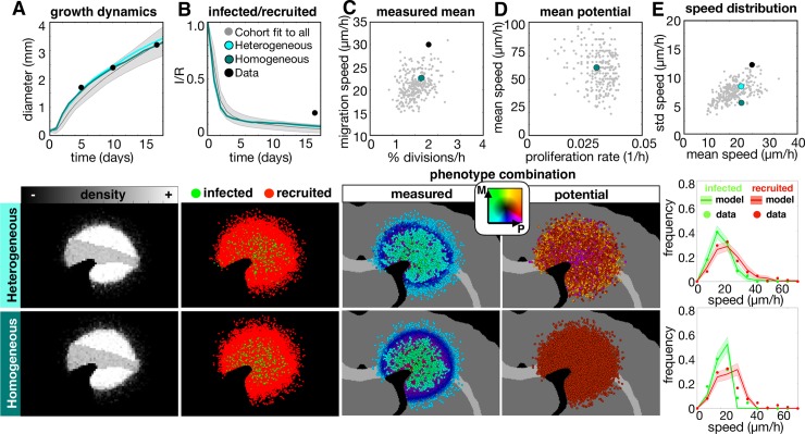
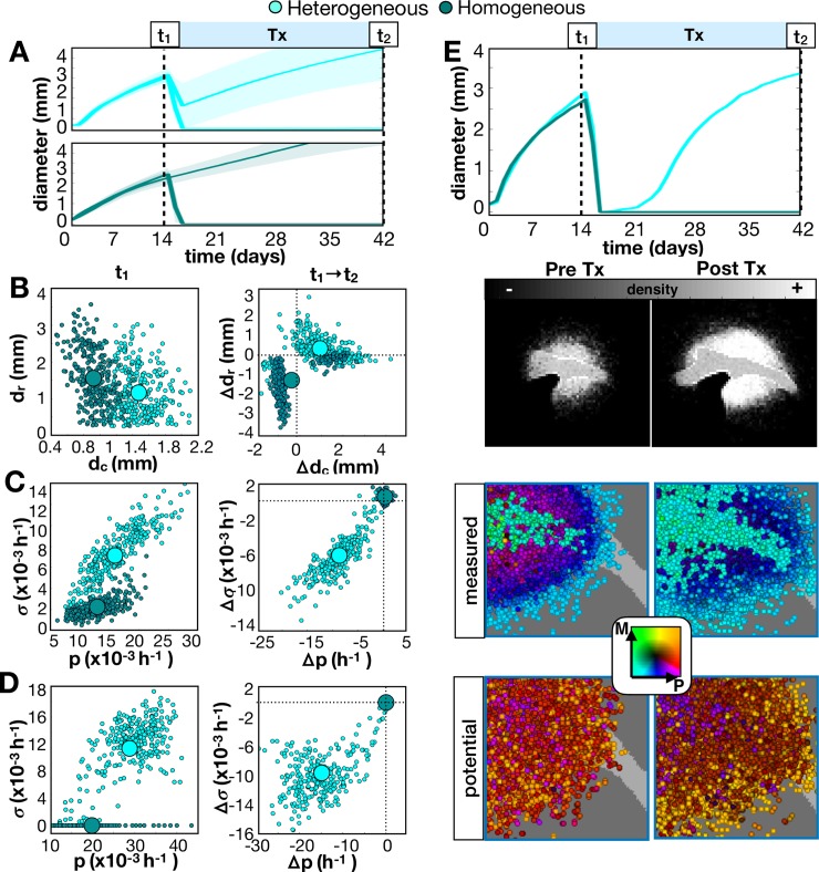
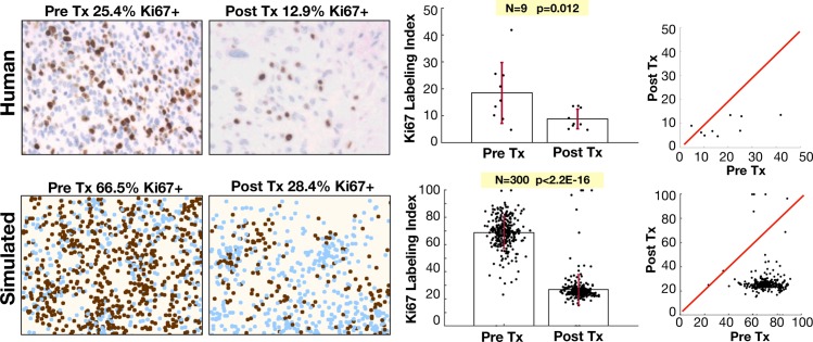
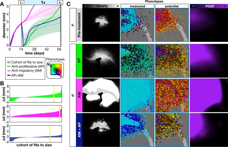
Glioblastomas are aggressive primary brain tumors known for their inter- and intratumor heterogeneity. This disease is uniformly fatal, with intratumor heterogeneity the major reason for treatment failure and recurrence. Just like the nature vs nurture debate, heterogeneity can arise from intrinsic or environmental influences. Whilst it is impossible to clinically separate observed behavior of cells from their environmental context, using a mathematical framework combined with multiscale data gives us insight into the relative roles of variation from different sources. To better understand the implications of intratumor heterogeneity on therapeutic outcomes, we created a hybrid agent-based mathematical model that captures both the overall tumor kinetics and the individual cellular behavior. We track single cells as agents, cell density on a coarser scale, and growth factor diffusion and dynamics on a finer scale over time and space. Our model parameters were fit utilizing serial MRI imaging and cell tracking data from ex vivo tissue slices acquired from a growth-factor driven glioblastoma murine model. When fitting our model to serial imaging only, there was a spectrum of equally-good parameter fits corresponding to a wide range of phenotypic behaviors. When fitting our model using imaging and cell scale data, we determined that environmental heterogeneity alone is insufficient to match the single cell data, and intrinsic heterogeneity is required to fully capture the migration behavior. The wide spectrum of in silico tumors also had a wide variety of responses to an application of an anti-proliferative treatment. Recurrent tumors were generally less proliferative than pre-treatment tumors as measured via the model simulations and validated from human GBM patient histology. Further, we found that all tumors continued to grow with an anti-migratory treatment alone, but the anti-proliferative/anti-migratory combination generally showed improvement over an anti-proliferative treatment alone. Together our results emphasize the need to better understand the underlying phenotypes and tumor heterogeneity present in a tumor when designing therapeutic regimens.


Conflict of interest statement

The authors have declared that no competing interests exist.

Figures

Fig 1
Fig 1. Coupling multiscale data to a multiscale mathematical model.
Upper: data from rat experiments including imaging at 5, 10, and 17 days post injection, circumscribed and quantified from serial MRI images, tissue slice image, spatial distribution of infected (green) and recruited (red) cells, and individual cell tracks. Lower: the multiscale model represents the imaging as a spatial density map, considers the gray and white matter distribution in the rat brain tissue, and tracks cell types (infected and recruited), measured cell phenotypes (actual proliferation and migration), potential cell phenotypes (maximal proliferation and migration), and the PDGF concentration field.
Fig 2
Fig 2. Computational model overview.
A) Flow chart shows key decision points in the model. Tissue processes are connected with thick black lines, while the cell loop for single cell processes are contained within the gray box and connected with thin black lines. At the start of each time step (green arrow), we calculate the density and find the activated and inactivated subsets of cells. All activated cells are checked for quiescence, division, migration, and PDGF interactions as shown. Then PDGF decay and diffusion occurs before moving onto the next time step. The infected and recruited cells respond differently to PDGF due to B) an autocrine stimulation for infected cells (CPA in Eq 2) and C) a decreased activation barrier for recruited cells (β in Eq 2). Increasing CPA shifts the response upward at low CPP. Decreasing β increases the slope to achieve high response at lower CPP, while still inactive at CPP = 0.
Fig 3
Fig 3. Data from the rat experiment.
Left: Single cell trajectories at 2 days post infection overlaid on the cell density map. The insert shows the region of interest within the rat brain where the pink highlights the white matter. An asterisk marks where a cell division occurred. Each track contains an arrow for the first and last half of the track showing the average direction and speed over that time period. The arrows for the infected cells are green for lower speeds and blue for higher speeds. The arrows for recruited cells are red for lower speeds and yellow for higher speeds. Gray dots mark where a cell has stopped longer than 1 hour with the size proportional to the stop time. Right: Metrics derived from data. A) Proliferation rates (in % divisions per hour) at day 2 and 10 for infected and recruited cells (for n trials indicated). Speed distributions (calculated as distance traveled over time travelling in μm/h) for B) infected vs recruited cells (mean speeds: 21.7μm/h vs. 25.0μm/h, respectively) and for C) undivided vs divided (mean speeds: 25.3μm/h vs. 22.1μm/h, respectively). D) Time spent during periods of movement or stopping for all cells (42.6min vs. 70.1min, respectively).
Fig 4
Fig 4. A wide range of in-silico tumors fit to the size dynamics from the experimental data.
The top row shows the wider variation of the whole cohort of fits, while the spatial distributions below show representative nodular, diffuse, and intermediate density tumors at the 17d time point. The columns correspond to the (A) growth dynamics, (B) ratio of infected to recruited cells over time, (C) measured proliferation rate and migration speed averaged over all cells, and the (D) potential proliferation rate and migration speed (corresponds to the maximum values allowed given a saturated PDGF environment). For each metric, the data points are shown in black, the best fits to the size dynamics of the data are shown in gray (as a mean and standard deviation for dynamic values), and each example tumor is represented in the plots in color (as a mean over 10 runs). Parameter values for each tumor are given in S2 Table. Phenotype are colored according to their combination of proliferation (P) and migration (M) rates according to the color key. Movies are available at jillagal.github.io/multiscaleGBM.
Fig 5
Fig 5. Long term responses of in-silico tumors to an anti-proliferative drug.
The drug was applied continuously at 14d until 42d. A) From the growth dynamics, tumors are categorized into 4 outcomes given the final diameter at the end of treatment. We compare the same top 300 fits from Fig 4 and 4 example tumors (including the same 3 tumors from Fig 4) averaged over 10 runs. B-C) Imaging metrics and phenotypes for different outcomes. B) Top: Tumor rim size (dr distance from tumor core to 1% cellular density) vs. tumor core diameter (dc average diameter of at least 50% density) prior to treatment. Bottom: The change in dr vs. the change in dc before and after treatment. C) Top: Standard deviation in measured proliferation rate (σ) vs. average measured proliferation rate (p) prior to treatment. Bottom: The change in σ vs. the change in p before and after treatment. D) Top: Potential σ vs. potential p prior to treatment. Bottom: Change in potential σ vs. change in potential p before and after treatment. E) The spatial distributions for the recurrent tumors before and after treatment shown as densities and measured/potential phenotype combinations. Phenotypes are colored according to their combination of proliferation (P) and migration (M) rates according to the color key. Movies are available at jillagal.github.io/multiscaleGBM.
Fig 6
Fig 6. The top fit in-silico tumor to the multiscale experimental data using all 16 metrics.
The top 300 fits to all data (gray) are compared to the best heterogeneous fit and its homogeneous counterpart (with no variation in potential phenotypes, i.e. στ = 0, σv = 0). For each metric, the corresponding spatial maps at 17d are shown below. Measured metrics include A) growth dynamics, B) infected/recruited cells over time, C) mean measured proliferation rate and migration speeds at 10d, the D) mean initial potential proliferation rate and migration speed at 10d, and the E) individual cell speed distributions in terms of mean and standard deviation at 10d. The final graphs in column E compare the 10d distributions of speeds of individual tracked cells to the data. Movies are available at jillagal.github.io/multiscaleGBM.
Fig 7
Fig 7. Comparison of long-term responses of heterogeneous and homogeneous in-silico tumors to an anti-proliferative drug.
The drug was applied continuously at 14d until 42d. A-D) We compare the cohort fit to all 16 metrics to the same cohort without heterogeneity. A) Growth dynamics. Top: The full cohort is shown as a shaded error plot. Bottom: The best fit from the previous figure is averaged over 10 runs and shown. B) Top: Tumor rim size (dr distance from tumor core to 1% cellular density) vs. tumor core diameter (dc average diameter of 50% density) prior to treatment. Bottom: Change in dr vs. change in dc after treatment. C) Top: Standard deviation in measured proliferation rate (σ) vs. average measured proliferation rate (p) prior to treatment. Bottom: Change in σ vs. change in p after treatment. D) Top: Standard deviation in potential σ vs. average potential p prior to treatment. Bottom: Change in potential σ vs. change in potential p after treatment. E) The spatial distribution for the recurrent heterogeneous tumor example before and after treatment shown as densities, measured phenotype combinations and potential phenotype combinations. Phenotypes are colored according to their combination of proliferation (P) and migration (M) rates according to the color key. Movies are available at jillagal.github.io/multiscaleGBM.
Fig 8
Fig 8. Proliferation is reduced in recurrent tumors.
Upper: diagnosis and recurrent tumor specimens from 9 GBM patients stained with Ki-67 antibody indicating proliferating cells. Lower: pre-treatment and post-treatment proliferation index for the virtual cohort fit to size dynamics. Left: Representative pre and post Tx samples. For the patient samples, the labeling index is defined as the % of DAB-stained area out of the total nuclear area for each patient in the region of highest staining density. For the model, we assume that Ki67 is positive only in the last 20 hours of the cell cycle, which is counted as a % in the area of highest activity. Right: Ki67 index is shown with pre and post treatment variation and compared using a Wilcoxon matched-pairs signed rank test. Red line shows the identity line on plot correlating pre and post Tx samples.
Fig 9
Fig 9. In-silico tumors treated with an anti-proliferative drug (AP), anti-migratory drug (AM), or an anti-proliferative, anti-migratory drug combination (AP+AM).
The drug is applied continuously at 14d until 28d. A) We show the growth dynamics for the AP, AM, and AP+AM treatments for the top 300 fits to the size dynamics. The average response (from 10 runs) to each treatment of the same diffuse tumor from the previous sections is also shown. B) Waterfall plot of the changes in tumor diameter from t1 to t2 for the cohort of top 300 fits to size when treated with AP (top) AM (middle), and AP+AM (bottom) treatments. The response of the diffuse tumor to these treatments is shown as a yellow line. C) Treating just the diffuse tumor example, we show representative spatial density distributions, the measured and potential phenotype distributions (colored according to the key), and the PDGF distribution. Movies are available at jillagal.github.io/multiscaleGBM.

Similar articles

Cited by

References

    1. Claes A, Idema AJ, Wesseling P. Diffuse glioma growth: A guerilla war. Acta Neuropathol. 2007;114(5):443–58. 10.1007/s00401-007-0293-7 - DOI - PMC - PubMed
    1. Holland EC. Glioblastoma multiforme: The terminator. Proc Natl Acad Sci. 2000;97(12):6242–4. 10.1073/pnas.97.12.6242 - DOI - PMC - PubMed
    1. Saeed-Vafa D, Bravo R, Dean JA, El-Kenawi A, Mon Père N, Strobl M, et al. Combining radiomics and mathematical modeling to elucidate mechanisms of resistance to immune checkpoint blockade in non-small cell lung cancer. Bioarxiv. 2017;190561.
    1. Annese J. The importance of combining MRI and large-scale digital histology in neuroimaging studies of brain connectivity and disease. Front Neuroinform. 2012;6(April):1–6. - PMC - PubMed
    1. Swanson KR, Rockne RC, Claridge J, Chaplain MA, Alvord EC, Anderson ARA. Quantifying the role of angiogenesis in malignant progression of gliomas: In Silico modeling integrates imaging and histology. Cancer Res. 2011;71(24):7366–75. 10.1158/0008-5472.CAN-11-1399 - DOI - PMC - PubMed

Publication types