. 2020 Mar 13;3(1):119.
doi: 10.1038/s42003-020-0856-x.

Ecosystem-wide metagenomic binning enables prediction of ecological niches from genomes

Affiliations

Ecosystem-wide metagenomic binning enables prediction of ecological niches from genomes

Johannes Alneberg et al. Commun Biol. .

Abstract

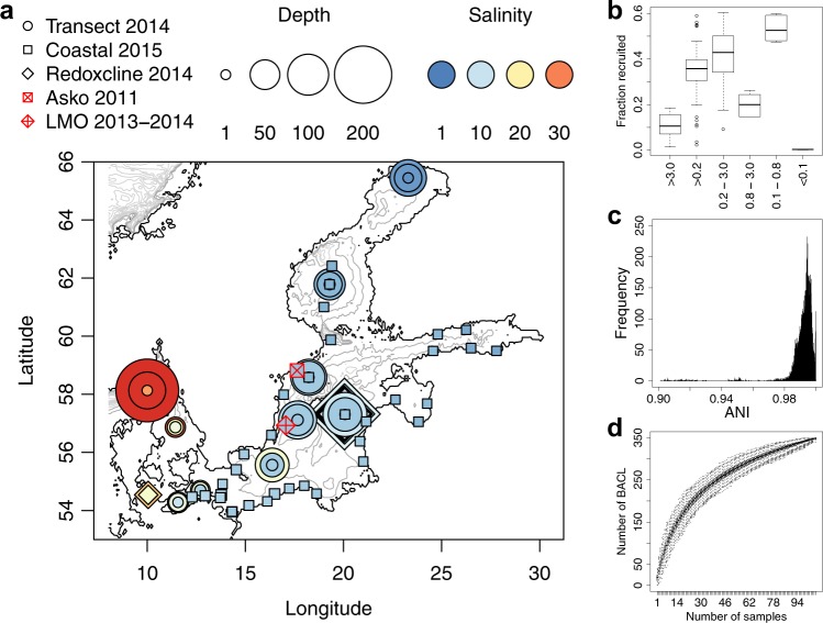
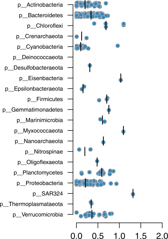
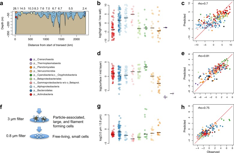
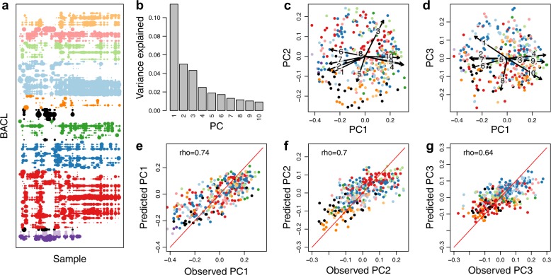
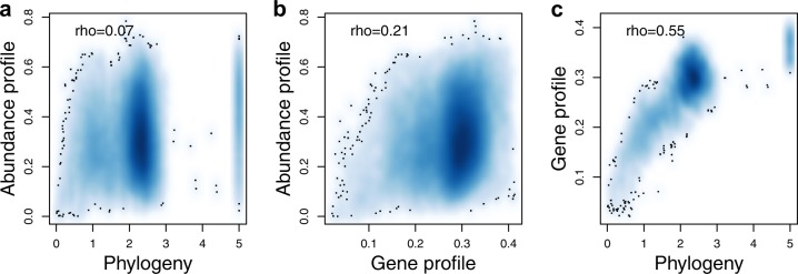
The genome encodes the metabolic and functional capabilities of an organism and should be a major determinant of its ecological niche. Yet, it is unknown if the niche can be predicted directly from the genome. Here, we conduct metagenomic binning on 123 water samples spanning major environmental gradients of the Baltic Sea. The resulting 1961 metagenome-assembled genomes represent 352 species-level clusters that correspond to 1/3 of the metagenome sequences of the prokaryotic size-fraction. By using machine-learning, the placement of a genome cluster along various niche gradients (salinity level, depth, size-fraction) could be predicted based solely on its functional genes. The same approach predicted the genomes' placement in a virtual niche-space that captures the highest variation in distribution patterns. The predictions generally outperformed those inferred from phylogenetic information. Our study demonstrates a strong link between genome and ecological niche and provides a conceptual framework for predictive ecology based on genomic data.


Conflict of interest statement

The authors declare no competing interests.

Figures

Fig. 1
Fig. 1. Sampling stations and summary of metagenome binning results.
a Map of sampling locations. The included sample sets are indicated with different symbols. The marker colour indicates the salinity of the water sample while the size indicates the sampling depth. The contour lines indicate depth with 50 m intervals. Three of the sample sets have previously been published: Askö Time Series 2011 (n = 24), Redoxcline 2014 (n = 14) and Transect 2014 (n = 30); and two are released with this paper: LMO Time Series 2013–2014 (n = 22) and Coastal Transect 2015 (n = 34). The map was generated with the marmap R package using the ETOPO1 database hosted by NOAA. b Proportion of metagenome reads recruited to the metagenome-assembled genomes (MAGs), summarized with one boxplot per filter size fraction. c Distribution of pairwise inter-MAG distances. Only average nucleotide identity (ANI) values >0.9 are shown. Minimum and maximum within-cluster identity for multi MAG Baltic Sea clusters (BACL) were 96.8% and 100.0%, respectively. Only four BACLs had any MAG with >96.5% identity to any MAG in another BACL. d Rarefaction curve showing number of obtained BACLs as a function of number of samples. Boxplots show distributions from 1000 random samplings.
Fig. 2
Fig. 2. Phylogenetic distances between BACLs and nearest GTDB neighbors.
Each circle is a BACL represented by a MAG and the placement along the x-axis indicates phylogenetic distance to the nearest reference genome in the GTDB tree. Distributions are plotted separately for each phylum, with median values indicated by verticallines.
Fig. 3
Fig. 3. Observed and predicted distributions of BACLs along selected niche gradients.
a Side view of Transect 2014 with surface and mid layer samples indicated by circles, colored according to salinity as in Fig. 1. Numbers above the graph indicate salinity in the surface layer samples. b Ratio between abundance in the high and low salinity surface samples of the Transect 2014 cruise. Values are log ratios of the mean abundances in the 14.5 and 28 PSU and the 2.4 and 5.5 PSU samples. Distributions are plotted separately for each taxon, with median values indicated by horizontal lines. c Machine learning predicted vs. observed log ratio between abundance in the high and low salinity samples. d Ratio between abundance in surface and abundance in mid layer water samples from the Transect 2014 cruise. Values are average log ratios for the 10 surface/mid sample pairs. e Machine learning predicted vs. observed log ratio between abundance in surface and mid layer samples. f Cartoon indicating difference between cells captured on 3 and 0.8 μm filters by sequential filtration. g Ratio between abundance on 3.0 μm and abundance on 0.8 μm filters in the Askö Time Series 2011 sample set. Values are average log ratios for the six 3.0 μm/0.8 μm sample pairs. h Machine learning predicted vs. observed log ratio between abundance on 3.0 and 0.8 μm filters. Machine learning predictions performed by gradient boosting using gene (eggNOG) profiles. Low abundance BACLs were excluded from the graphs in b, d, g (see Methods).
Fig. 4
Fig. 4. Observed and predicted distributions of BACLs along principal axes of abundance variation.
a BACL abundance profiles (one BACL per line; the 99 most abundant BACL shown) across all 124 samples, with dot size proportional to log abundance in the sample, using the same color schema as in Fig. 3 but with additional taxa shown in black. bd Principal coordinates analysis of BACL abundance profiles, with b displaying proportion of variation explained by the ten first principal coordinates (PC) and c, d plotting the BACLs along the first three principal coordinates. The arrows indicate relationships between the principal coordinates and measured environmental parameters (see Methods), where the numbers correspond to 1: salinity; 2: depth; 3: oxygen; 4: temperature; 5: filter size; 6: nitrate; 7: phosphate; 8: silicate; 9: chlorophyll a; 10: dissolved organic carbon. eg Machine learning predicted (gradient boosting using gene profiles) vs. observed values of principal coordinate scores, with e displaying results for PC1, f for PC2 and g for PC3. Rho-values indicate Spearman rank correlation coefficients between predicted and observed values (all correlations P < 10-16). Prediction results for PC1–PC10 using different machine learning algorithms can be found in Supplementary Table 2.
Fig. 5
Fig. 5. Relationships between ecology, phylogeny and gene-content.
a Abundance profile dissimilarity (y-axis) vs. phylogenetic distance (x-axis). b Abundance profile dissimilarity (y-axis) vs. gene profile dissimilarity (x-axis). c Gene profile dissimilarity (y-axis) vs. phylogenetic distance (x-axis). Rho-values indicate Spearman rank correlation coefficients. All correlations were significant (Mantel test, P = 10−4, number of permutations = 104). The background color indicates density of datapoints (BACLs). Individual data points are not shown, except those falling in low density areas (black dots).

References

    1. Hutchinson GE. Concluding remarks. Cold Spring Harb. Symposia Quant. Biol. 1957;22:415–427. doi: 10.1101/SQB.1957.022.01.039. - DOI
    1. Webb CO. Exploring the phylogenetic structure of ecological communities: an example for rain forest trees. Am. Nat. 2000;156:145–155. doi: 10.1086/303378. - DOI - PubMed
    1. Horner-Devine MC, Bohannan BJM. Phylogenetic clustering and overdispersion in bacterial communities. Ecology. 2006;87:S100–8. doi: 10.1890/0012-9658(2006)87[100:PCAOIB]2.0.CO;2. - DOI - PubMed
    1. Burns JH, Strauss SY. More closely related species are more ecologically similar in an experimental test. Proc. Natl Acad. Sci. USA. 2011;108:5302–5307. doi: 10.1073/pnas.1013003108. - DOI - PMC - PubMed
    1. Andersson AF, Riemann L, Bertilsson S. Pyrosequencing reveals contrasting seasonal dynamics of taxa within Baltic Sea bacterioplankton communities. ISME J. 2010;4:171–181. doi: 10.1038/ismej.2009.108. - DOI - PubMed

Publication types