doi: 10.1083/jcb.202001064.
SuperPlots: Communicating reproducibility and variability in cell biology
Affiliations
- PMID: 32346721
- PMCID: PMC7265319
- DOI: 10.1083/jcb.202001064
Item in Clipboard
SuperPlots: Communicating reproducibility and variability in cell biology
J Cell Biol.
.
Abstract
P values and error bars help readers infer whether a reported difference would likely recur, with the sample size n used for statistical tests representing biological replicates, independent measurements of the population from separate experiments. We provide examples and practical tutorials for creating figures that communicate both the cell-level variability and the experimental reproducibility.
© 2020 Lord et al.
Figures
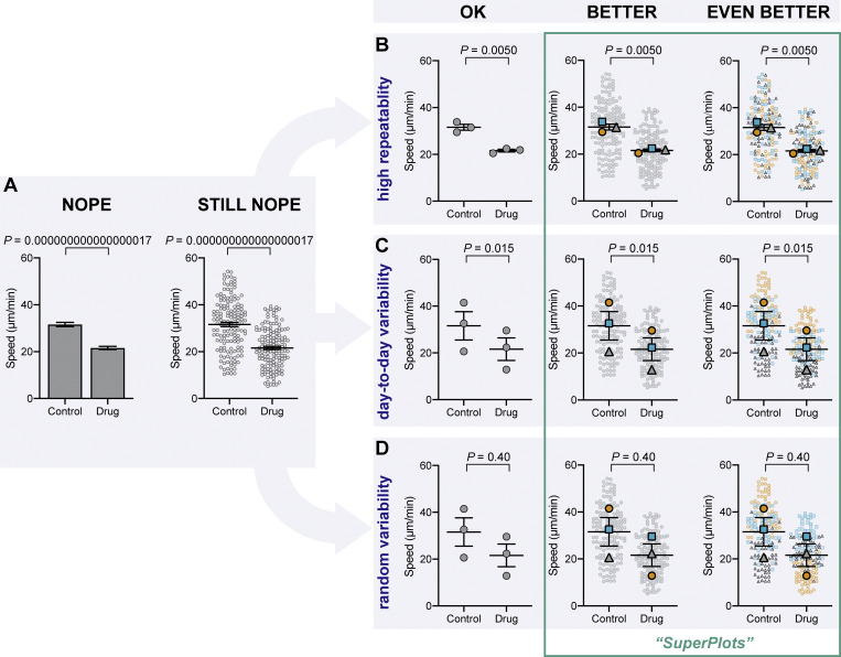
The importance of displaying reproducibility. Drastically different experimental outcomes can result in the same plots and statistics unless experiment-to-experiment variability is considered. (A) Problematic plots treat n as the number of cells, resulting in tiny error bars and P values. These plots also conceal any systematic run-to-run error, mixing it with cell-to-cell variability. (B–D) To illustrate this, we simulated three different scenarios that all have identical underlying cell-level values but are clustered differently by experiment: B shows highly repeatable, unclustered data, C shows day-to-day variability, but a consistent trend in each experiment, and D is dominated by one random run. Note that the plots in A that treat each cell as its own n fail to distinguish the three scenarios, claiming a significant difference after drug treatment, even when the experiments are not actually repeatable. To correct that, “SuperPlots” superimpose summary statistics from biological replicates consisting of independent experiments on top of data from all cells, and P values were calculated using an n of three, not 300. In this case, the cell-level values were separately pooled for each biological replicate and the mean calculated for each pool; those three means were then used to calculate the average (horizontal bar), standard error of the mean (error bars), and P value. While the dot plots in the “OK” column ensure that the P values are calculated correctly, they still fail to convey the experiment-to-experiment differences. In the SuperPlots, each biological replicate is color-coded: the averages from one experimental run are yellow dots, another independent experiment is represented by gray triangles, and a third experiment is shown as blue squares. This helps convey whether the trend is observed within each experimental run, as well as for the dataset as a whole. The beeswarm SuperPlots in the rightmost column represent each cell with a dot that is color-coded according to the biological replicate it came from. The P values represent an unpaired two-tailed t test (A) and a paired two-tailed t test (B–D). For tutorials on making SuperPlots in Prism, R, Python, and Excel, see the supporting information.
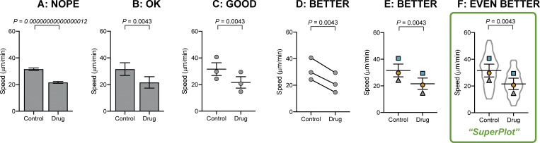
Other plotting examples. Bar plots can be enhanced even without using beeswarm plots. (A) Bar plots that calculate P and standard error of the mean using the number of cells as n are unhelpful. (B) A bar graph can be corrected by using biological replicates to calculate P value and standard error of the mean. (C) Dot plots reveal more than a simple bar graph. (D and E) Linking each pair by the replicate conveys important information about the trend in each experiment. (F) A SuperPlot not only shows information about each replicate and the trends, but also superimposes the distribution of the cell-level data, here using a violin plot.
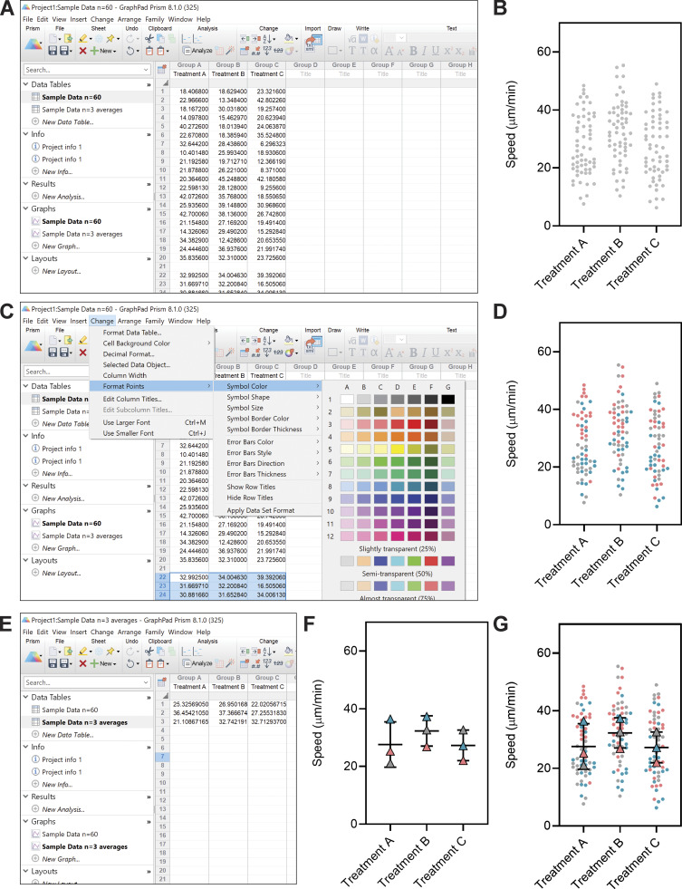
Tutorial for making SuperPlots in Prism. We describe how to make SuperPlots in GraphPad Prism 8 (version 8.1.0) graphing software. If using other graphing software, one may create a separate, different colored plot for each replicate, then overlay those plots in software like Adobe Illustrator. (A) When adding data to the table, leave a blank row between replicates. (B) Create a new graph of this existing data; under type of graph select “Column” and “Individual values,” and select “No line or error bar.” (C) After formatting the universal features of plot from B (e.g., symbol size, font, axes), go back to the data table and highlight the data values that correspond to one of the replicates. Under the “Change” menu, select “Format Points” and change the color, shape, etc. of the subset of points that correspond to that replicate. (D) Repeat for the other replicates to produce a graph with each trial color coded. (E and F) To display summary statistics, take the average of the technical replicates in each biological replicate (so you will have one value for each condition from each biological replicate), and enter those averages into another data table and graph. Use this data sheet that contains only the averages to run statistical tests. (G) To make a plot that combines the full dataset with the correct summary statistics, format this graph and overlay it with the above scatter SuperPlots (in Prism, this can be done on a “Layout”). This process could be tweaked to display other overlaid, color-coded plots (e.g., violin).
Tutorial for making SuperPlots in Excel.
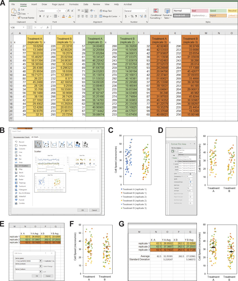
(A) To make a SuperPlot using Excel (Microsoft Office 365 ProPlus for Windows; version 1912; Build 12325.20172), enter the values for the first replicate for the first condition into column B (highlighted in yellow), the second condition into column D (highlighted in yellow), and continue to skip columns between datasets for the remaining conditions and replicates (in this example, replicate 2 is highlighted in green and replicate 3 is in orange). For example, “Treatment A” could be control cells and “Treatment B” could be drug-treated cells. Label the empty columns as “x” and, starting with column A, enter random values to generate the scatter effect by using the formula “=RANDBETWEEN(25, 100)”. To create a gap between the datasets A and B, use larger X values for treatment B by entering the formula “=RANDBETWEEN(225, 300)”. (B) Highlight all the data and headings. In the insert menu, expand the charts menu to open the “Insert Chart” dialog box. Select “All Charts,” and choose “X Y Scatter.” Select the option that has Y values corresponding to your datasets. (In Excel for Mac, there is not a separate dialog box. Instead, make a scatter plot, right click on the plot and select “Select Data,” remove the “x” columns from the list, then manually select the corresponding “X values =” for each dataset.) (C) Change the general properties of the graph to your liking. In this example, we removed the chart title and the gridlines, added a black outline to the chart area, resized the graph, adjusted the x axis range to 0–325, removed the x axis labels, added a y axis title and tick marks, changed the font to Arial, and changed the font color to black. This style can be saved as a template for future use by right clicking. We recommend keeping the figure legend until the next step. (D) Next, double click the graph to open the “Format Plot Area” panel. Under “Chart Options,” select your first dataset, “Series Treatment A (replicate 1).” (On a Mac, click on a datapoint from one of the replicates, right click and select “Format Data Series.”) Select “Marker” and change the color and style of the data points. Repeat with the remaining datasets so that the colors, shapes, etc. correspond to the biological replicate the data points came from. Delete the chart legend and add axis labels with the text tool if desired. (E) Calculate the average for each replicate for each condition, and pair this value with the X coordinate of 62.5 for the first treatment, and 262.5 for the second treatment to center the values in the scatterplot. Then, click the graph, and under the “Chart Design” menu, click “Select Data.” Under “Legend Entries (Series),” select “Add” and under series name, select the three trial names, then select all three X and Y values for first treatment condition for “Series X Values” and “Series Y Values,” respectively. Repeat for the second treatment condition, and hit “OK.” (F) On the chart, select the data point corresponding to the first average and double click to isolate the data point. Format the size, color, etc. and repeat for remaining data points. (G) Optional: To add an average and error bars, either generate a second graph and overlay the data, or calculate the average and standard deviation using Excel and add the data series to the graph as was done in E and F, using the “-” symbol for the data point.

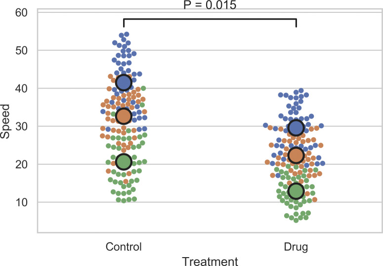
Tutorial for making SuperPlots in R. Here is some simple code to help make SuperPlots in R using the ggplot2, ggpubr, dplyr, and ggbeeswarm packages. Dataset that can be renamed “combined” is included in the supporting information. Lines separated by semicolons: ReplicateAverages <- combined %>% group_by(Treatment, Replicate) %>% summarise_each(list(mean)); ggplot(combined, aes(x=Treatment,y=Speed,color=factor(Replicate))) + geom_beeswarm(cex=3) + scale_colour_brewer(palette = "Set1") + geom_beeswarm(data=ReplicateAverages, size=8) + stat_compare_means(data=ReplicateAverages, comparisons = list(c("Control", "Drug")), method="t.test", paired=TRUE) + theme(legend.position="none").
Tutorial for making SuperPlots in Python. Here is some simple code to help make SuperPlots in Python using the Matplotlib, Pandas, Numpy, Scipy, and Seaborn packages. Dataset that can be renamed “combined.csv” is included in the supporting information. Lines separated by semicolons: combined = pd.read_csv("combined.csv"); sns.set(style="whitegrid"); ReplicateAverages = combined.groupby(['Treatment','Replicate'], as_index=False).agg({'Speed': "mean"}); ReplicateAvePivot = ReplicateAverages.pivot_table(columns='Treatment', values='Speed', index="Replicate"); statistic, pvalue = scipy.stats.ttest_rel(ReplicateAvePivot['Control'], ReplicateAvePivot['Drug']); P_value = str(float(round(pvalue, 3))); sns.swarmplot(x="Treatment", y="Speed", hue="Replicate", data=combined); ax = sns.swarmplot(x="Treatment", y="Speed", hue="Replicate", size=15, edgecolor="k", linewidth=2, data=ReplicateAverages); ax.legend_.remove(); x1, x2 = 0, 1; y, h, col = combined['Speed'].max() + 2, 2, 'k'; plt.plot([x1, x1, x2, x2], [y, y+h, y+h, y], lw=1.5, c=col); plt.text((x1+x2)*.5, y+h*2, "P = "+P_value, ha='center', va='bottom', color=col).