. 2020 May 19;11(1):2486.
doi: 10.1038/s41467-020-16184-x.

Rapid cost decrease of renewables and storage accelerates the decarbonization of China's power system

Affiliations

Rapid cost decrease of renewables and storage accelerates the decarbonization of China's power system

Gang He et al. Nat Commun. .

Erratum in

Abstract

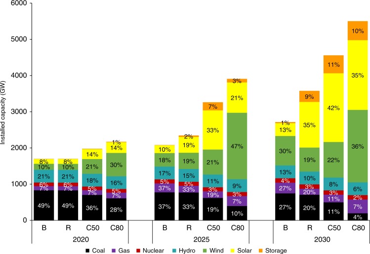
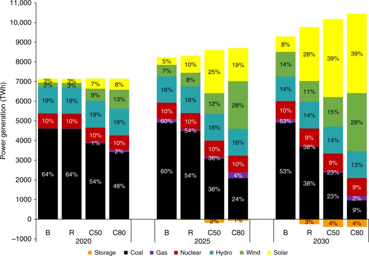
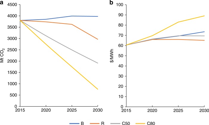
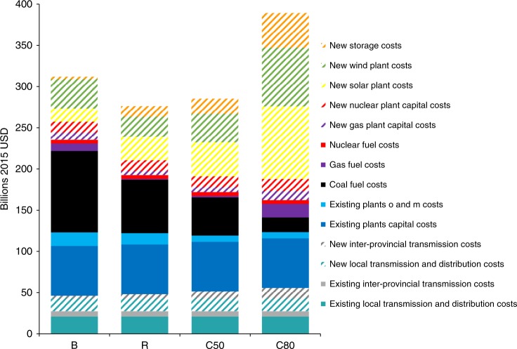
The costs for solar photovoltaics, wind, and battery storage have dropped markedly since 2010, however, many recent studies and reports around the world have not adequately captured such dramatic decrease. Those costs are projected to decline further in the near future, bringing new prospects for the widespread penetration of renewables and extensive power-sector decarbonization that previous policy discussions did not fully consider. Here we show if cost trends for renewables continue, 62% of China's electricity could come from non-fossil sources by 2030 at a cost that is 11% lower than achieved through a business-as-usual approach. Further, China's power sector could cut half of its 2015 carbon emissions at a cost about 6% lower compared to business-as-usual conditions.


Conflict of interest statement

The authors declare no competing interests.

Figures

Fig. 1
Fig. 1. National capacity mix for four scenarios in 2020, 2025, and 2030.
The scale of the bar chart are the installed capacity by technologies, and the data labels show the share of each technology in total capacity. Source data are provided as a Source Data file.
Fig. 2
Fig. 2. National power-generating mix for four scenarios in 2020, 2025, and 2030.
The scale of the bar chart are the generation by technologies, and the data labels show the share of generation by each technology in total generation. Source data are provided as a Source Data file.
Fig. 3
Fig. 3. Hourly dispatch sources in 2030 under the R and C50 scenarios.
Two days, a normal day (•) and a peak day (••) are selected in each month to represent the month. Black solid line is the system load. a Hourly dispatch in the R scenario. b Hourly dispatch in the C50 scenario. Source data are provided as a Source Data file.
Fig. 4
Fig. 4. Carbon emissions and power costs to 2030 under four scenarios.
a Carbon emissions and b Power costs are shown in the business as usual scenario (B), the low-cost renewables scenario (R), the carbon constraints scenario (C50), and the deep carbon constraints scenario (C80), respectively. Power costs in the R scenario and the C50 scenario are 11% and 6% lower than that of the BAU scenario in 2030, respectively. Source data are provided as a Source Data file.
Fig. 5
Fig. 5. Distribution and costs of power sources under four scenarios in 2030.
The costs are categorized into existing and new capacity and transmission. Fossil fuel technologies and nuclear have fuel costs. Source data are provided as a Source Data file.
Fig. 6
Fig. 6. Provincial total capacity mix and new transmission lines required by 2030 under the R scenario.
The pie charts shows the total power capacity mix in each province, and the red lines show the new interprovincial transmission lines to bring electricity from resource centers to demand centers. Source data are provided as a Source Data file.
Fig. 7
Fig. 7. Regional generation, demand, and interregional transmission map for the R scenario in 2030.
The different grids are shaded in different colors based on the dominating energy source as the region decarbonizes. For example, the Northeastern grid is dominated by high wind energy penetration and is therefore shaded green and the Central grid is dominated by hydro electricity generation and is therefore shaded blue. Each region shows a graph with four bars representing the generation for the four different scenarios in order of increased carbon reduction (from left to right: BAU, R, C50, and C80, respectively). The dotted line across all bars in each set of generation graphs represents the yearly demand in 2030 in each region, which stays constant across the four scenarios. The magenta arrows point in the direction of the transmission flow between two regions. Source data are provided as a Source Data file.
Fig. 8
Fig. 8. Sensitivity analyses of 2030 capacity and generation mixes under the D + 20% and C + 20% scenarios.
a installed capacity mix. b power generation mix. D + 20% assumes that demand increases linearly 20% until 2030; C + 20% assumes that the capital costs of solar, wind, and storage are 20% higher than under the R scenario. Source data are provided as a Source Data file.

References

    1. IEA. CO2 Emissions from Fuel Combustion 2019. (Organisation for Economic Co-operation and Development, 2019).
    1. UNEP. Emissions Gap Report 2018. https://unenvironment.org/resources/emissions-gap-report-2018 (2018).
    1. Zhou N, et al. China’s energy and emissions outlook to 2050: perspectives from bottom-up energy end-use model. Energy Policy. 2013;53:51–62. doi: 10.1016/j.enpol.2012.09.065. - DOI
    1. ERI. China 2050 High Renewable Energy Penetration Scenario and Roadmap Study. http://efchina.org/Attachments/Report/report-20150420/China-2050-High-Re... (2015).
    1. Yuan J, et al. Peak energy consumption and CO2 emissions in China. Energy Policy. 2014;68:508–523. doi: 10.1016/j.enpol.2014.01.019. - DOI