. 2020 May 29;11(1):2680.
doi: 10.1038/s41467-020-16354-x.

A genome-scale map of DNA methylation turnover identifies site-specific dependencies of DNMT and TET activity

Affiliations

A genome-scale map of DNA methylation turnover identifies site-specific dependencies of DNMT and TET activity

Paul Adrian Ginno et al. Nat Commun. .

Abstract

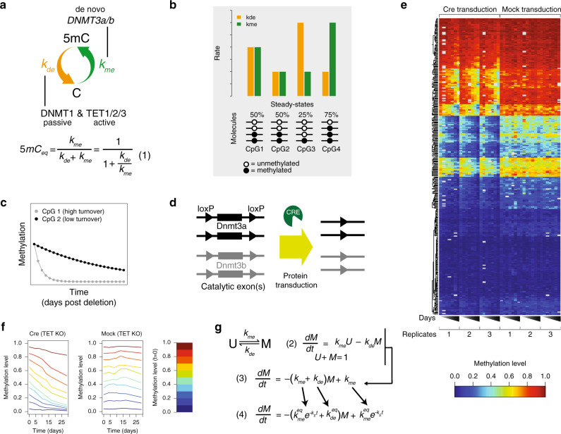
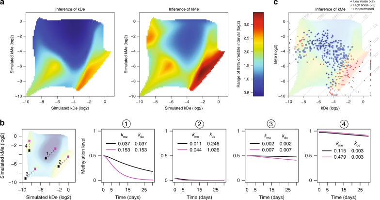
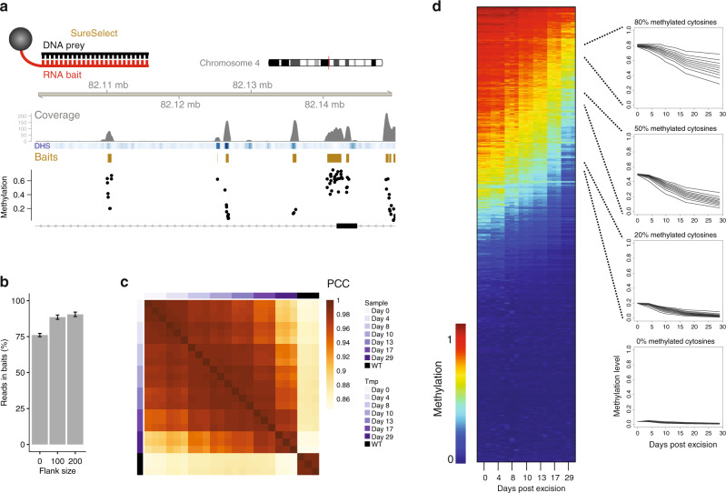
DNA methylation is considered a stable epigenetic mark, yet methylation patterns can vary during differentiation and in diseases such as cancer. Local levels of DNA methylation result from opposing enzymatic activities, the rates of which remain largely unknown. Here we developed a theoretical and experimental framework enabling us to infer methylation and demethylation rates at 860,404 CpGs in mouse embryonic stem cells. We find that enzymatic rates can vary as much as two orders of magnitude between CpGs with identical steady-state DNA methylation. Unexpectedly, de novo and maintenance methylation activity is reduced at transcription factor binding sites, while methylation turnover is elevated in transcribed gene bodies. Furthermore, we show that TET activity contributes substantially more than passive demethylation to establishing low methylation levels at distal enhancers. Taken together, our work unveils a genome-scale map of methylation kinetics, revealing highly variable and context-specific activity for the DNA methylation machinery.


Conflict of interest statement

The authors declare no competing interests.

Figures

Fig. 1
Fig. 1. A dynamical model and cellular system to infer methylation and demethylation rates.
a Graphic representation of methylation and demethylation rates. The orange and green arrows represent kde and kme, respectively. The enzymes responsible for influencing rates are noted. The ratio of rates determines overall methylation levels (Equation (1) below). b Example steady-state methylation levels resulting from different kme (green) and kde (orange) combinations. Higher methylation levels are established when kme is larger than kde, while low methylation levels represent the opposite. CpGs with the same steady state can have different rates as shown here for 50%. c Theoretical trace of methylation loss over time post Cre transduction for two CpGs with similar steady states. d Cellular system for genetic ablation of kme. Dnmt3a and Dnmt3b with loxP sites flanking catalytic exons. Cre protein transduction allows for efficient genetic deletion of all four alleles. e Heatmap of methylation levels for 405 CpGs as measured by amplicon bisulfite sequencing. The left half represents methylation levels for triplicate experiments measured 0, 4, 8, 10, 13, 17, and 29 days post Cre transduction. The right half represents triplicates for mock-treated samples. f CpGs were binned based on starting methylation in 10% increments, and the mean decay over triplicates for Cre-transduced samples (left) and mock samples (right) are shown. g Dynamical model for DNA methylation and implementation of the exponential dampening factor ke for affecting kme over time (Eqs. (2)–(4)). See text and “Methods” for details.
Fig. 2
Fig. 2. The inference landscape for methylation and demethylation rates.
a Inference landscape for kde (left) and kme (right), respectively, given all 6400 possible combinations tested (see “Methods”). Blue regions represent high-confidence regimes were rates can be accurately inferred, whereas CpGs lying in the green to yellow regimes are increasingly difficult and ultimately impossible to determine with high confidence. Confidence levels were determined by an error model explicitly detailed in “Methods”. b Example pairs of CpGs and their placement in the inference landscape. Theoretical decay curves for the point pairs (connected by dashed lines) are shown to the right. Each pair number trajectory from the far left panel is shown individually in the right four panels. Note, rates for some CpGs can be accurately distinguished (1), while others have reduced confidence (3) or are governed by rates that are not possible to determine (2 and 4). c Points representing rate combinations for all CpGs (405) measured with amplicon sequencing. Points are overlaid on the inference landscape taking both kde and kme into account, inference colors are as a. Blue points have low noise in rate inference, while red points represent CpGs where noise is high. Black points represent CpGs where rates cannot be determined. Because the logarithm of the rates is displayed on both axes, lines with a slope of one (cases 1–3) correspond to rate combinations that result in the same steady-state methylation level but with different turnover.
Fig. 3
Fig. 3. Genome-scale measurement of methylation kinetics.
a Outline of the SureSelect strategy (above) and a browser screenshot of raw read counts, DHS signal (blue), bait design regions (gold), and CpG methylation level measured prior to induced deletion (black dots). b Percentage of reads in libraries mapping to bait regions. Bars represent bait region boundary extension by 0, 100, or 200 bp, respectively. Error bars represent two standard deviations from the mean of three replicates. c Hierarchical clustering of methylation levels for all samples measured. Annotation column and row depicts days post transduction and wild-type samples. PCC is the Pearson correlation coefficient. d Decay of methylation over time for 2.1 million CpGs. Color scale is as in Fig. 1e, dark red representing 100% methylated CpGs and dark blue representing 0% methylation. Traces to the right represent average profiles of CpGs with similar steady states (noted above panels) but different decay kinetics. CpGs with steady states of 20, 50, and 80% (±2%) were separated into decile bins based on kde and average profiles from these bins are shown.
Fig. 4
Fig. 4. Rate combinations are characteristic of particular genomic contexts.
a Scatterplot of kde and kme for all cytosines. Dashed lines represent different steady-state methylation levels, which are noted on the right upper borders. b Scatterplots as in a, but with CpGs colored according to overlap with previous genome annotations,. Red points represent CpGs of interest for the particular genomic annotation. For example, in the first panel all CpGs overlapping with promoter regions are shown in red, while all CpGs outside of promoters are shown in gray. The number of CpGs overlapping with each state are noted above the respective panel. A graphical depiction of the genomic annotations for the five different contexts is shown below the scatterplots. c Scatterplot of methylation levels measured in wild-type (x-axis) and TTKO cells (y-axis). Inset: change in kde as a function of TET activity. Values on the x-axis represent log2(kdeWT) − log2(kdeTTKO). The vertical blue line represents CpGs where TET activity has no effect on kde, while the red vertical line represents a three-fold increase in the demethylation rate as a function of TET activity. Note the almost unimodal shift in steady-state methylation levels underscoring the role of TET proteins as demethylases. d TET mediated changes in kde as a function of genomic context. TET activity is as defined above in c. Annotated regions are sorted based on mean change in kde. The box represents the middle 50% of the data, the line inside the box is the median, and whiskers are defined by the most extreme values lying within 1.5 times the interquartile range.
Fig. 5
Fig. 5. Turnover at highly methylated cytosines correlates with genomic activity.
a Scatterplot of kde and kme highlighting CpGs in red that have a high steady state ≥70%). b Rates and methylation levels as a function of location in genic regions. Mean values for CpGs are represented as a function of their position in genes as a percentage (i.e., each genic region represents 100 bins). Upstream and downstream of noted TSS and TTS regions represent 10 kb of flanking DNA. Each row in the heatmap represents a collection of genes binned on transcriptional output in RPKM (five bins total), with the highest expressing bin on top. Each bin represents at least 2k genes. c Heatmap representing signal for eight different chromatin marks across bins of highly methylated cytosines (red points from a). Mean histone signal was calculated by tiling the genome into 1 kb bins and determining enrichment in ChIP signal over input for the respective marks. From left to right, bins are split based on mean methylation turnover within the bin, with the highest turnover bin on the far right. Note the increase in H3K36me3 and active marks, with the concomitant decrease in H3K9me2/3. d Turnover increases with proximity to distal regulatory elements. CpGs were binned on turnover as for c, but their distance to the nearest DHS site was calculated. Boxplot elements are as defined in Fig. 4d.
Fig. 6
Fig. 6. Transcription factor binding shows variable effects on methylation and demethylation activity.
a Rates and TET activity as a function of distal DHS signal. The mouse genome was split into 500 bp bins, and reads tallied for all bins that were completely mappable. Bins were then selected as having a minimum distance of 10 kb from an annotated promoter, and split based on number of DHS reads overlapping these bins. DHS signal increases with increasing bin number, where it is apparent that while kme (left) decreases with increasing accessibility, both kde (middle) and TET activity (right) increase. Boxplot elements are as defined in Fig. 4d. b Rates and TET activity as a function of distance to bound TF motifs. ENCODE ChIP data for 15 TFs was quantified by counting reads surrounding motifs for each TF in a 201 bp window centered on the motif. Each row of the heatmap represents mean rates as a function of distance to the center of the motif for the respective factor. Sites represented here were selected as the top 900 enriched motif occurrences for each factor (see “Methods” for enrichment determination). c Nucleosome positioning, rate of de novo methylation, passive demethylation, and TET activity around bound CTCF sites, color as in b. MNase read counts were shifted by 75 bp to reflect position of the nucleosome dyad. d Model representing the effect of chromatin processes on methylation and demethylation rates. Presence of bound transcription factors can inhibit both processes, while transcription through gene bodies results in increased de novo methylation and passive demethylation. TET proteins in contrast tend to illicit the strongest effect on demethylation rates at accessible regions proximal to bound transcription factors.

Similar articles

Cited by

References

    1. Baubec T, Schubeler D. Genomic patterns and context specific interpretation of DNA methylation. Curr. Opin. Genet Dev. 2014;25:85–92. - PubMed
    1. Jaenisch R, Bird A. Epigenetic regulation of gene expression: how the genome integrates intrinsic and environmental signals. Nat. Genet. 2003;33:245–254. - PubMed
    1. Bird A. DNA methylation patterns and epigenetic memory. Genes Dev. 2002;16:6–21. - PubMed
    1. Smith ZD, Meissner A. DNA methylation: roles in mammalian development. Nat. Rev. Genet. 2013;14:204–220. - PubMed
    1. Stadler MB, et al. DNA-binding factors shape the mouse methylome at distal regulatory regions. Nature. 2011;480:490–495. - PubMed

Publication types

MeSH terms