. 2020 Jun 1;10(1):8845.
doi: 10.1038/s41598-020-64083-4.

Detecting cardiac pathologies via machine learning on heart-rate variability time series and related markers

Affiliations

Detecting cardiac pathologies via machine learning on heart-rate variability time series and related markers

Elena Agliari et al. Sci Rep. .

Abstract

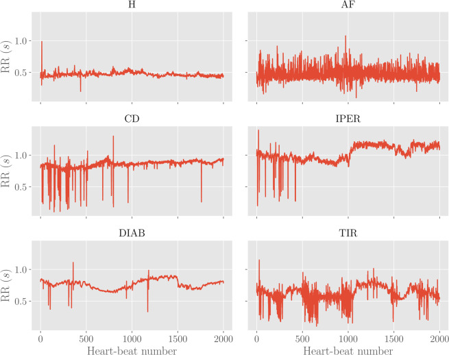
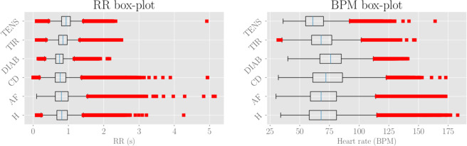
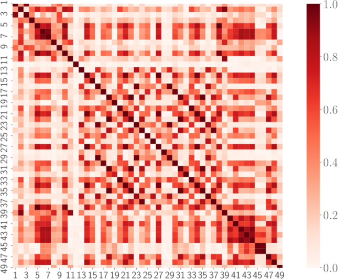
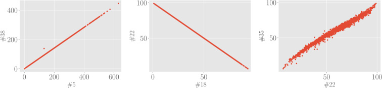
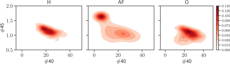
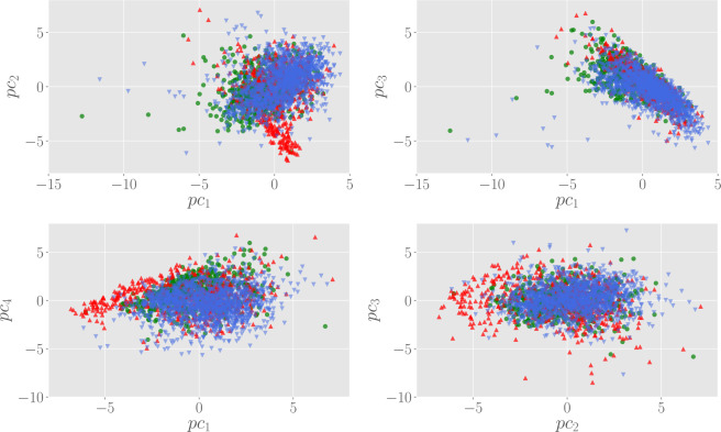
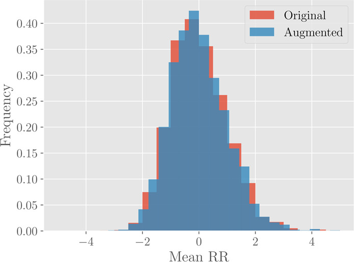
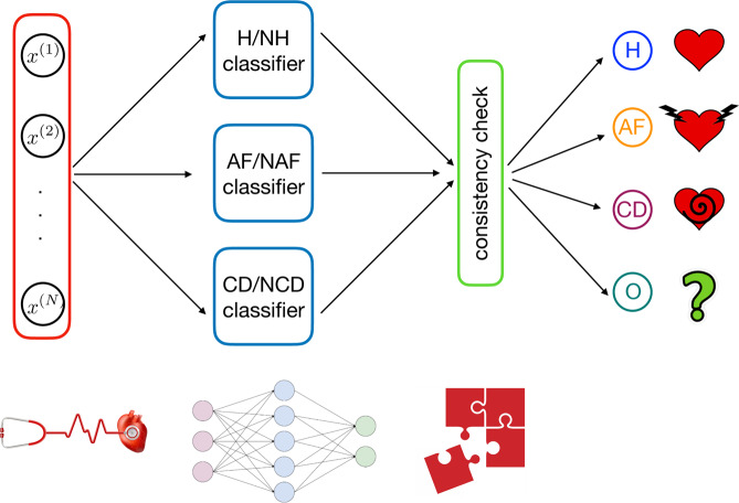
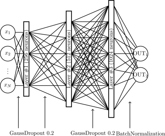
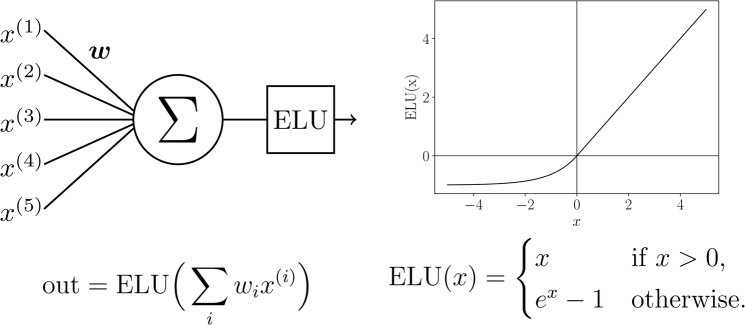
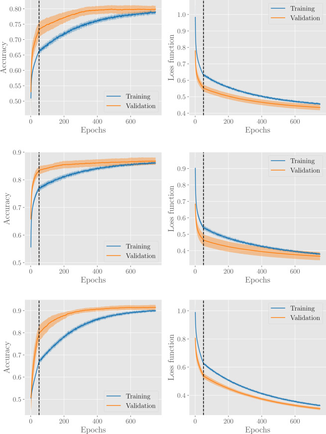
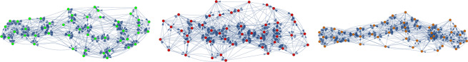
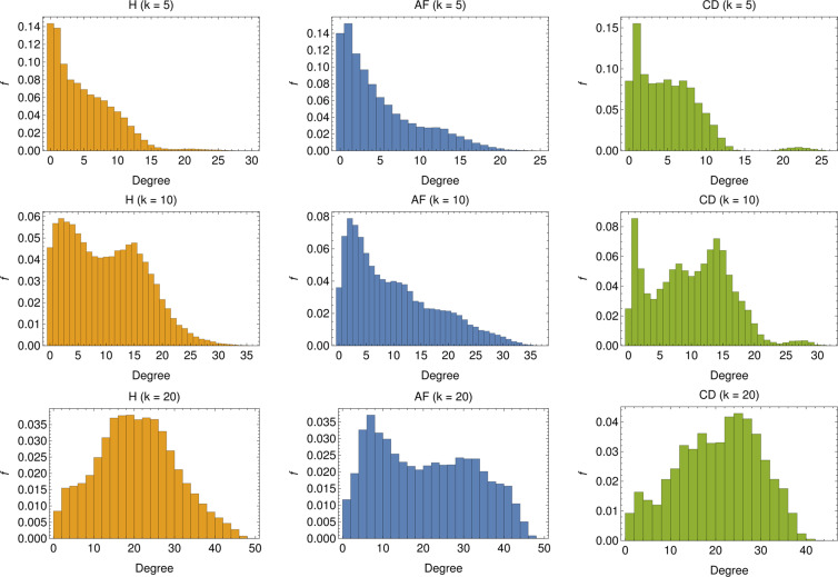
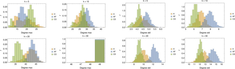
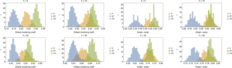
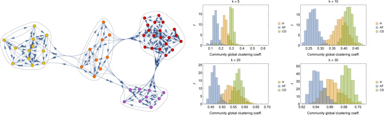
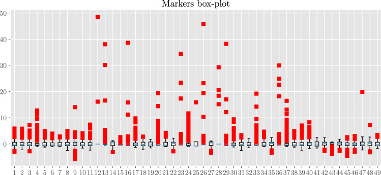
In this paper we develop statistical algorithms to infer possible cardiac pathologies, based on data collected from 24 h Holter recording over a sample of 2829 labelled patients; labels highlight whether a patient is suffering from cardiac pathologies. In the first part of the work we analyze statistically the heart-beat series associated to each patient and we work them out to get a coarse-grained description of heart variability in terms of 49 markers well established in the reference community. These markers are then used as inputs for a multi-layer feed-forward neural network that we train in order to make it able to classify patients. However, before training the network, preliminary operations are in order to check the effective number of markers (via principal component analysis) and to achieve data augmentation (because of the broadness of the input data). With such groundwork, we finally train the network and show that it can classify with high accuracy (at most ~85% successful identifications) patients that are healthy from those displaying atrial fibrillation or congestive heart failure. In the second part of the work, we still start from raw data and we get a classification of pathologies in terms of their related networks: patients are associated to nodes and links are drawn according to a similarity measure between the related heart-beat series. We study the emergent properties of these networks looking for features (e.g., degree, clustering, clique proliferation) able to robustly discriminate between networks built over healthy patients or over patients suffering from cardiac pathologies. We find overall very good agreement among the two paved routes.


Conflict of interest statement

The authors declare no competing interests.

Figures

Figure 1
Figure 1
Examples of RR time-series for different classes. Each plot shows the first 2000 points (i.e. heart beats) with the corresponding RR intervals (in seconds) for the various classes considered.
Figure 2
Figure 2
Left: RR box-plot (left panel) and BPM box-plot (right panel) for each subclass. The boxes represent the interquartile range, while the blue line is the median. Horizontal lines are the fliers extending from the boxes ends up in the whiskers, and finally red dots represent outlier points. The sample sizes are, respectively, 600 (H), 560 (AF), 232 (CD), 217 (TIR), 161 (DIAB), 113 (TEN).
Figure 3
Figure 3
Correlation plot for the 49 standardized markers. The colormap refers to the absolute value of the Pearson correlation coefficient Cij, since we are only interested in the magnitude of possible correlations.
Figure 4
Figure 4
Examples of scatter plot for highly correlated markers. Left panel: Standard deviation of the Poincaré plot in the direction orthogonal to the identity line (#38) versus square root of the mean squared differences between successive RR intervals (#5) displays a perfect correlation with unitary Pearson correlation. Central panel: Normalized power of the LF band evaluated with FFT-based methods (#22) versus normalized power of the HF band evaluated with FFT-based methods (#18) displays a perfect anti-correlation with Pearson coefficient equal to −1. Right panel: Normalized power of the HF band evaluated with autoregressive methods (#35) versus normalized power of the LF band evaluated with FFT-based methods (#22) display a large correlation with Pearson coefficient equal to 0.992.
Figure 5
Figure 5
These panels display the joint probability distribution Pclass(x(i),x(j)) for the couple (40, 45) of markers, obtained from the H (left), the AF (middle) and the O (right) classes. As highlighted by the shared colormap on the right, darker regions are those more more likely. Remarkably, the AF population tends to condense in a region quite far from the one characteristic of H and O patients, suggesting that they can be effectively distinguished from the H+O bulk.
Figure 6
Figure 6
Scatter plots in the space spanned by the first principal components. Here, green circles represent H patients, while AF and O are, respectively, red up and blue down triangles. In general, AF patients tend to clusterize in a zone outside the cloud of the H+O population.
Figure 7
Figure 7
Histograms for the marker #1 (Mean RR) before (red) and after (blue) the data augmentation. The original histogram takes into account 2300 different patients, while the augmented one is drawn from 46000 different data points.
Figure 8
Figure 8
Overall architecture of the classifier developed in this work. From left to right: first, for a given example n, we evaluate the entries of the vector xn and we use this as input for the machine. The number of entries in the input vector is N=41. This input is then simultaneously passed to the H/NH block – which evaluates whether the example corresponds to a healthy unit or not – to the AF/NAF block – which evaluates whether the example corresponds to a unit displaying atrial fibrillation or not – and to the CD/NCD block – which evaluates whether the example corresponds to a unit displaying congestive heart failure or not. The outcomes stemming from this layer are compared checking for consistency; if this test is passed the outer layer provides the classification.
Figure 9
Figure 9
Neural network architecture of the single classifier. The hidden layers are composed by neurons with exponential linear units (ELU), while the output layer is composed by two softmax neurons. Before each hidden layer, a Gaussian Dropout operation is performed, while before the output layer a Batch Normalization is executed. The OUT1,2 neurons are chosen according to the specific task (i.e. H/NH, AF/NAF or CD/NCD).
Figure 10
Figure 10
Schematical representation of ELU hidden units. In the left column, we give a schematical representation of neurons in the hidden layers. The inputs are summed according to the weights w, then the result is given as argument to the activation function (which is mathematically defined and depicted in the right column).
Figure 11
Figure 11
Results for the H/NH classifier (first row), AF/NAF classifier (second row) and CD/NCD classifier (third row). Panels in the left and in the right column show, respectively, the evolution of the accuracy and of the loss functions with the number of epochs. The vertical dashed lines denote the pre-training stages. Results are averaged over 20 different network training procedures, where, in each procedure, the dabase is split into a training set (containing 80% of examples, from the H, AF, CD, or O subsets respectively) and a validation set (containing the remaining 20% of examples). The solid line corresponds to the average over these procedures, while the coloured area around the curve highlights the standard deviation interval.
Figure 12
Figure 12
Examples of graphs for H (left), AF (center) and CD (right) patients. The graphs are realized by randomly extracting N=50 individuals in the H, AF and CD data-bases and by linking (with a directed edge) the first k=10 nearest patients for each node in the network according to the DTW distance.
Figure 13
Figure 13
In-degree distribution for several choices of k: The distributions are realized by merging the degree distributions of 1000 different realizations of O(100)-node graphs. For low values of k (i.e. k=5) we see that, for both the H and AF cases, the majority of nodes display rather low in-degree, and the in-degree distribution exhibits a long tail. Conversely, for the CD case, the in-degree is rather homogeneous up to din10, beyond which the tendency of nodes to acquire more links is softened (apart for a tiny fraction of nodes with din20÷25). By increasing k, nodes with low degree get fewer but still the most predominant for both H and AF patients but new peaks appear in the distribution (see k=10) highlighting a change of the topological structure of the network (see also the CD case). This structural change is clear for higher values of k (i.e. k=20), especially for H and CD, for which low-linked nodes are fewer, the majority of nodes presenting an in-degree comparable with k (din20÷25), ultimately suggesting that the networks are becoming regular.
Figure 14
Figure 14
Left panel: Distributions of the maximal degree for values of k(5,10,20,30). Apart for the largest value of k (where the graph tends to a fully connected), in all the other cases, the average maximal degree seems able to split AF from CD patients aiming for proper classification. Right panel: Distributions of the degree standard deviations for values of k(5,10,20,30); notice that, since for a certain choice of k, the average degree evaluated on different realizations of GH,AF,CD is constant and equal to k, the standard deviation correponds, a constant k apart, to the variation coefficient.
Figure 15
Figure 15
Left panel: Distributions of the GC coefficient for values of k(5,10,20,30). For all values of k, also the global clustering coefficient seems able to discriminate among the various classes. In particular, systematically, AF patients share lower clustering while CD patients share higher values of clustering. Right panel: Distributions of the GR for values of k(5,10,20,30). While the larger k the more pronounced the overlap between H and CD patients, yet classification of AF patients seems robust.
Figure 16
Figure 16
Left panel: A realization of GH, where different communities are highlighted. Right panel: Distributions of the GC coefficient measured in the various community detected for values of k(5,10,20,30). Also from this perspective, despite an increasing overlap between H and CD patients as k grows, discrimination for the AF patients seems possible and robust.
Figure 17
Figure 17
Box-plot diagram for the 49 standardized markers. Each line corresponds to a different marker as highlighted by the index on the left (see also Table 1). The blue vertical line within each box denotes the related median and each box spans from the lower to the upper related quartiles. Outer bars (whiskers) range from the lowest to the highest non-outlier data points. Bullets correspond to outlier data points.

References

    1. Ascent of machine learning in medicine. Nature Materials18(5), 407–407 (2019). - PubMed
    1. Chen P-HC, Liu Y, Peng L. How to develop machine learning models for healthcare. Nature Materials. 2019;18(5):410–414. doi: 10.1038/s41563-019-0345-0. - DOI - PubMed
    1. Saria, S., Butte, A. & Sheikh, A. Better medicine through machine learning: What's real, and what’s artificial? PLOS Medicine15(12), 1–5, 12 (2019). - PMC - PubMed
    1. Flaxman, A. D. & Vos, T. Machine learning in population health: Opportunities and threats. PLOS Medicine15(11), 1–3, 11 (2018). - PMC - PubMed
    1. Ashrafian, H. & Darzi, A. Transforming health policy through machine learning. PLOS Medicine15(11), 1–3, 11 (2018). - PMC - PubMed

Publication types