[Preprint]. 2020 May 23:2020.05.20.106401.
doi: 10.1101/2020.05.20.106401.

Deep immune profiling of COVID-19 patients reveals patient heterogeneity and distinct immunotypes with implications for therapeutic interventions

Affiliations

Deep immune profiling of COVID-19 patients reveals patient heterogeneity and distinct immunotypes with implications for therapeutic interventions

Divij Mathew et al. bioRxiv. .

Update in

  • Deep immune profiling of COVID-19 patients reveals distinct immunotypes with therapeutic implications.
    Mathew D, Giles JR, Baxter AE, Oldridge DA, Greenplate AR, Wu JE, Alanio C, Kuri-Cervantes L, Pampena MB, D'Andrea K, Manne S, Chen Z, Huang YJ, Reilly JP, Weisman AR, Ittner CAG, Kuthuru O, Dougherty J, Nzingha K, Han N, Kim J, Pattekar A, Goodwin EC, Anderson EM, Weirick ME, Gouma S, Arevalo CP, Bolton MJ, Chen F, Lacey SF, Ramage H, Cherry S, Hensley SE, Apostolidis SA, Huang AC, Vella LA; UPenn COVID Processing Unit; Betts MR, Meyer NJ, Wherry EJ. Mathew D, et al. Science. 2020 Sep 4;369(6508):eabc8511. doi: 10.1126/science.abc8511. Epub 2020 Jul 15. Science. 2020. PMID: 32669297 Free PMC article.

Abstract

COVID-19 has become a global pandemic. Immune dysregulation has been implicated, but immune responses remain poorly understood. We analyzed 71 COVID-19 patients compared to recovered and healthy subjects using high dimensional cytometry. Integrated analysis of ~200 immune and >30 clinical features revealed activation of T cell and B cell subsets, but only in some patients. A subgroup of patients had T cell activation characteristic of acute viral infection and plasmablast responses could reach >30% of circulating B cells. However, another subgroup had lymphocyte activation comparable to uninfected subjects. Stable versus dynamic immunological signatures were identified and linked to trajectories of disease severity change. These analyses identified three "immunotypes" associated with poor clinical trajectories versus improving health. These immunotypes may have implications for therapeutics and vaccines.


Figures
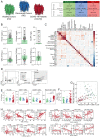
Figure 1.
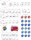
Figure 1.. Clinical characterization of cohort, inflammatory markers, and quantification of major immune subsets
(A) Overview of cohort in study, including healthy donors (HD), recovered patients (RD), and COVID-19 patients enrolled, median age and range (in years), and gender distribution. (B) Quantification of key clinical parameters of COVID-19 patients. Each dot represents an individual COVID-19 patient; healthy donor range indicated in green. (C) Consensus hierarchical clustering of Spearman correlation (95% confidence interval) of 25 demographic, clinical, and immunological features of COVID-19 patients. 65 patients were included in analysis; significance indicated by: * p < 0.05, ** p< 0.01, and *** p < 0.001. (D) Representative flow cytometry plots indicating gating strategy for identification of major immune cell subsets. (E) Frequencies of major immune cell subsets (as a percentage of live singlets). (F) Ratio of CD4:CD8 T cells within each subject group. (G) Correlation plot comparing frequencies of CD4 and CD8 T cells (both as a percentage of live cells) within the same patient. (H) Spearman correlations of immune cell subset frequencies with various clinical features. Regression line indicated in red, with 95% confidence area shown in shaded gray. Spearman’s Rank Correlation coefficient and associated p-value shown. (E-F) Each dot represents an individual HD donor (green), RD donor (blue), or COVID-19 patient (red). Significance as determined by Wilcoxon Rank-Sum Test indicated by: * p < 0.05, ** p< 0.01, *** p < 0.001, and **** p <0.0001.
Figure 2.
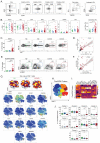
Figure 2.. CD8 T cell subset skewing and activation patterns in COVID-19 patients and potential links to T cell driven cytokines
(A) Principal component analysis of aggregated high parameter flow cytometry data. Each dot represents an individual healthy donor (HD, green), recovered donor (RD, blue), or COVID-19 patient (red). (B) Representative flow cytometry plots indicating gating strategy for identification of CD8 T cell subsets. (C) Frequencies of CD8 T cell subsets (as a percentage of total CD8 T cells). (D) Frequencies of PD1+ and CD39+ (as percentages of non-naïve CD8 T cells). (E) [left] Frequencies of KI67+ cells (as a percentage of non-naïve CD8 T cells). [right] Representative flow cytometry plots illustrating KI67 expression in non-naïve CD8 T cells from each subject group. For COVID-19 patients, examples of a low and high response are shown. (F) [left] Frequencies of CD38+HLA-DR+ cells (as a percentage of non-naïve CD8 T cells). [right] Representative flow cytometry plots illustrating CD38 and HLA-DR expression in non-naïve CD8 T cells from each subject group. For COVID-19 patients, examples of a low and high response are shown. (G) [top] Global viSNE projection of non-naïve CD8 T cells for all subjects pooled, with non-naïve CD8 T cell populations of HD, RD, and COVID-19 patients overlaid. [bottom] viSNE projections indicating expression of various markers of interest on non-naïve CD8 T cells for all subjects pooled. (H) viSNE projection of non-naïve CD8 T cell clusters identified by FlowSOM clustering of tSNE axes. (I) Heatmap showing contributions of various CD8 T cell markers to FlowSOM CD8 T cell clusters. Heat scale calculated as column z-score of MFI. (J) Boxplots indicating percentage of HD, RD, or COVID-19 patient CD8 T cells in each FlowSOM cluster. (CDEFJ) Each dot represents an individual healthy donor (HD, green), recovered donor (RD, blue), or COVID-19 patient (red). Significance as determined by Wilcoxon Rank-Sum Test indicated by: * p < 0.05, ** p< 0.01, *** p < 0.001, and **** p <0.0001.
Figure 3.
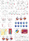
Figure 3.. CD4 T cell activation in a subset of COVID-19 patients associates with distinct CD4 T cell subsets
(A) Representative flow cytometry plots indicating gating strategy for identification of CD4 T cell subsets. (B) Frequencies of CD4 T cell subsets (as a percentage of live CD4 T cells); and frequency of activated cTfh (CD38+ICOS+, as a percentage of cTfh). (C) [left] Frequencies of KI67+ cells (as a percentage of non-naïve CD4 T cells); upper decile of healthy donor frequencies denoted by green line. [right] Representative flow cytometry plots illustrating KI67 expression in non-naïve CD4 T cells from each subject group. For COVID-19 patients, examples of a low and high response are shown. (D) Spearman correlation of KI67 expression between CD4 and CD8 T cells (both as a percentage of non-naïve CD4/8 T cells) from COVID-19 patients. Regression line indicated in red, with 95% confidence area shown in shaded gray. (E) Frequencies of HLA-DR+CD38+ cells (as a percentage of non-naïve CD4 T cells); upper decile of healthy donor frequencies denoted by green line. [right] Representative flow cytometry plots illustrating KI67 expression in non-naïve CD4 T cells from each subject group. For COVID-19 patients, examples of a low and high response are shown. (F) Spearman correlation of HLA-DR+CD38+ expression between non-naïve CD4 and CD8 T cells from COVID-19 patients. Regression line indicated in red, with 95% confidence area shown in shaded gray. (G) [top] Global viSNE projection of non-naïve CD4 T cells for all subjects pooled, with non-naïve CD4 T cell populations of HD, RD, and COVID-19 patients overlaid. [bottom] viSNE projections indicating expression of various markers of interest on non-naïve CD4 T cells for all subjects pooled. (H) CD4 T cell clusters identified by FlowSOM clustering of tSNE axes. (I) Heatmap showing contributions of various CD4 T cell markers to FlowSOM CD4 T cell clusters. Heat scale calculated as column z-score of MFI. (J) Boxplots indicating percentage of HD, RD, or COVID-19 patient CD8 T cells in each FlowSOM cluster. (BCEJ) Each dot represents an individual HD (green), RD (blue), or COVID-19 patient (red). Significance as determined by Wilcoxon Rank-Sum Test indicated by: * p < 0.05, ** p< 0.01, *** p < 0.001, and **** p <0.0001.
Figure 4.
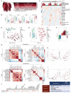
Figure 4.. Deep profiling of COVID-19 patient B cell populations compared to recovered subjects and healthy controls reveals robust plasmablast populations and other B cell alterations
(A) [left] Representative flow cytometry plot indicating gating strategy for naïve, class-switched memory, and not-class switched memory B cells. [right] Frequencies of B cell populations (as a percentage of live CD19+ non-plasmablast B cells). (B) [left] Representative flow cytometry plots highlighting variation in plasmablast (PB) frequencies in COVID-19 patients. [right] Plasmablast frequencies (as a percentage of live CD19+ B cells). (C) [left] Representative flow cytometry plots illustrating KI67 expression in B cells from healthy, recovered, and COVID-19 patients. [right] Frequencies of KI67+ cells (as a percentage of indicated B cell subsets). (D) [left] Representative flow cytometry histograms illustrating CXCR5 expression in naïve and non-naïve B cells from HD, RD, and COVID-19 patients. [right] Per-cell expression (GMFI) of CXCR5 on each B cell subset. (E) Per-cell expression of CXCR5 (GMFI) on naïve and non-naïve CD4 T cells. (F-G) Correlation between plasmablast frequencies and (F) total circulating Tfh or (G) activated (CD38+ICOS+) cTfh frequencies. Regression line indicated in red, with 95% confidence area shown in shaded gray. Spearman’s Rank Correlation coefficient and associated p-value shown. (H-I) Correlation between plasmablast frequencies and plasma concentration of anti-COVID spike (H) IgM or (I) IgG in COVID-19 patients. Gray line indicates assay limit of detection. (J) [top] Global viSNE projection of B cells for all subjects pooled, with B cell populations of HD, RD, and COVID-19 patients overlaid. [bottom] viSNE projections indicating expression of various markers of interest on B cells for all subjects pooled. (K) Hierarchical clustering of Earth Mover’s Distance (EMD) using Pearson correlation, calculated pairwise for B cell populations for all patients. (L) Breakdown of EMD patient clusters by HD (green), RD (blue), or COVID19 patients (red). (M) Global viSNE projection of B cells for all subjects pooled, with B cell populations of EMD patient clusters 1–3 overlaid. (N) B cell clusters identified by FlowSOM clustering of tSNE axes. (O) Heatmap showing contributions of various B cell markers to FlowSOM B cell clusters. Heat scale calculated as column z-score of MFI. (P) Boxplots indicating frequencies of cells in each FlowSOM cluster as a percentage of cells in each EMD patient cluster. (A-G, P) Each dot represents an individual HD (green), RD (blue), or COVID-19 patient (red). (A-E, P) Significance as determined by Wilcoxon Rank-Sum Test indicated by: * p < 0.05, ** p< 0.01, *** p < 0.001, and **** p <0.0001.
Figure 5.
Figure 5.. Temporal relationships between immune responses and disease manifestation
(A) Global viSNE projection of non-naïve CD8 T cells, non-naïve CD4 T cells, and B cells for all subjects pooled, with cells sampled from COVID-19 patients at D0 and D7 of hospitalization overlaid. (B-C) Changes in frequencies of CD4 T cell subsets (as a percentage of non-naïve CD4 T cells) in COVID-19 patients between D0 and 7 of hospitalization, including (B) EM2 and cTfh and (C) activated CD4 T cells, shown as KI67+ and HLA-DR+CD38+. (D) Changes in frequencies of B cell subsets (as a percentage of live B cells) in COVID-19 patients between D0 and 7 of hospitalization. (E) Longitudinal patterns of CD4 T cell activation in COVID-19 patients between D0 and 7 of hospitalization. [left] Frequencies of HLA-DR+CD38+ (as a percentage of non-naïve CD4 T cells) and [right] representative flow cytometry plots shown for patients demonstrating [top] an increase, [middle] a decrease, or [bottom] no change in activated CD4 T cells. (F) Longitudinal patterns of plasmablast frequencies in COVID-19 patients between D0 and 7 of hospitalization. [left] Frequencies of plasmablasts (as a percentage of B cells) and [right] representative flow cytometry plots shown for patients demonstrating [top] an increase, [middle] a decrease, or [bottom] no change. (G) Spearman correlations of clinical parameters with fold changes in immune populations of interest. Significance is indicated by: * p < 0.05, ** p< 0.01, and *** p < 0.001. (H) Frequency of patients on treatment plans, including vasoactive medication (black), nitric oxide (dark gray), early steroid (medium gray), and hyperlipidemia (light gray), demonstrating fold changes in immune populations of interest. (B-D) Each dot represents an individual healthy donor (green), recovered donor (blue), or COVID-19 patient (red) at D0 and D7 of hospitalization (connected by black line). Significance as determined by Wilcoxon Rank-Sum Test is indicated by: * p < 0.05, ** p< 0.01, *** p < 0.001, and **** p <0.0001. (E-F) Donors were sorted into groups based on thresholds of fold change: patients that showed an increase or decrease were defined by >1.5 fold change; patients that remained stable were defined by <0.5 fold change.
Figure 6.
Figure 6.. High dimensional analysis of immune phenotypes with clinical data reveals distinct patient immunotypes related to disease manifestation
(A) NIH ordinal scale describing COVID-19 clinical severity. (B) Frequencies of major lymphocyte cell subsets (as a percentage of live cells). (C) Hierarchical clustering of all patients by immune subset data. Disease severity at blood collection timepoints and/or mortality indicated in red color scale across top of heatmap. (D) Unmodified UMAP projection of all subjects, using single-positive populations of all immune cell subsets. (E) Transformed UMAP projection of all subjects graphing “Component 1” (horizontal axis) versus “Component 2” (vertical axis). Kernel density contours are drawn separately for HD, RD, and COVID populations to help visualize population clusters. (F) Mean of UMAP Component 1 for each group of subjects. Each dot represents an individual subject, with bars shaded according to subject group and severity score. (G) Correlation matrix for top 20 (selected by P-value rank) immune cell populations versus UMAP Components based on single gate flow features. Performed separately for T cell versus B cell features (columns) and Component 1 and 2 (rows). (H) Correlations between Component 1 and frequencies of example immune cell subsets. (I) Correlations between Component 2 and frequencies of example immune cell subsets. (J) Correlation matrix for UMAP components 1 and 2 with clinical metadata. (K) Summary table for the three immunotypes identified, highlighting the core immune features and associations with UMAP Components. Red up arrow represents positive association, down arrow represents negative association. (BDEHI) Each dot represents an individual HD donor (green), RD donor (blue), or COVID-19 patient (clinical severity from (A) indicated in red color scale). (J) Significance as determined by Wilcoxon Rank-Sum Test (binary clinical covariates) or Spearman rank correlation test (continuous clinical covariates) is indicated by * p < 0.05, ** p< 0.01, and *** p < 0.001.

References

    1. Iype E., Gulati S., Understanding the asymmetric spread and case fatality rate (CFR) for COVID-19 among countries. medRxiv (2020) (available at https://www.medrxiv.org/content/10.1101/2020.04.21.20073791v1.abstract). - DOI
    1. Moore J. B., June C. H., Cytokine release syndrome in severe COVID-19. Science. 368, 473–474 (2020). - PubMed
    1. Shi Y., Wang Y., Shao C., Huang J., Gan J., Huang X., Bucci E., Piacentini M., Ippolito G., Melino G., COVID-19 infection: the perspectives on immune responses. Cell Death Differ. 27, 1451–1454 (2020). - PMC - PubMed
    1. Vabret N., Britton G. J., Gruber C., Hegde S., Kim J., Kuksin M., Levantovsky R., Malle L., Moreira A., Park M. D., Pia L., Risson E., Saffern M., Salomé B., Selvan M. E., Spindler M. P., Tan J., van der Heide V., Gregory J. K., Alexandropoulos K., Bhardwaj N., Brown B. D., Greenbaum B., Gümüş Z. H., Homann D., Horowitz A., Kamphorst A. O., Curotto de Lafaille M. A., Mehandru S., Merad M., Samstein R. M., Immunology of COVID-19: current state of the science. Immunity (2020), doi: 10.1016/j.immuni.2020.05.002 - DOI - PMC - PubMed
    1. Weiskopf D., Schmitz K. S., Raadsen M. P., Grifoni A., Okba N. M. A., Endeman H., van den Akker J. P. C., Molenkamp R., Koopmans M. P. G., van Gorp E. C. M., Others, Phenotype of SARS-CoV-2-specific T-cells in COVID-19 patients with acute respiratory distress syndrome. medRxiv (2020) (available at https://www.medrxiv.org/content/10.1101/2020.04.11.20062349v1.abstract). - DOI - PMC - PubMed

Publication types